Design exists to solve problems—functional ones, aesthetic ones, or both. But sometimes, instead of improving things, it creates even more problems than it fixes. And if you need proof, just look at this subreddit dedicated to design fails, where people share examples that are so bad, they almost circle back to being good.
Bizarre typos, baffling text placements, confusing instructions, questionable interiors, stairs that seem actively out to get you—it’s all here. Scroll down for the full parade and upvote the best ones. Or the worst ones. At this point, there may not be much of a difference.
Click here & follow us for more lists, facts, and stories.
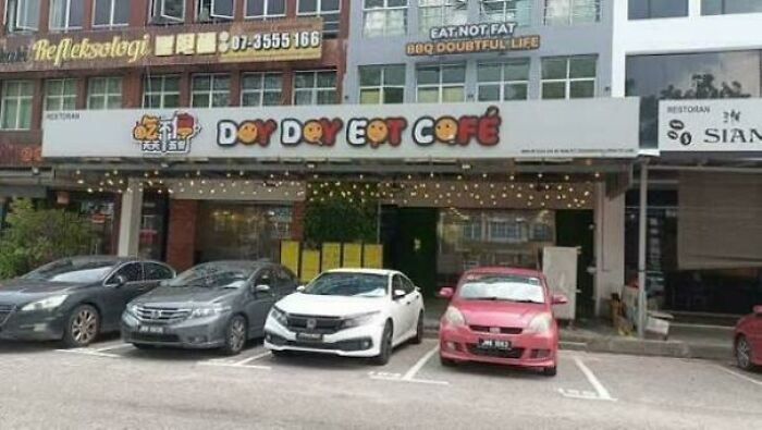
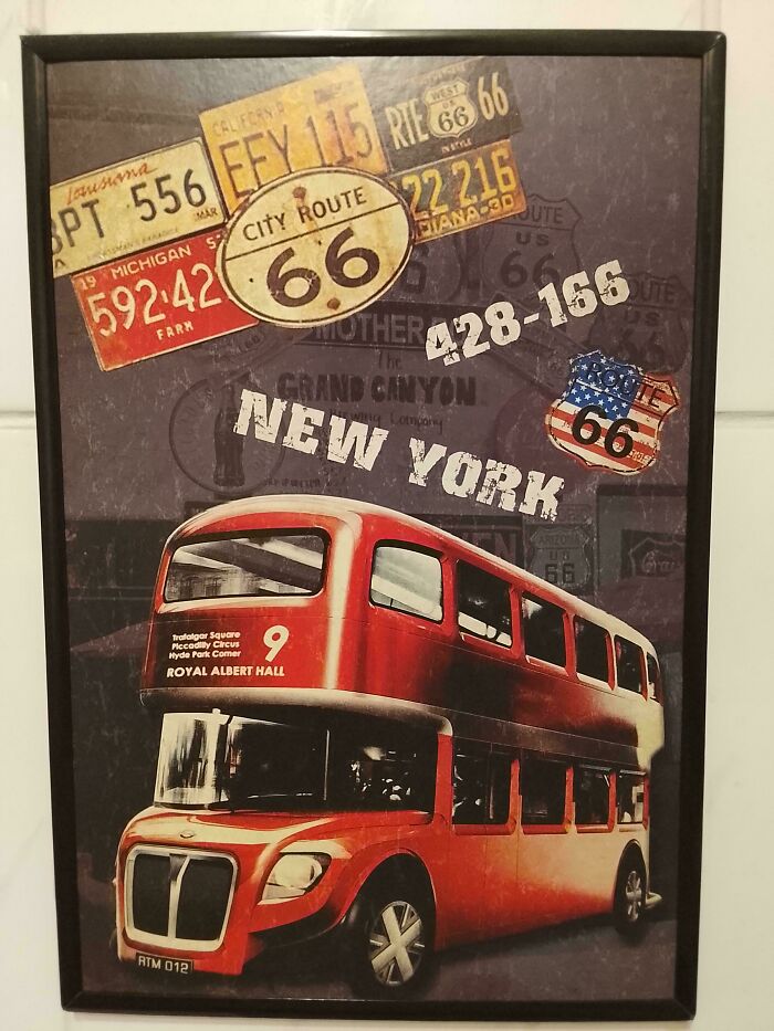
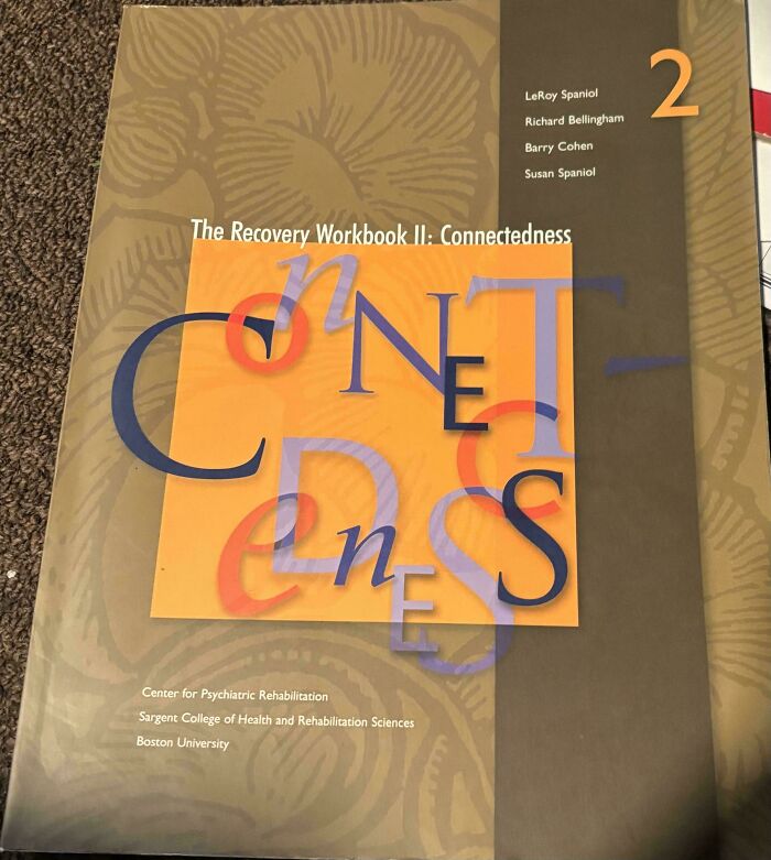
#1 When You Skip The Typography Section Of Your Groupon Graphic Design Course
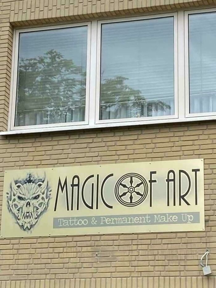
© Photo: xkelsx1
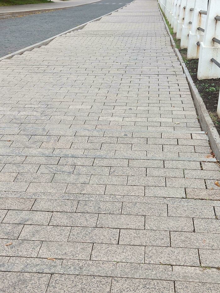
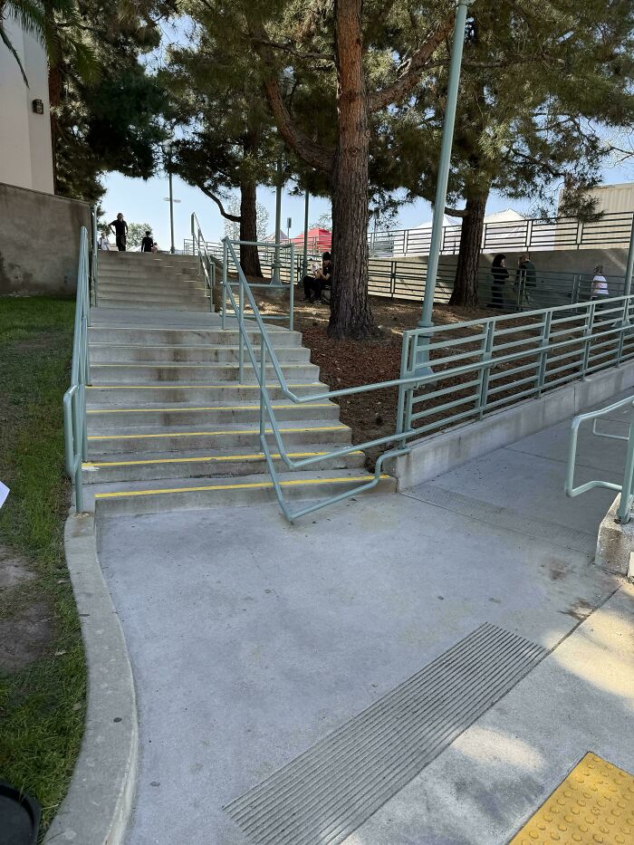
#2 Those Are Five Steps Or More
© Photo: g87a_l
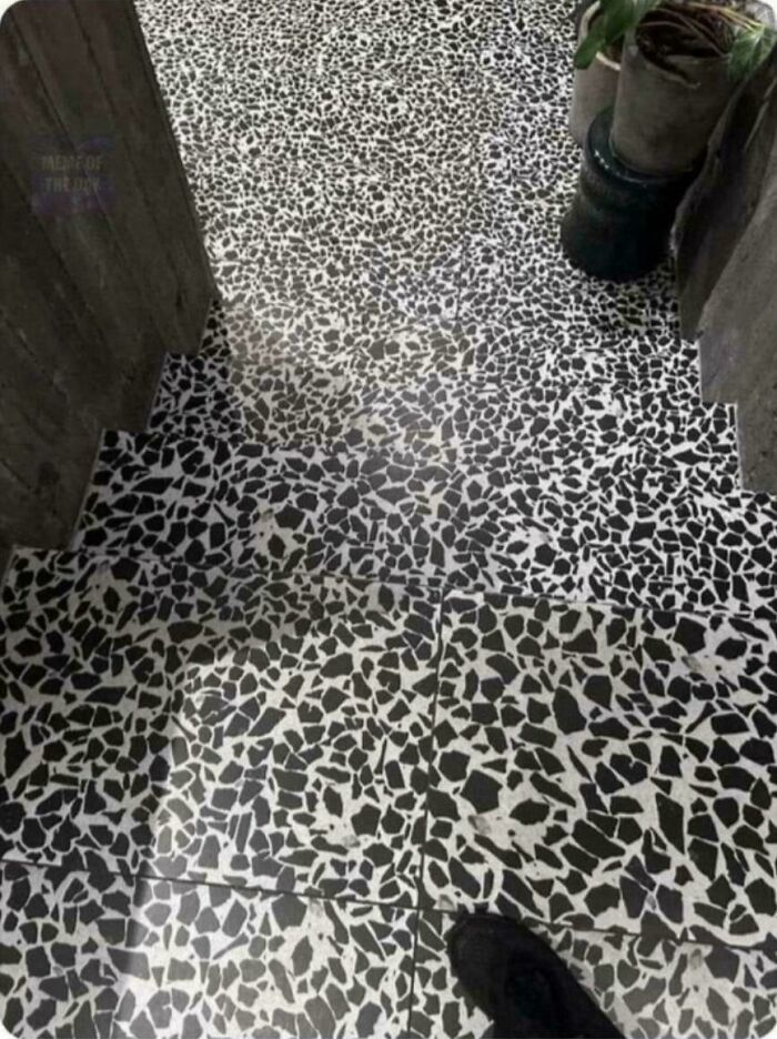
#3 Long Invisible Steps
© Photo: roman_pokora
Design is meant to make life easier, but anyone who has wrestled with a confusing shower dial in a hotel or had a minor breakdown trying to follow the instructions for assembling furniture knows that it doesn’t always work out that way.
There is one silver lining, though: when a product frustrates you, it’s rarely your fault. More often than not, the blame sits squarely with the person who designed it.
#4 It’s Like A Fun Maze For Blind People!
© Photo: BinaryBible
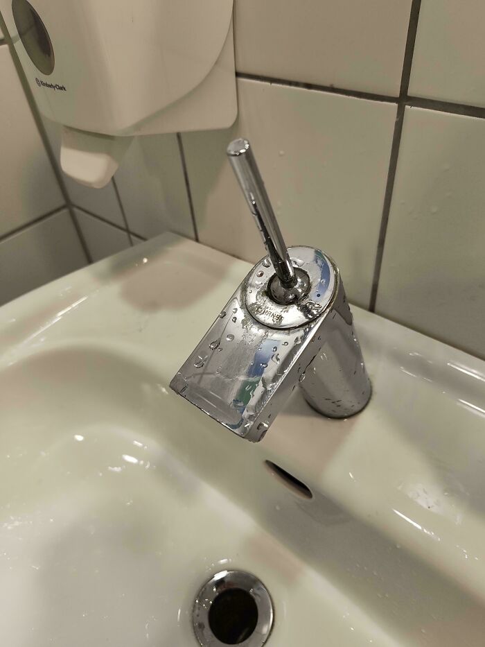
#5 The Place I’m Staying Has Running Water On Top Of A Cabinet That Doesn’t Have A Sink
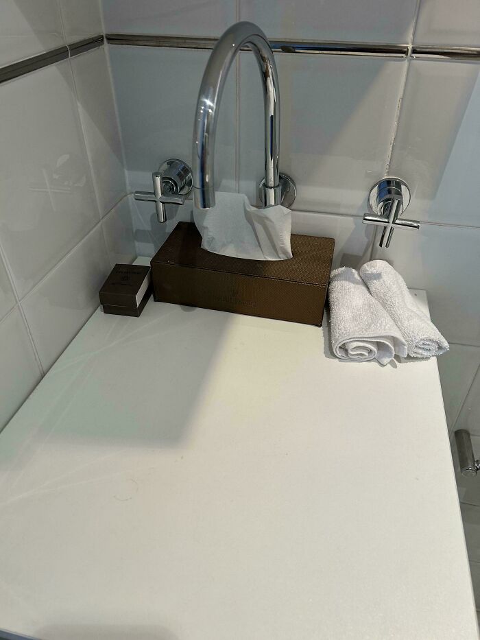
© Photo: Carrmann
#6 The Buttons To Change Temp On My Fridge
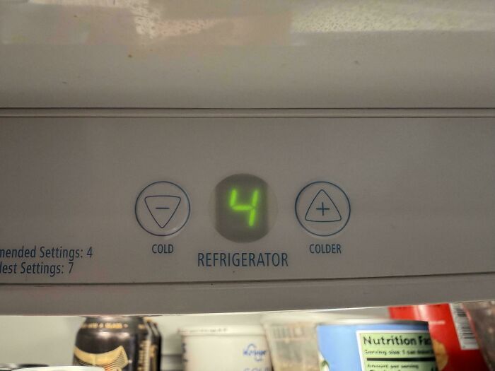
© Photo: MrNobodyX3
Take doors, for example. Have you ever confidently pushed a door, only to find it needed to be pulled? This is actually one of the most well-known examples of bad design, and it even has a name.
It’s called a “Norman Door,” after Don Norman, who wrote The Design of Everyday Things and spent a great deal of it asking why so many everyday objects feel harder to use than they should.
His point was that design should communicate with you almost without you noticing, through shapes and surfaces that tell you what to do with them before you even think about it. When that fails, the door wins.
#7 The Woman Was A Man. And The Girl Was An Adult
© Photo: wtclover
#8 Half Of The Dosage Instructions For Persil Washing Powder Are Printed On The Strip You Tear Off To Open The Box
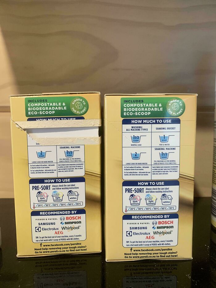
© Photo: fearville
#9 Transparent Sticker With Writing On Mirror
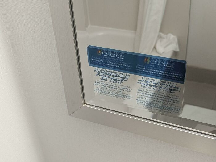
© Photo: Majestic_Phase3452
The reason we get so stumped by something as common as a push and pull door is precisely because of those signals, ones we respond to without even consciously realizing it.
When we see a vertical bar or handle on a door, we naturally reach out and grab it, and that grabbing motion makes us want to pull. But if the door has a flat surface instead, we instinctively know to push it.
An ideal door, assuming it doesn’t swing both ways, will have a vertical bar on the side you need to pull and a flat panel on the side you need to push. When designers ignore that logic, or mix the two up, they have essentially set a small trap for everyone who walks through.
#10 I Know It Is Sold By Weight, And Contents May Settle … But Maybe It’s Not The Best Idea To Put The Clear Window In The Middle Of The Package?
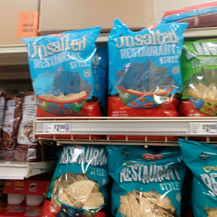
© Photo: Pale-Lynx328
#11 Grocery Store Barcode Scanner Was Scanning Its Own Advertised Barcode, So They Had To Cover It With Permanent Marker
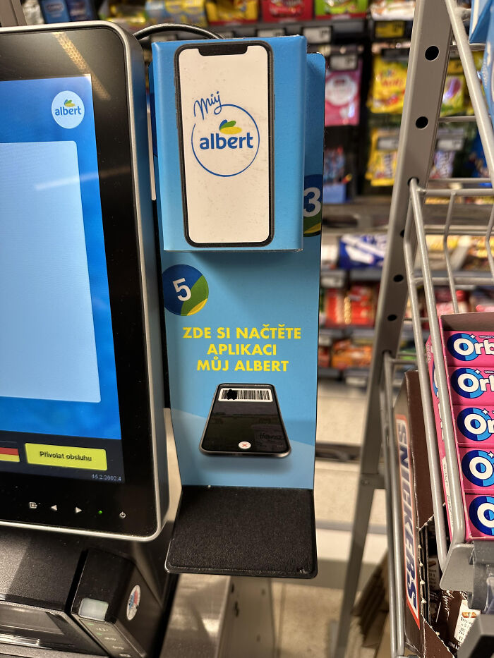
© Photo: Troner892
#12 This Building’s Billboard Lights Point Straight To My Bedroom
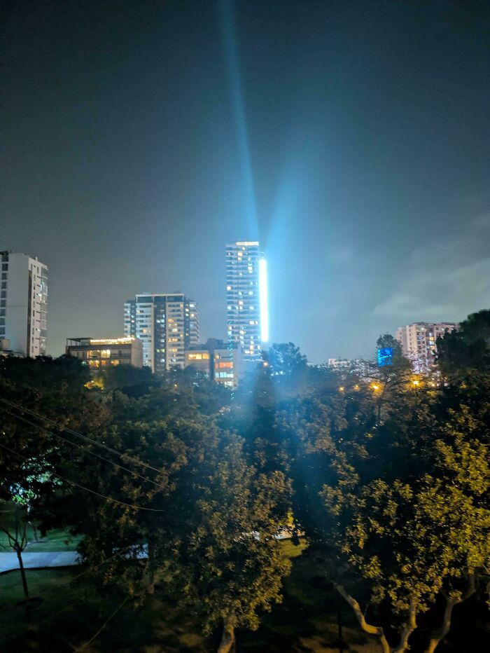
© Photo: Correct_Win_7396
This kind of invisible communication between an object and its user is at the core of what Norman was writing about.
He built his thinking around two principles: discoverability, which is about whether something makes clear what it can do, and feedback, which is whether it confirms you’re using it correctly.
When a designer gets both right, a product feels effortless. When they get it wrong, you end up with things that require guesswork or an unnecessarily complicated manual.
#13 This “Sudoku” Christmas Tree Decoration Is Clearly A Bingo Card
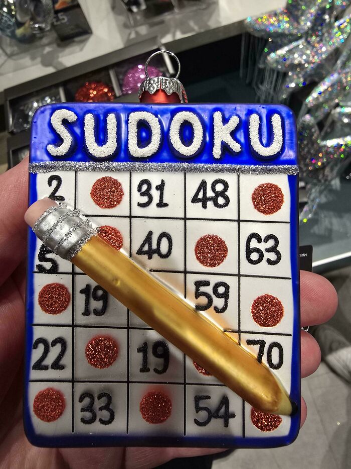
© Photo: Conorcat
#14 Coasters From A Local Designer, But The Sand Is Elevated So The Cups Fall Off
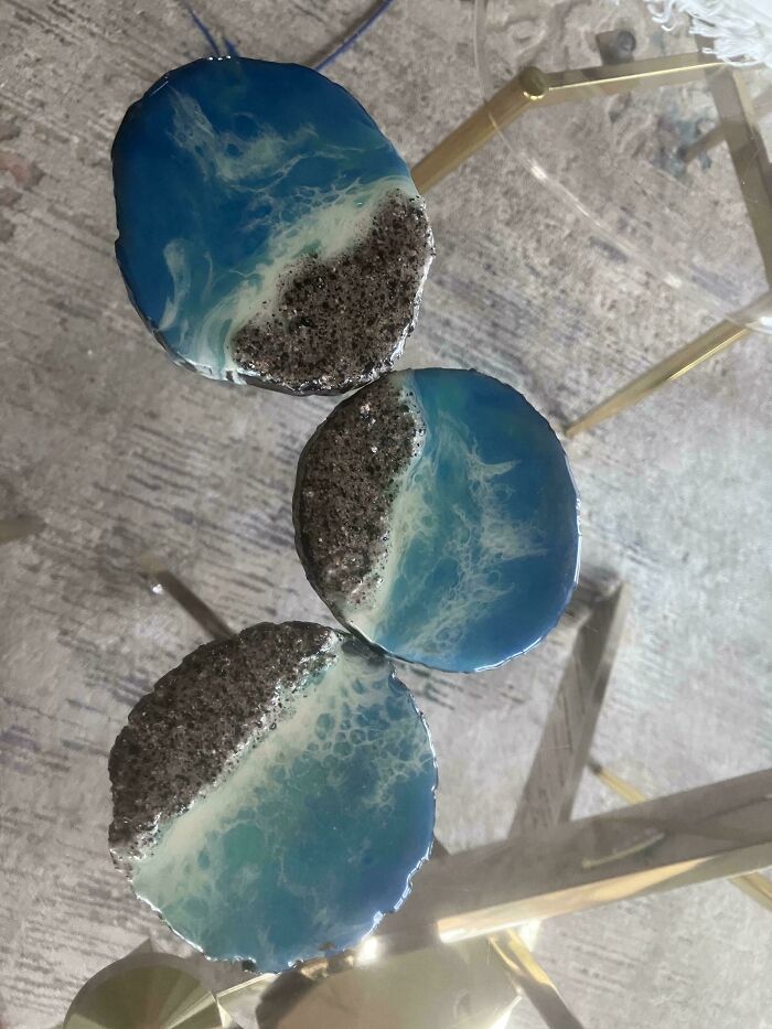
© Photo: Ecstatic-Yak-6016
#15 Which Way To Temple 38? Or Group F? Took Me Half A Day To Figure Out That These Signs Are Both Pointing Straight Ahead

© Photo: -davros
This is why the concept of human-centered design puts so much emphasis on empathy—on genuinely imagining what it feels like to use something you’ve built, rather than assuming it’s intuitive just because it was intuitive to you.
The most reliable way to test that is to put the product in front of real people. Someone who designed something already understands it completely, which makes them a pretty poor judge of how obvious it is. Watching a stranger use something for the very first time will tell you more than months of internal review ever could.
#16 Instruction Manual References Parts By Diagram Number, But Diagram Isn’t Labeled
© Photo: TRB4
#17 Watched A Dozen People Try To Push This Door Open Today During Brunch
Full disclosure: I tried to push it open, too. The push plate was not a push plate, the door handle is on the right. All they have to do is spray paint that plate black to fix the issue.
Literally every customer who came in pushed the wrong side initially. And to top it off, every sticker and sign on the door is symmetric so there’s no hint for which side of the door opens!
Best banana bread pudding French toast in the world, though, so I forgive them.
© Photo: Illustrious_Can_1656
#18 This TV That Is Way Too Far From The Bed And Obscured By The Wardrobe @ A Scotland Hotel
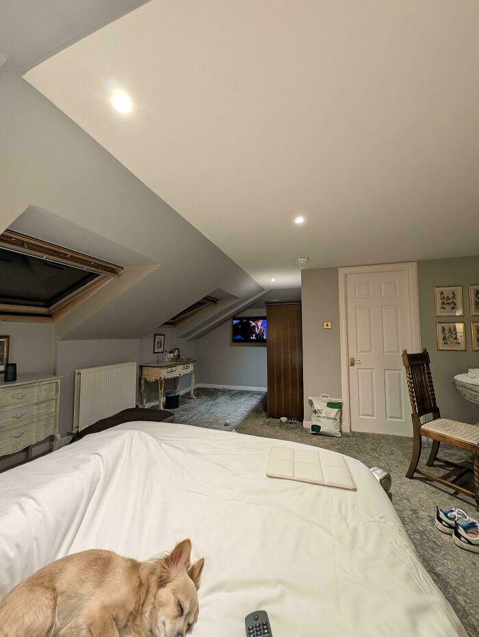
© Photo: User
Even that has its limits, though. When Coca-Cola reformulated its drink in 1985, the decision was backed by extensive research that consistently showed people preferred the new taste over the original and over Pepsi. The launch was still a catastrophe.
It didn’t matter that the new version may have technically tasted better in a blind test—what people knew was that it tasted different from the Coke they had grown up with and loved, and that was enough for the public to turn on it completely. Within three months, the company brought the original back.
#19 Which Way Do I Walk?
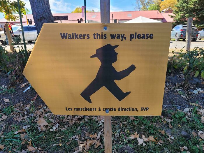
© Photo: ConsistentLab8661
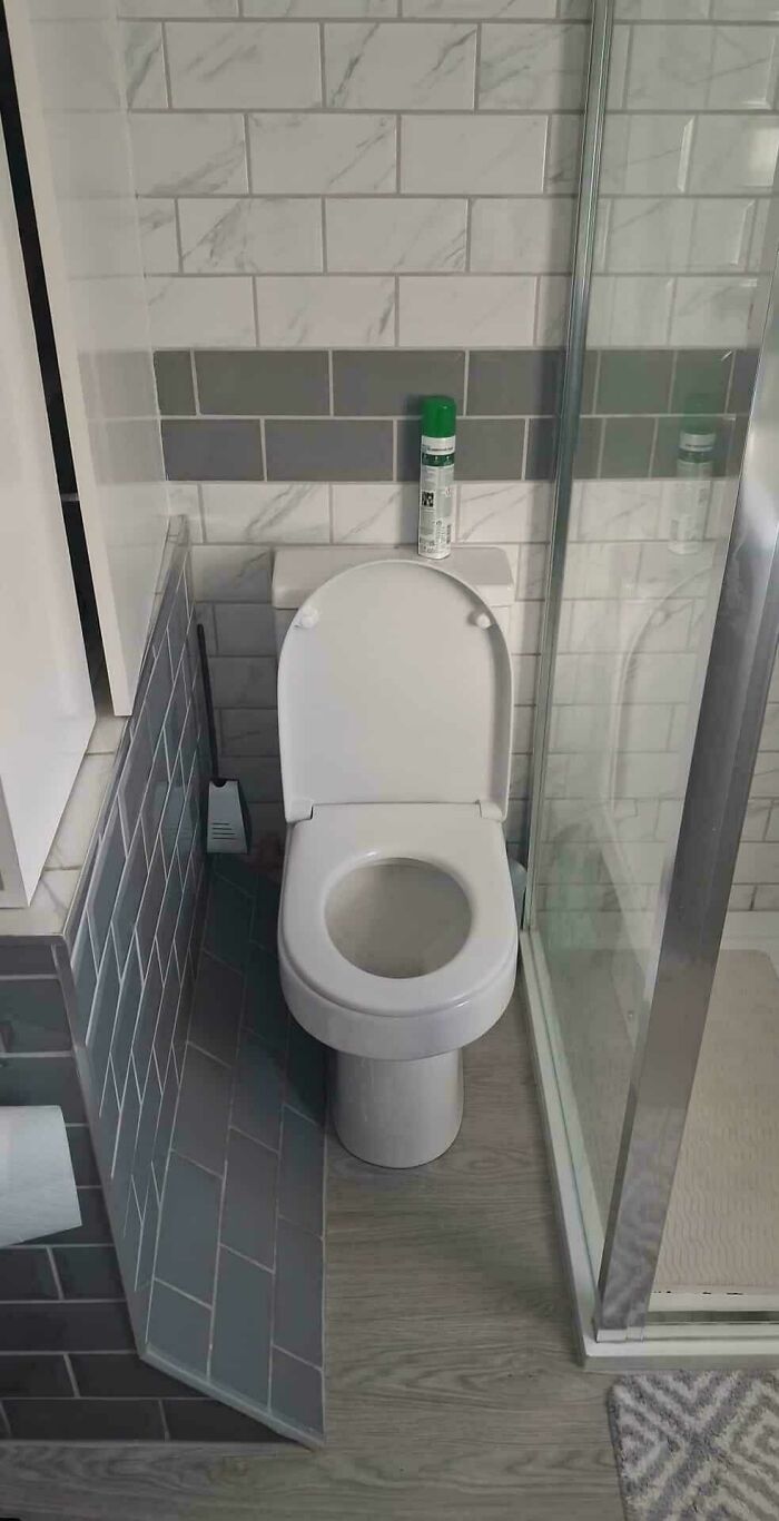
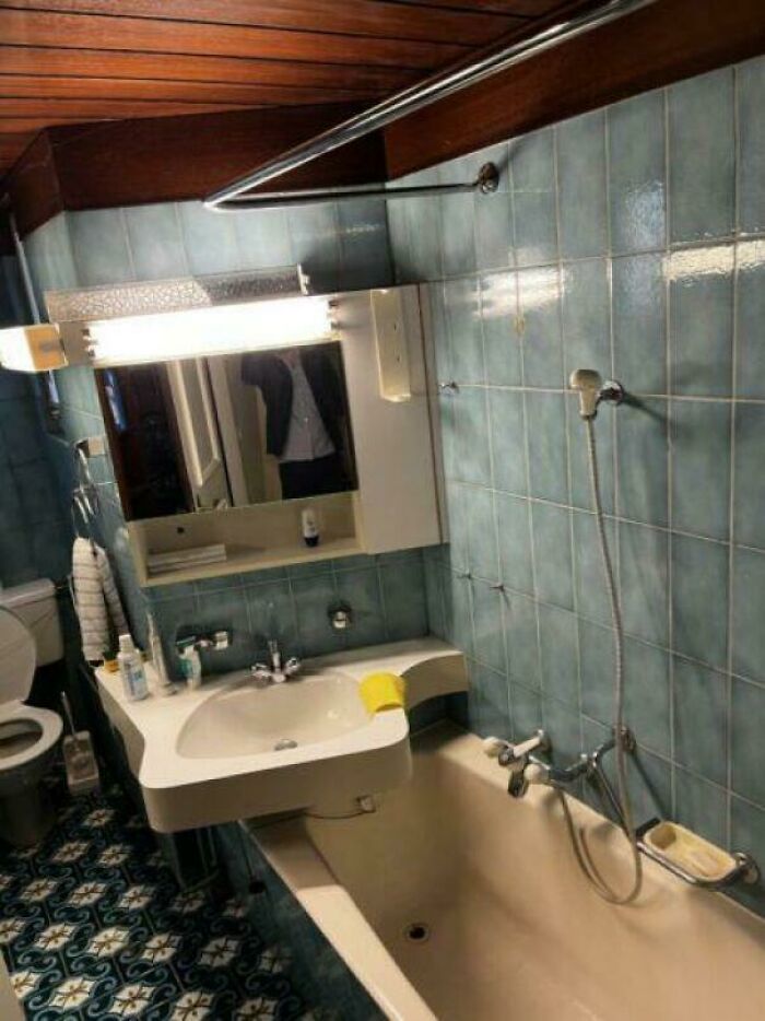
#20 Bathroom And Kitchen Combined
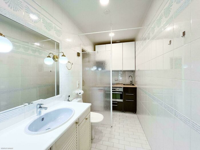
© Photo: JopeliH
#21 This Promotional Shot Makes It Look Like The Pump Is Malfunctioning And Causing Major Leakage
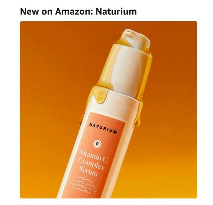
© Photo: yaamen
Scott Berkun, a bestselling author and speaker on innovation and creativity, argues that design failure is actually a good thing, because without it we simply wouldn’t know what good design looked like.
He used to keep a notebook where he’d write down every idea that came to him, and most of them were, by his own admission, just plain unworkable. But that wasn’t really the point.
Each bad idea taught him something about the problem he was trying to solve that he hadn’t thought about before, and each new attempt was a little more informed than the last. As he puts it, out of every five or six ideas, he’d find one or two that might actually be worth pursuing.
#22 Record Label Sumerian Records Uses An Image Of The Sphinx

© Photo: Time4Homework
#23 Safety Is Chimney Check Your Clean
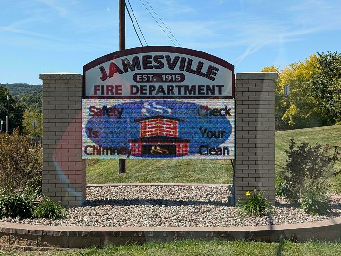
© Photo: JshWright
#24 Stairway To Heck
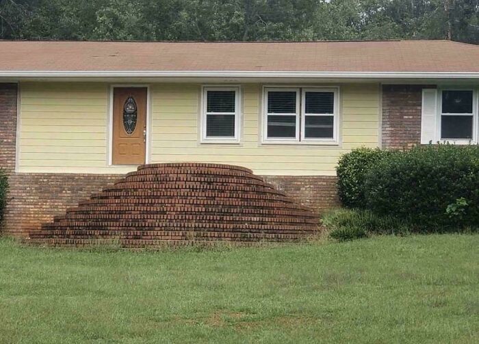
© Photo: Catalina_whine_fixer
All that’s to say that while we are certainly having a great time laughing at these designs and wondering how on earth they ever made it out into the world, they are not entirely without purpose.
Each one is a record of what doesn’t work, and sometimes knowing that is just as valuable as knowing what does. They push designers, and really anyone who makes anything, to think differently and do better the next time around.
Call it failure if you want, but maybe it’s more accurate to just call it experience.
#25 My Soul Just Fell Down These Stairs
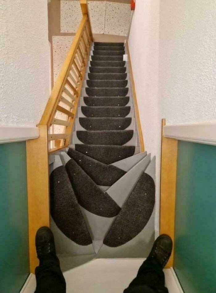
© Photo: NerdyBirdyAZ
#26 No Room To Store The Wrench That Comes Outside The Plastic Container As Demo
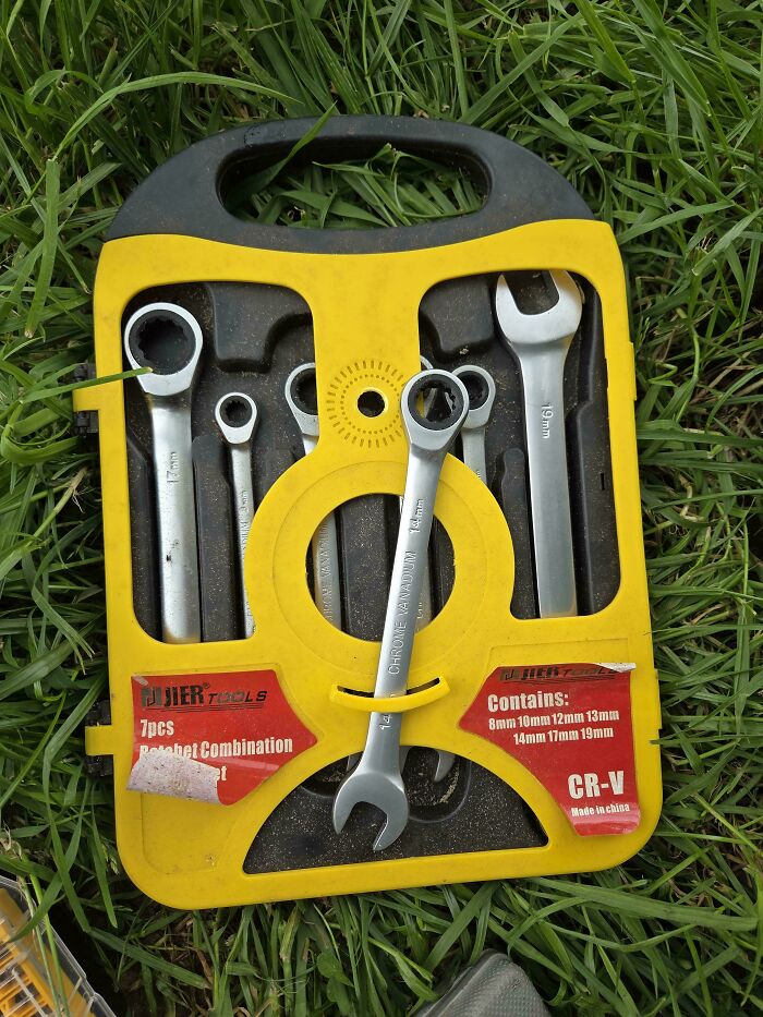
© Photo: cimocw
#27 This Was Not A Fun Experience
© Photo: Atkinator1
#28 I’m No Dogologist But…
© Photo: Blackbyrn
#29 My Local Park Benches Made Of Stainless Steel. Too Cold To Sit On In Winter, Too Hot To Sit On In Summer
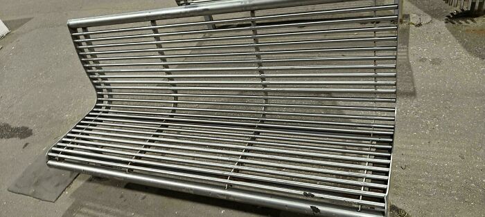
© Photo: TheHyperFlame
#30 Page Folds On Africa In Global Hunger Map In My Textbook
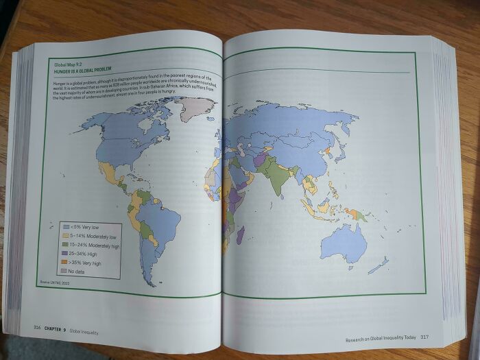
© Photo: Xancrim
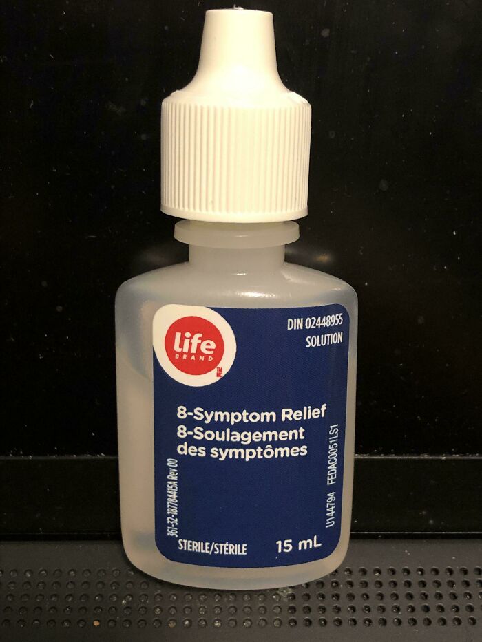
#31 Eye Drop Bottle Does Not Note That It Is Eye Drops
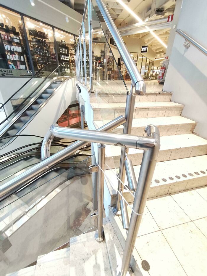
© Photo: gachunt
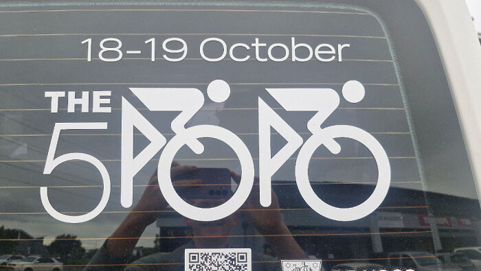
#32 The 5 Popo
© Photo: Handsome_Bread_Roll
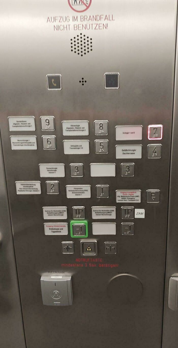
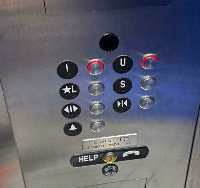
#33 Austrian Elevators Are Hard To Understand
© Photo: Austrian_printer
#34 The Words On The Display Of The Marzipan Museum In Germany
© Photo: CottonPendulum
#35 On The Mcdonalds’ Monopoly Game They Removed The ‘Go To Jail’ Character’s Whistle But Left His Cheeks Blowing
© Photo: SilverApples
#36 The Button For The Third Floor Is Located At The Very Top Of The Elevator Panel
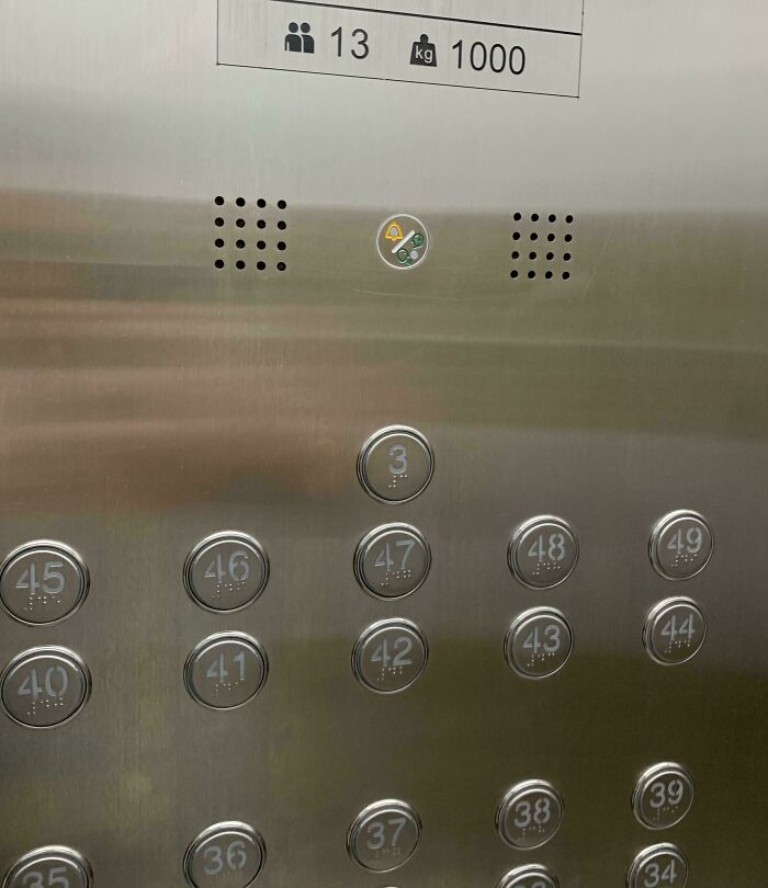
© Photo: [deleted]
#37 Imagine The Logistics And The Cleaning
© Photo: Alpoh1502
#38 It’s Pepper, It’s Red, But We Decided To Assign Red To The Cheese
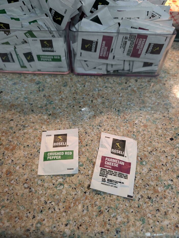
© Photo: morgred13
#39 What Was Even The Plan Here?
© Photo: Mundane-Low7125
#40 Apparently This Is A Promo For A Writer’s Festival
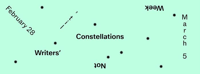
© Photo: simsimdimsim
#41 Drano Suggests To Use 1/3 Of A Bottle, But Markings On The Side Are In 1/4 Increments
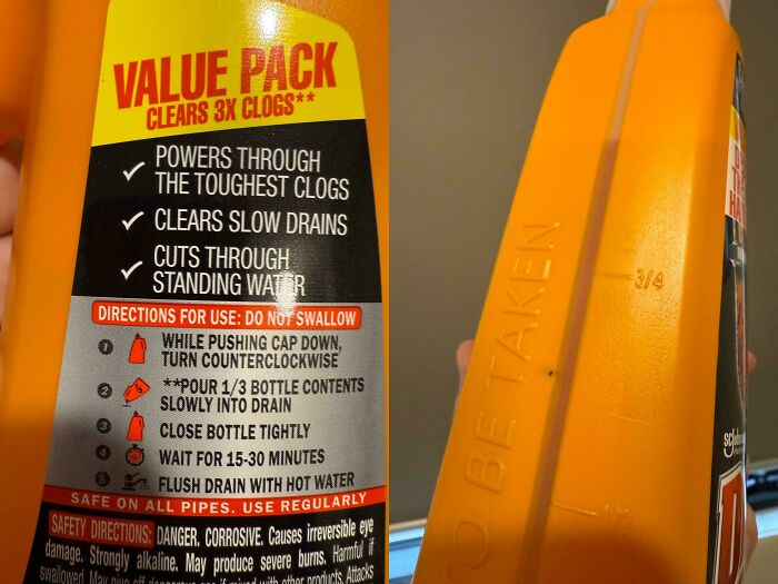
© Photo: acherion
#42 This Birthday Plate Where The Balloon Strings Just Look Like Hair
© Photo: FtMFandomBoy
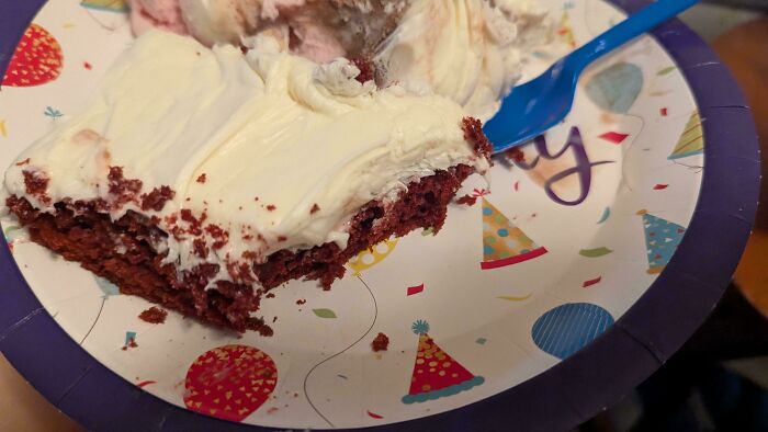
#43 Eggnog Puke Cake

© Photo: Terytha
#44 This Mailbox Speaks For Itself
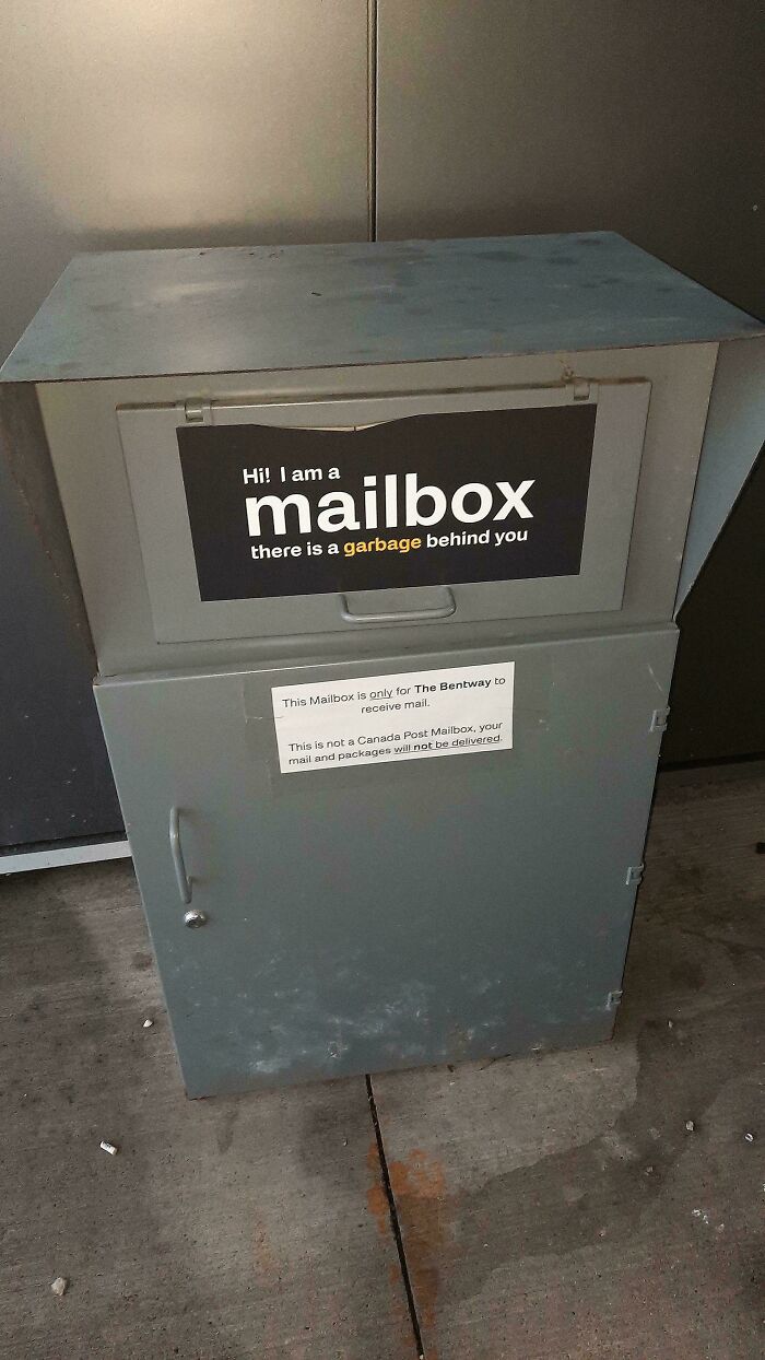
© Photo: muppetcowboy
#45 The Wear On This Sticker Where People Have Pressed It Instead Of The Actual Functioning Button
© Photo: NewNiklas
#46 Outdoor Boot Bag For Skiing Pockets Don’t Close So Snow And Rain Can Get In
© Photo: DarkThunder312
#47 Nothing Says “Buy Our Seed” Like 50% Of The Ear Being Undeveloped
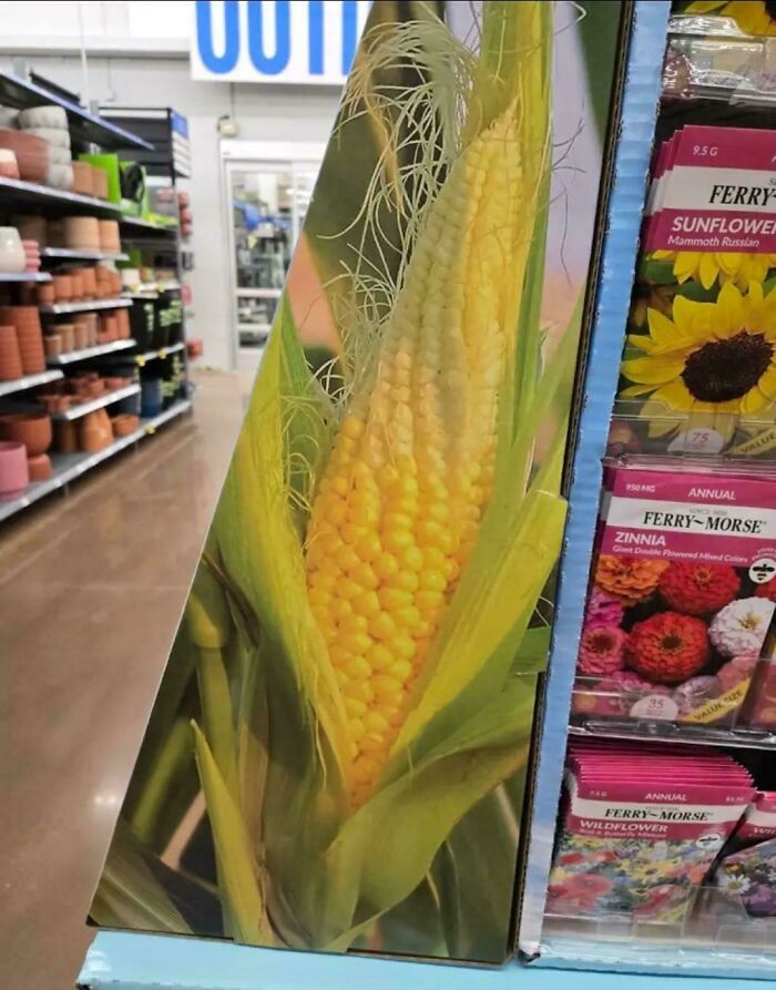
© Photo: McChiser
#48 Weird 90° Power Supply Plug That Doesn’t Have Enough Clearance To Fit Correctly Into The Intended Outlets. Need To Buy An Extra Cable To Use It
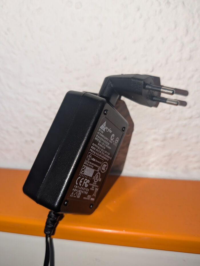
© Photo: DrCyb3r
#49 I Guess We Dont Need Spacing Between Go On
© Photo: Blue_Storybook
#50 I Was Wondering Why My Niece Always Zones Out Halfway Through While Counting On This Toy, Until I Noticed
© Photo: d-the-luc
#51 Infinity – Spotted In The Wild

© Photo: User
#52 If You Ever Wanna Watch Yourself
© Photo: superiorgarlic
#53 Hip-Pinching Chairs: I’m A Skinny Guy & These Bang Into My Hip Bones. How Can They Possibly Be Comfortable For Anyone Wider?
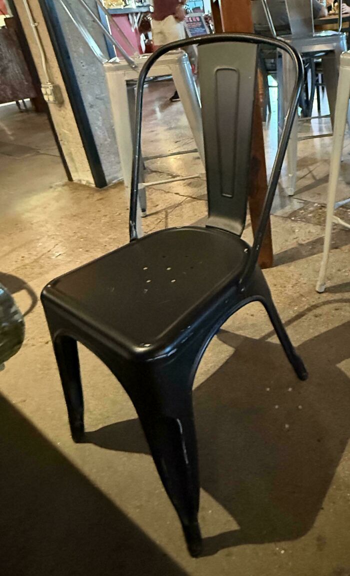
© Photo: carlcrossgrove
#54 Wear No Clothes Sign Is Actually A Penalty Warning
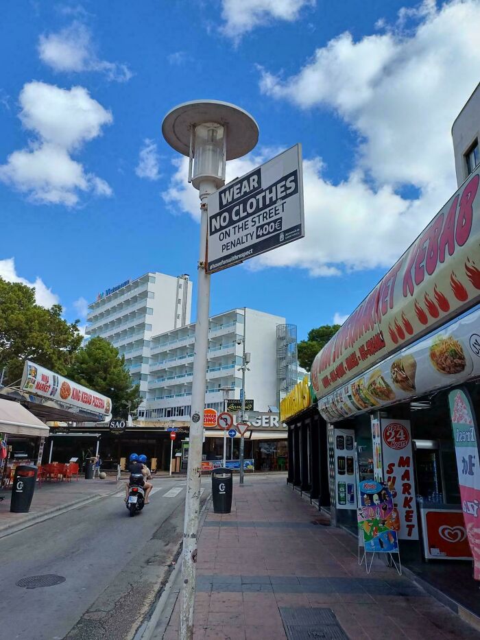
© Photo: Flintloq
#55 Do You Want A Zero Protein Diet? Look No Further
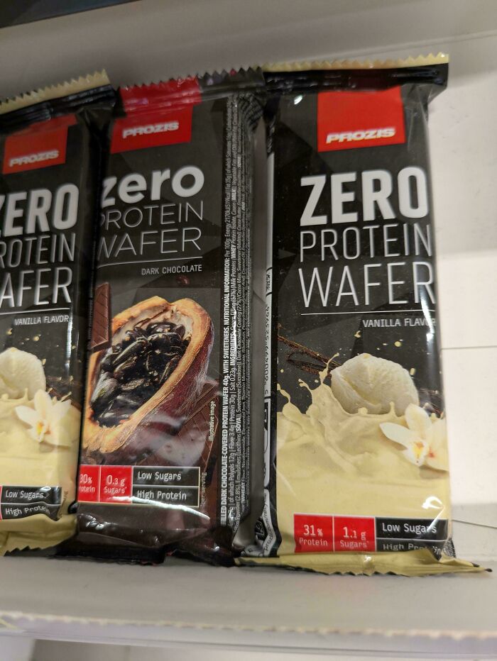
© Photo: Kayonji02
#56 This Balloon Is 26 Inches Wide. That Is Neither 2 Feet Or 1 Person Tall
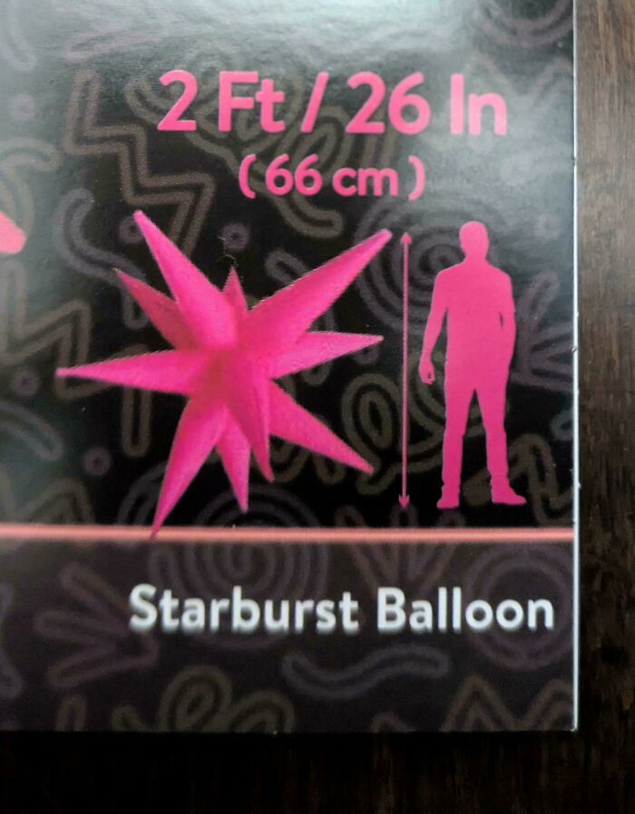
© Photo: [deleted]
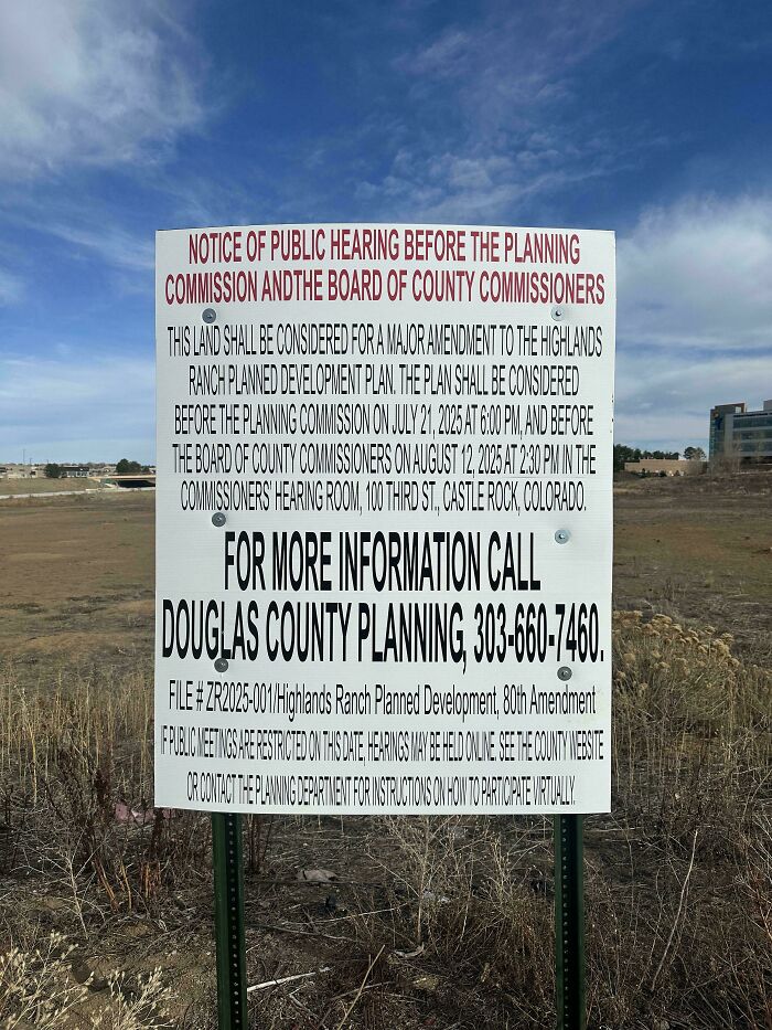
#57 Public Notice Where The Font Is The Main Obstacle To Being Informed
© Photo: Pitiful-Bluebird7951
#58 A Playground Where You Can Get Burned In Summer
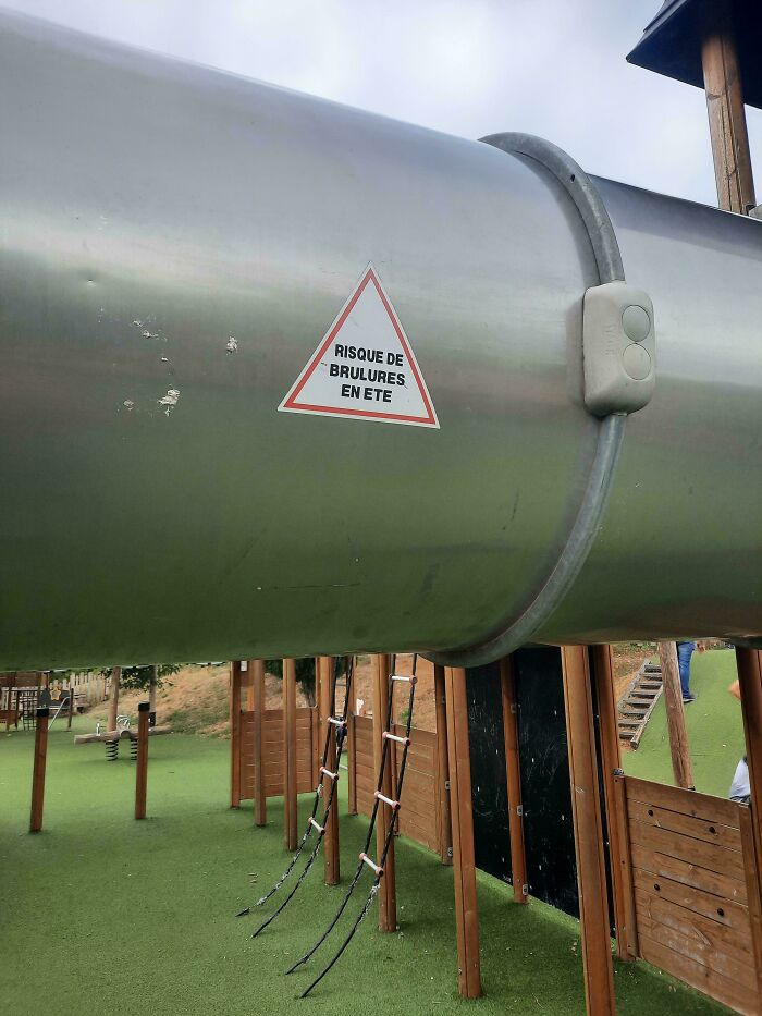
© Photo: Sarahsurlalune
#59 My Family Took Me To The Titanic Exhibit For My Birthday
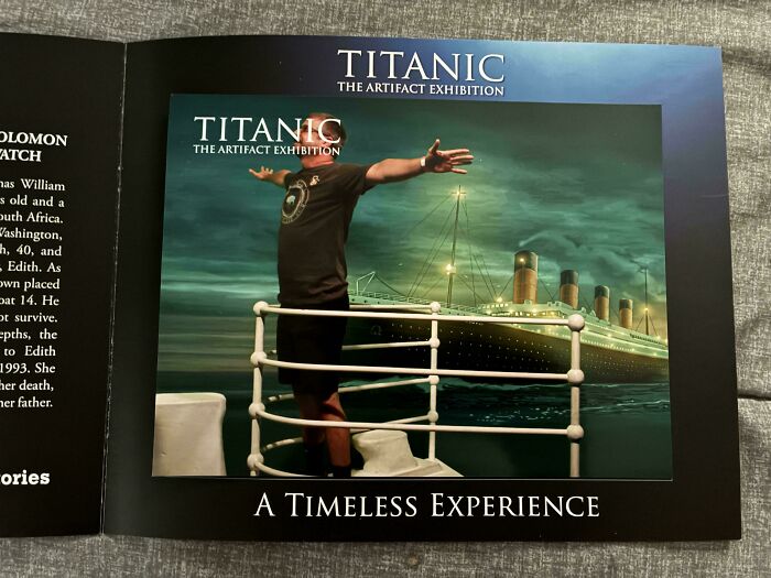
© Photo: That_EngineeringGuy
#60 These Leviton Switches Have Raised Lettering That Love Gathering And Keeping Dirt In Them
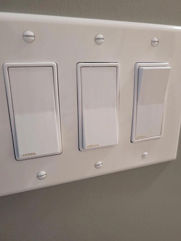
© Photo: User
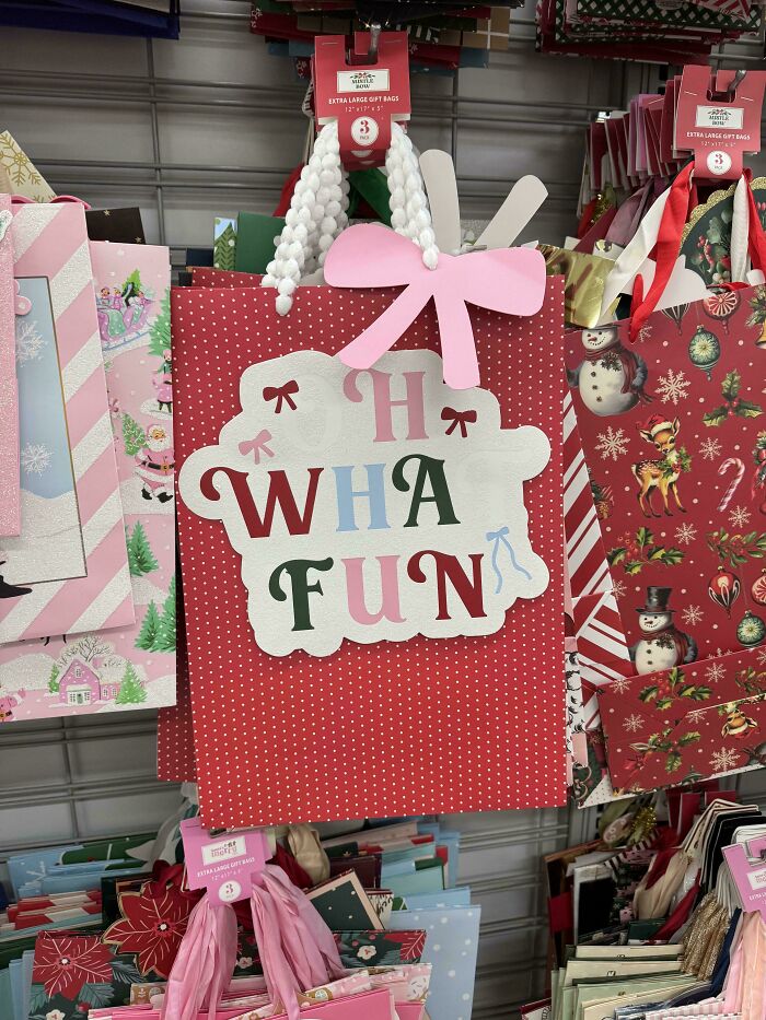
#61 H Wha Fun 🎀
© Photo: 7ofeggs
#62 Good Luck Plugging Your Charger Into This Outlet On The Hungarian National Railway
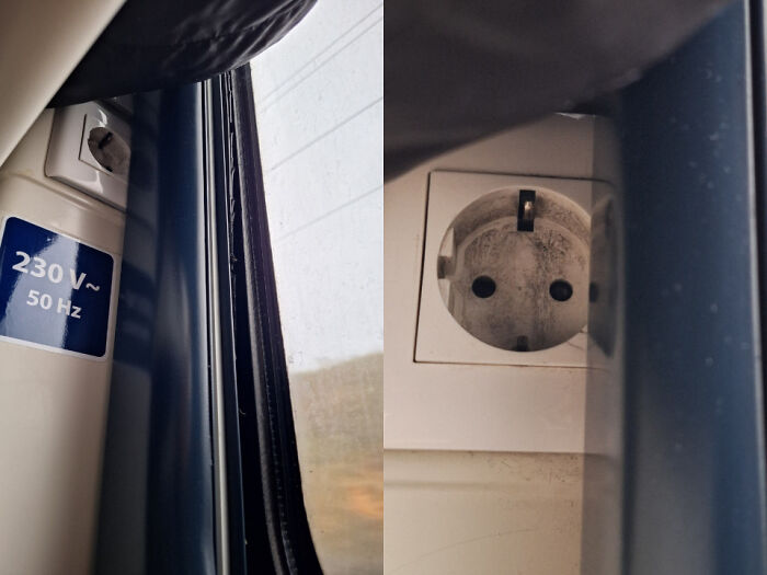
© Photo: GotHelpGiveHelp
#63 Because Potty Training Needs More Splatter-Producing Elements
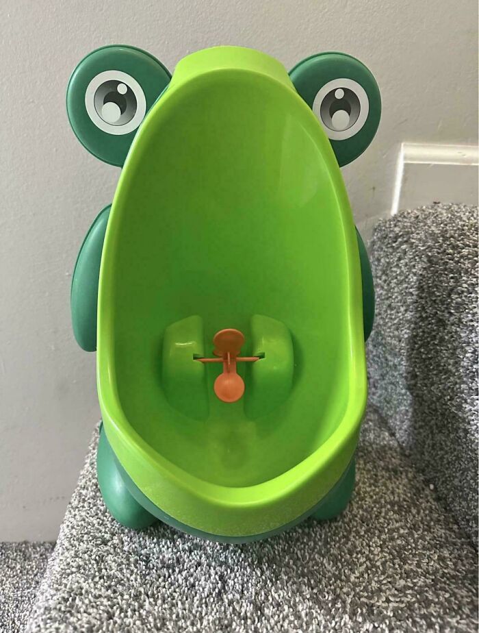
© Photo: parothed28
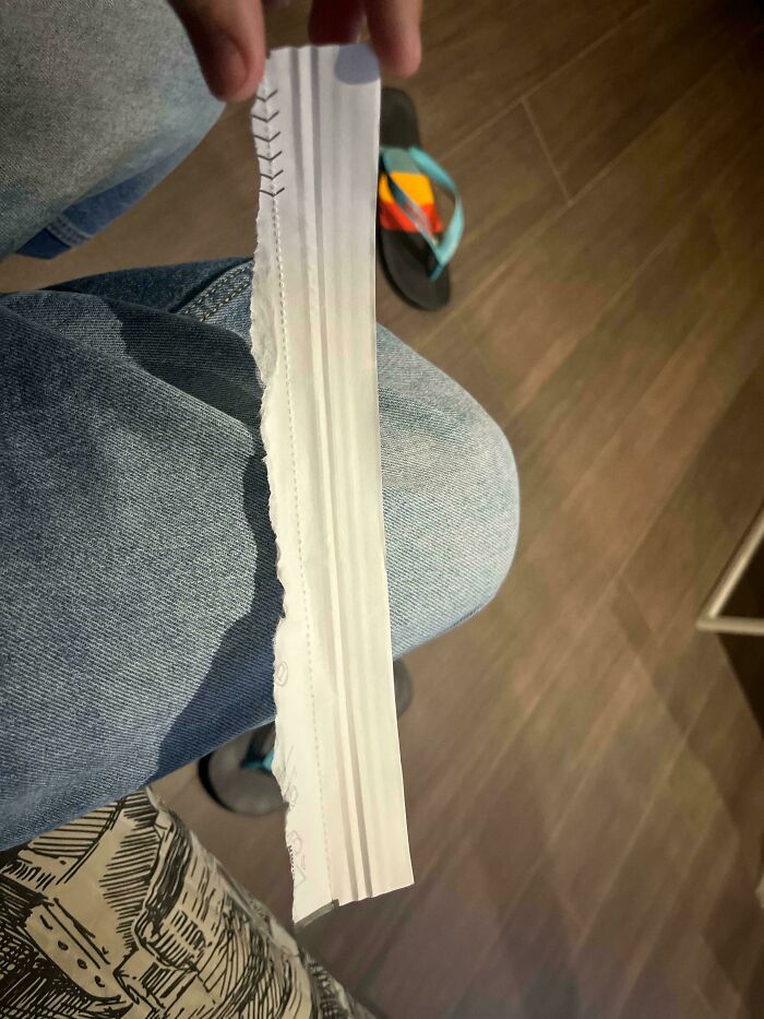
#64 My Pants Pockets Are Only As Deep As The Bottom Of The Opening, So Anything I Put In Them Will Fall Out
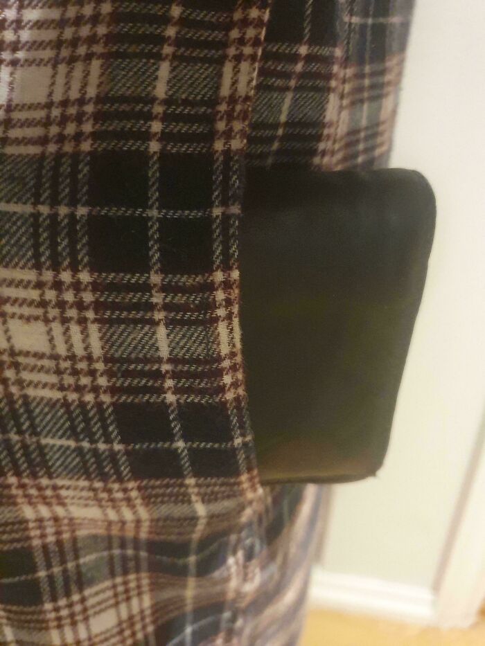
© Photo: Knopes
#65 You Switch It Off By Positioning The Rod Exactly In The Middle, No Locking, Free Movement In Any Direction, Opposite To Switch It On
© Photo: eXus_Nerubis
#66 Three Different O Widths Hurts My Brain
© Photo: tfowers
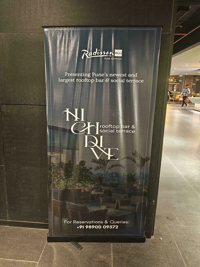
#67 It’s Definitely “Brugre”, Right?
© Photo: AsPeHeat
#68 Bathroom Of An Appartment I Was Viewing For Rent
© Photo: chaoze50
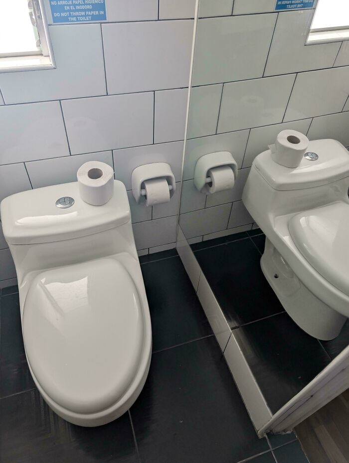
#69 Sweet Home Home!
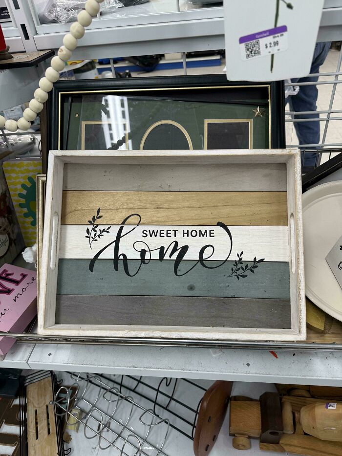
© Photo: Worldly-Return-9417
#70 The Elevator In This Brand New Parking Garage
© Photo: Grsz11
#71 What Could Go Wrong! (Btw It’s Pitch Black Until You Hit The Light Switch)
© Photo: Potential_Lock_5212
#72 Lunchbox Company Uses A Woman Making Juice To Show Their Product Is Hand Washable
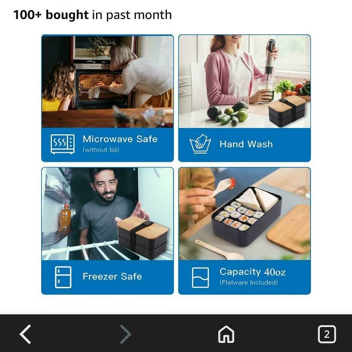
© Photo: PURPLZMM2
#73 This Odd One Out Puzzle Doesn’t Have An Odd One Out!
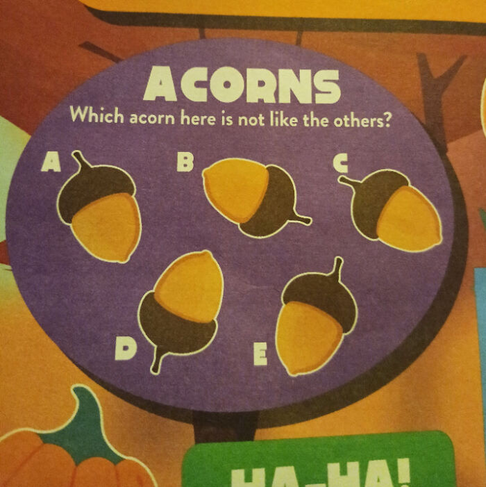
© Photo: easywrite
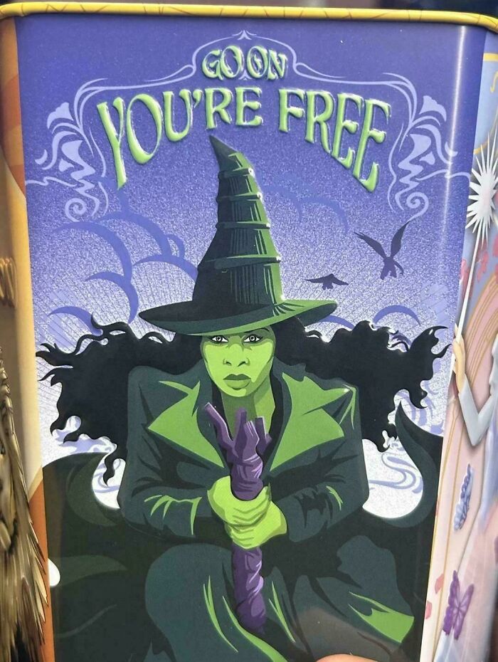
#74 This Bingo Card From The Female Lead That Was Definitely Designed By Someone Who Has Never Played Bingo
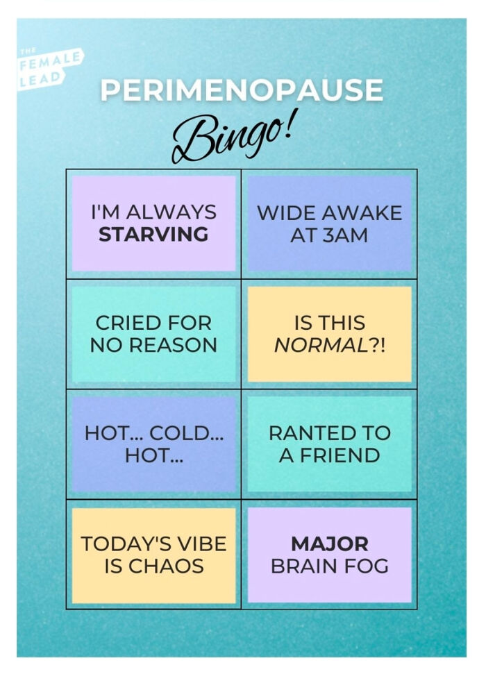
© Photo: haleylovesvirgil
#75 Our Small Shopping Centre Has Really Good Direction Signs
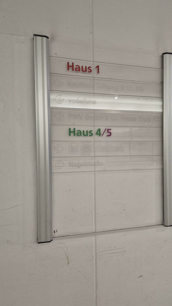
© Photo: longitudinisx
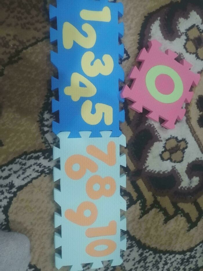
#76 Missing Numbers On Kids Height Measurement
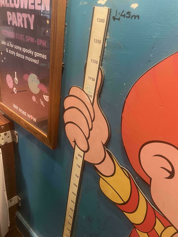
© Photo: User
#77 Please Excuse The Mess Made, Memories Are Being
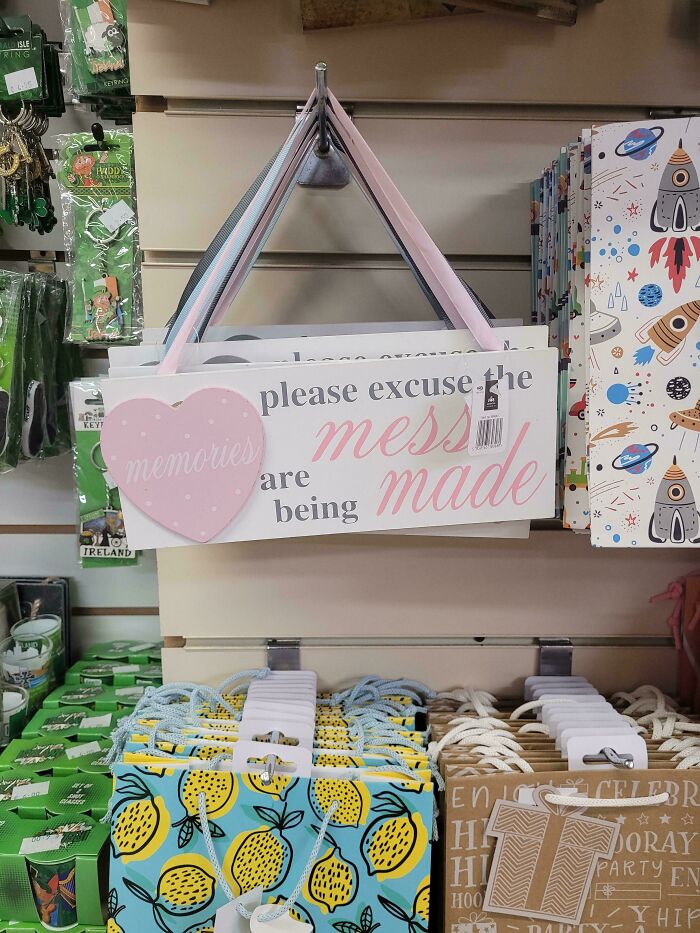
© Photo: Zendo7777
#78 Mmmm Colour-Blind Simulator
© Photo: PotatoPotatoApple
#79 No Pain No Paizza
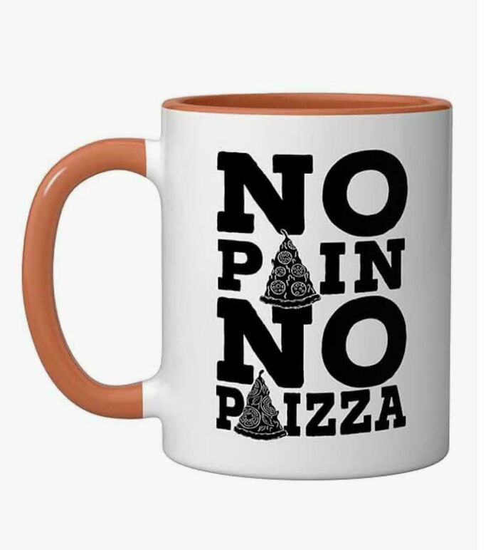
© Photo: Violet_Walls
#80 The Dice Shaker That Comes With Yahtzee Is Exactly Two Dice Wide And Has An Internal Edge That The Dice Constantly Get Stuck Behind
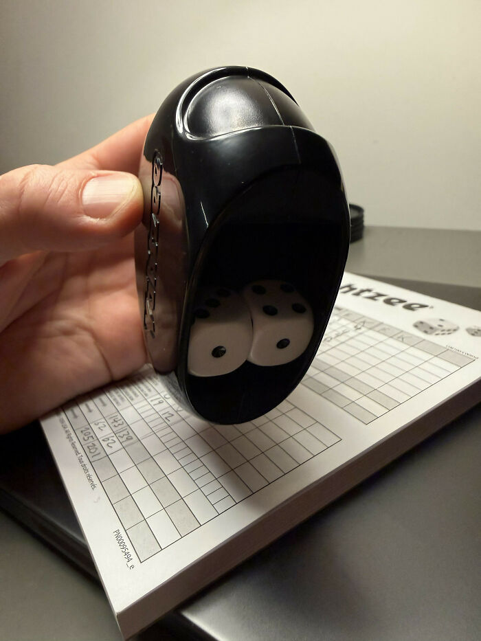
© Photo: Kimos
#81 Happy New Year Everybody!
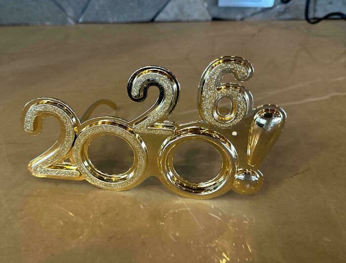
© Photo: Greainy
#82 In The Bathroom At A School I Work At…
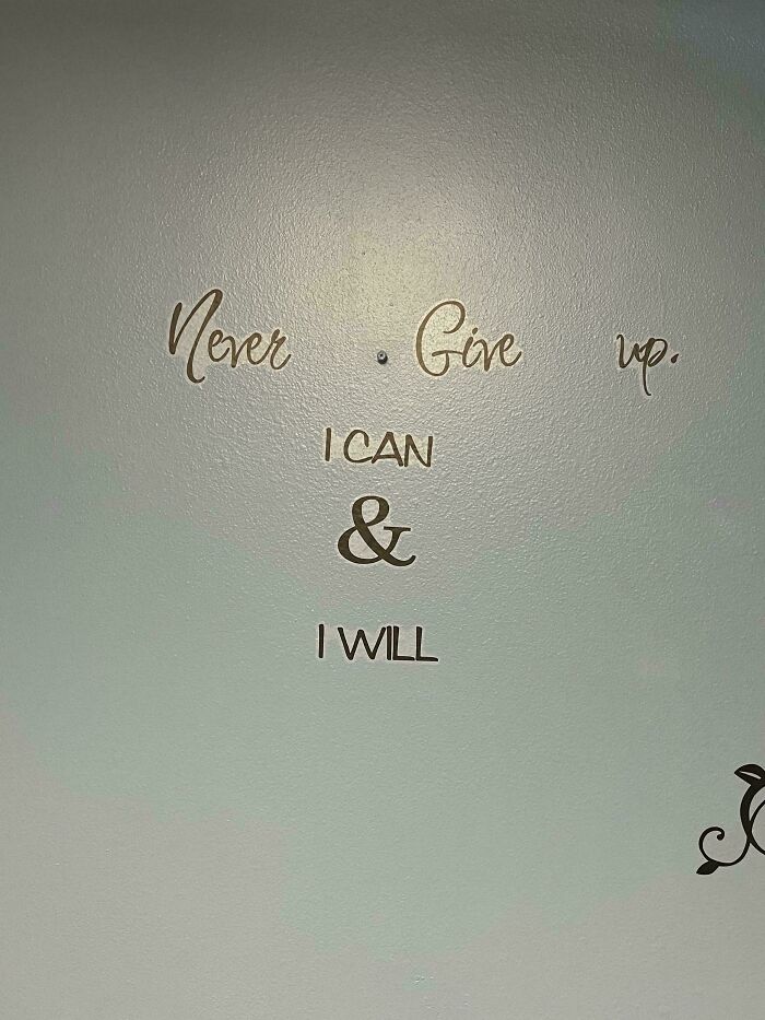
© Photo: thatfood
#83 Belgian Urban Design
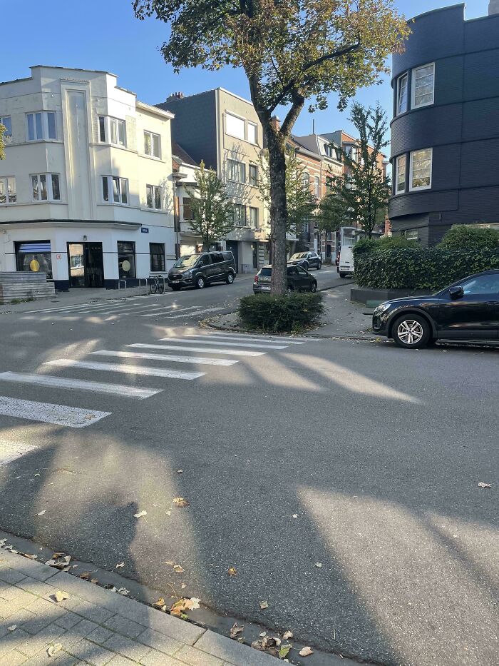
© Photo: laferrarinz
#84 Ritz’s Guide To A Serving Size
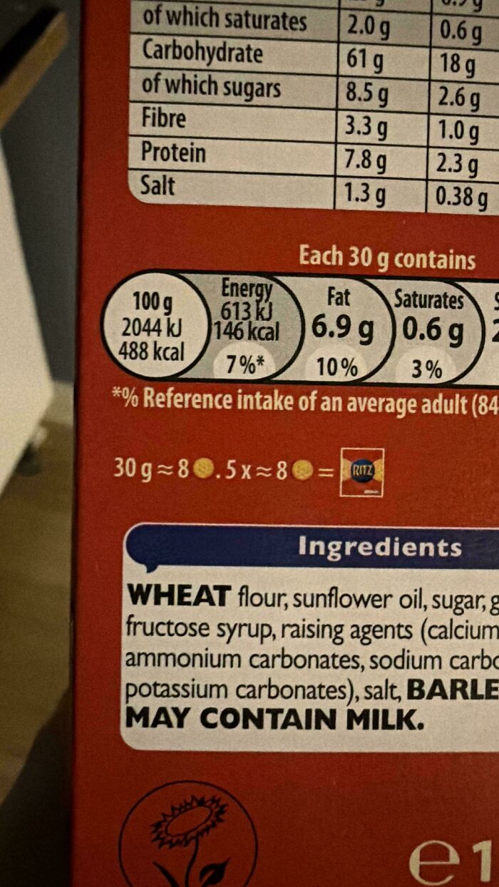
© Photo: Reddit-Sama-
#85 They Proudly Presented The New Logo Of The Austrian Football Association (Öfb)
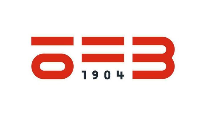
© Photo: Visual_Fold_7826
#86 The Emojis Make The A’s Look Like O’s
© Photo: 92233720368547758080
#87 An Advertisement In My Office
© Photo: dominic4443
#88 Ah Yes, Let’s Just Extend The Railing For Some Reason
© Photo: acumen94
#89 This Plaque Is Having An Identity Crisis
© Photo: User
#90 Regularly Updated Billboard Near My House
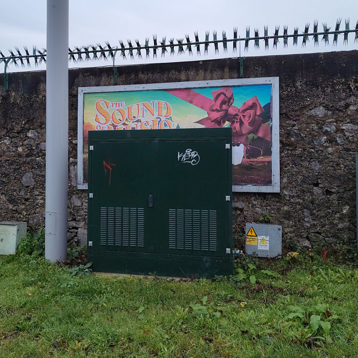
© Photo: macdaibhi90
#91 The Math On The Back Of This Cereal Box, Is The Polar Opposite Of The Truth
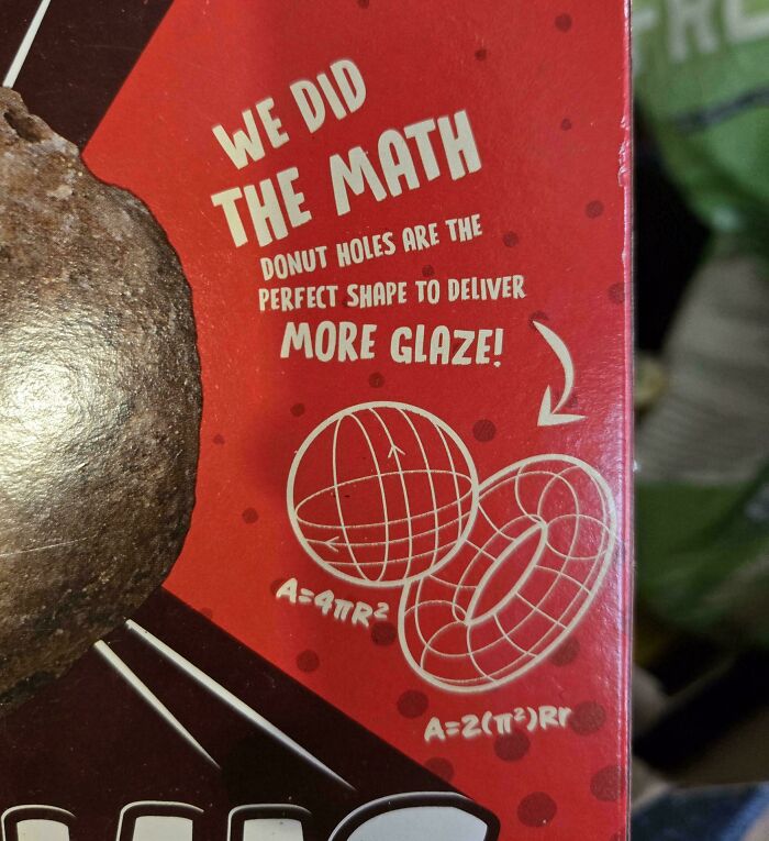
© Photo: slammahytale
#92 The Pre-Cutting On The Paper LEGO Bags Is Pointless
© Photo: TomtomXDD
#93 I’m Not A Design Bruh, But I Couldn’t Even Read This
© Photo: HappySheep84
#94 Small Gap In Phones Case, Broke First Time I Dropped It
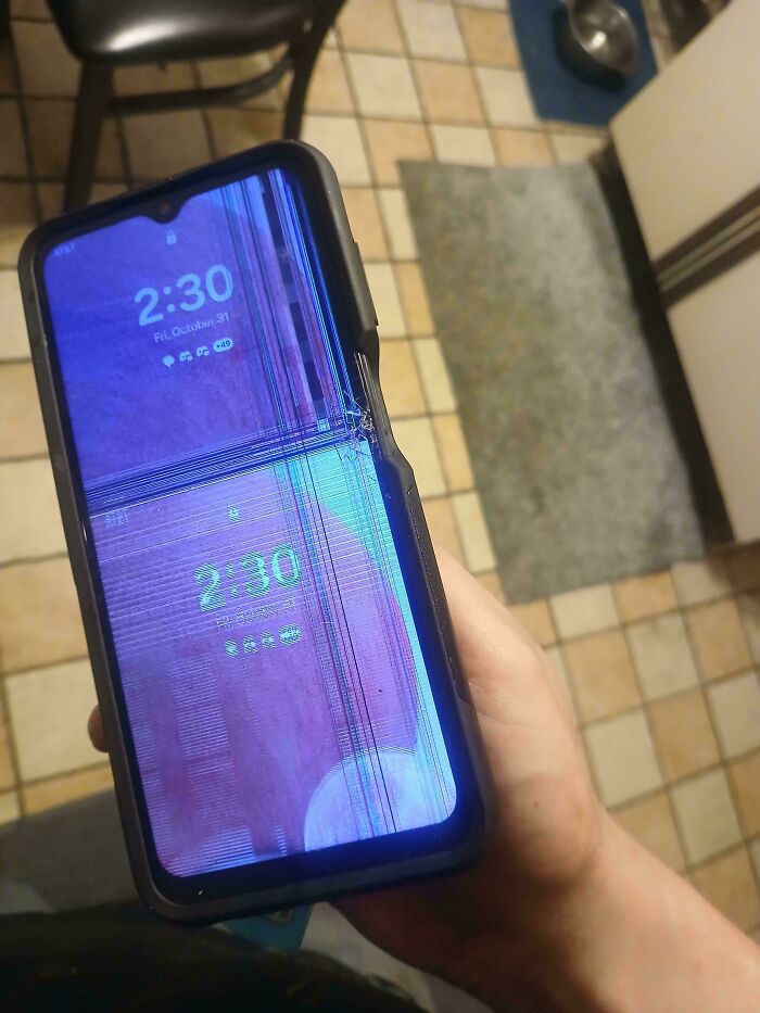
© Photo: Zazarian
#95 So Is It Off Or Set To 60 Watts?
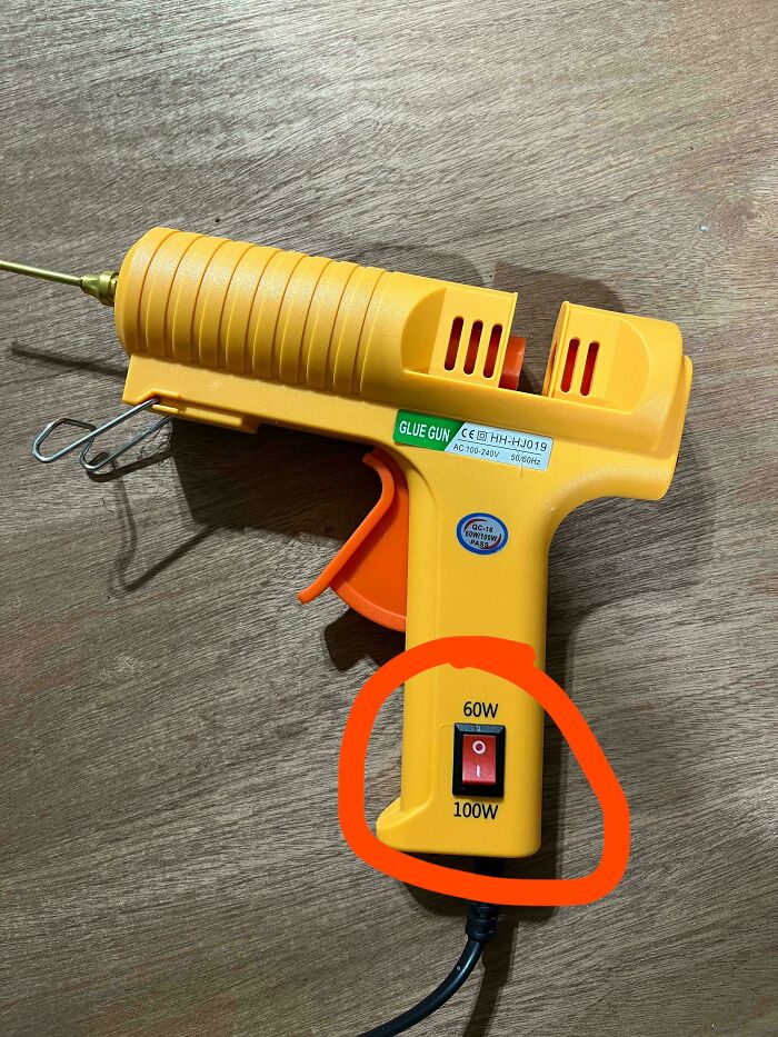
© Photo: jbosh999
#96 I Just Bought This Thinking It Was Washing Detergent. Nowhere Does It Say Its Fabric Softener
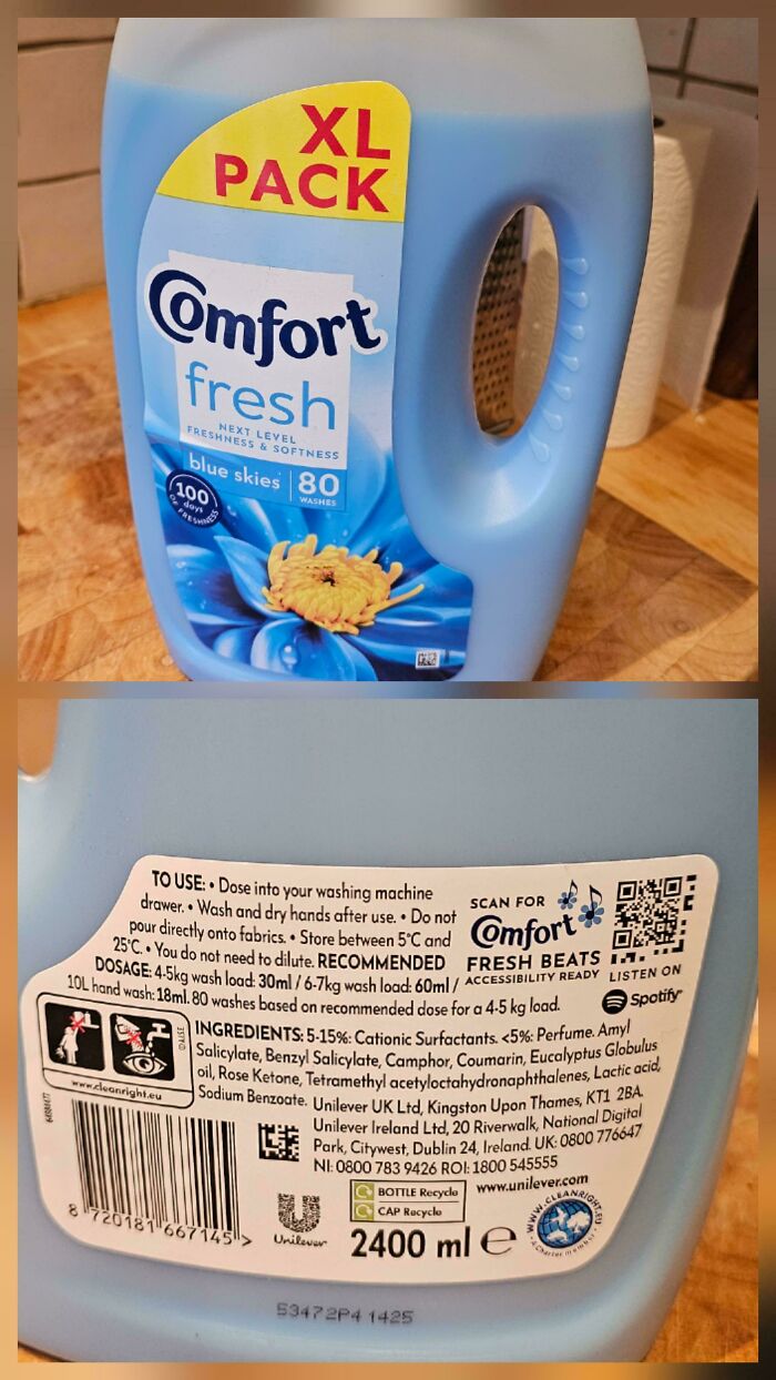
© Photo: Geofferz
#97 Spotted At Seaworld, They Used A Y Shape To Represent A W. So Now It Reads “The Yhale Shop” Shop Instead Of “The Whale Shop”
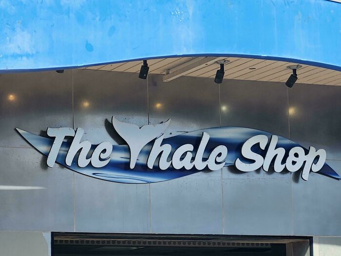
© Photo: gruggiwuggi5
#98 My Friend Just Had A Baby And She Has This Sign Above Her Crib
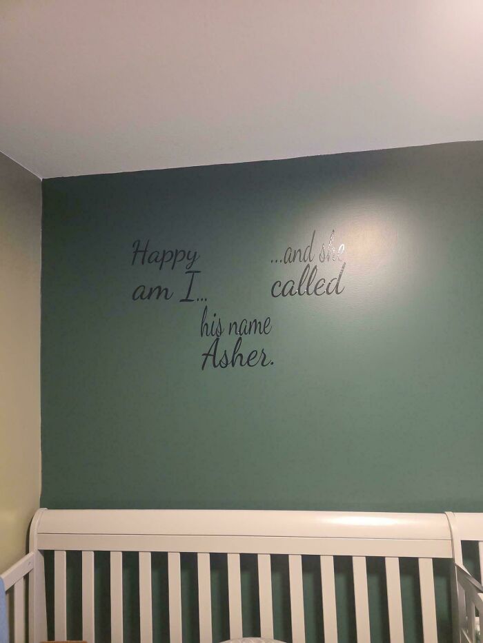
© Photo: Strange_Occasion_370
#99 This Birthday Card I Saw In A Store In Switzerland For $5
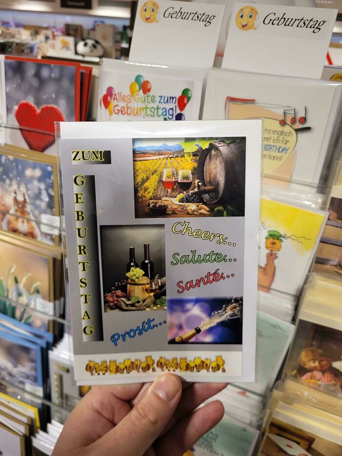
© Photo: biwook
#100 What Good Is The Design If The Words Aren’t Legible?

© Photo: GreatestOneInTheSky
#101 Media Buttons On Razer Keyboard Are Unlit
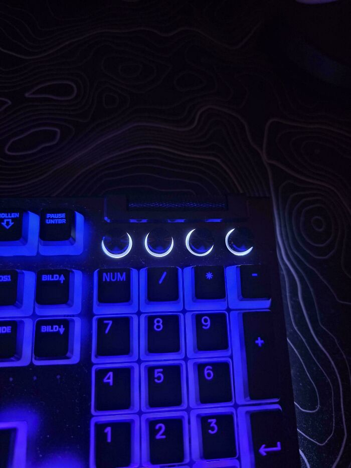
© Photo: Rouven-Dillinger
#102 Impossible To Read “What Are We” Without Knowing What You’re Trying To Read

© Photo: Yukki64
#103 These Storage Steps In A Homemade Tiny Home Look Like An Accident Waiting To Happen
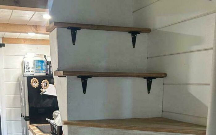
© Photo: ThorWinchester
#104 Curb To Trip On Between The Sidewalk And Crosswalk
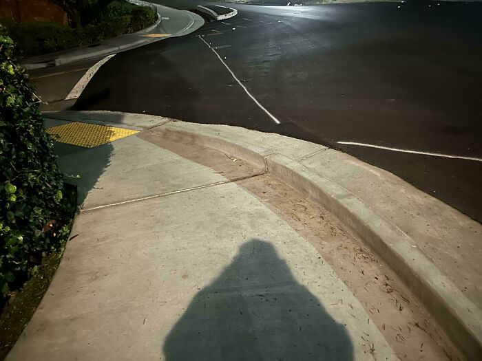
© Photo: HappyChandler
#105 The Official Coat Of Arms Of Zambesia, An Unrecognized Region In Southern Africa Striving For Independence

© Photo: meliax
You might also like: 50 People Who Tried To Be Creative With Their Homes And Failed (New Pics)
from Bored Panda https://ift.tt/qj4v5yI
via IFTTT source site : boredpanda