Think of some great designs of the modern era. Like iPhone, Tetra Pak, Post-It, Zippo, the list is endless. How would you describe it? Simple, smart, timeless, appealing, intriguing, engaging, well, basically everything but what you’re about to see in this post.
Because we’re about to dive into the collection of pics that put design to shame. Whether it’s a product, window, furniture, interior, poster design, you name it, they all have some pretty bad examples they would much rather forget.
So without further ado I leave the stage to a bunch of aesthetic apocalypses from this amusing corner of Reddit that will make you appreciate whatever it is that you have at home, even that old broken chair that’s barely alive, because it could be worse. Worse squared.
Psst! After you’re done, treat yourself with more epic design fails from our previous posts here, here and here.
#1 Suppose To Say Trick Or Treat
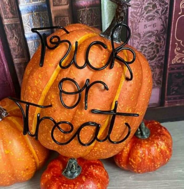
Image credits: probler
#2 My Son Won This As A Prize In Math Class A While Back. It Used To Say “Be A Problem Solver”
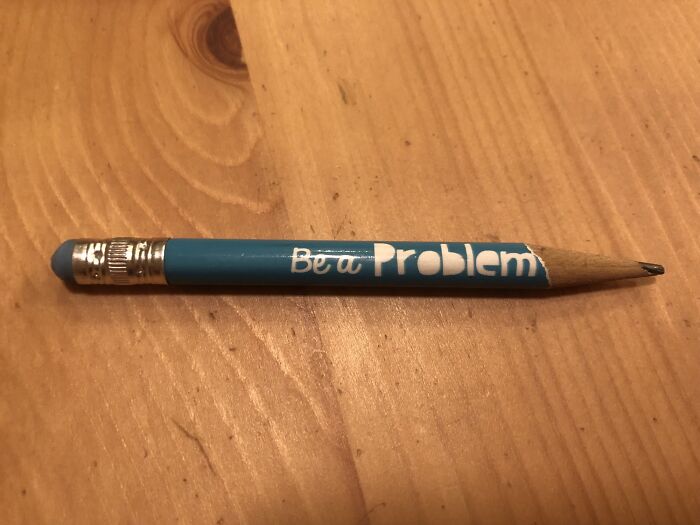
Image credits: MrBirdBeak
#3 This Traffic Safety Sign
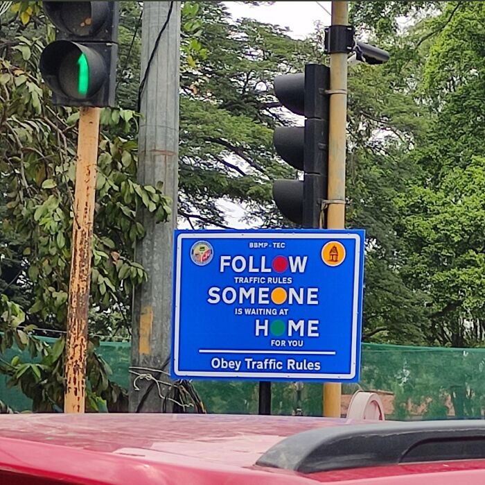
Image credits: psuranas
#4 This Portuguese Football Team Shorts

Image credits: EletricoAmarelo
#5 We Had To Stop… We Kept Mixing Up Our Pieces
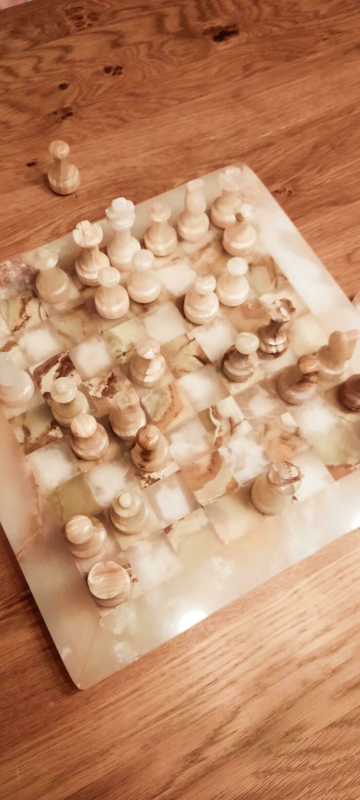
Image credits: MaxMustemal
#6 I Almost Gagged When I Opened The Cabinet In My Bnb. Turns Out It Was Just The Design
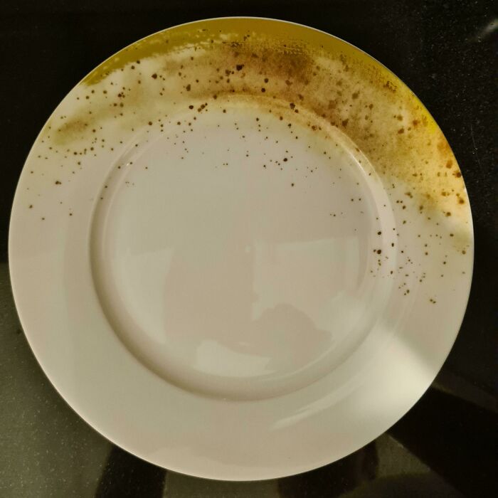
Image credits: barebasem
#7 Almost Drank From This Bottle Of Wood Polish Disguised As A Water Bottle
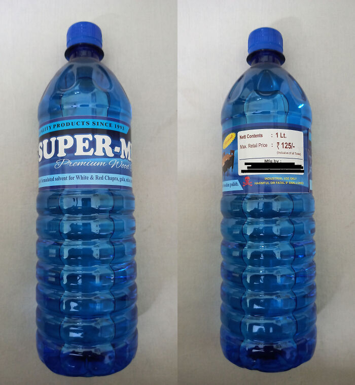
Image credits: puta_blyat
#8 Ah Yes, The Eiffel Tower, My Favorite Italian Landmark
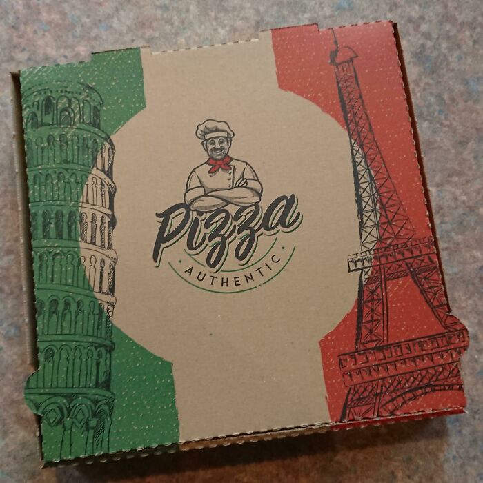
Image credits: Rene1993In
#9 You Have To Step Over The Bathtub To Get Between The Toilet And The Sink
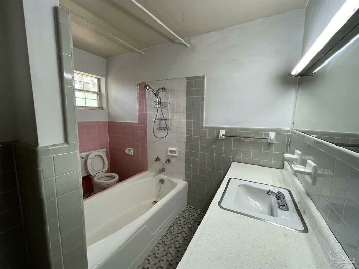
Image credits: Mococe
#10 Why Do Hotel Rooms Insist On Making Me Watch My Partner Bathe? I‘m Just Glad I’m Not Sharing The Room With A Friend Or Parent…
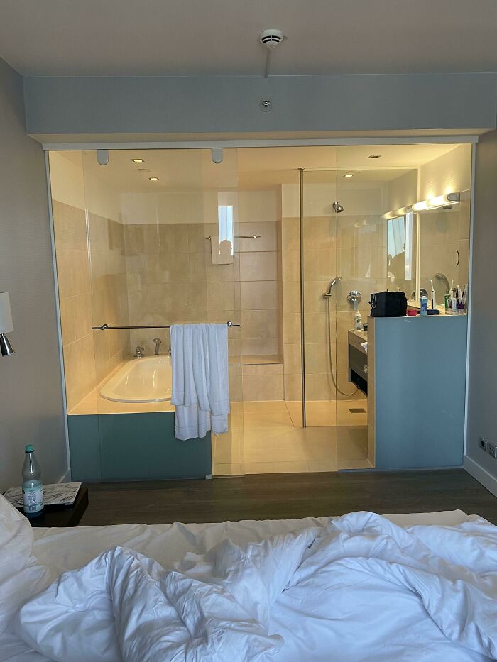
Image credits: Coneskater
#11 My Grandparent’s Carpeted Bathroom
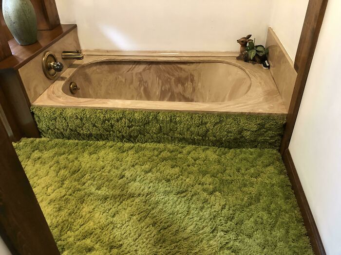
Image credits: Iamwallpaper
#12 We Stayed In Room 204…on The 4th Floor
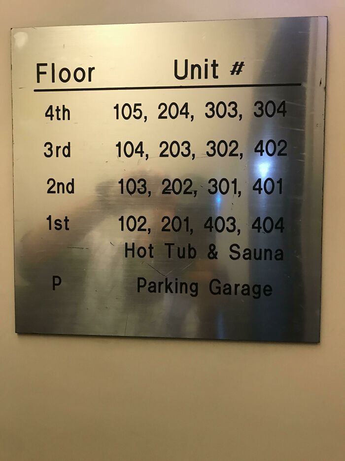
Image credits: sopwith-camels
#13 Who Wouldn’t Want A Ceiling That Looks Like It’s Covered With Hair?
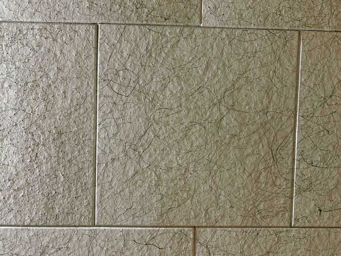
Image credits: im-jared-im-19
#14 Closet Space
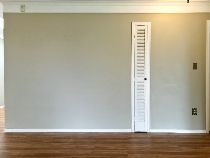
Image credits: monkbass
#15 I’ll Drink The What Now?
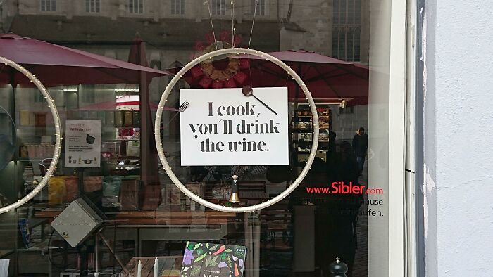
Image credits: magicalglitteringsea
#16 This Sign That Due To Shade And Letters Being Close To Each Other Is Almost Unreadable
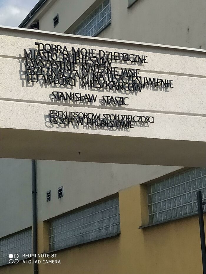
Image credits: polish_animu_boi
#17 The Dog Is Supposed Look Like It’s Running
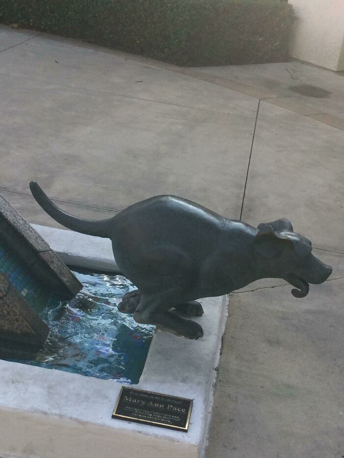
Image credits: PheonixGalaxy
#18 When It’s A Sfw Foot Post
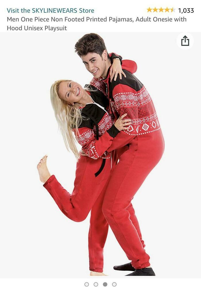
Image credits: Toowiz
#19 If Only There Was A Letter Resembling The Shape Of The Eiffel Tower They Could’ve Used…
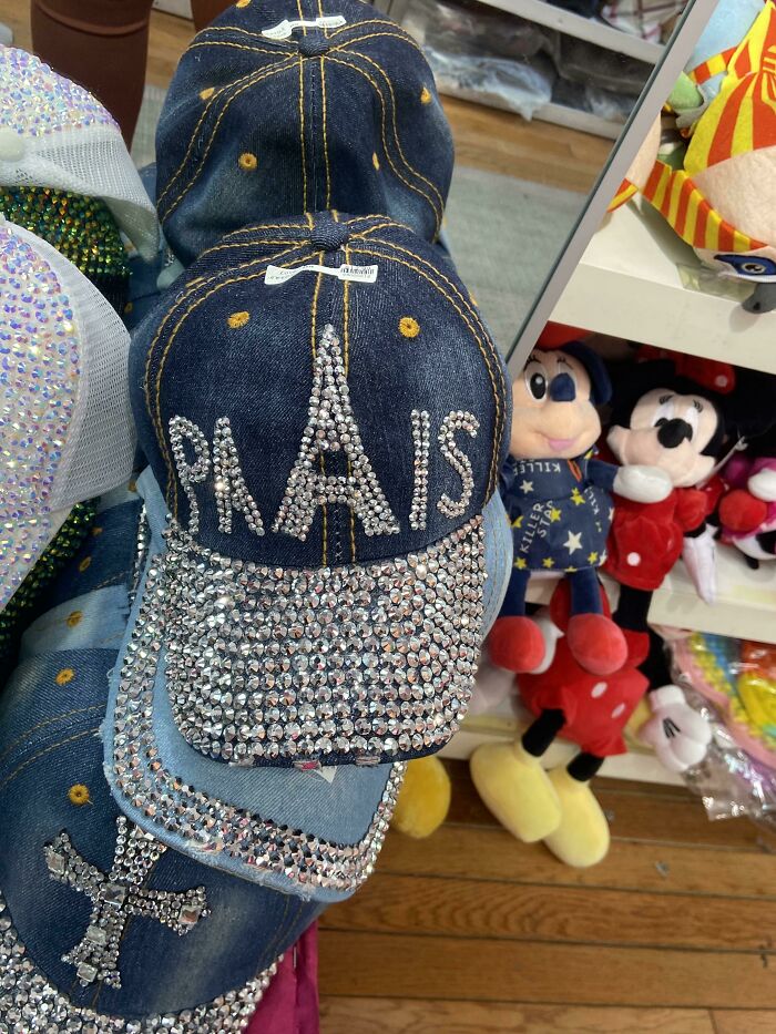
Image credits: racheljobe
#20 Stop
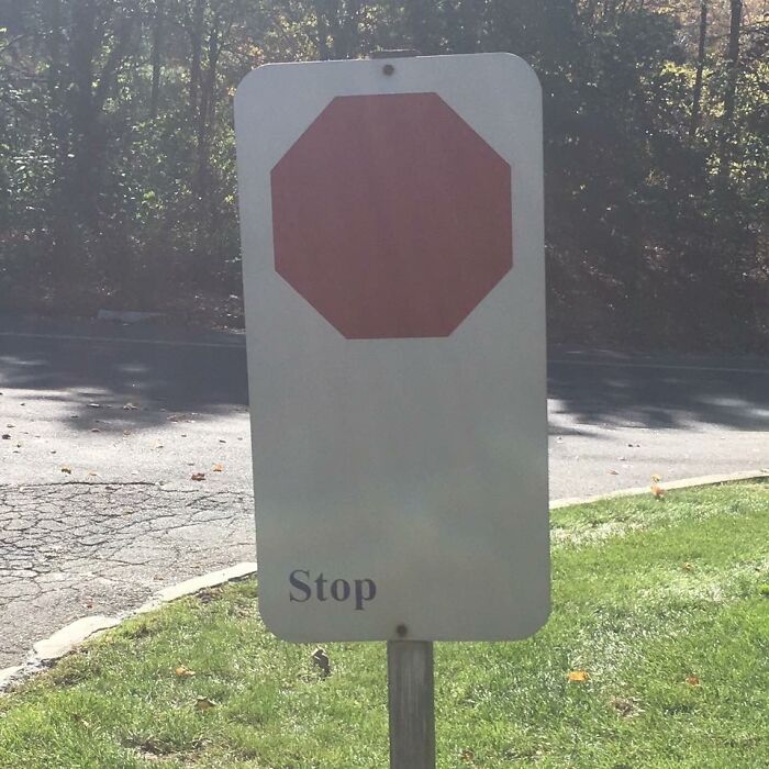
Image credits: coyotoka
#21 These Garbage Bins Placed On Top Of Park Benches To Save Space
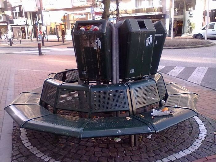
Image credits: arkydon
#22 Shape Of The Bowl Kind Of Makes It Look Like “Puke”
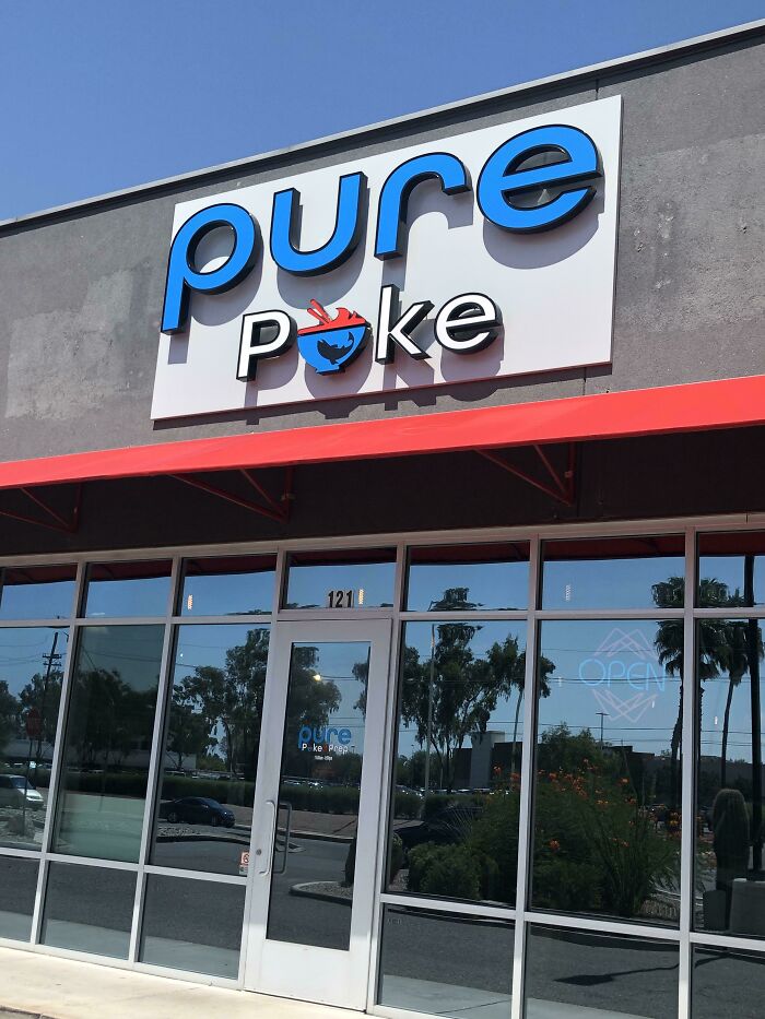
Image credits: zektuuk138
#23 I Feel As Though The ‘Tackling’ Could Be A Little Larger…
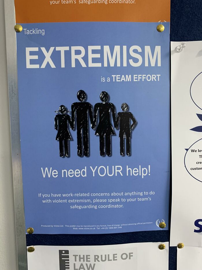
Image credits: Serious-Minimum7482
#24 For That, Dipped In Mud Look
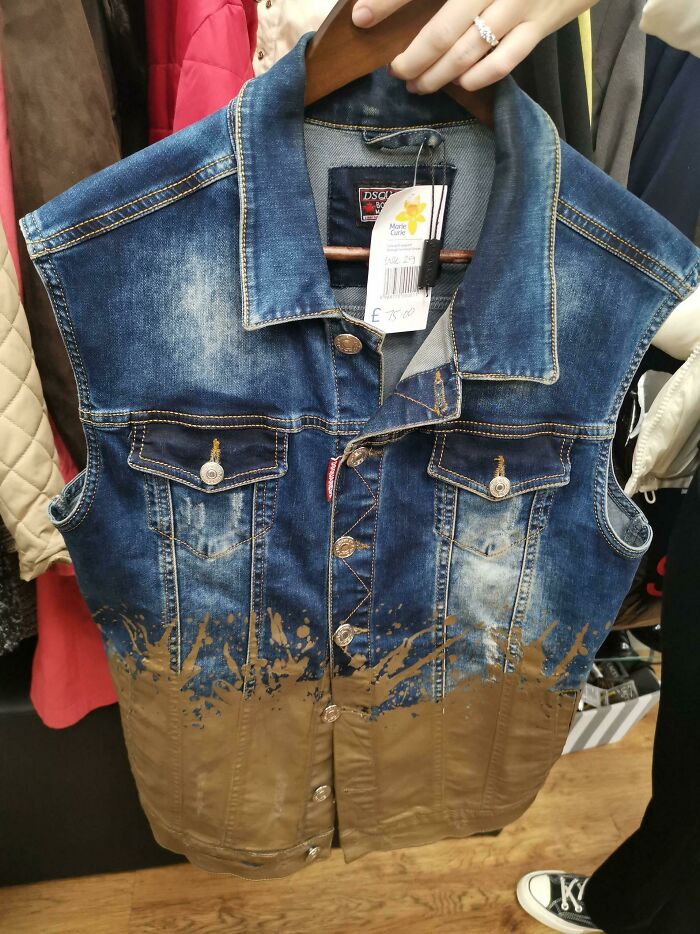
Image credits: ImRussell
#25 I Have No Idea How They Turn This Off
- You Might Also Like: 47 Times People Captured Something Unexplainable In A Picture
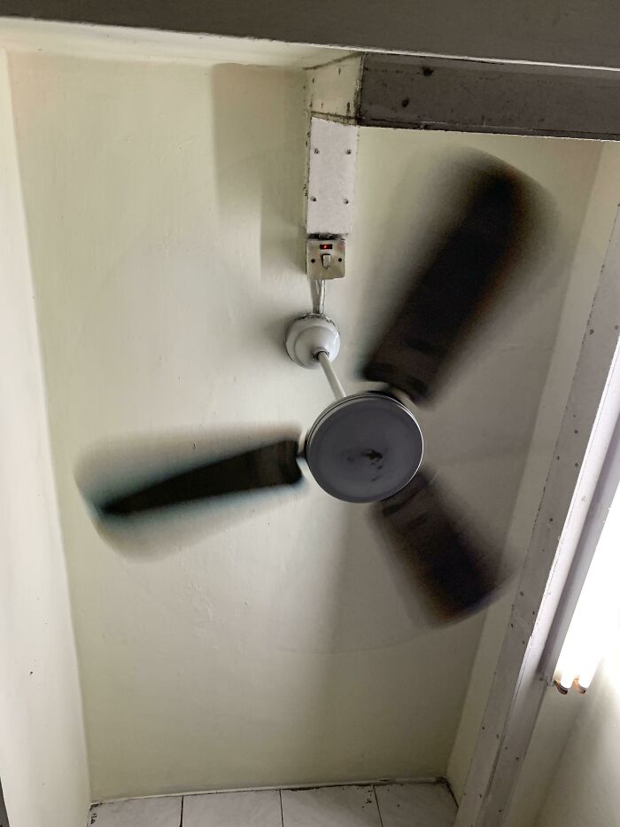
Image credits: Iridalken65
from Bored Panda https://ift.tt/FD92LMI
via IFTTT source site : boredpanda