The oldest maps out there are roughly 4000 years old, depicting a section of the river Odet valley in modern Finistère, Brittany. It was found in a tomb, possibly to communicate to people what its inhabitant “controlled.” The fact is that all through history, humans have been trying to make records of the world around them in interesting ways.
The “Simon shows you maps” Facebook page, run by the titular Simon, is dedicated to sharing cool and interesting maps. So get comfortable as you scroll through, upvote the best ones and be sure to share your thoughts and ideas in the comments section down below.
More info: Facebook
#1 Fun Infographic Shows When We Tend To Peak At Certain Things
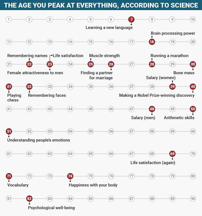
Image credits: Simon shows you maps
#2 Stumbled Across A Dumb Little Post
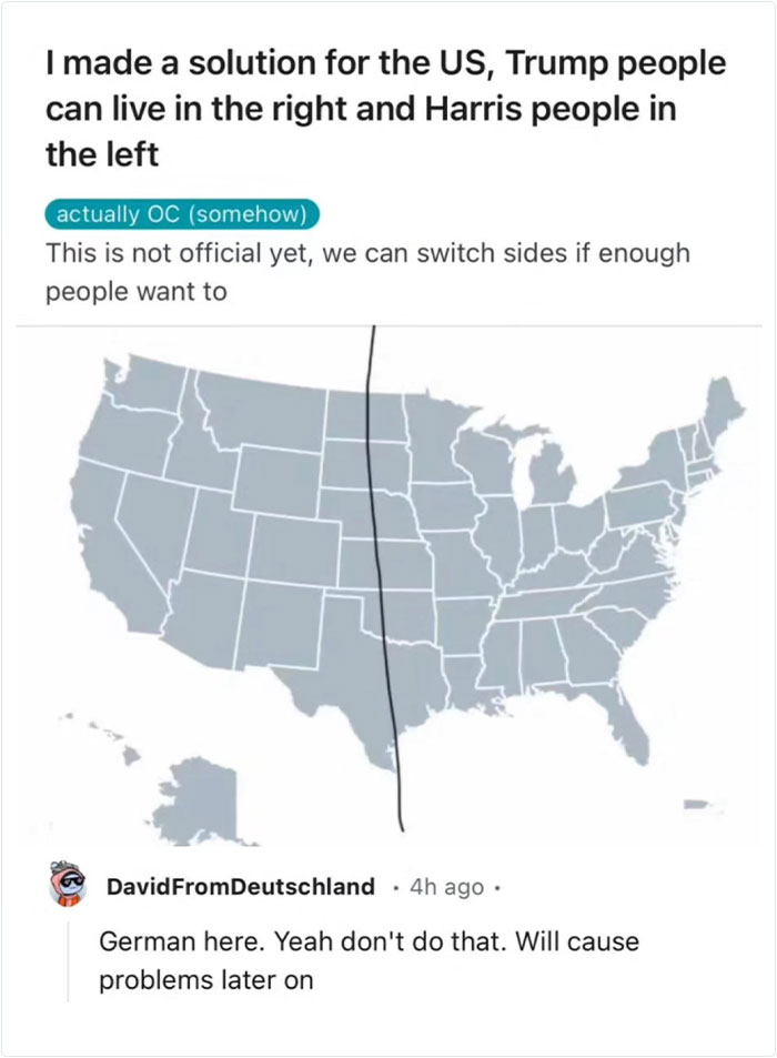
Image credits: Simon shows you maps
#3
The Great Fire of London ragged in 1666. This fantastic map overlays the effected area on modern day London. Would be cool to walk the area to feel the extent
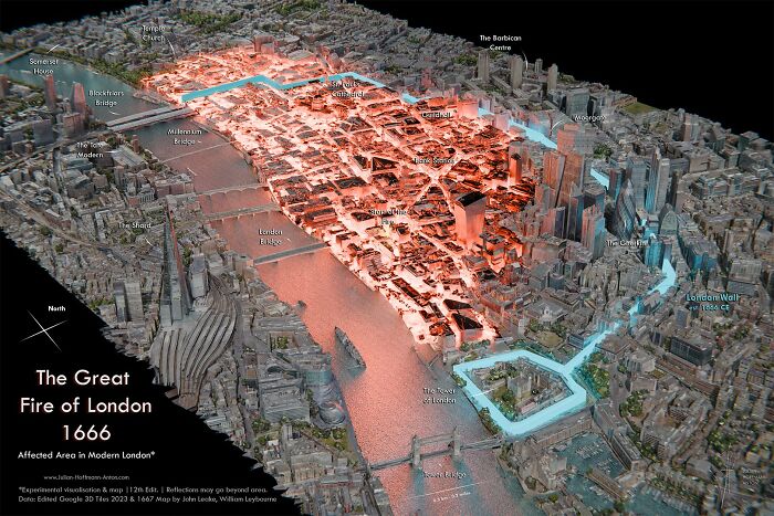
Image credits: Simon shows you maps
#4
The classification of Germany in this map classifying the nature of most commonly used profanities across Europe is certainly correct. I would argue a whole category is missing here: family related profanities. Sure, they are often mixed with sexual insults but I thing they deserve their own category!
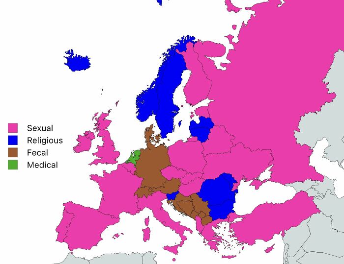
Image credits: Simon shows you maps
#5
Image credits: Simon shows you maps
#6 This Map Shows What The Word “Yankee” Means Around The World
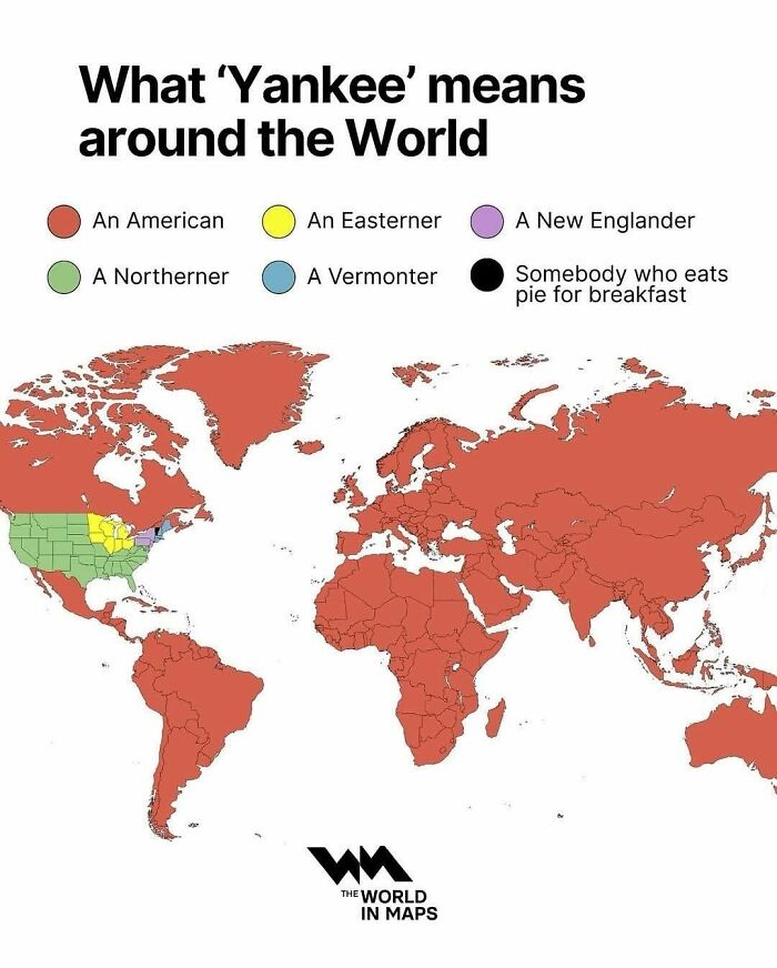
Image credits: Simon shows you maps
#7 For A While During The Northern Hemisphere’s Summer, The Sun Sets In Eastern Brazil Before It Does In Ireland. Now You Know
Image credits: Simon shows you maps
#8 Just A Quick Reminder. A Little Public Service Announcement To Please My Dutch Friends
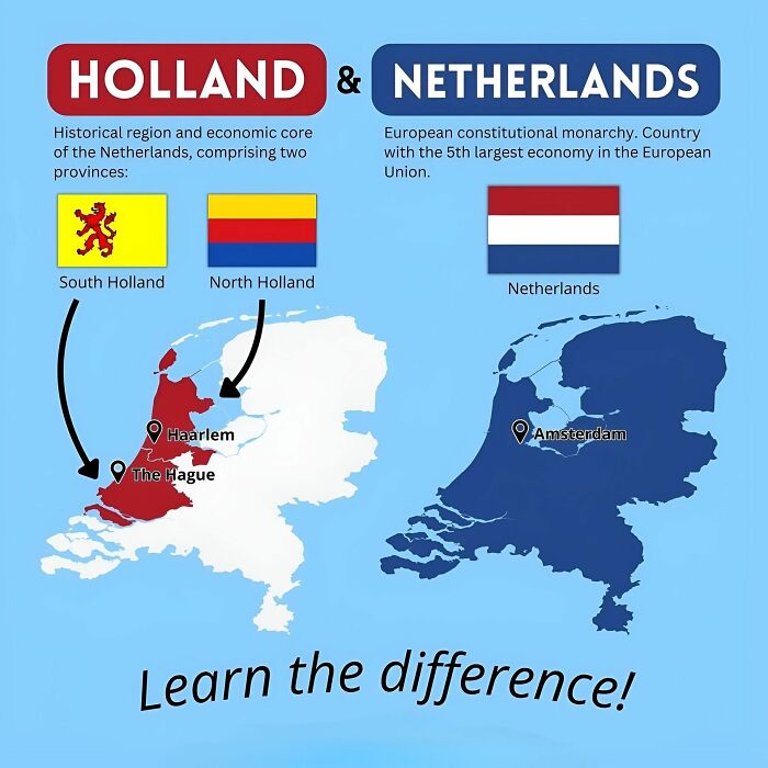
Image credits: Simon shows you maps
#9 Challenge: Which Definition, Which Terminology Doesn’t Offend Anyone? I’ve Found That Someone Will Always Be Mad
Image credits: Simon shows you maps
#10 Good News, Australia! The Motherland Still Likes Us!
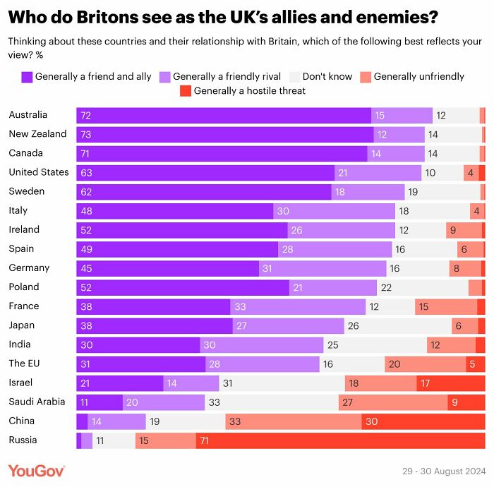
Image credits: Simon shows you maps
#11
In places like Germany, the full retirement of the huge Baby Boomer cohort will drive pension payments up significantly. The relatively small workforce will pay for that. Young workers will increasingly dislike that. Voting behaviour might shift further away from established parties as a result.
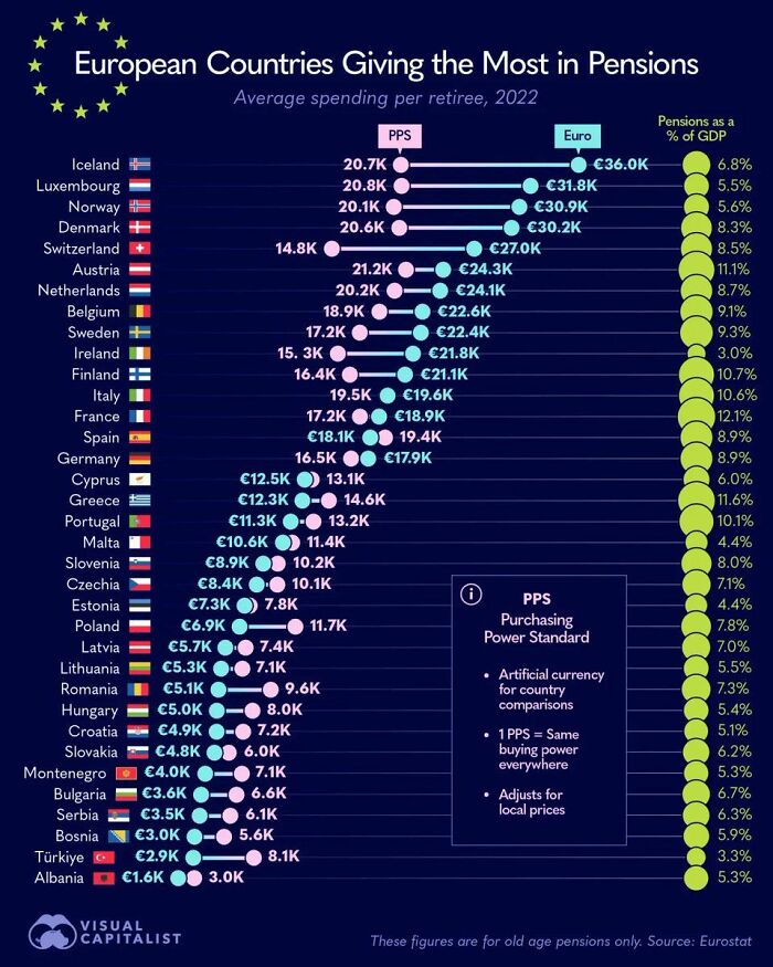
Image credits: Simon shows you maps
#12 Yet Another Map That Supports My Suspicion That Poland Is Europe’s Hottest Place To Be At The Moment. Cheaper Than Germany, On The Up Economically
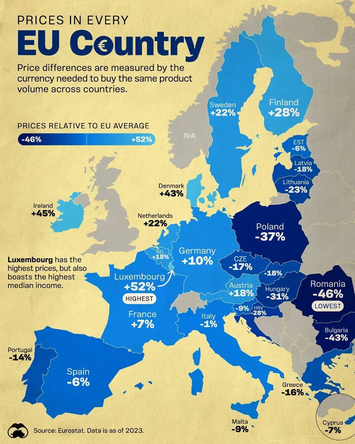
Image credits: Simon shows you maps
#13 As A German, For A Personal Meeting 12 Means 12 But For A Professional Meeting 12 Means Be 5 Minutes Early. Any Alternative Interpretation Hurts My Little German Brain

Image credits: Simon shows you maps
#14 This Map Shows The Number Of Dentists Per 10,000 Residents Across Europe
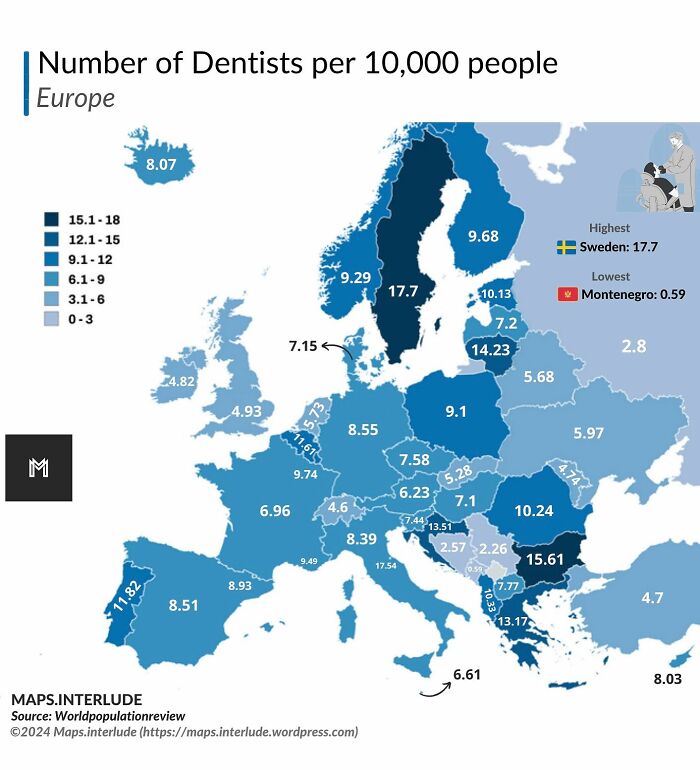
Image credits: Simon shows you maps
#15 I Guess It’s Truly The Heartland Of The Us?!
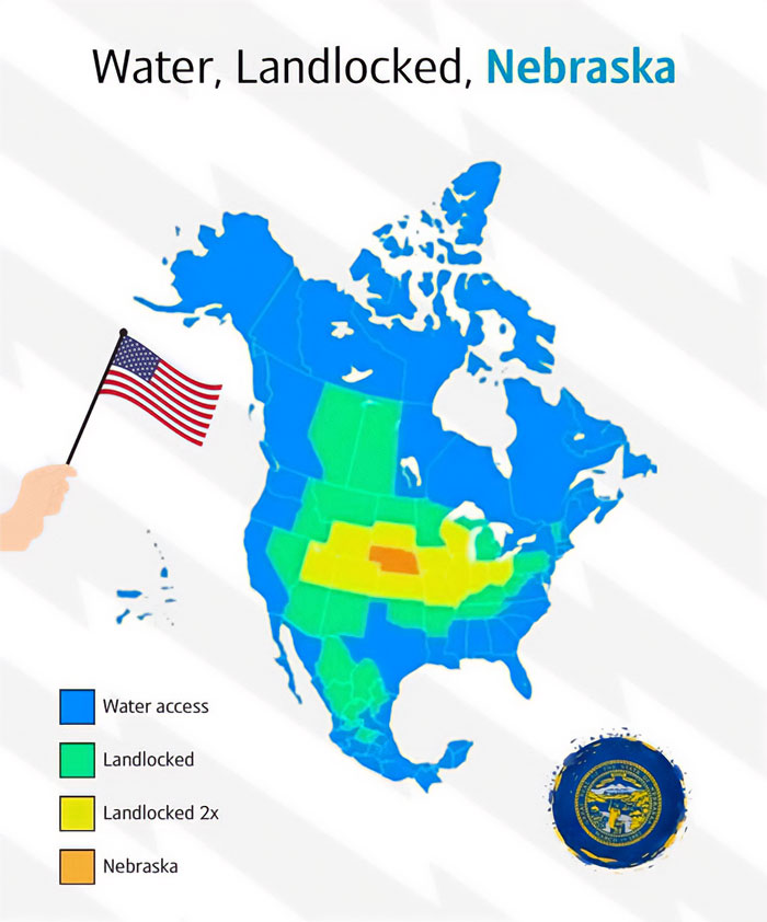
Image credits: Simon shows you maps
#16 Holidaymakers In The Mediterranean Should Study This Map Carefully To Impress (Annoy?) Their Friends And Family With Island Related Geography Trivia!
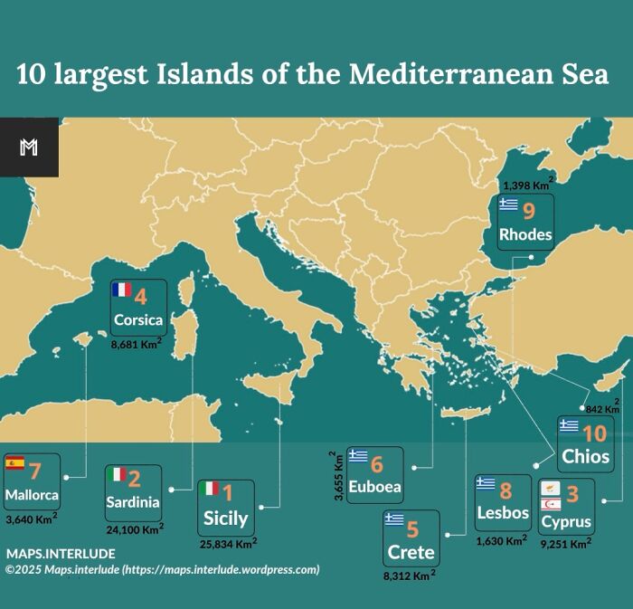
Image credits: Simon shows you maps
#17 If You Are Being Born Today, This Is The Likelihood Of You Ending Up In Each Continent
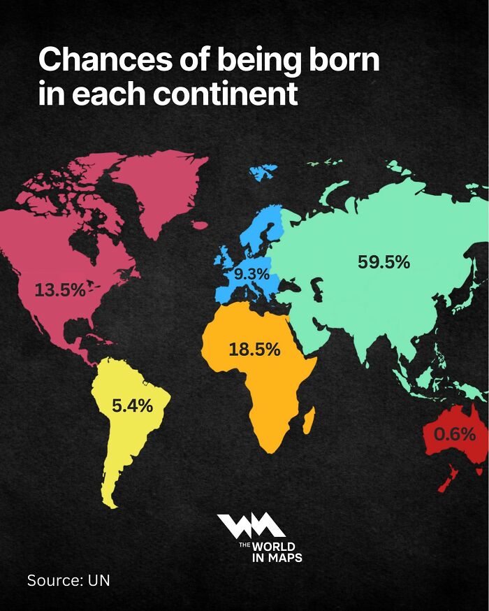
Image credits: Simon shows you maps
#18 Etymology Of Spain. This Map Shows The Origin Of Various Spanish Province Names
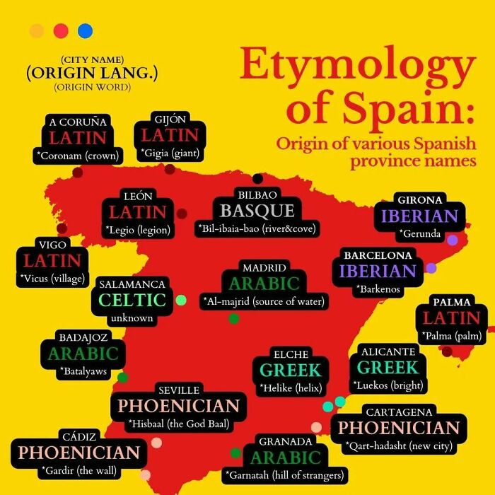
Image credits: Simon shows you maps
#19 How Long Is Your Summer School Break?
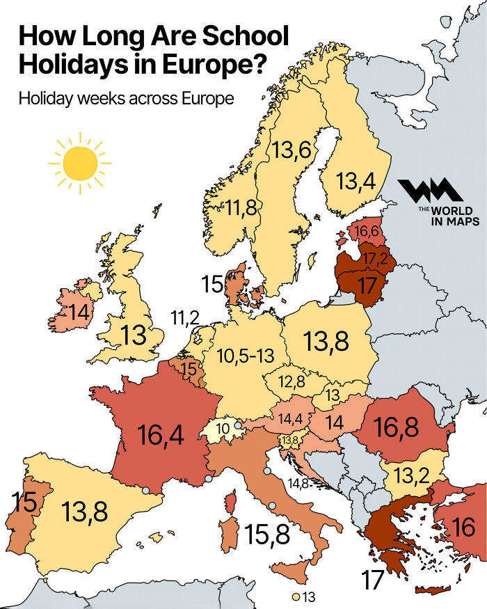
Image credits: Simon shows you maps
#20 Good To See The French Still Being Skinny
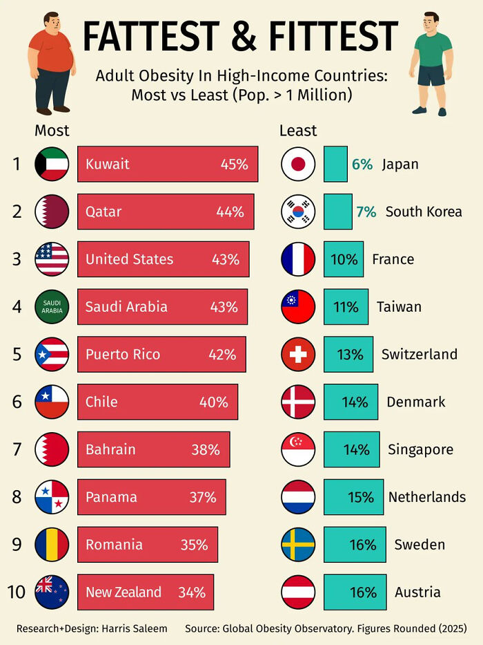
Image credits: Simon shows you maps
#21 Map Shows The World In About 250 Million Years
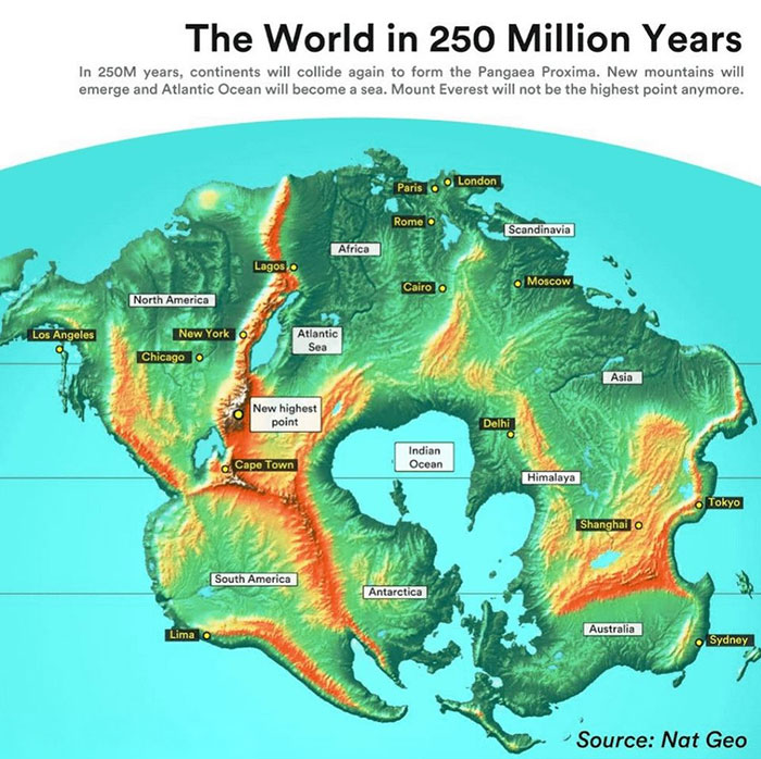
Image credits: Simon shows you maps
#22 That’s One Way Of Saying That Poland Really Saw Impressive Economic Growth In Recent Years
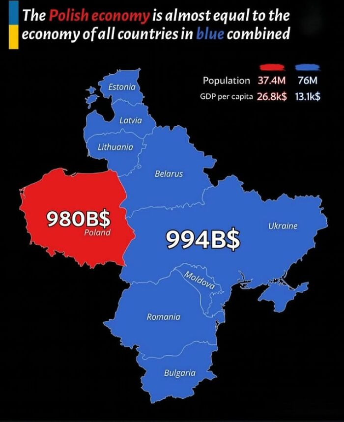
Image credits: Simon shows you maps
#23 Technically Correct
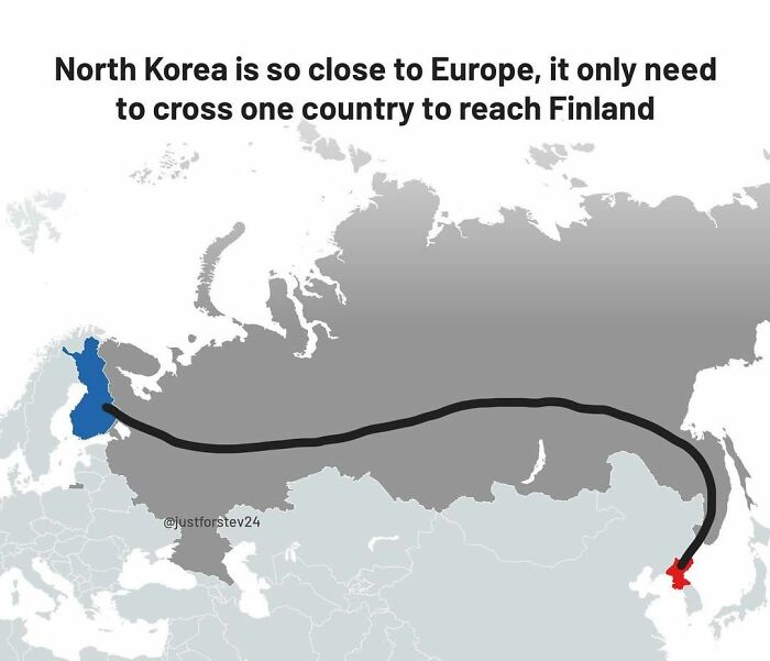
Image credits: Simon shows you maps
#24 By 2050 India Will Be One United States Bigger Than China
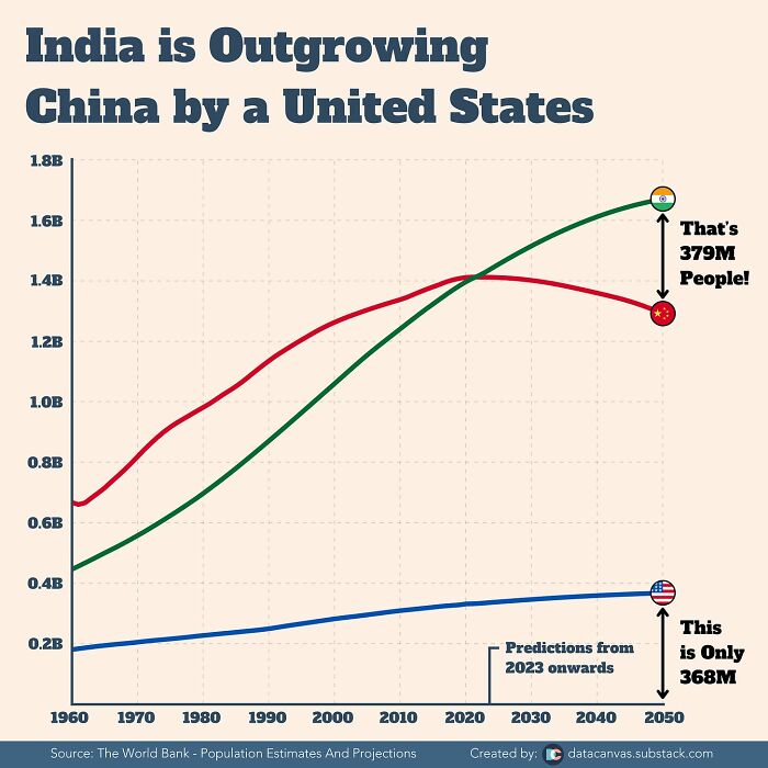
Image credits: Simon shows you maps
#25 Wow. That Puts Market Sizes Into Perspective

Image credits: Simon shows you maps
#26 Michigander Remains The Funniest Us Demonym
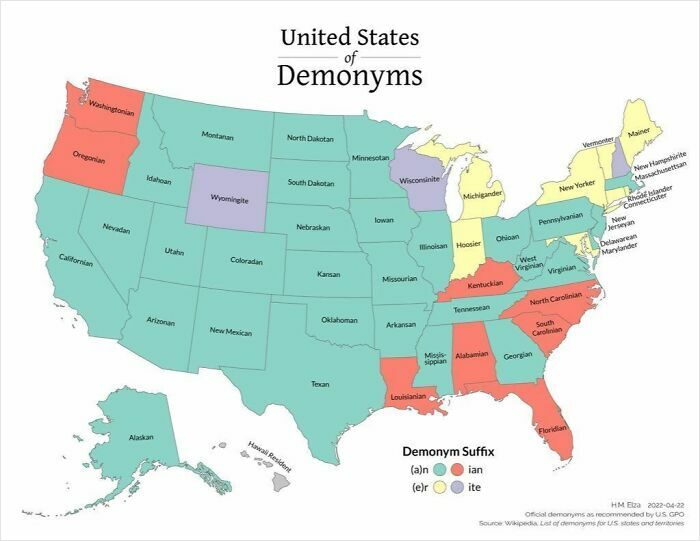
Image credits: Simon shows you maps
#27 This Map Might Be Bananas But The Word Keeps Changing More Than I Would’ve Expected
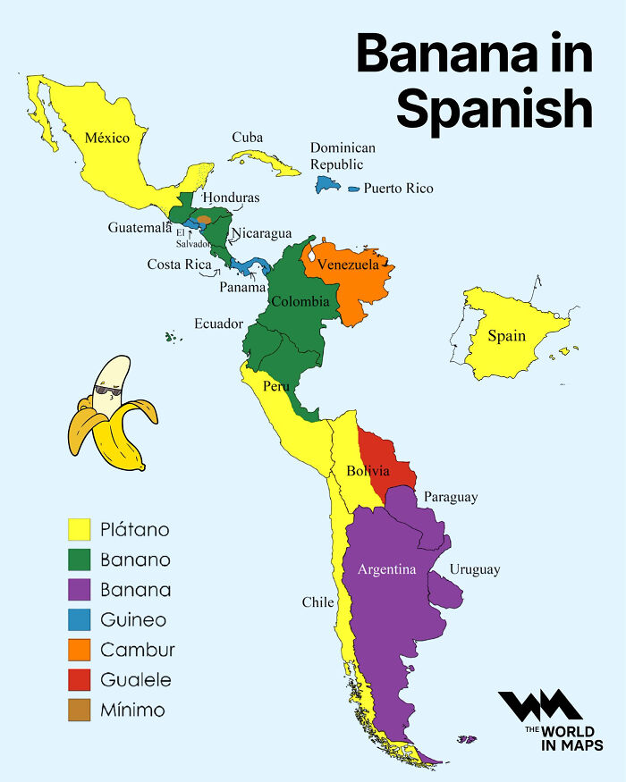
Image credits: Simon shows you maps
#28 You Are Not Nostalgic About The 90s, 80s, Or 70s. You Are Nostalgic About Your Own Youth – Whenever That Was
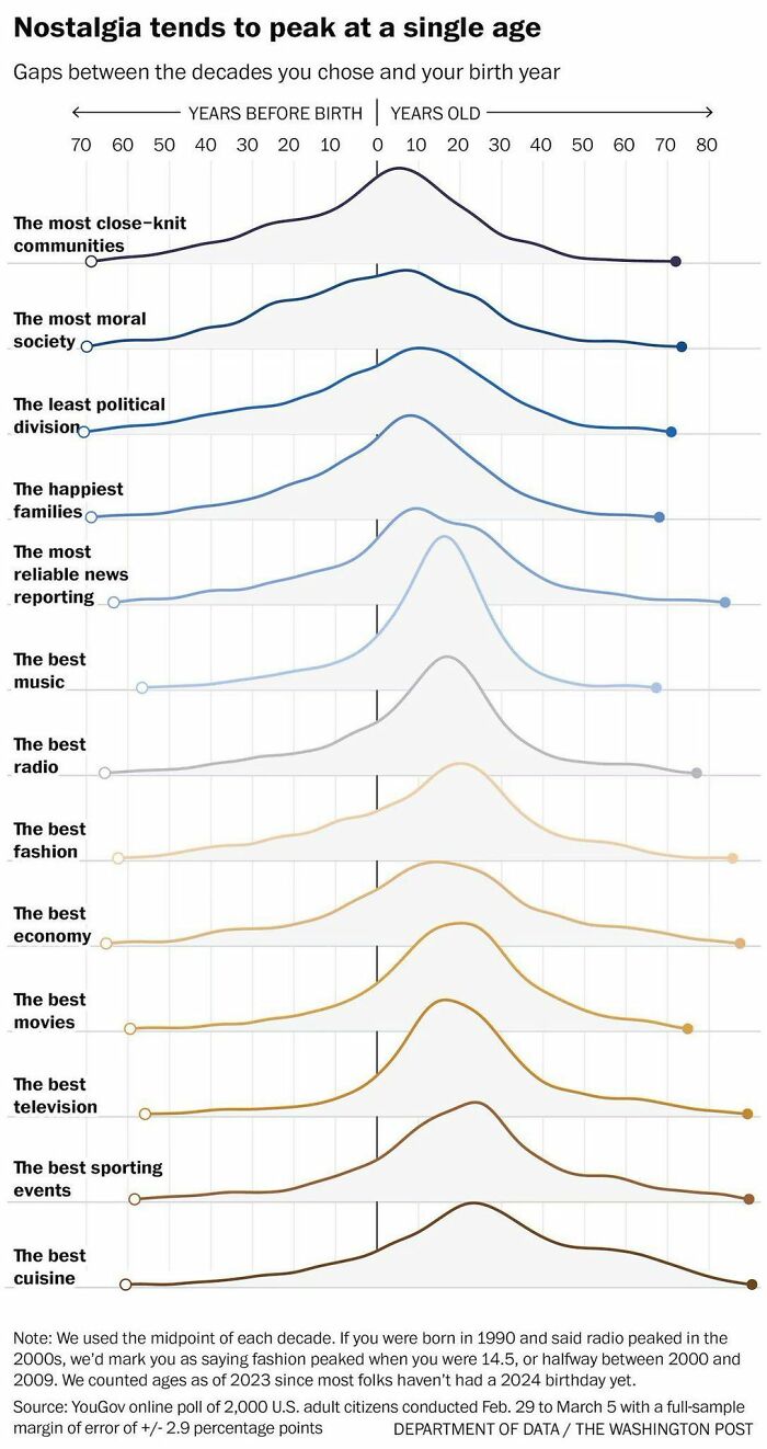
Image credits: Simon shows you maps
#29 This Map Overlays The 49th Parallel (Essentially The Us–canada Border) On Europe
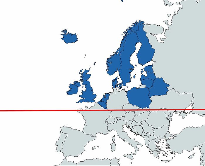
Image credits: Simon shows you maps
#30 Truth
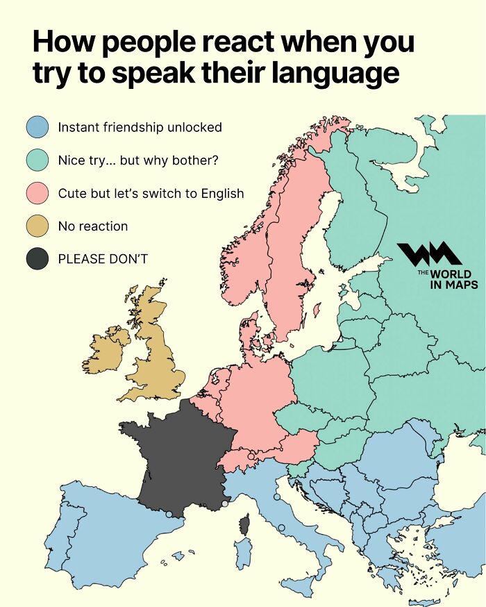
Image credits: Simon shows you maps
#31 In A World Where More People Obsess About Their Work Being Inherently Meaningful, I Hope That You See Your Job Relatively Close To The Left Side Of The Chart
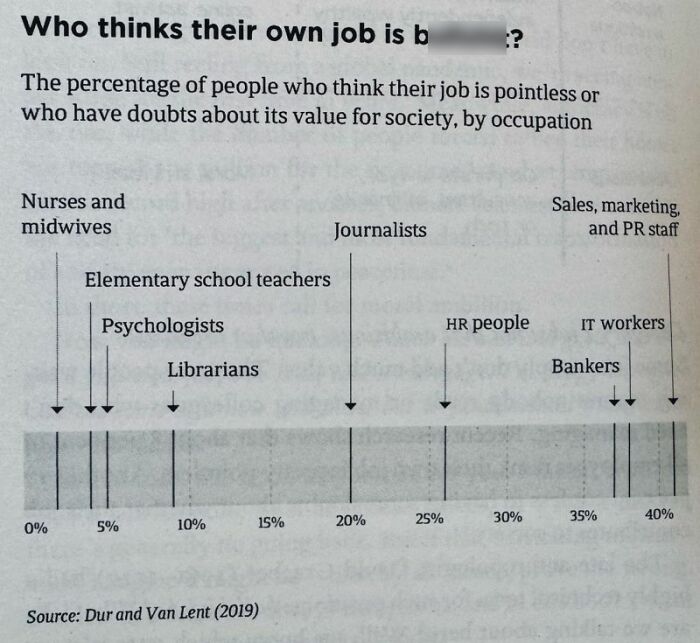
Image credits: Simon shows you maps
#32 I Live Such A Sheltered Life That I Had Never Heard Of A Horse Chopping Sabre Before
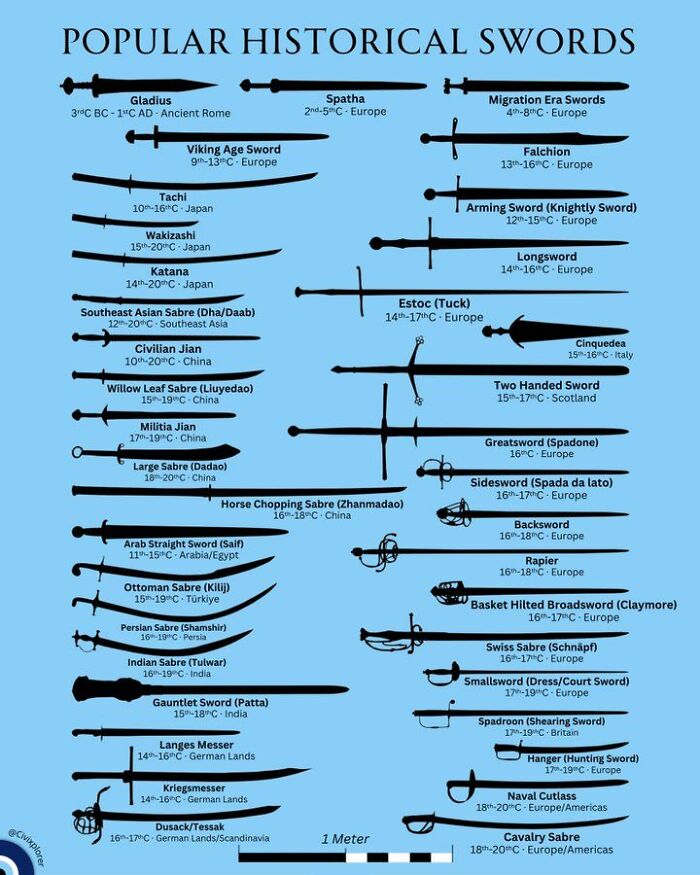
Image credits: Simon shows you maps
#33 Poland-Czechoslovakia Needed A Cooler Name. Just Sayin’…
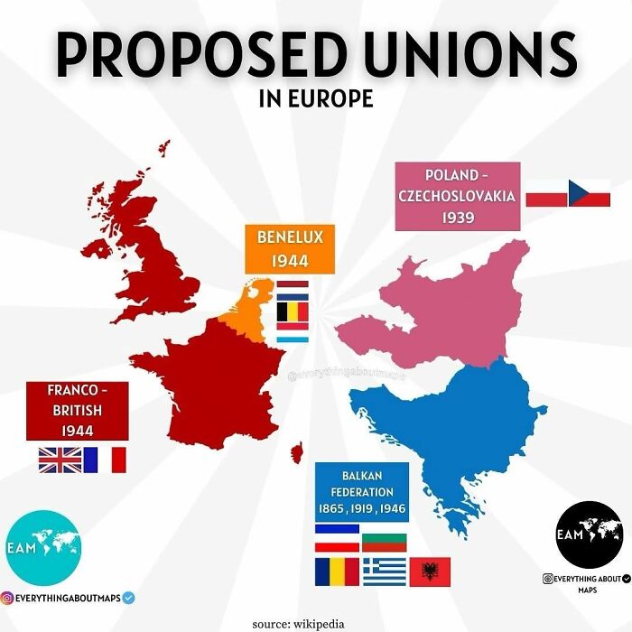
Image credits: Simon shows you maps
#34 The Great War, Wwi, Changed The Map Of Europe Significantly
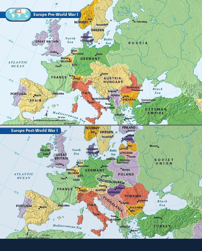
Image credits: Simon shows you maps
#35
The very low birth rates across Europe lock in future population decline now. The Mediterranean countries will be pretty empty. Well, except for the summer months when everyone still comes to Italy and co for a holiday.
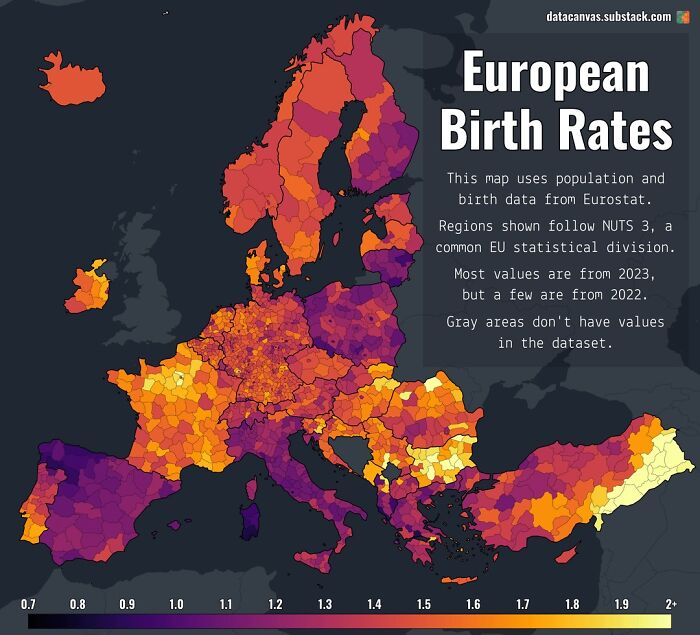
Image credits: Simon shows you maps
#36
A Government being excited about their own ideas is normal. This chart made me laugh though. The White House’s economic impact assessment of their Big Beautiful Bill is comically out of whack with all major economic forecasters.
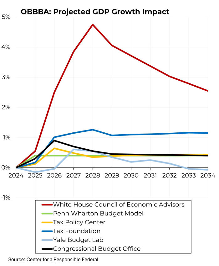
Image credits: Simon shows you maps
#37 This Map Looks Like The Setup For Europe’s Weirdest Cop Show
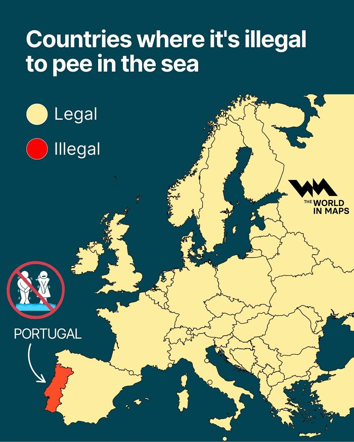
Image credits: Simon shows you maps
#38 Map Of The UK Shows Which Country Is The Nearest Neighbour
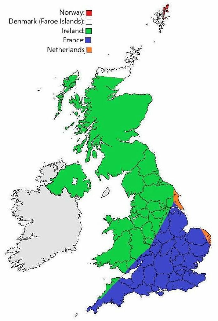
Image credits: Simon shows you maps
#39
With Italy and Japan we have two big economies where over a quarter of the population is aged 65+. Traditional models of aged care and state guaranteed retirement funding are about to collapse. Time to figure out new models. Younger nations have time and can copy successful approaches of the old nations (and dearly hope that they come up with something smart fast).
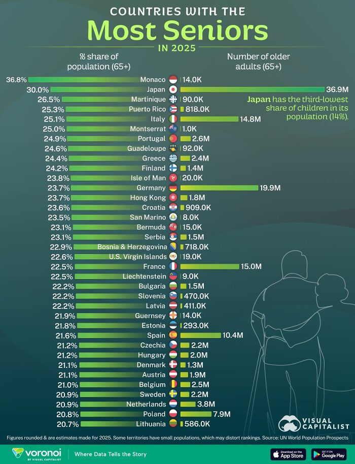
Image credits: Simon shows you maps
#40 Chinese Factories Would Get To Sell Heaps More American Flags Once The Us Take In Another State Or One State Defects
Image credits: Simon shows you maps
#41 Time To Enrage Most Of Europe With A Single Map?
Image credits: Simon shows you maps
#42
This map categorizes European forests according to their use. Unmanaged forests are super rare. Finland and Sweden are timber plantations. France has created Landes de Gascogne, a match box forest on the Atlantic coast. Britain got rid of their forests altogether.
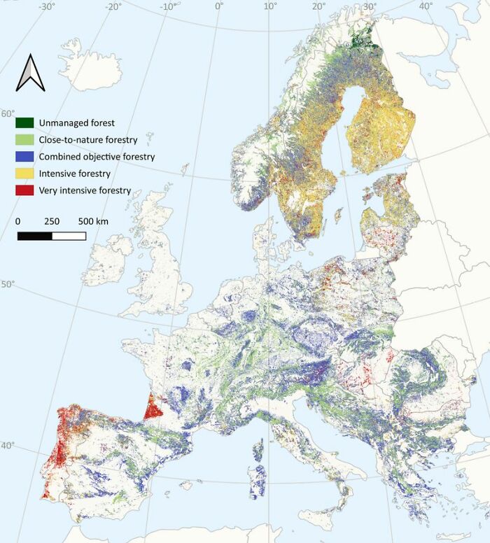
Image credits: Simon shows you maps
#43 Most Of Europe Is Shrinking As Is. Without Migration The Shrinkage Would Be Huuuge By 2100
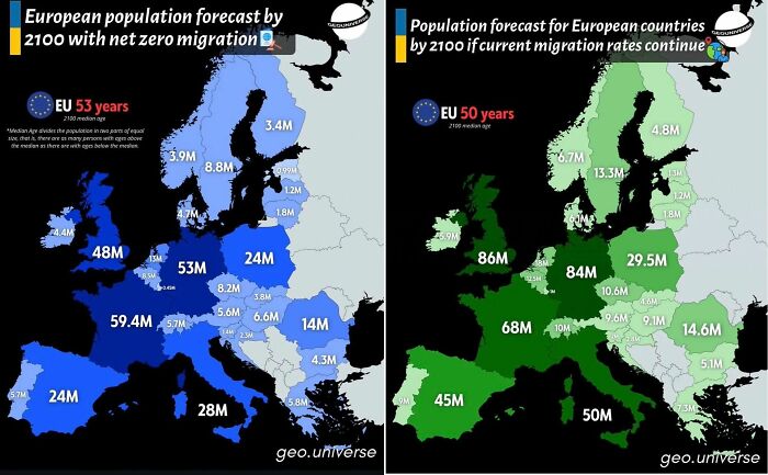
Image credits: Simon shows you maps
#44 Let’s See If This Map Will Come In Handy Any Time Soon
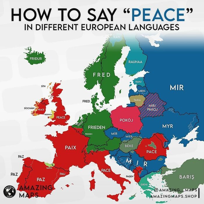
Image credits: Simon shows you maps
#45
Young adults are dying at an increasing rate in the United States. France roughly mirrored the US before the introduction of Oxycontin in the mid-90s and later fentanyl. The US isn’t doing a great job looking after its own people
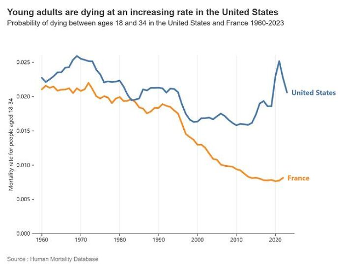
Image credits: Simon shows you maps
#46
By now you would’ve read how New York City voted. Have you seen the clear geographic division of votes yet? Countless cities around the world are evenly geographically divided in their political leanings.
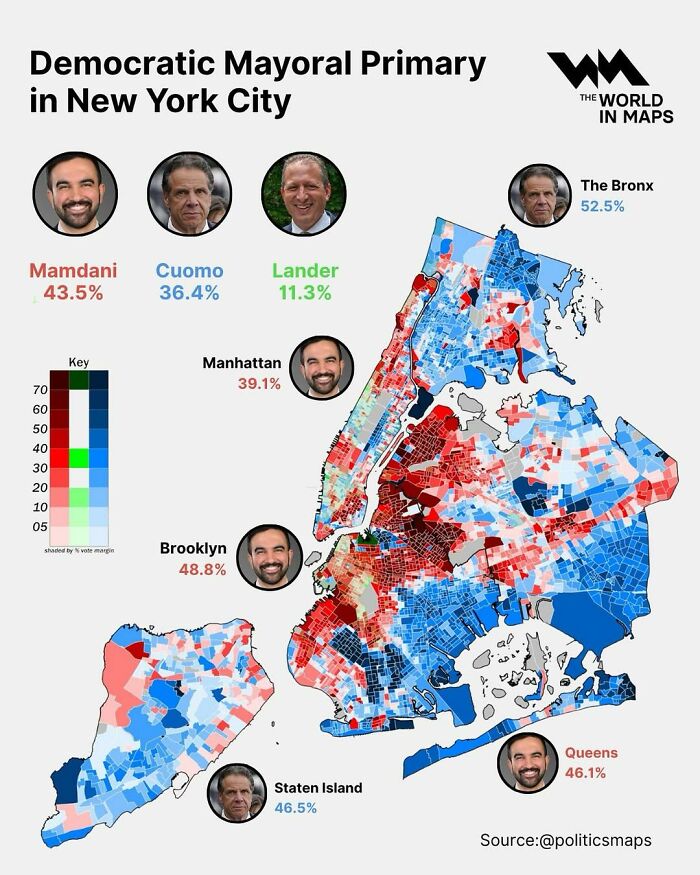
Image credits: Simon shows you maps
#47
Just after you cross the Alps (🚗🚴🐘) into Italy, you enter the Italian Motor Valley. The funnest and fastest Italian engineering marvels are friendly neighbours here.
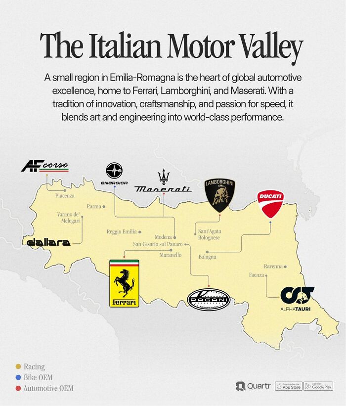
Image credits: Simon shows you maps
#48 The China–north Korea–russia Tripoint Must Be One Of The Weirder Borders Out There
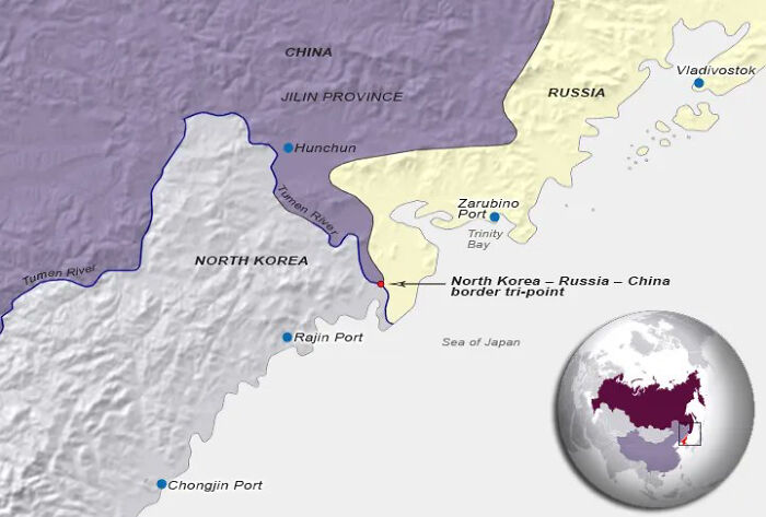
Image credits: Simon shows you maps
#49
Image credits: Simon shows you maps
#50 Look Who Just Made It Into The Top 20 Of The World’s Largest Economies. Welcome To The Top, Poland
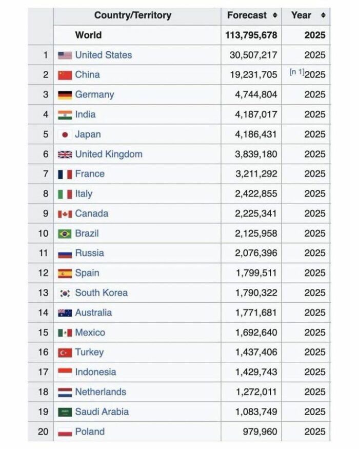
Image credits: Simon shows you maps
#51 Not So Forbidden After All…
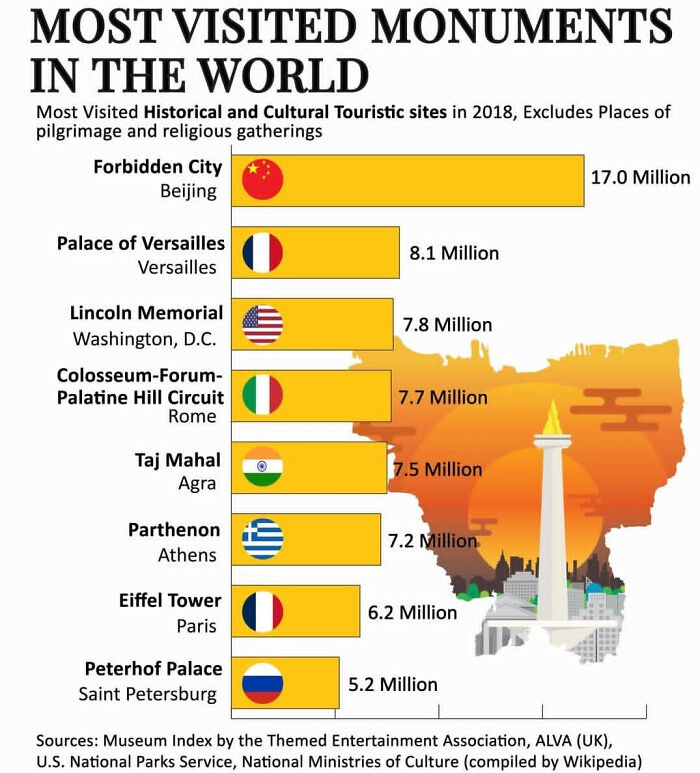
Image credits: Simon shows you maps
#52 Germany’s Economy Faces Many Struggles Buuuuut It Is Still Huge As This Map Reminds Us
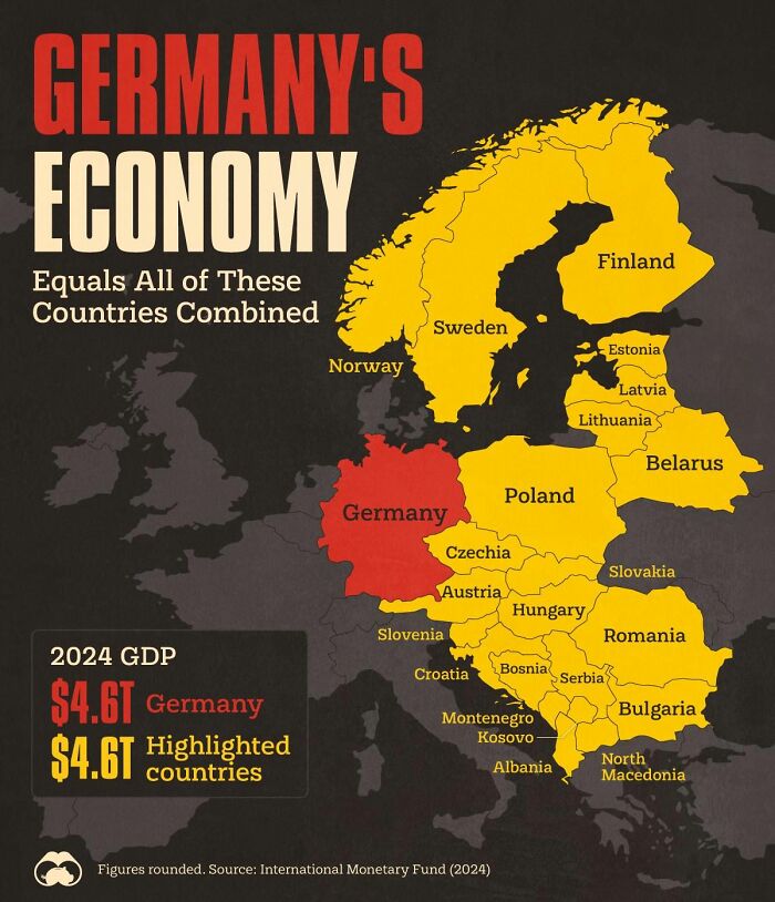
Image credits: Simon shows you maps
#53

Image credits: Simon shows you maps
#54 Minor Correction: Skateboarding Seniors Are Cool As Heck And The Chart Should Point Up Again!
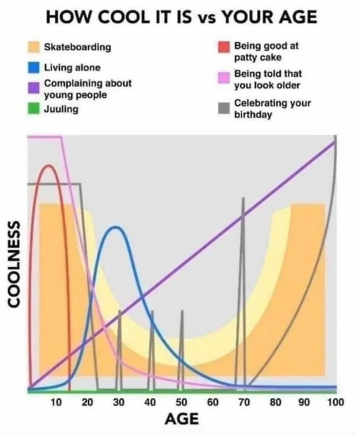
Image credits: Simon shows you maps
#55
Wait, this is a real thing? A cave deeper than 2000m? And people are crazy enough to go all the way down? Good lord! It’s a hard no from me. Happy to support mountaineers all the way to the top but caving is a big no no for your friendly armchair cartography enthusiast
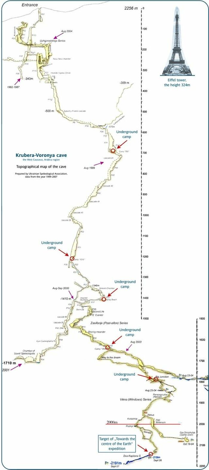
Image credits: Simon shows you maps
#56 Country Lookalikes
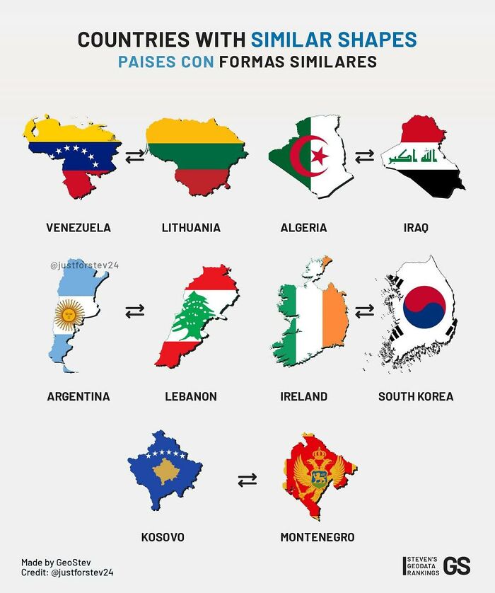
Image credits: Simon shows you maps
#57
I had never seen the US Baby Boom been visualized in this way. Rather cool visuals. The chart assumes Baby Boomers to be born between 1946 and 1964
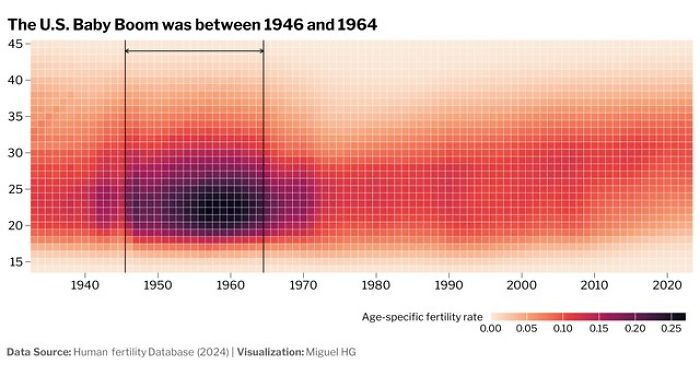
Image credits: Simon shows you maps
#58 Beer Types By Bitterness And Alcohol Levels
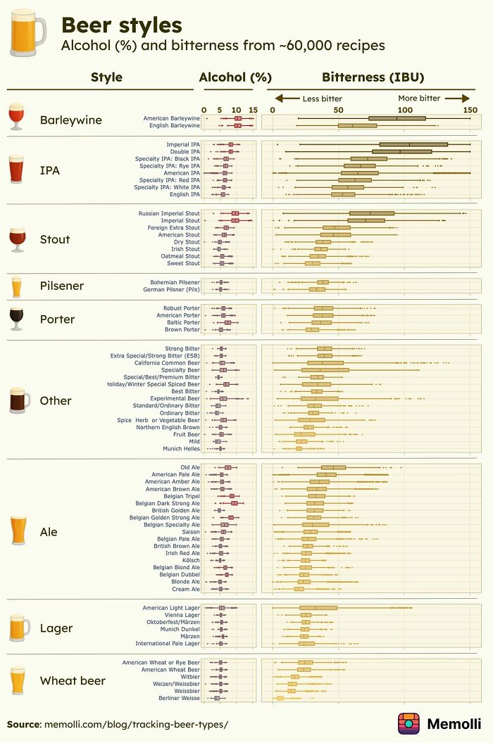
Image credits: Simon shows you maps
#59
Excess mortality in the EU during the Covid years was 12 per cent. This means we’ve seen 12 per cent more deaths than we would’ve statistically expected. The Swedish approach wasn’t as lackadaisical as we make it out to be. Targeted protection of the elderly saw super high compliance. Sweden’s Covid approach remains highly respected
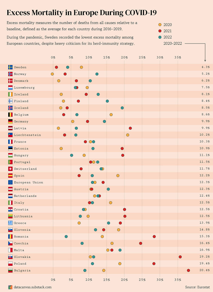
Image credits: Simon shows you maps
#60 Where To Pee? European Edition
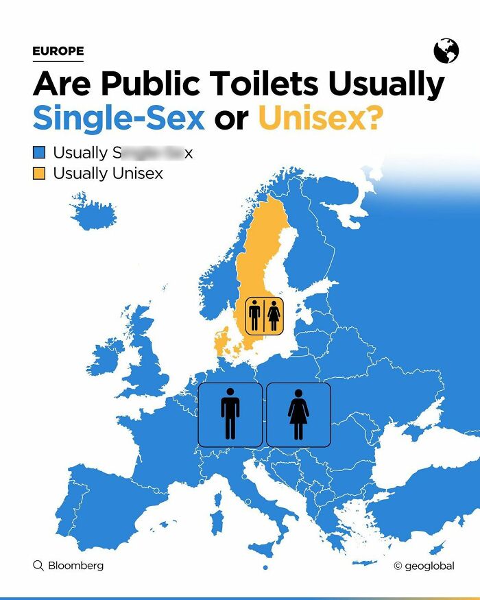
Image credits: Simon shows you maps
#61 This Map Shows Europe In A Silly Scenario Where Sea Levels Decrease By 1000 Meters
Image credits: Simon shows you maps
#62 The Electric Car Boom Continues To Boom
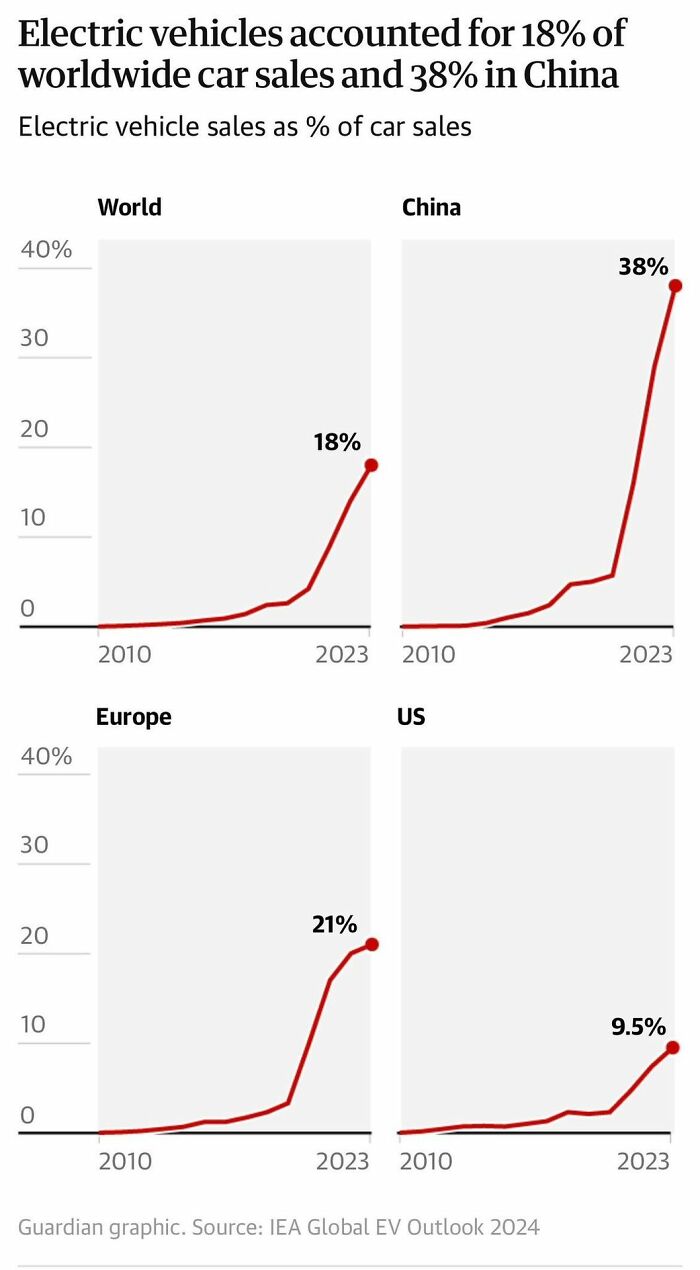
Image credits: Simon shows you maps
#63 Now That European Ice Cream Season Is In Full Swing, This Map Seems Like Essential Knowledge
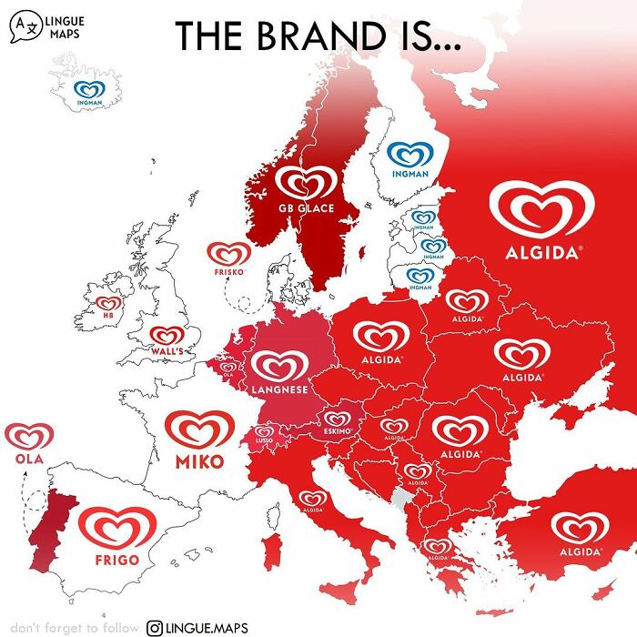
Image credits: Simon shows you maps
#64 Roosters Without Borders
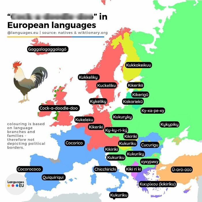
Image credits: Simon shows you maps
#65 Across Most Of The World, The Us Is Now Seen Less Favorably Than Just A Year Ago. The Exceptions Are Worth Noting: Israel, India, Nigeria, South Africa, And Turkey
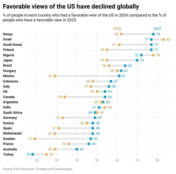
Image credits: Simon shows you maps
#66 Enjoy Your Summer Holidays My Dear European Friends!
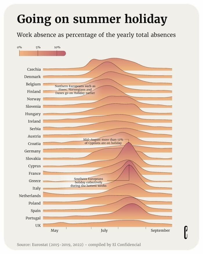
Image credits: Simon shows you maps
#67 Germans And Scandinavias Holidaying In Spain Lose Their Mind Over The Late Dinners
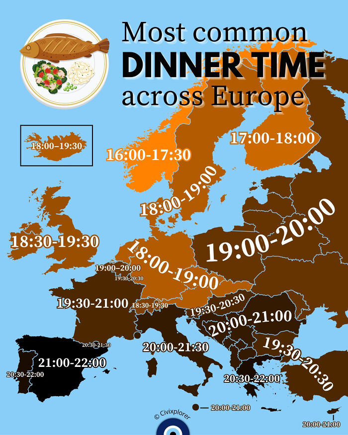
Image credits: Simon shows you maps
#68
This chart shows what baby names peaked in each decade in the US. The postwar Larry boom is long gone, the Jennifer-hype of the 70s and 80s died down, but Oliver is still on the rise
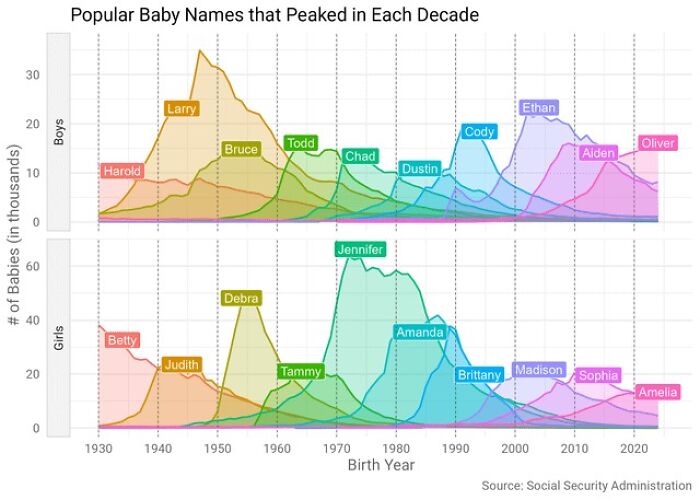
Image credits: Simon shows you maps
#69
We are being shown how people in Slovakia reference other European nations in their idioms. Germans also use the stingy Scotsman stereotype
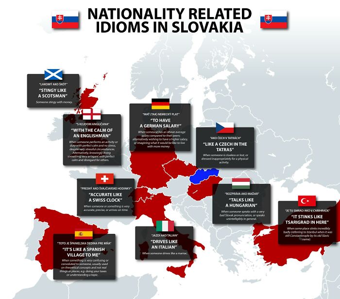
Image credits: Simon shows you maps
#70 Europe Felt The Heat In 2024. Ok, Iceland Didn’t
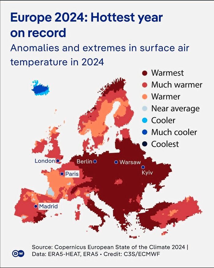
Image credits: Simon shows you maps
#71
Image credits: Simon shows you maps
#72
Almost one third of Russians are opposed to vaccines. The second ranked country is the world’s most advanced economy happily shooting itself not in the arm but in the foot. My birth country of Germany also has unnecessarily high opposition
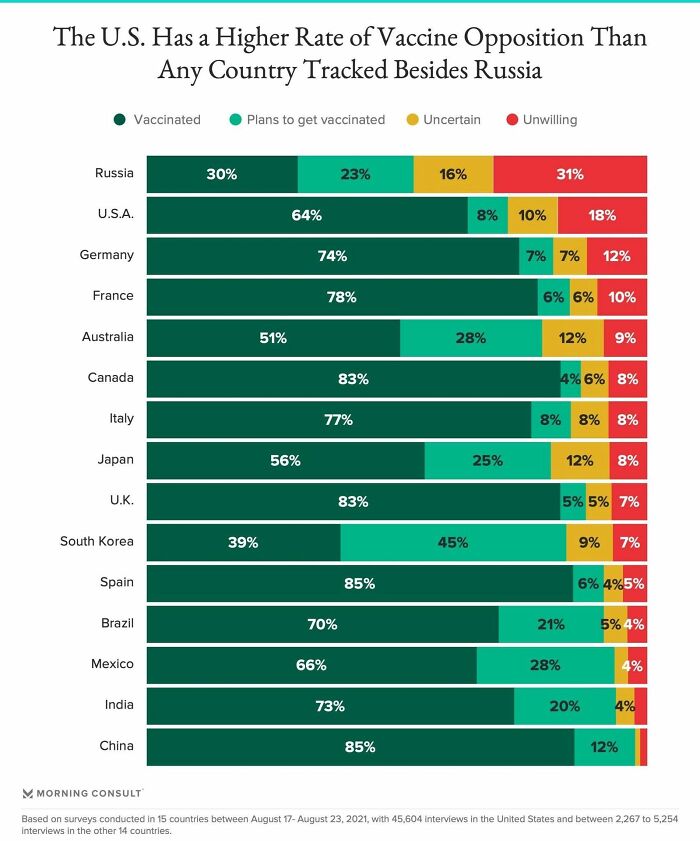
Image credits: Simon shows you maps
#73
The wider the gap, the harder to find a partner. This should in turn further drive down birth rates. On top of this, the UK now has a reverse gender pay gap for young workers. Considering that women still prefer an equally or higher earning partner, birth rates should take yet another hit
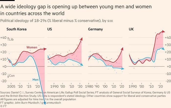
Image credits: Simon shows you maps
#74 This Map Shows The Number Of Ant Species In The 50 Most “Antsy” Countries

Image credits: Simon shows you maps
#75 This Map Shows When (If Ever) Asian Nations Partook At The Fifa Football World Cup
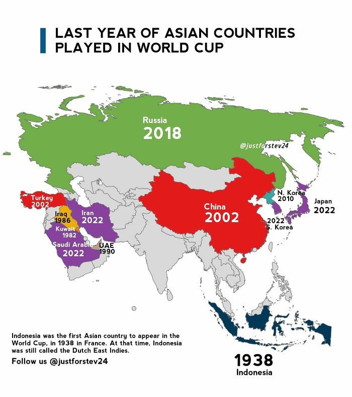
Image credits: Simon shows you maps
#76 Time Traveling Back To 600 Ad Europe, Would You Be Able To Communicate With Anyone?
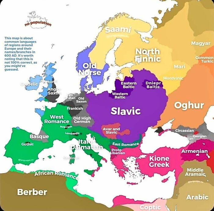
Image credits: Simon shows you maps
#77
Image credits: Simon shows you maps
#78 Want To Swear But Kids Are Around? Use These Kid-Friendly Swear Words!
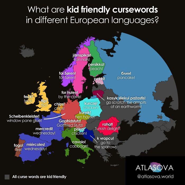
Image credits: Simon shows you maps
#79
This map of Ukrainian deep strike capability is astonishing. Drone warfare is so hard to defend against. Any country not heavily investing in defensive and offensive drone technology is simply naive.
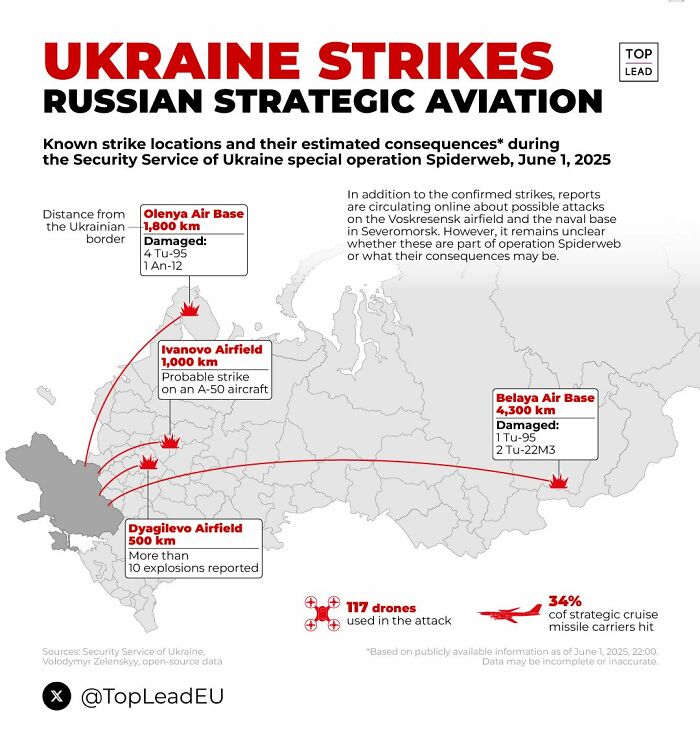
Image credits: Simon shows you maps
#80
Wonderfully detailed map shows the Human Development Index across Europe. Concentration of development in Central Europe generally and within the big cities within each individual country

Image credits: Simon shows you maps
#81 There Are European Cities That Have Been Continuously Inhabited For 7000-8000 Years!
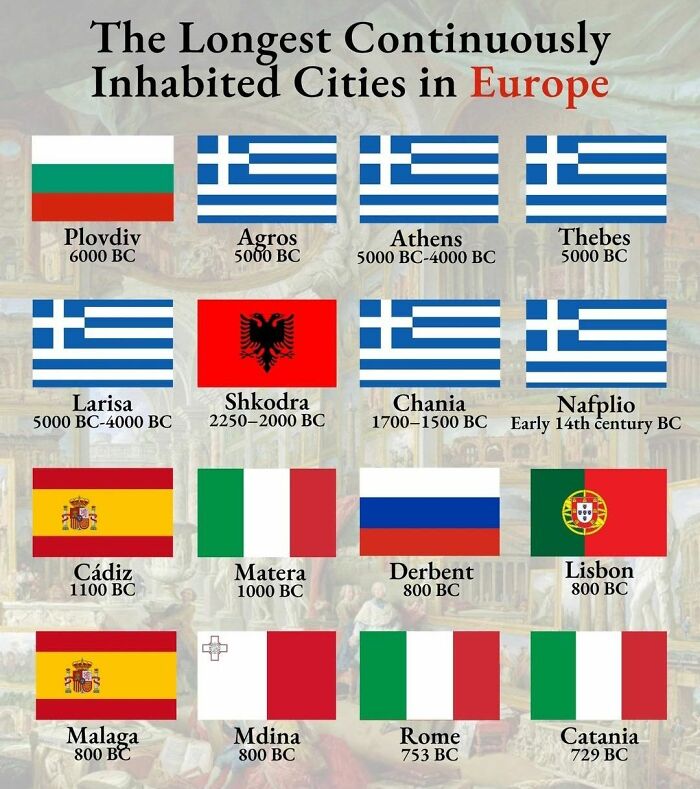
Image credits: Simon shows you maps
#82 Gay Marriage Is Slowly Moving Eastward
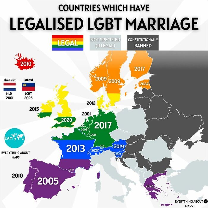
Image credits: Simon shows you maps
#83
Image credits: Simon shows you maps
#84 London Continues Turning Itself Into A Bicycle City!
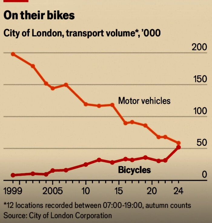
Image credits: Simon shows you maps
#85
This map shows the status of coal power in Europe as of 2024. Coal is being phased out. Now it’s time to drive down energy costs. Crucial considering the continent wants to be competitive in high end manufacturing, needs big data centers, and wants at least a bit of supply chain sovereignty.
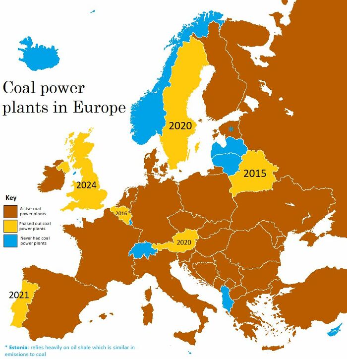
Image credits: Simon shows you maps
#86
Share of the working age (25-64) population that holds at least a bachelor’s degree by country. In the 40% hold academic credentials. Super high considering the population size of the US and the extreme debt that people go into for degrees.
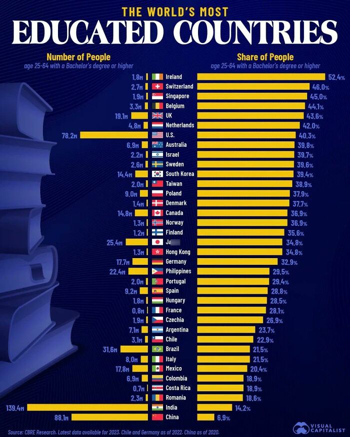
Image credits: Simon shows you maps
#87
16 countries are home to over 100 million people. 51% of countries officially recognized by the UN are smaller than 10 million residents. 36 countries are smaller than 1 million people.
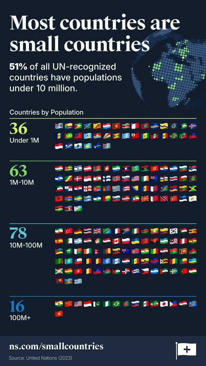
Image credits: Simon shows you maps
#88
Sure, big parts of our healthcare systems are in need of reform but please keep in mind what wonderful progress medicine and pharmaceuticals have given humanity as a whole in the last 100-150 years.
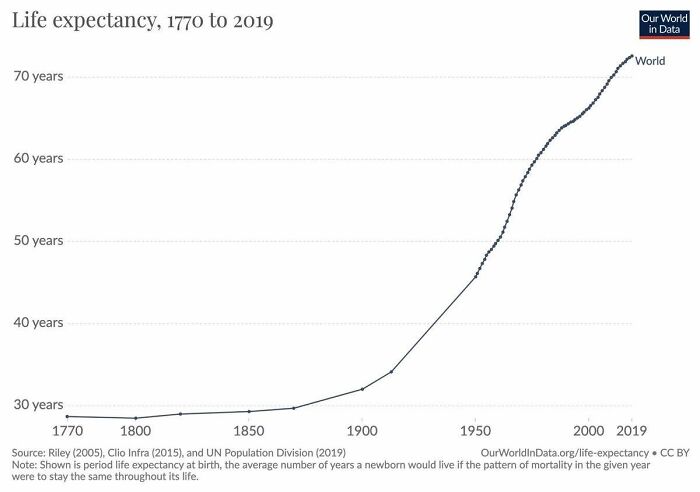
Image credits: Simon shows you maps
#89 This Map Shows The Radioactive Fallout In The Us From Nuclear Testing. The First Test, Trinity, In New Mexico Is Visible
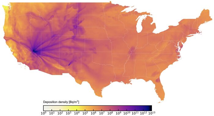
Image credits: Simon shows you maps
#90 Life Expectancy At Birth In Europe As Of 2024. It Helps To Be Rich And To Eat Healthy
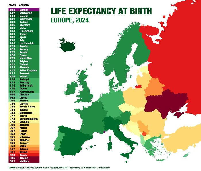
Image credits: Simon shows you maps
#91
The Australian efforts towards tackling the public health issue that is smoking were super successful. Something the country should be proud of. Look at the huge number of ex smokers Australian policies created. Good stuff.
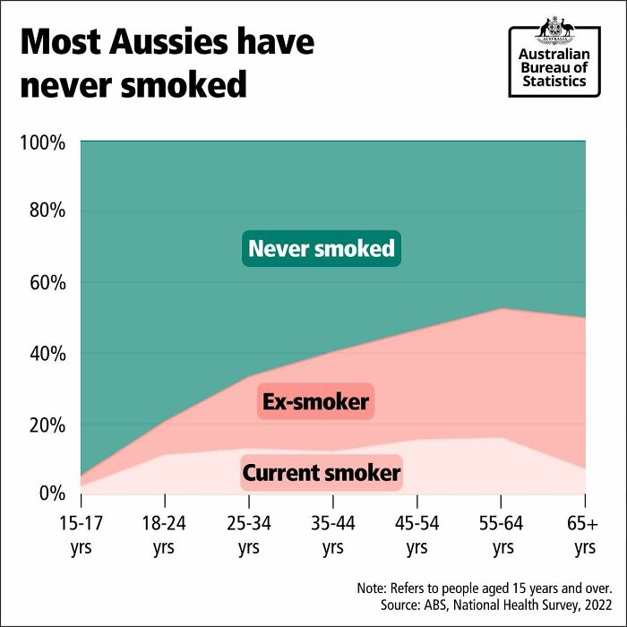
Image credits: Simon shows you maps
#92
Image credits: Simon shows you maps
#93 Share Of European Countries’ Population Living In The Capital City. Rome And Berlin Are Relatively Small Within Their Country – At Least When Compared To London, Paris, And Madrid
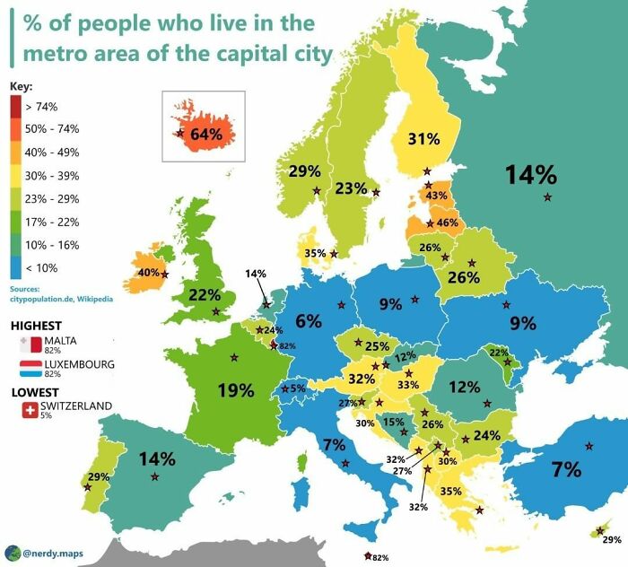
Image credits: Simon shows you maps
#94 It’s Getting Warmer In Europe. In Case You Want To Travel Through Germany, This Map Might Be Of Use
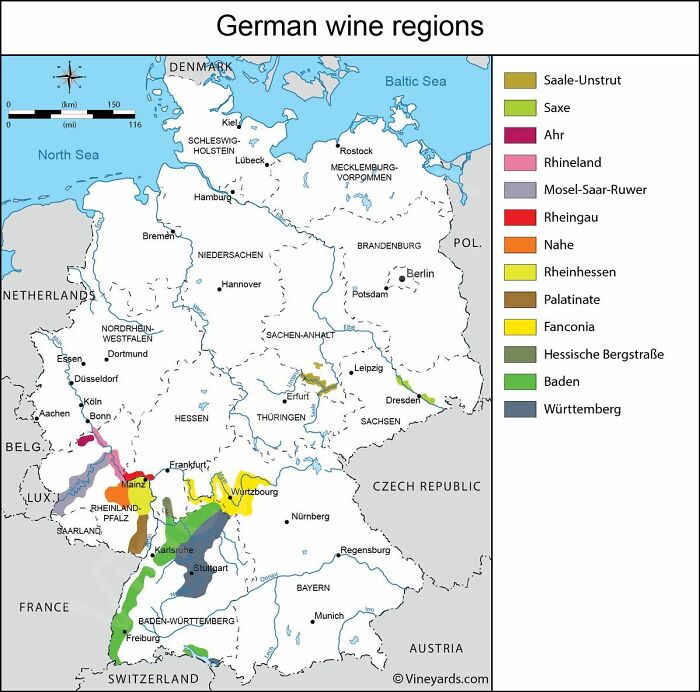
Image credits: Simon shows you maps
from Bored Panda https://ift.tt/DuwtMHA
via IFTTT source site : boredpanda