The oldest maps out there are roughly 4000 years old, depicting a section of the river Odet valley in modern Finistère, Brittany. It was found in a tomb, possibly to communicate to people what its inhabitant “controlled.” The fact is that all through history, humans have been trying to make records of the world around them in interesting ways.
The “Simon shows you maps” Facebook page, run by the titular Simon, is dedicated to sharing cool and interesting maps. So get comfortable as you scroll through, upvote the best ones and be sure to share your thoughts and ideas in the comments section down below.
More info: Facebook
#1 Stumbled Across A Dumb Little Post
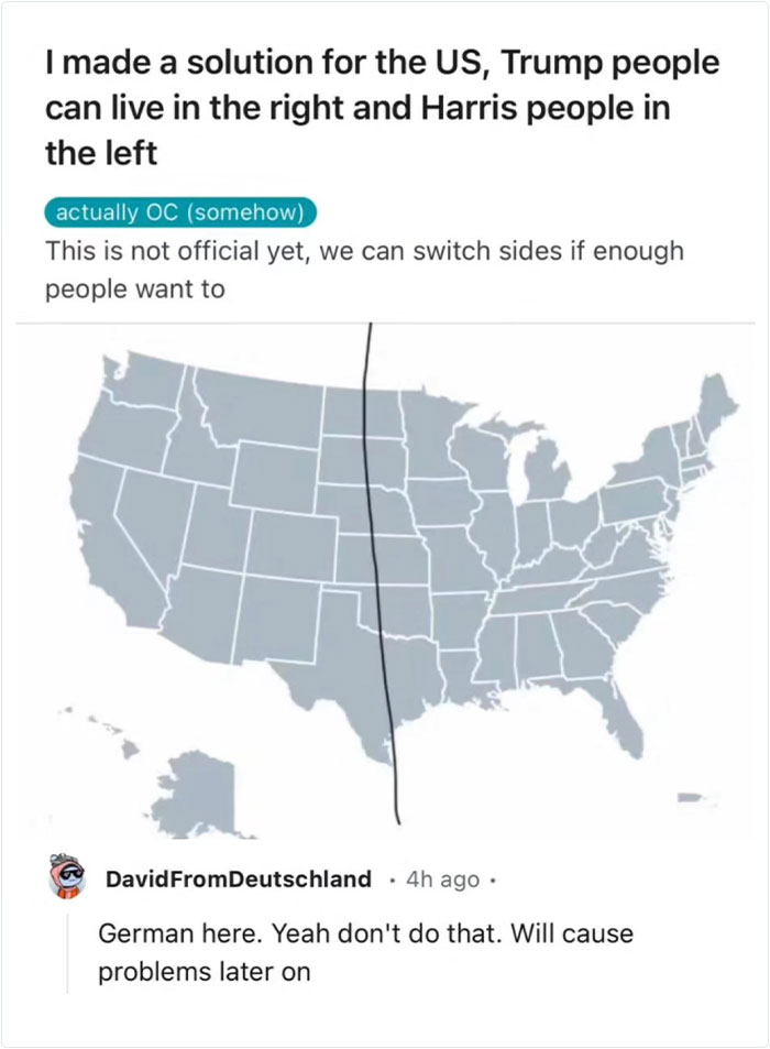
Image credits: Simon shows you maps
#2 For A While During The Northern Hemisphere’s Summer, The Sun Sets In Eastern Brazil Before It Does In Ireland. Now You Know
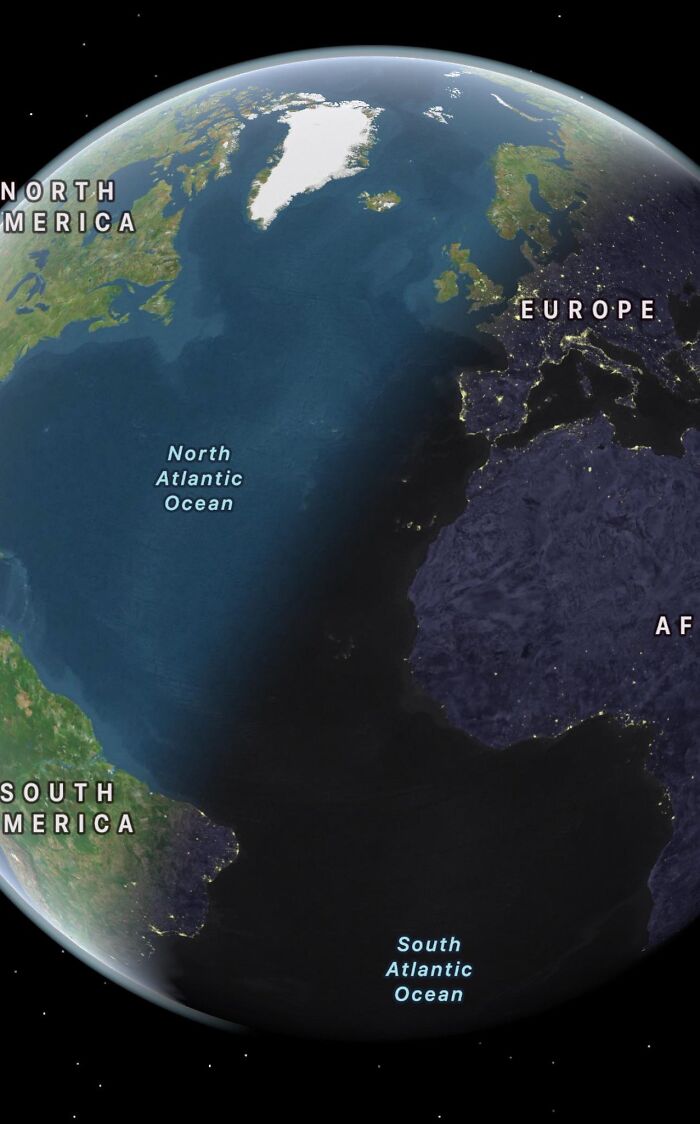
Image credits: Simon shows you maps
#3 There Are European Cities That Have Been Continuously Inhabited For 7000-8000 Years!
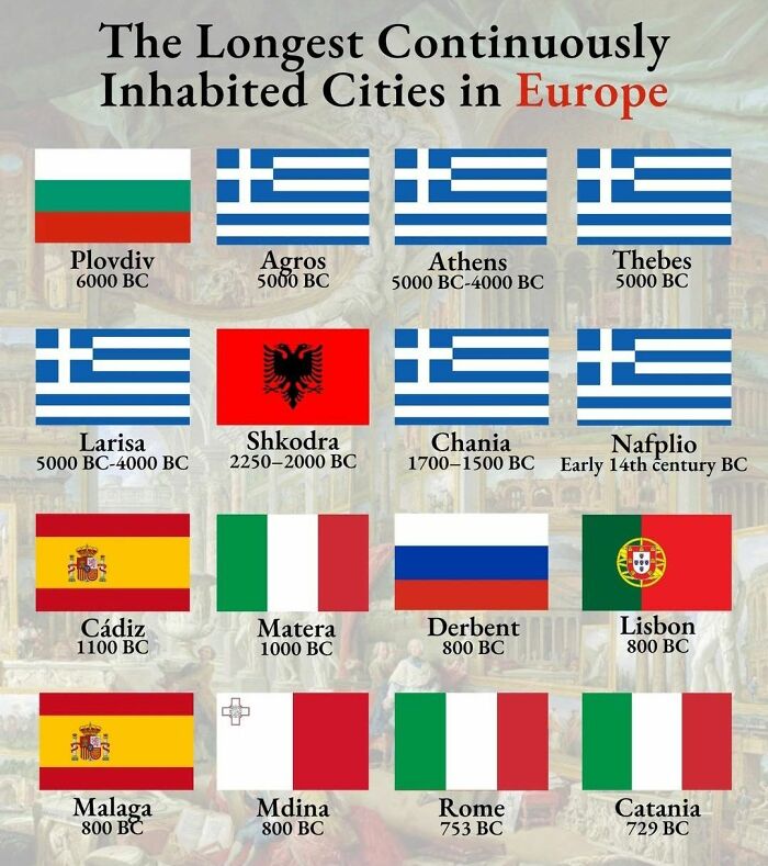
Image credits: Simon shows you maps
#4 Etymology Of Spain. This Map Shows The Origin Of Various Spanish Province Names
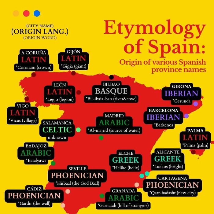
Image credits: Simon shows you maps
#5
Wait, this is a real thing? A cave deeper than 2000m? And people are crazy enough to go all the way down? Good lord! It’s a hard no from me. Happy to support mountaineers all the way to the top but caving is a big no no for your friendly armchair cartography enthusiast
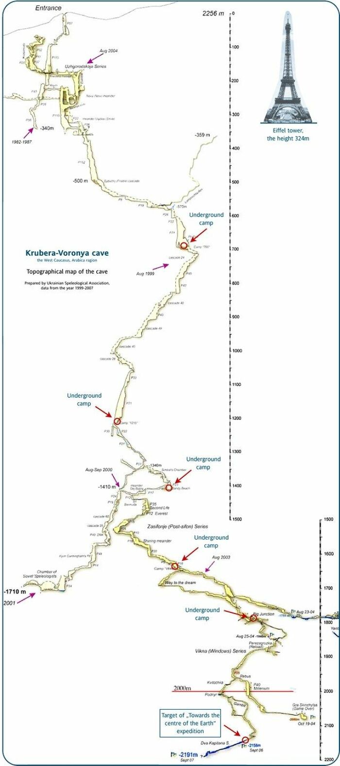
Image credits: Simon shows you maps
#6 As A German, For A Personal Meeting 12 Means 12 But For A Professional Meeting 12 Means Be 5 Minutes Early. Any Alternative Interpretation Hurts My Little German Brain

Image credits: Simon shows you maps
#7 This Map Shows What The Word “Yankee” Means Around The World
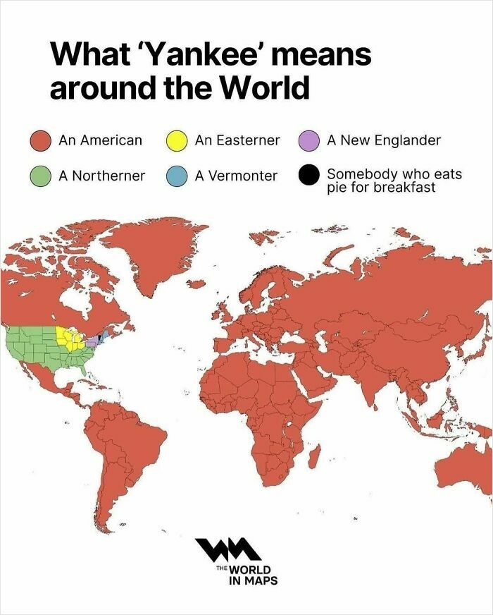
Image credits: Simon shows you maps
#8 If You Are Being Born Today, This Is The Likelihood Of You Ending Up In Each Continent
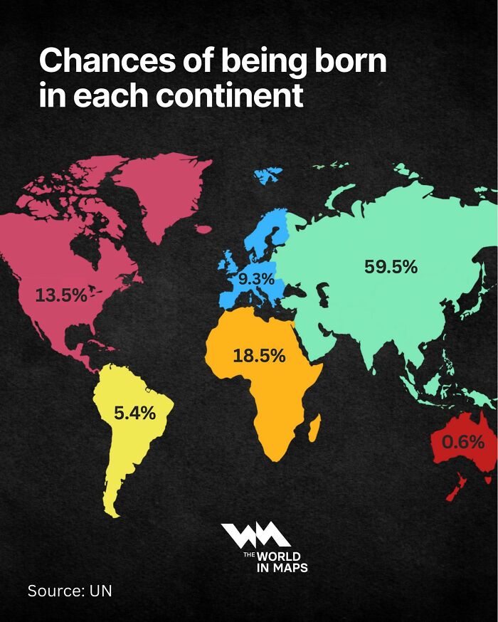
Image credits: Simon shows you maps
#9
Almost one third of Russians are opposed to vaccines. The second ranked country is the world’s most advanced economy happily shooting itself not in the arm but in the foot. My birth country of Germany also has unnecessarily high opposition
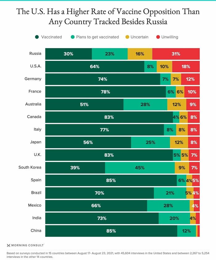
Image credits: Simon shows you maps
#10
Young adults are dying at an increasing rate in the United States. France roughly mirrored the US before the introduction of Oxycontin in the mid-90s and later fentanyl. The US isn’t doing a great job looking after its own people
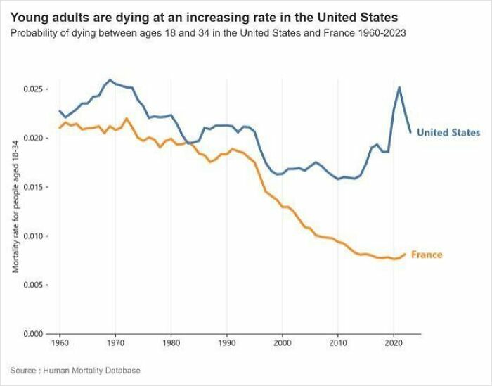
Image credits: Simon shows you maps
#11 Map Shows The World In About 250 Million Years
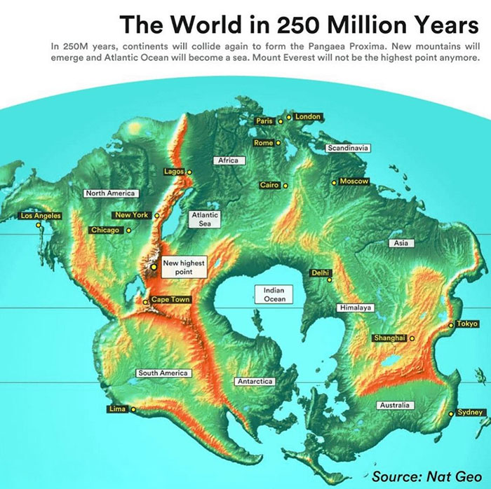
Image credits: Simon shows you maps
#12
The Great Fire of London ragged in 1666. This fantastic map overlays the effected area on modern day London. Would be cool to walk the area to feel the extent
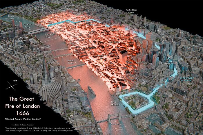
Image credits: Simon shows you maps
#13 Let’s See If This Map Will Come In Handy Any Time Soon
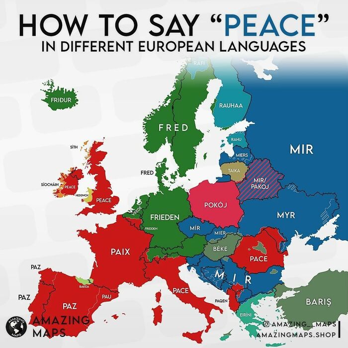
Image credits: Simon shows you maps
#14 Fun Infographic Shows When We Tend To Peak At Certain Things
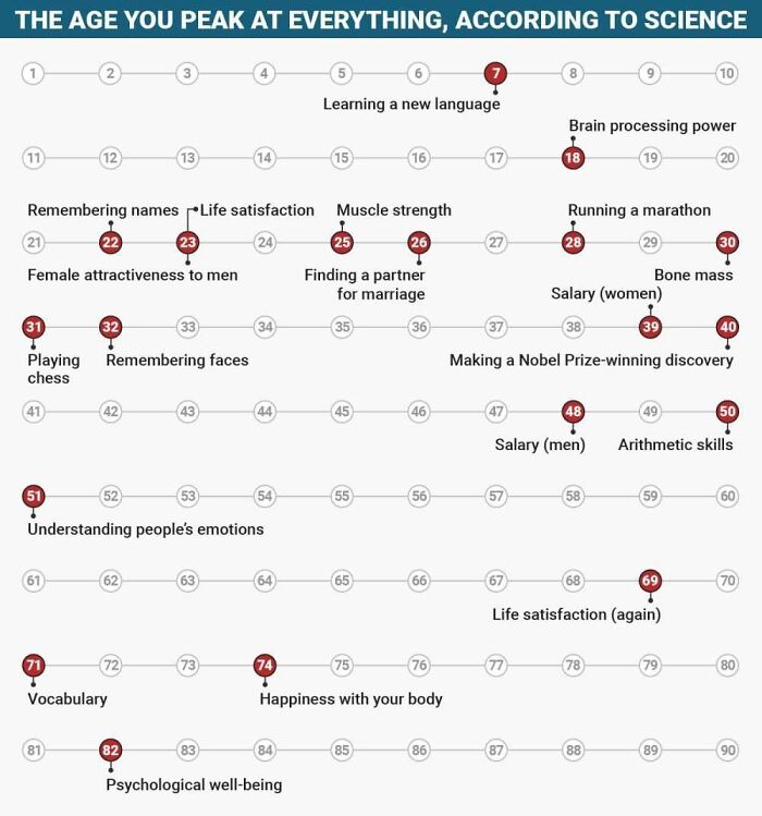
Image credits: Simon shows you maps
#15 I Live Such A Sheltered Life That I Had Never Heard Of A Horse Chopping Sabre Before
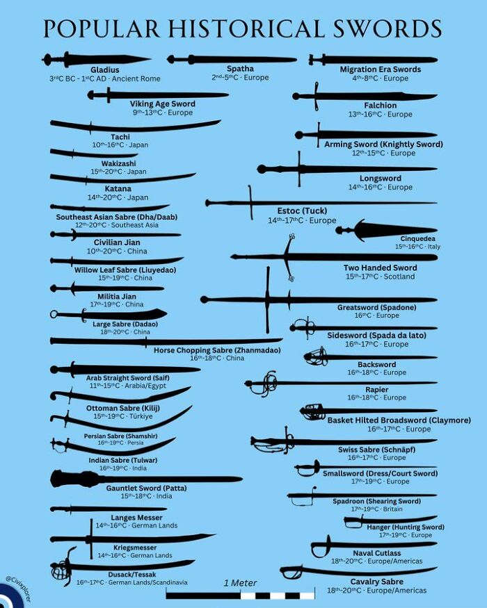
Image credits: Simon shows you maps
#16 Germany’s Economy Faces Many Struggles Buuuuut It Is Still Huge As This Map Reminds Us
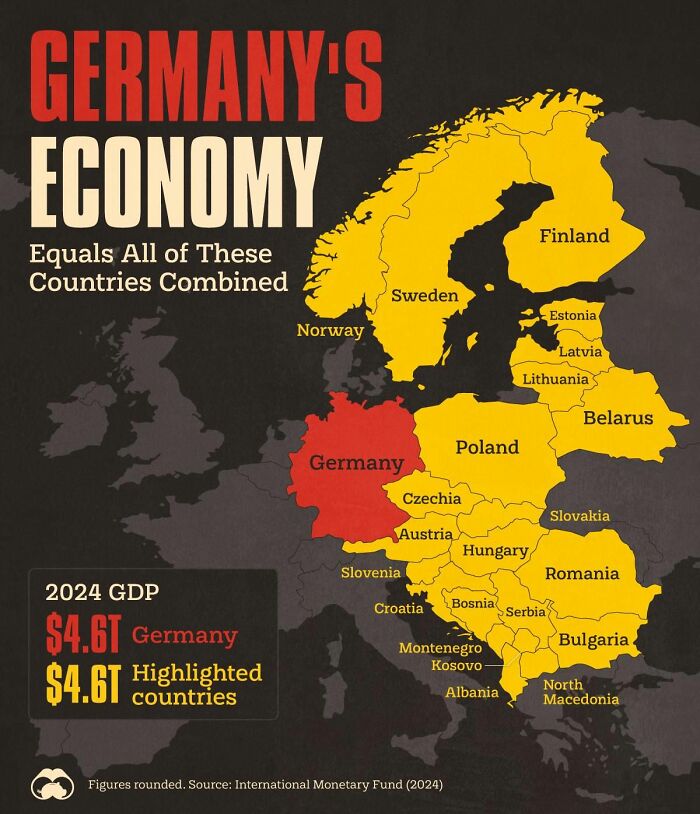
Image credits: Simon shows you maps
#17 Challenge: Which Definition, Which Terminology Doesn’t Offend Anyone? I’ve Found That Someone Will Always Be Mad
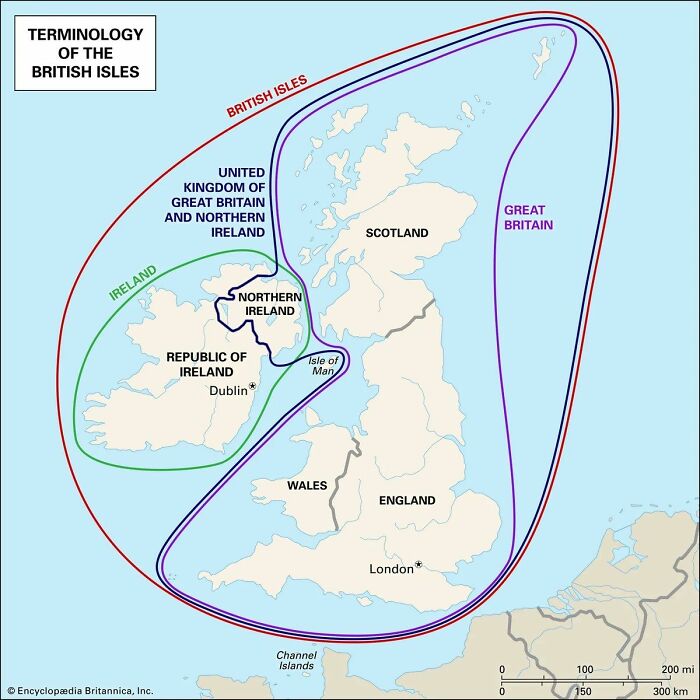
Image credits: Simon shows you maps
#18
This map of Ukrainian deep strike capability is astonishing. Drone warfare is so hard to defend against. Any country not heavily investing in defensive and offensive drone technology is simply naive.
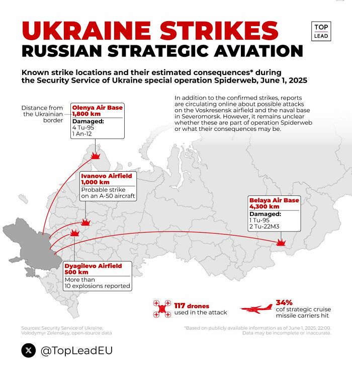
Image credits: Simon shows you maps
#19
The Australian efforts towards tackling the public health issue that is smoking were super successful. Something the country should be proud of. Look at the huge number of ex smokers Australian policies created. Good stuff.
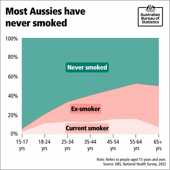
Image credits: Simon shows you maps
#20 Just A Quick Reminder. A Little Public Service Announcement To Please My Dutch Friends
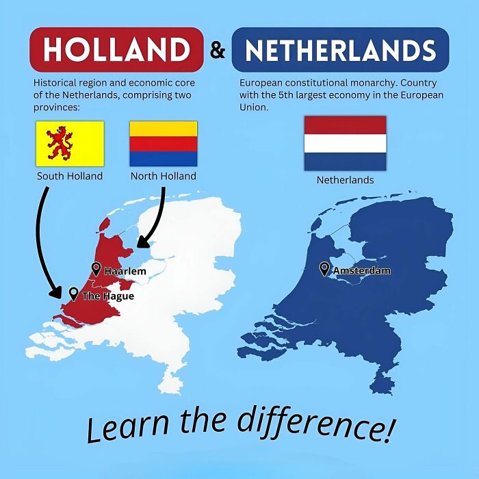
Image credits: Simon shows you maps
#21 Technically Correct
Image credits: Simon shows you maps
#22 Truth
Image credits: Simon shows you maps
#23 Germans And Scandinavias Holidaying In Spain Lose Their Mind Over The Late Dinners
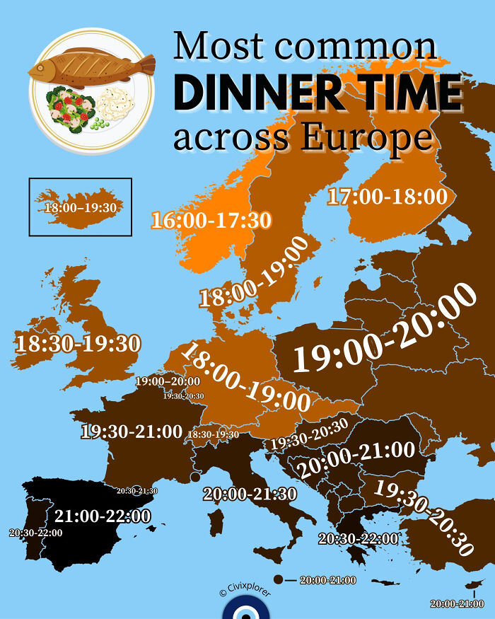
Image credits: Simon shows you maps
#24 In A World Where More People Obsess About Their Work Being Inherently Meaningful, I Hope That You See Your Job Relatively Close To The Left Side Of The Chart
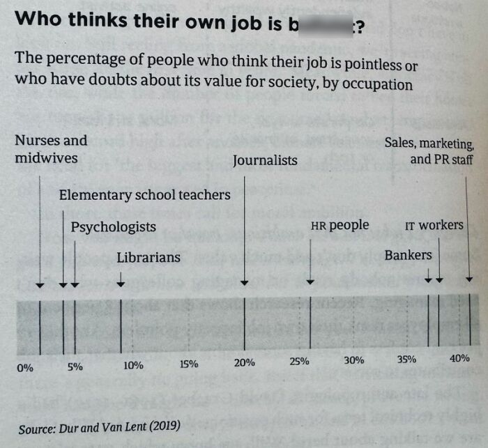
Image credits: Simon shows you maps
#25
In places like Germany, the full retirement of the huge Baby Boomer cohort will drive pension payments up significantly. The relatively small workforce will pay for that. Young workers will increasingly dislike that. Voting behaviour might shift further away from established parties as a result.
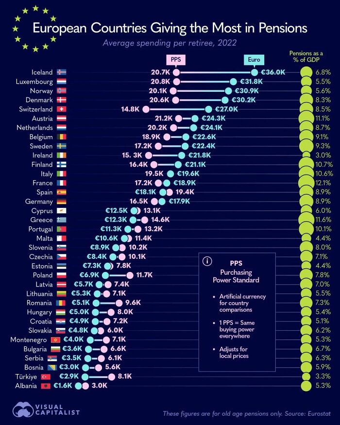
Image credits: Simon shows you maps
#26 This Map Shows The Number Of Dentists Per 10,000 Residents Across Europe
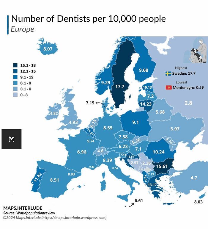
Image credits: Simon shows you maps
#27 Look Who Just Made It Into The Top 20 Of The World’s Largest Economies. Welcome To The Top, Poland
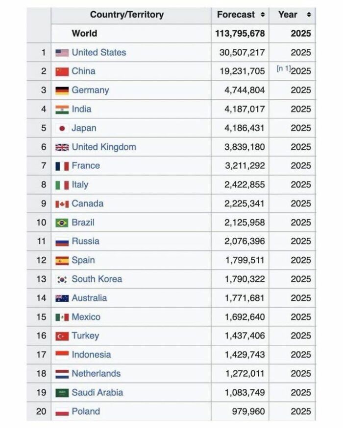
Image credits: Simon shows you maps
#28
I had never seen the US Baby Boom been visualized in this way. Rather cool visuals. The chart assumes Baby Boomers to be born between 1946 and 1964
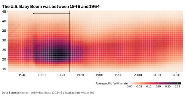
Image credits: Simon shows you maps
#29 This Map Shows Europe In A Silly Scenario Where Sea Levels Decrease By 1000 Meters
Image credits: Simon shows you maps
#30 Want To Swear But Kids Are Around? Use These Kid-Friendly Swear Words!
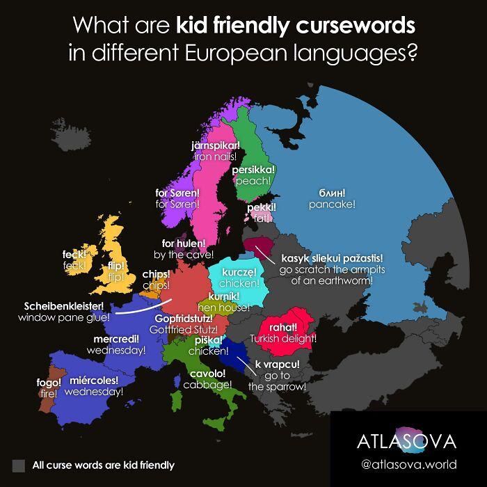
Image credits: Simon shows you maps
#31 By 2050 India Will Be One United States Bigger Than China
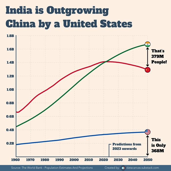
Image credits: Simon shows you maps
#32 This Map Shows The Number Of Ant Species In The 50 Most “Antsy” Countries

Image credits: Simon shows you maps
#33 Time Traveling Back To 600 Ad Europe, Would You Be Able To Communicate With Anyone?
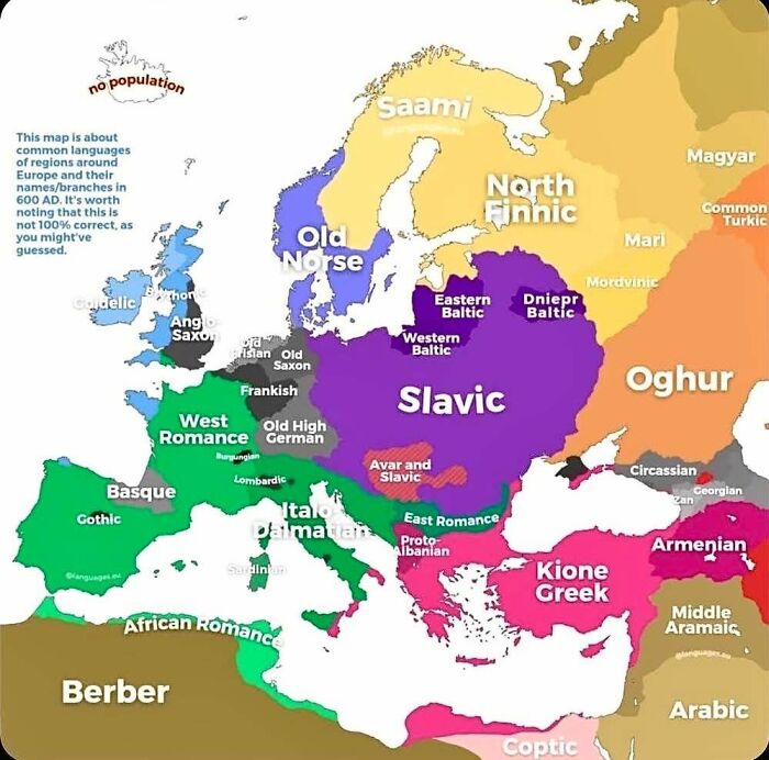
Image credits: Simon shows you maps
#34
This map shows the status of coal power in Europe as of 2024. Coal is being phased out. Now it’s time to drive down energy costs. Crucial considering the continent wants to be competitive in high end manufacturing, needs big data centers, and wants at least a bit of supply chain sovereignty.
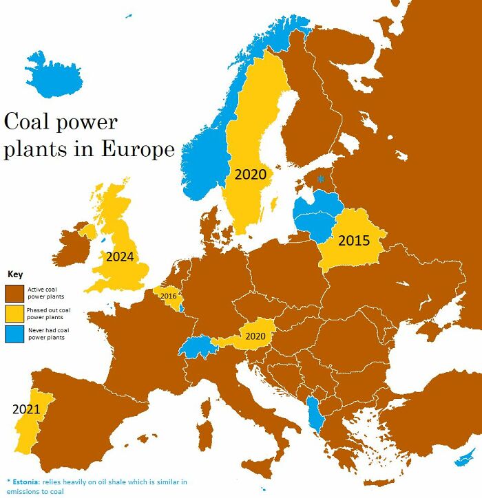
Image credits: Simon shows you maps
#35
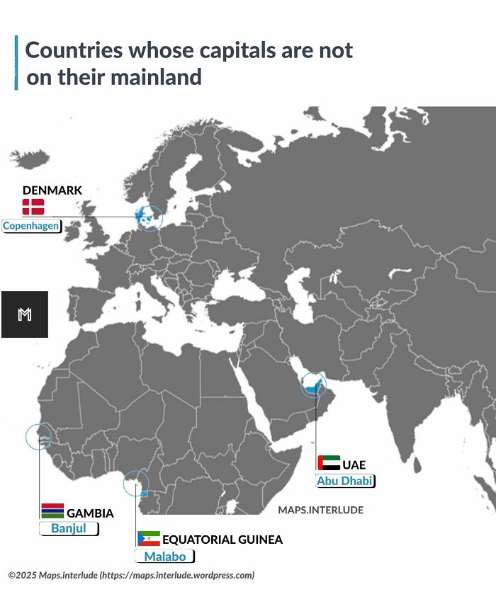
Image credits: Simon shows you maps
#36 Yet Another Map That Supports My Suspicion That Poland Is Europe’s Hottest Place To Be At The Moment. Cheaper Than Germany, On The Up Economically
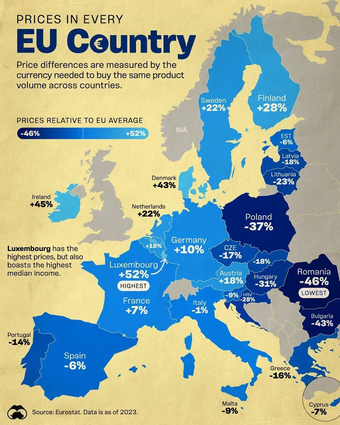
Image credits: Simon shows you maps
#37
We are being shown how people in Slovakia reference other European nations in their idioms. Germans also use the stingy Scotsman stereotype
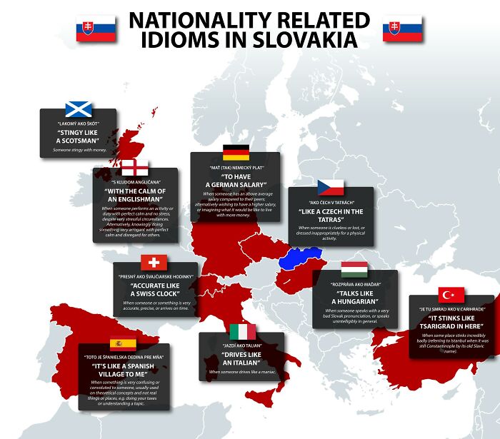
Image credits: Simon shows you maps
#38
The very low birth rates across Europe lock in future population decline now. The Mediterranean countries will be pretty empty. Well, except for the summer months when everyone still comes to Italy and co for a holiday.
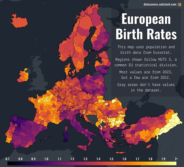
Image credits: Simon shows you maps
#39 Holidaymakers In The Mediterranean Should Study This Map Carefully To Impress (Annoy?) Their Friends And Family With Island Related Geography Trivia!
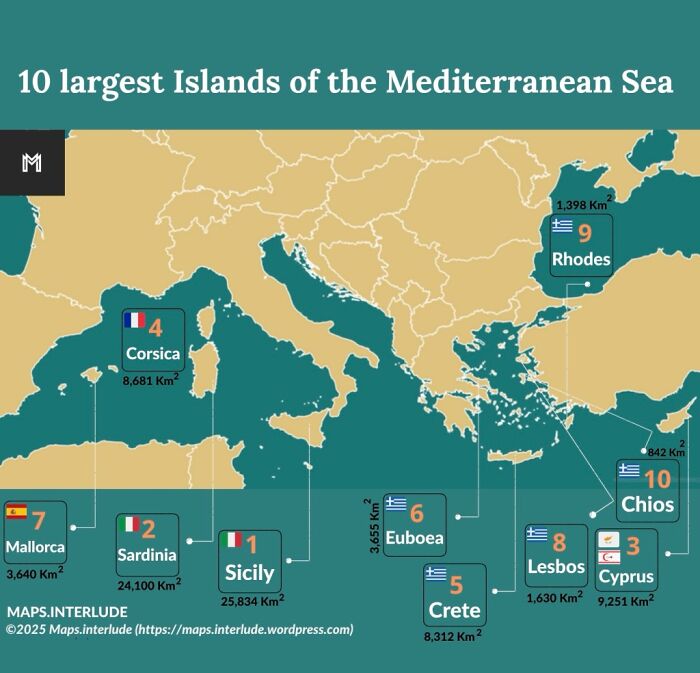
Image credits: Simon shows you maps
#40 The Great War, Wwi, Changed The Map Of Europe Significantly
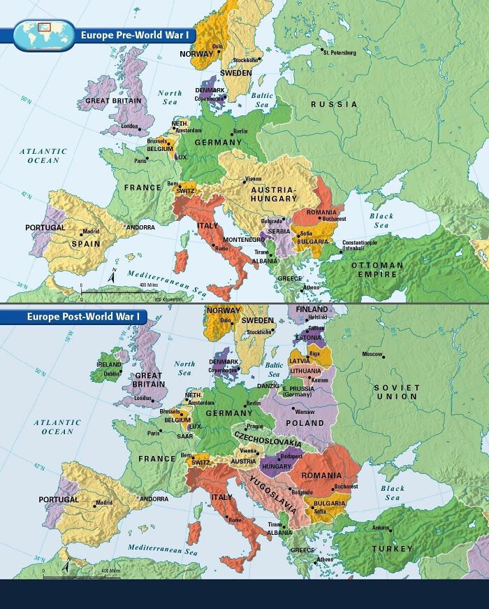
Image credits: Simon shows you maps
#41 Most Of Europe Is Shrinking As Is. Without Migration The Shrinkage Would Be Huuuge By 2100
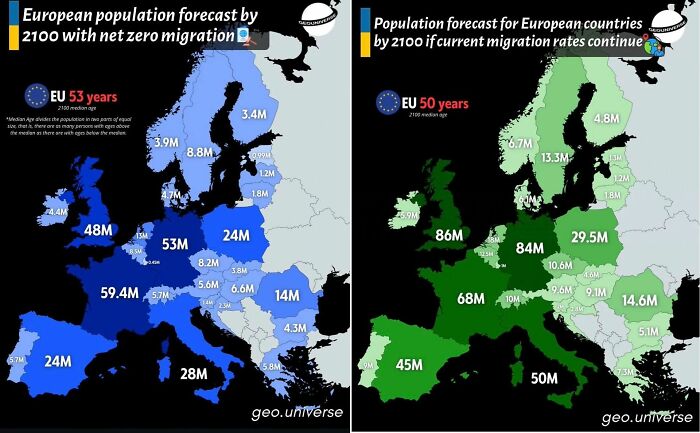
Image credits: Simon shows you maps
#42 Not So Forbidden After All…
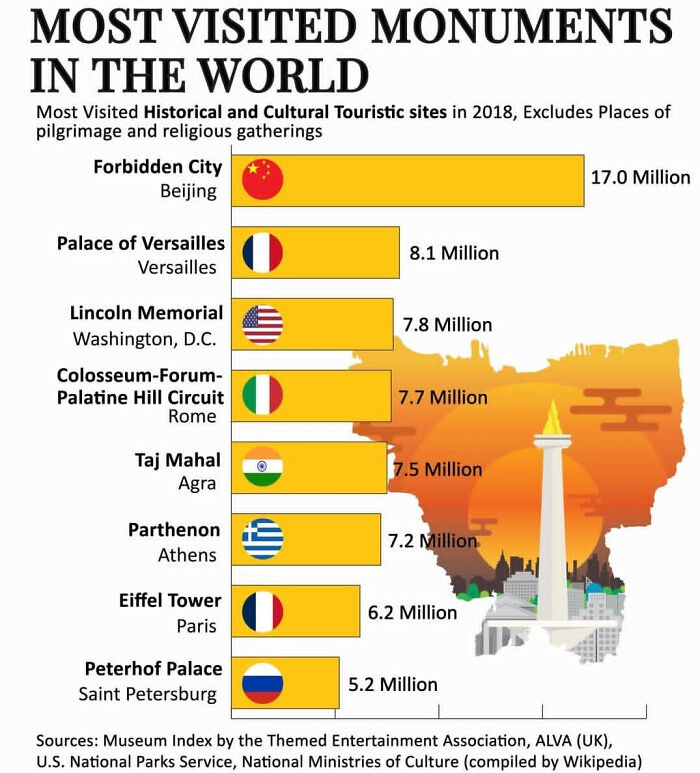
Image credits: Simon shows you maps
#43 That’s One Way Of Saying That Poland Really Saw Impressive Economic Growth In Recent Years
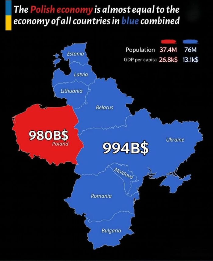
Image credits: Simon shows you maps
#44 Wow. That Puts Market Sizes Into Perspective

Image credits: Simon shows you maps
#45 This Map Overlays The 49th Parallel (Essentially The Us–canada Border) On Europe
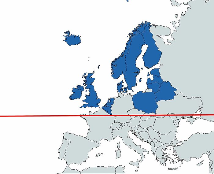
Image credits: Simon shows you maps
#46 Good News, Australia! The Motherland Still Likes Us!
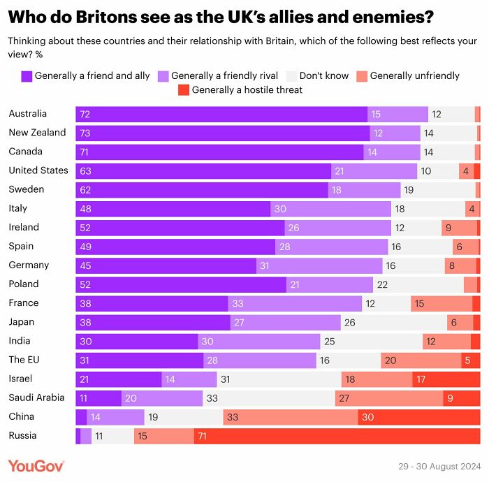
Image credits: Simon shows you maps
#47 How Long Is Your Summer School Break?
- You might also like: 50 ‘Weird Facts’ About The World That Might Give You A Fresh Perspective
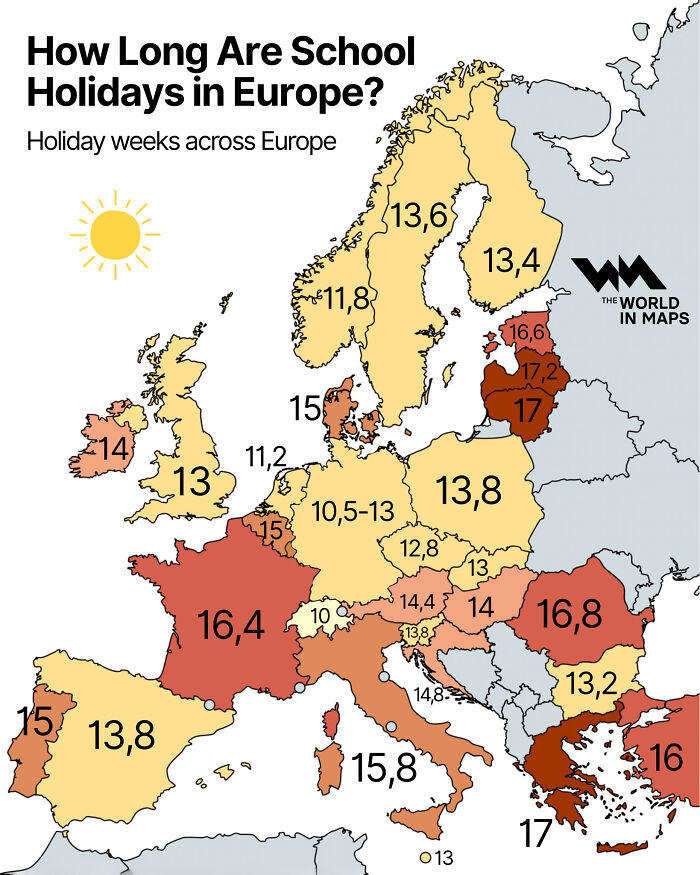
Image credits: Simon shows you maps
from Bored Panda https://ift.tt/ZgO5PCq
via IFTTT source site : boredpanda