Maps are awesome. And you can’t convince us otherwise. The obsessed, always-curious cartographer inside us gets excited every time they spot something new to ogle and analyze. However, not all maps are made equal. Some of them lean so heavily into comedy that we can’t help but spread the fun vibes.
The brainchild of Michael Howe, ‘Terrible Maps’ is a wonderfully witty social media project about nonsensical, semi-useless, and hilarious maps. They’re so ‘bad’ they’re good, and they help you look at the world from perspectives that you’ve never quite seen before. Scroll down to enjoy the latest batch below. We hope these maps make you as happy as they did us.
More info: Book | Facebook | Instagram | X | Linktree
#1 Nordic Map: Cat Edition
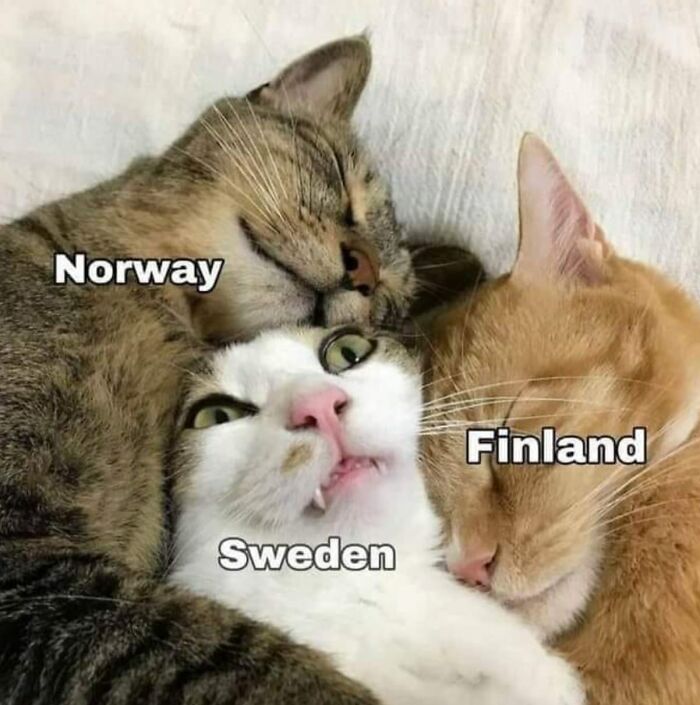
Image credits: Terrible Maps
#2 A World Map Centred Around Antarctica
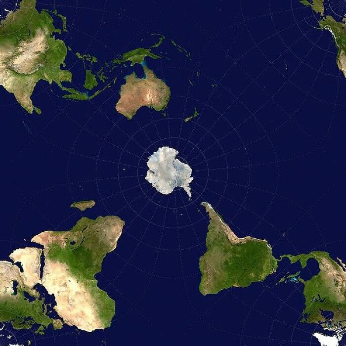
Image credits: Terrible Maps
#3 When You’re In Charge Of Naming Scottish Lochs And It’s 4:59pm
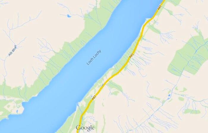
Image credits: Terrible Maps
Making a map look good isn’t enough. Just like when you’re designing anything else, you have to find a delicate balance between function on the one hand and form on the other.
The former means that whatever you’re creating actually does what it’s supposed to. In the case of a map, this might mean giving a person clear instructions on the geographical locations, educating them on a specific issue, or making them laugh.
#4 The Human Race Never Ceases To Amaze
Image credits: Terrible Maps
#5 Japanese Stereotypes Of Europe
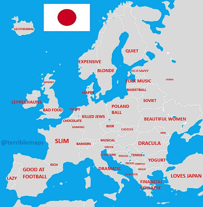
Image credits: Terrible Maps
#6 How People React When You Try To Speak Their Language
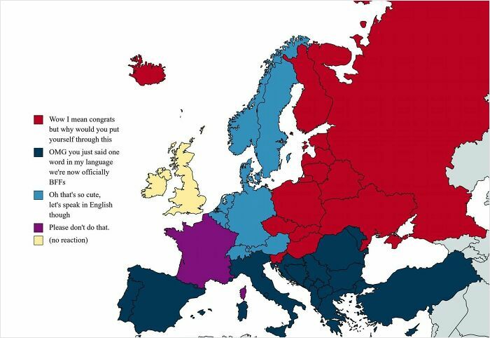
Image credits: Terrible Maps
Function aside, the form of what you’re designing matters a lot, too. Like it or not, human beings are drawn to beautiful things. When you make something aesthetic, it captivates people.
Naturally, if you’ve spent a lot of time working on a map, making it the best it can possibly be, you want it to end up being seen by the biggest number of people possible. So, you need to spend some time refining the visuals to make it pleasant to look at.
#7 Which Is Your Favourite Mexican Country?
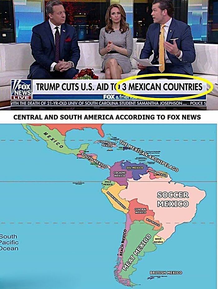
Image credits: Terrible Maps
#8 How To Build A T-Rex
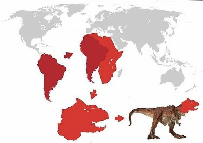
Image credits: Terrible Maps
#9 Well, That’s One Way To Do It
Image credits: Terrible Maps
All that being said, if you veer too much in either direction, prioritizing form over function or function over form, you might end up pushing people away.
For example, if your map looks absolutely divine, full of artistic flourishes, gorgeous fonts, and well-coordinated colors, but your audience gets lost among the details, you’ve failed as a cartographer.
Often, less is more.
You need to use the visuals to make it clear what the most important information on your map is.
#10 Percentage Of People That Can Hold A Conversation In Icelandic
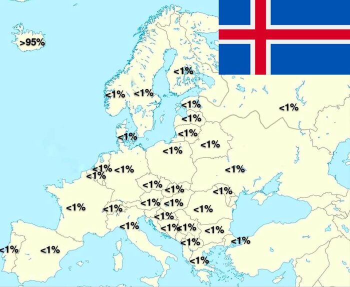
Image credits: Terrible Maps
#11 Ancient Grease Map
Image credits: Terrible Maps
#12 Countries That Have Eaten Their Prime Minister
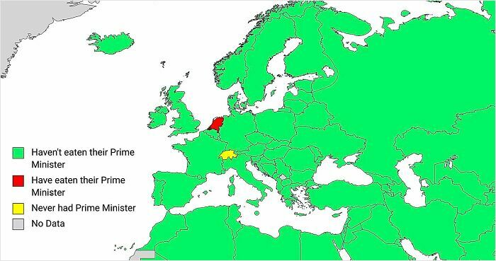
Image credits: Terrible Maps
On the other side of the scale, you have maps that are incredibly accurate and informative, but they lack that spark that would otherwise make them stand out from the crowd.
So, they fulfill their function well, but their form falls short of good design principles. A bit of imagination and soulfulness can really make your map sing.
People are very visual creatures. You need to know how to get their attention instantly as they’re scrolling through their social media feeds.
#13 “Coma” (Medical Term) In European Languages
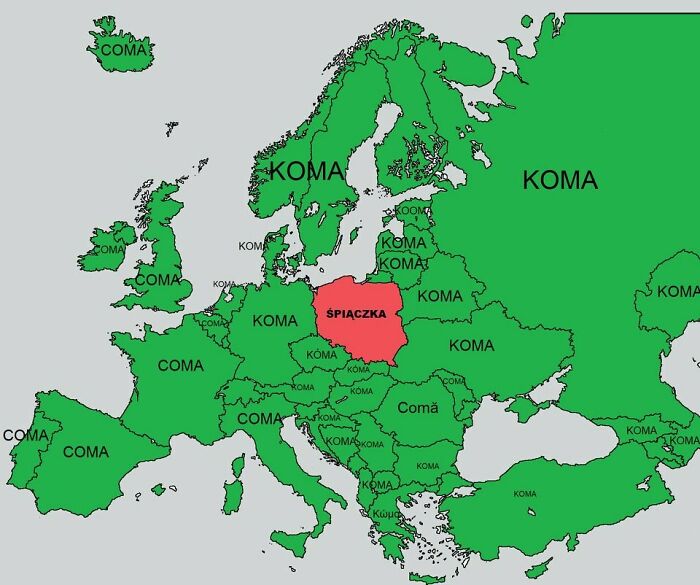
Image credits: Terrible Maps
#14 If You Laid The Great Wall Of China Around Europe’s Coastline
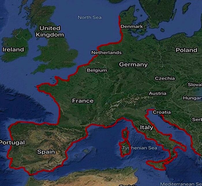
Image credits: Terrible Maps
#15 A Map Of Sunken Japanese Ships From World War II
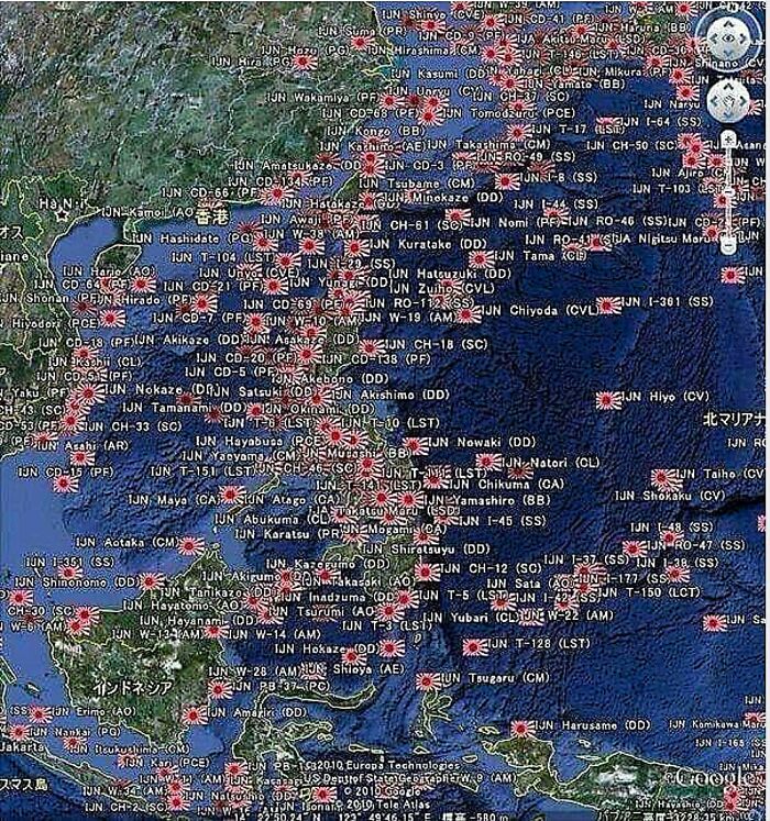
Image credits: Terrible Maps
People’s attention spans are short enough as they are right now. Based on recent research, the average person spends just 47 seconds using an electronic device before shifting their focus to something else.
This used to be 2.5 minutes back in the early 2000s.
So, the competition between digital creators for your attention on social media is even more intense.
#16 India As Seen By Indians
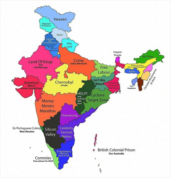
Image credits: Terrible Maps
#17 Europe If Europe Had Colonised Europe
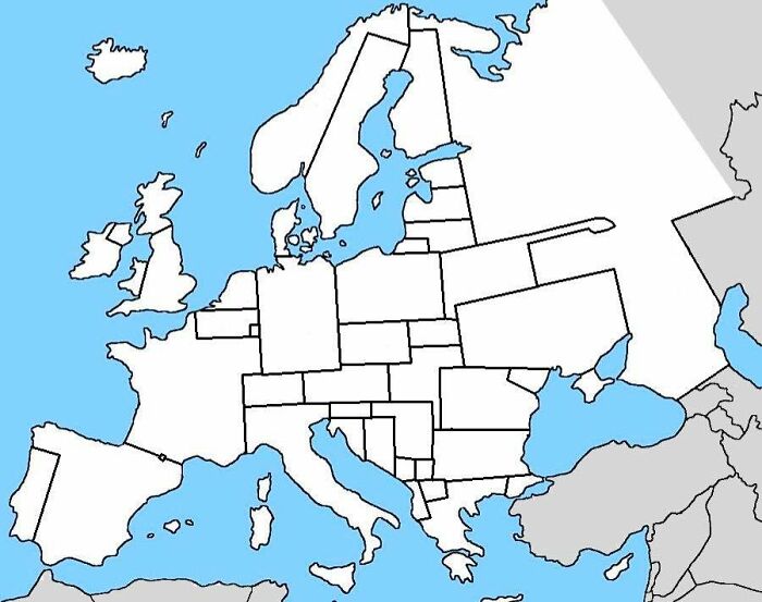
Image credits: Terrible Maps
#18 States That Are Clearly In The Midwest
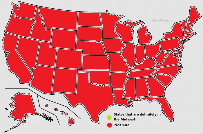
Image credits: Terrible Maps
As per Geography Realm, something to keep in mind when making a map is that you should only picture the area that is relevant to the data.
That sounds like common sense, but it’s fundamental.
What’s more, any data that you choose to include on the map itself should be relevant. “Cluttering the map with too much background data can lead to excess noise and dilute the actual message of the map.”
#19 Top-Selling Musical Artists From Each English County
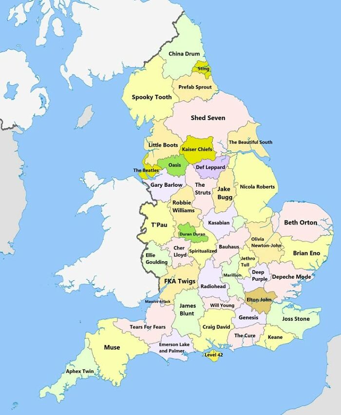
Image credits: Terrible Maps
#20 How Hard It Is To Understand Spanish Accents
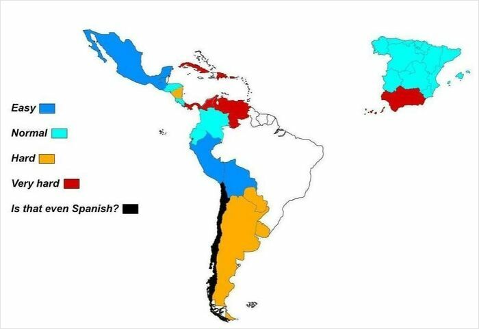
Image credits: Terrible Maps
#21 Countries Where It’s Illegal To Pee In The Sea
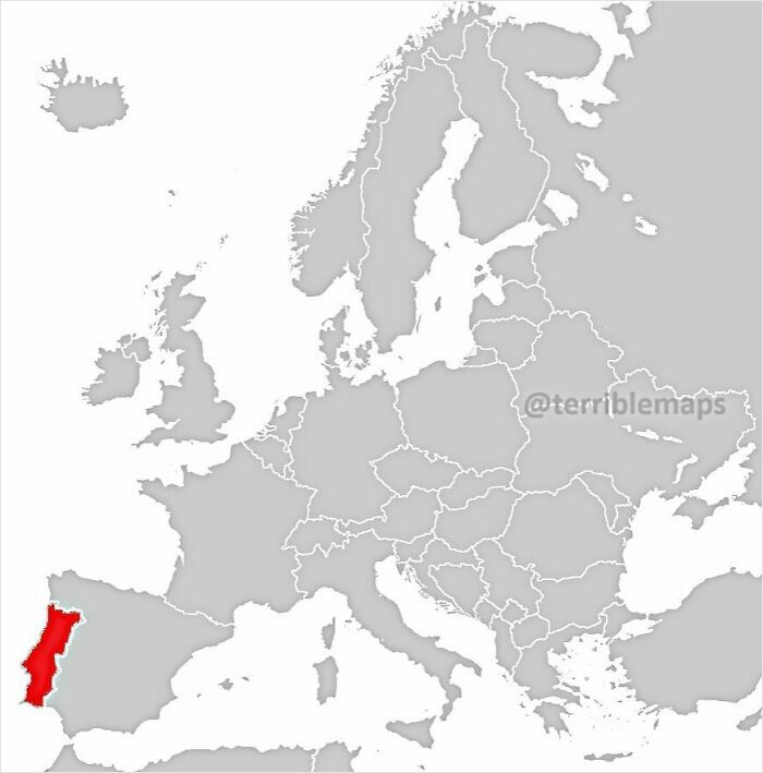
Image credits: Terrible Maps
Meanwhile, you should put a lot of care into the symbology of your map. Some of the most important things that affect the readability and message of your map are:
- The color choices you make
- The widths of your lines
- The icons you use
- The labeling
Of course, no proper map is complete without a legend. It allows your audience to decipher the symbology of the map. In a nutshell, the legend has to be legible and easy to understand.
#22 The U.S. Map With Between 3 And 500 Edges
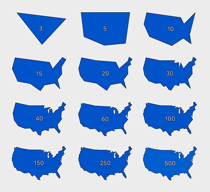
Image credits: Terrible Maps
#23 Countries Where The National Anthem Mentions Blood
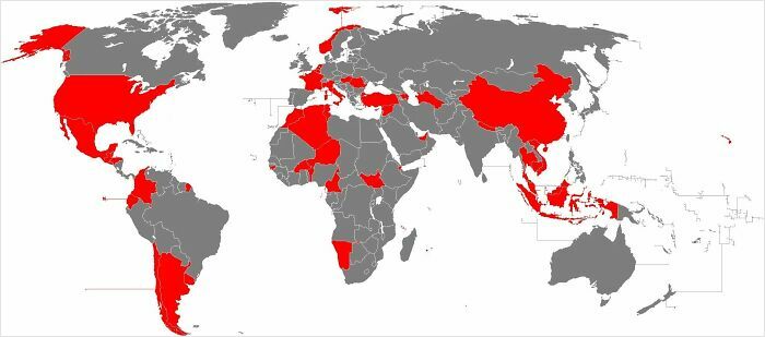
Image credits: Terrible Maps
#24 San Diego Looks Like A Flooded Melbourne

Image credits: Terrible Maps
‘Terrible Maps’ has become so popular that Howe even ended up publishing a book—‘Terrible Maps: The stupidly funny illustrated gift book perfect for geography lovers’—full of the most hilarious ones he’s crafted. According to the author, the book is a celebration of “pointless cartography in all its glory.”
Bored Panda has reached out to Howe via email to learn more about the entire project, and we’ll update the article as soon as we hear back from him.
#25 U.S. States, But With Some Letters Missing For Your Amusement
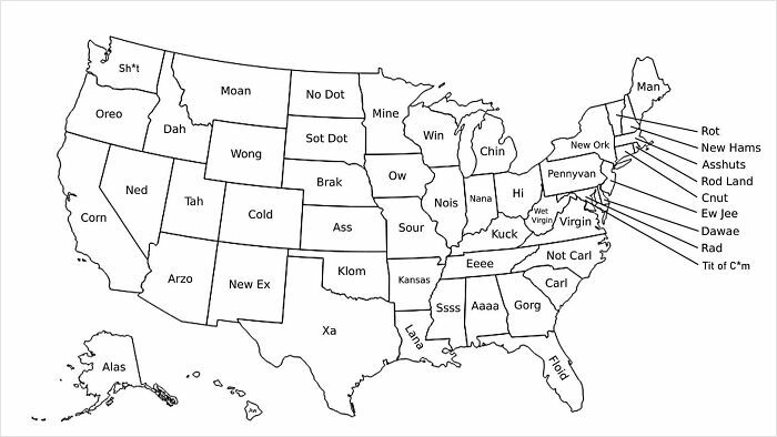
Image credits: Terrible Maps
#26 World Map Of Borders
Image credits: Terrible Maps
#27 2,066 Americans Were Asked To Locate Ukraine On A Map
Image credits: Terrible Maps
The ‘Terrible Maps’ project has seen incredible success over the years. For example, on Facebook alone, the project’s account has garnered 1.2 million followers and 882k likes.
Meanwhile, even more people follow its account on X (formerly Twitter): 1.7 million people from around the globe are fans of the page there. And on Instagram, a further 382k people follow ‘Terrible Maps.’
#28 Prisoners Per 100,000 People
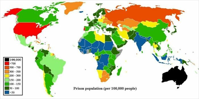
Image credits: Terrible Maps
#29 Countries Mentioned In The Bible vs. % Of Population Practising Christianity
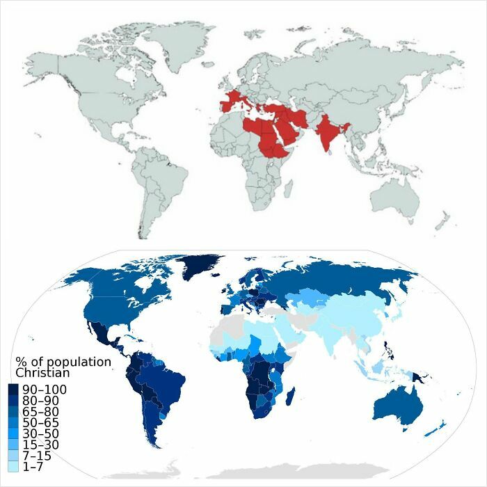
Image credits: Terrible Maps
#30 The Country Each European Nation Jokes About Most
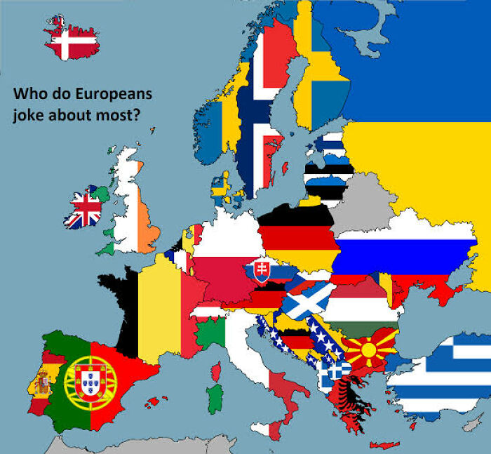
Image credits: Terrible Maps
What are your thoughts about ‘Terrible Maps,’ dear Pandas? Which of the maps that we’ve showcased here today amused you the most? Which ones did you find surprisingly informative, despite the witty ideas behind them?
On a scale of 1 to 10, how big of a cartography and geography fan would you say you are? We’d like to hear from you. Share your thoughts below!
#31 Eurovision: The Country Each Nation Received The Most Points From Over The Last 20 Year
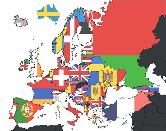
Image credits: Terrible Maps
#32 Map Of Countries That Lost Both World Wars
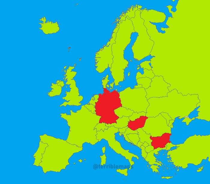
Image credits: Terrible Maps
#33 Nature Is Amazing. Here’s An Image Of The Carina Nebula From The James Webb Space Telescope — It Matches The Eastern Coast Of Algeria
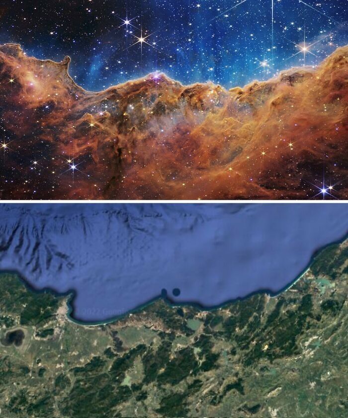
Image credits: Terrible Maps
#34 Map Of The Shrek Republic
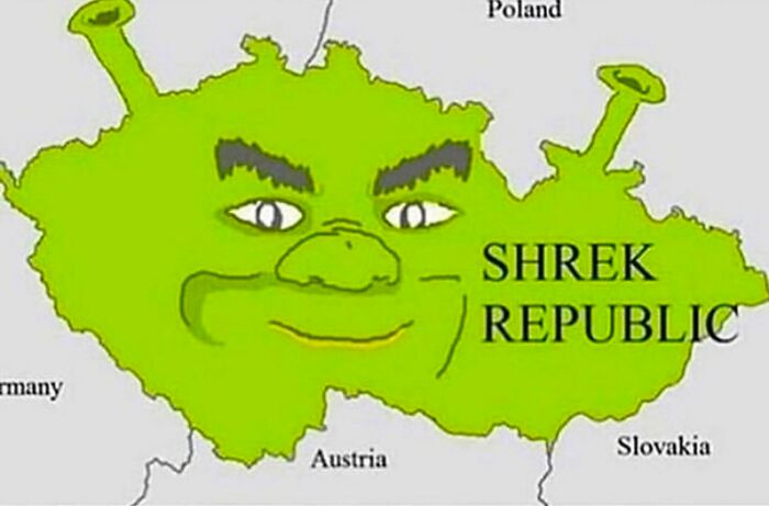
Image credits: Terrible Maps
#35 Europe If Sea Levels Went Up 100m
Image credits: Terrible Maps
#36 European Countries And Their National Animals
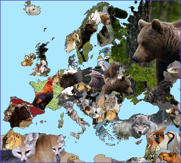
Image credits: Terrible Maps
#37 How Many Skyscrapers Are In Each Us State
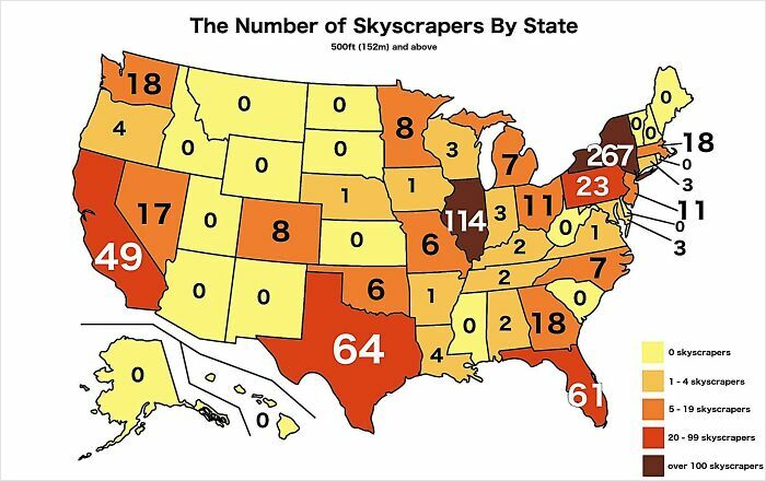
Image credits: Terrible Maps
#38 European Places With More Sheep Than People
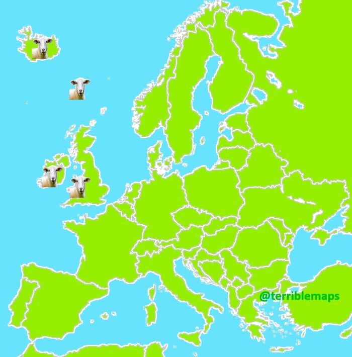
Image credits: Terrible Maps
#39 Average Size Of A Pizza
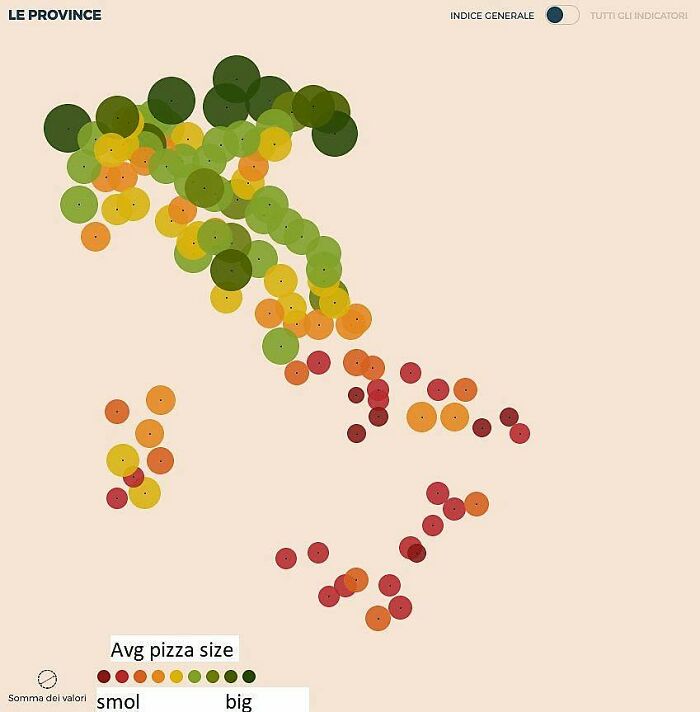
Image credits: Terrible Maps
#40 Map Showing The Hairiest Countries In The World
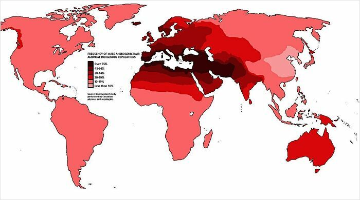
Image credits: Terrible Maps
#41 Dividing The World By Nearest Australian Capital City
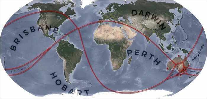
Image credits: Terrible Maps
#42 Believe It Or Not, Portugal Is Actually Smaller Than Spain
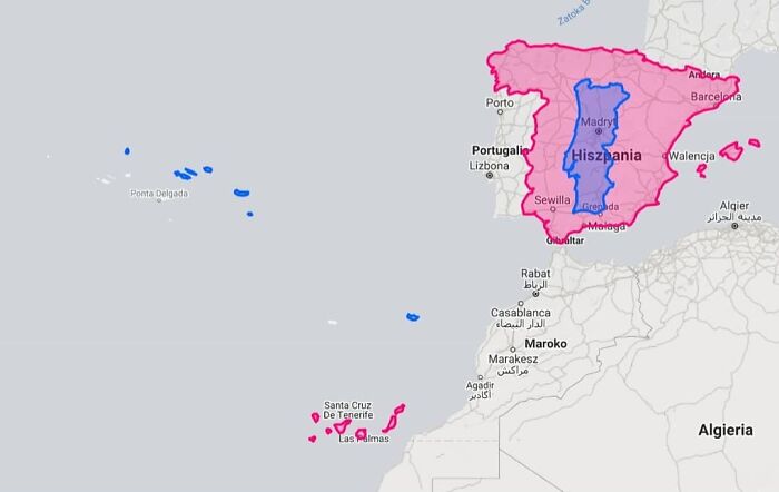
Image credits: Terrible Maps
#43 The Nearest Country To Each Portuguese Region
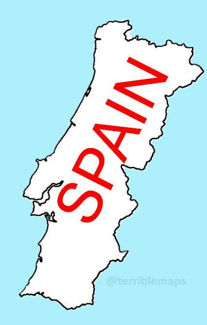
Image credits: Terrible Maps
#44 South Korea Takes The Idea Of Political Left vs. Right Very Seriously (2025 South Korean Presidential Election Results)
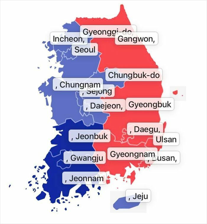
Image credits: Terrible Maps
#45 Mapping Spanish Stereotypes
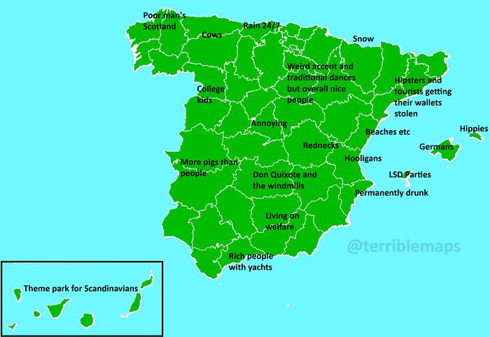
Image credits: Terrible Maps
#46 Road Trip, Anyone?
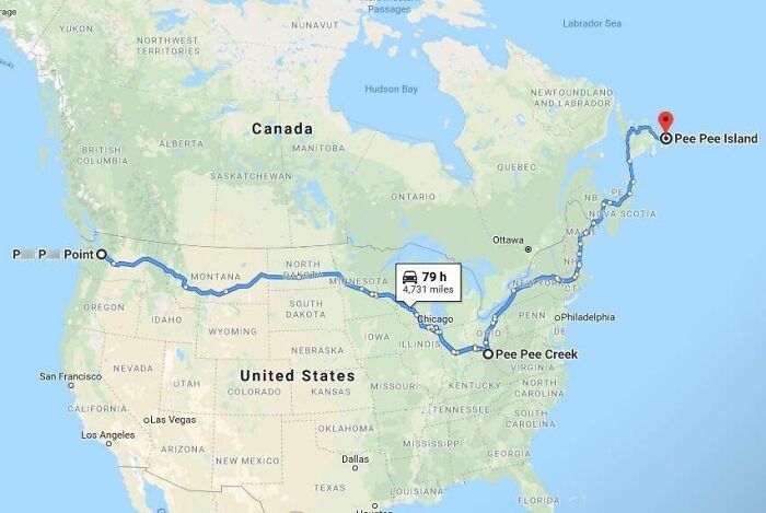
Image credits: Terrible Maps
#47 Public Toilets In The United Kingdom In 1540
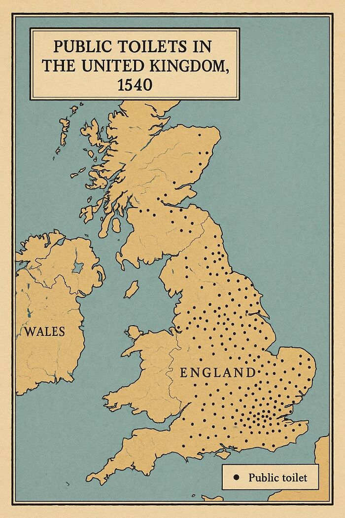
Image credits: Terrible Maps
#48 France Pizza Map
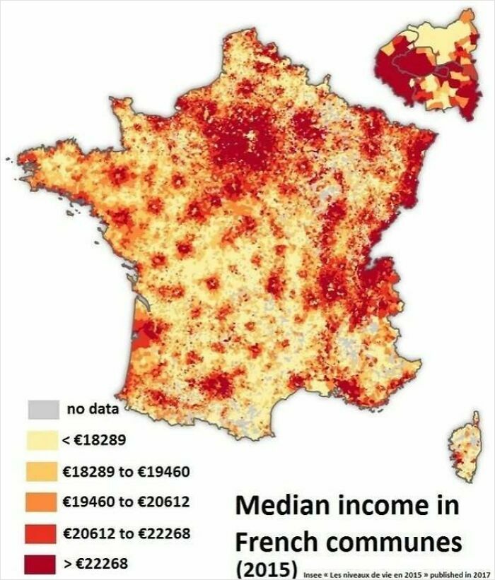
Image credits: Terrible Maps
#49 Europe’s Most Famous Composers
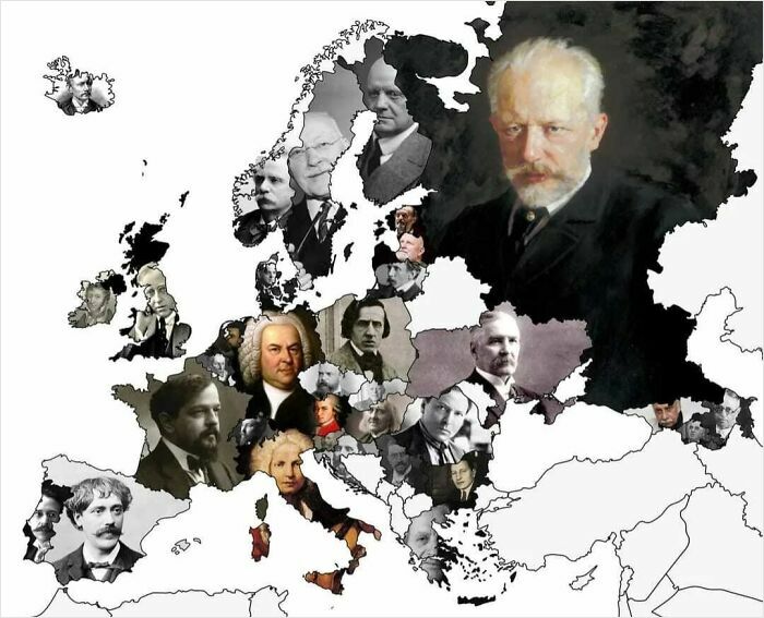
Image credits: Terrible Maps
#50 Interestingly, Egypt Is Smaller Than The United States, Russia, And China Combined
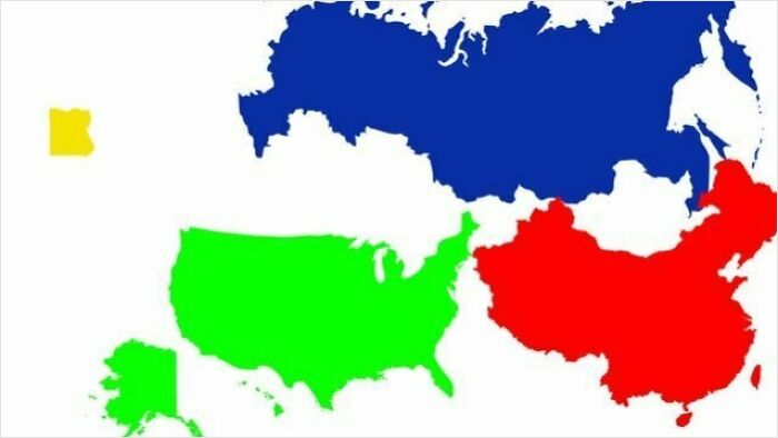
Image credits: Terrible Maps
from Bored Panda https://ift.tt/xck2vqy
via IFTTT source site : boredpanda