Visual clarity is underrated. The exact way you present vast quantities of data is more important than you might think. It’s the difference between your audience seeing what you intended and your message getting lost in the digital void.
‘Data Stuff Plus’ is a well-established account on Instagram whose curator shares intriguing charts, graphs, and maps that show you a different perspective of the world. Scroll down to check out some of the coolest, most entertaining, and educational pics!
Bored Panda reached out to Kyle Pastor, the founder of ‘Data Stuff Plus,’ to learn more about the project. You’ll find our full interview with him below. Meanwhile, don’t forget to take a peek at his work on Instagram, Medium, and Kaggle.
More info: Instagram | Medium | Kaggle
#1
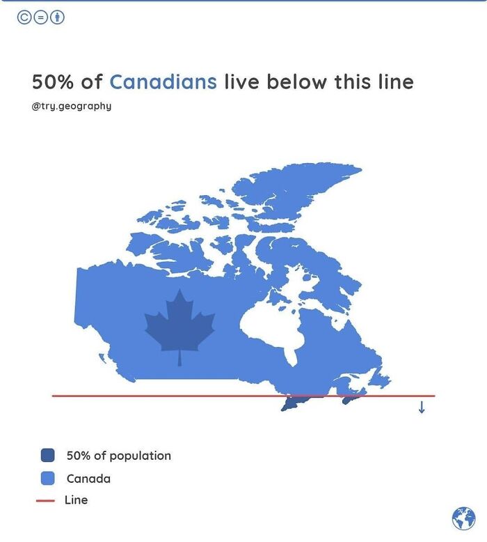
Image credits: datastuffplus
#2
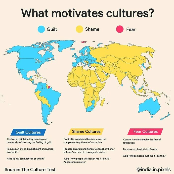
Image credits: datastuffplus
#3
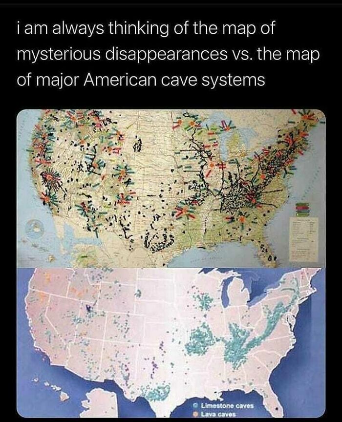
Image credits: datastuffplus
We were incredibly curious to hear about the origins of ‘Data Stuff Plus,’ so we asked Pastor about the inspiration behind his project. “Coding has always been a hobby for me, and generally I like to work on larger projects (websites, and tools etc.) but it is hard to stay motivated when the end product is far away and there is not a lot of feedback,” he told Bored Panda.
“I started to do mini projects to play with data and generate some of my own graphs and charts that I could share so that way I can at least get the sense of completion for a few things. The only downside is that I don’t have a ton of time to focus on it (work, kids, life) so I have been reposting interesting stuff I find for a lot of it,” Pastor said.
“To keep on it, I just sort of note anything interesting I find online when perusing and keep an ongoing list. That and it helps when random people find out it is my account and say they follow it! I’m like, damn, that’s crazy.”
#4
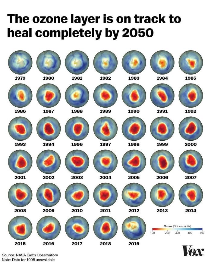
Image credits: datastuffplus
#5
Image credits: datastuffplus
#6
Image credits: datastuffplus
Bored Panda asked the founder of ‘Data Stuff Plus’ for his opinion about what lies at the core of truly good data representation.
“I think it has to be simple and visually engaging. Especially on Instagram and social media in general, people are not going to even stop if the chart doesn’t make them stop. That visual grab is the first thing needed to engage. Then, if the chart tells a succinct visual story I think it becomes engaging,” he explained.
“Anything too complicated I find people can’t/won’t make the time to really dig in. If there is more nuance to the data that requires a bigger investigation I like platforms like Medium.”
#7
Image credits: datastuffplus
#8
Image credits: datastuffplus
#9
Image credits: datastuffplus
Pastor also wanted to clear up a few details. He pointed out that ‘Data Stuff Plus’ had now mostly turned into a reposting account. “So, the majority of the things on there are now the work of others. I still think it is great to spread the word on interesting data, but I would much rather do my own stuff if I had more time,” he said.
“I have been posting more AI stuff recently and I get some pushback in the comments. The reason I am doing this is that AI is coming and progressing very fast and that people need to be exposed to it now when it is still discernible from reality. Almost like a way to train your eyes and mind to sniff it out while it is early enough.”
#10
Image credits: datastuffplus
#11
Image credits: datastuffplus
#12
Image credits: datastuffplus
Visual clarity is so, so important. Especially in this day and age when people’s attention spans are short and at a premium. So, the more clearly you present your data in a chart, graph, or map, the quicker and better your message gets across.
Typically, it’s a good approach to use fonts that are easy to read and contrasting colors that don’t get lost in the background. You want to create a user-friendly experience. In terms of the text itself, it should be edited down to the essentials where it’s short and snappy but fully encapsulates the main idea.
#13
Image credits: datastuffplus
#14
Image credits: datastuffplus
#15
Image credits: datastuffplus
According to one The Economist post on Medium, there are numerous ways to mess up when trying to visualize data. Probably the biggest mistake you can make is presenting your data in a misleading way.
For example, you might (accidentally) draw bars that don’t quite match up with the actual size of the numbers. Then, some bars might look bigger or smaller relative to other bars, even if the numerical difference isn’t as vast or narrow in reality.
#16
Image credits: datastuffplus
#17
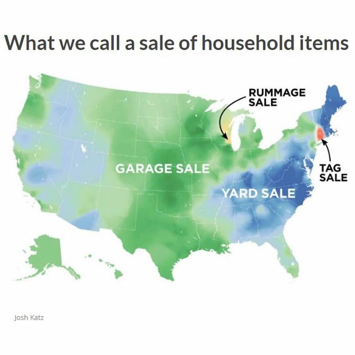
Image credits: datastuffplus
#18
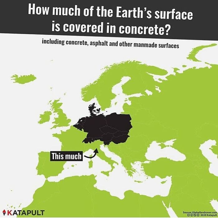
Image credits: datastuffplus
Or, as a chart maker, you might use specific colors to denote something without actually mentioning what it is that they mean, in the legend. Sure, it might be obvious to a lot of people. But not everyone will ‘get it.’ Stating the obvious is often an important part of making clean, clear, and communicative charts. You don’t, in fact, know what other people don’t know. So, it’s best to be thorough! Though, that being said, being overly detailed can lead to too much visual noise, too. Aim for a balance between the two, ideally.
Another way to mislead your audience is by using data scales and ranges that might make it seem like two factors are more closely correlated than they might actually be. For example, if two lines from two categories practically overlap on a chart, you might want to adjust the scale so that the data points are more visually distinct.
#19
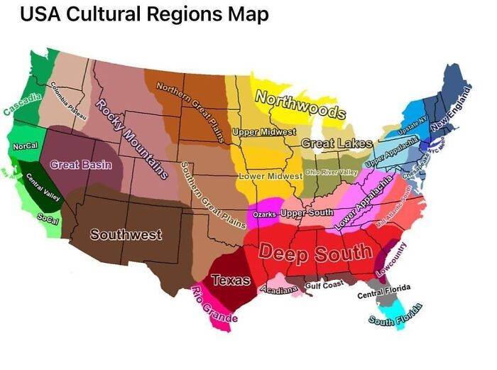
Image credits: datastuffplus
#20
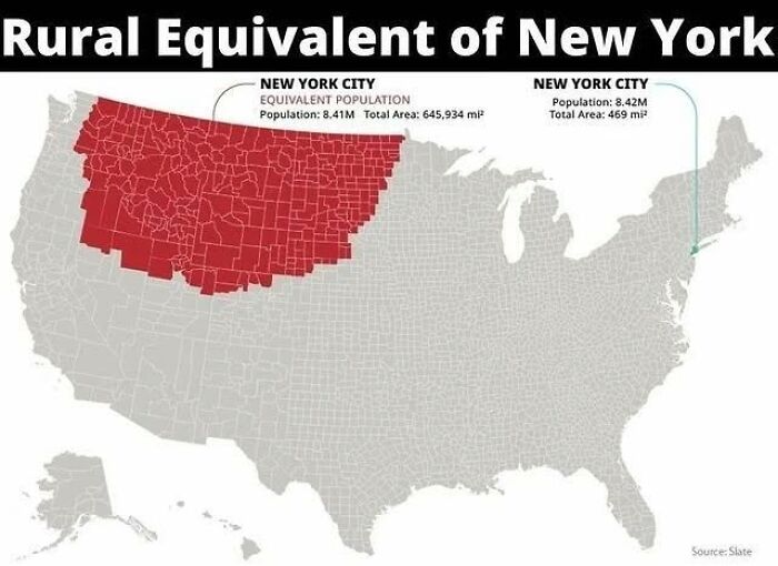
Image credits: datastuffplus
#21

Image credits: datastuffplus
It’s also important to think about the correct way to visualize your data. Some methods aren’t as helpful as others to allow your audience to see the results. If your chart looks visually messy, then the odds are that your audience will feel lost. On the flip side, the clearer you are in your presentation, the ‘friendlier’ you are toward your audience, and the easier your findings will connect with them. You could, for instance, use empty space strategically, for the sake of better clarity.
A good rule of thumb is to redesign charts that are simply too difficult to read. Less is often more. Maybe you’re referring to too many data points in the chart and there’s an over-abundance of information. You want to make it easy for your audience to follow along. If they feel like they have to do all the thinking for you, why bother making a chart in the first place instead of sharing the raw numbers?
#22
Image credits: datastuffplus
#23
Image credits: datastuffplus
#24
Image credits: datastuffplus
Charts shouldn’t conceal their point. “Charts like these are not misleading, nor are they very confusing. They merely fail to justify their existence — often because they have been visualized incorrectly or because we tried to cram too much in too little space.”
It’s also a bad idea to use too many colors. A change in color can often signify a change in category, according to The Economist. So, if this doesn’t happen, you shouldn’t be adding too many hues to your chart.
#25
Image credits: datastuffplus
#26
Image credits: datastuffplus
#27
Image credits: datastuffplus
The Canada-based ‘Data Stuff Plus’ account is practically ancient. It was initially created in the autumn of 2017 (which now feels like almost a few decades ago). Over the years, the account has drawn in over 66k followers. According to the curator of the account, Pastor, he focuses on sharing interesting data and sometimes he finds the time to make his own charts as well.
#28
Image credits: datastuffplus
#29
Image credits: datastuffplus
#30
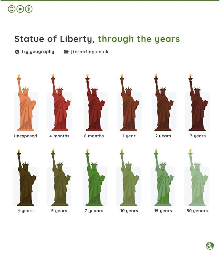
Image credits: datastuffplus
What do you think about all of these maps and charts, dear Pandas? Which ones did you personally find to be the most educational? Which ones do you feel presented the data in the clearest and also most aesthetic way possible? Were there any charts that made you want to dig deeper into the topic?
What’s the best map you’ve ever seen? You can share your thoughts in the comments section at the very bottom of this list.
#31
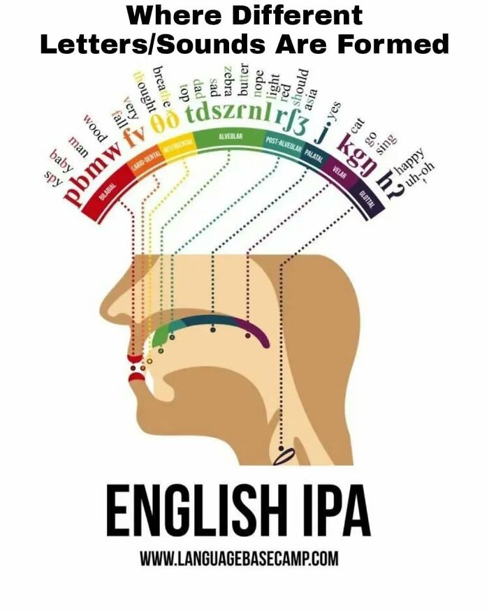
Image credits: datastuffplus
#32
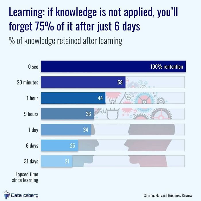
Image credits: datastuffplus
#33
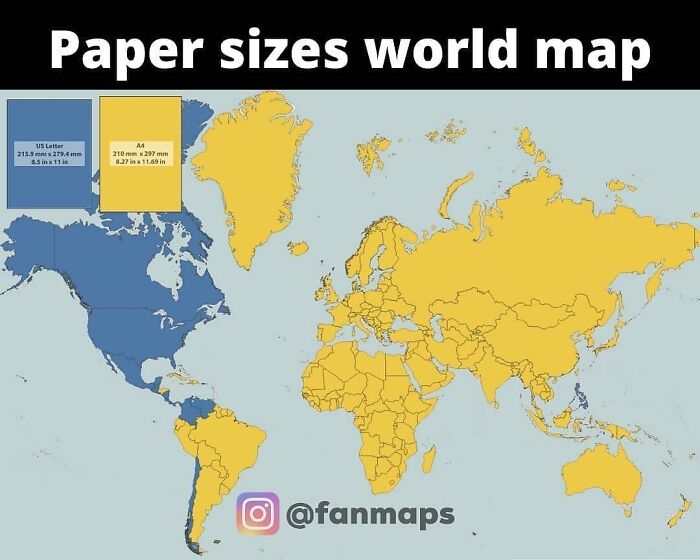
Image credits: datastuffplus
#34
Image credits: datastuffplus
#35
Image credits: datastuffplus
#36
Image credits: datastuffplus
#37
Image credits: datastuffplus
#38
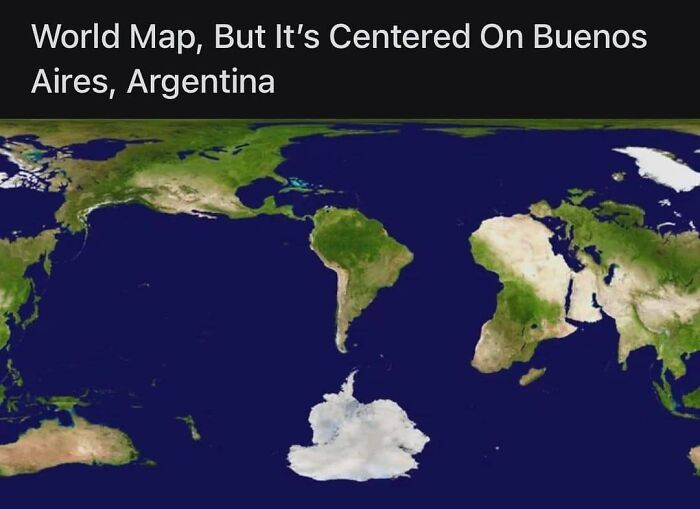
Image credits: datastuffplus
#39
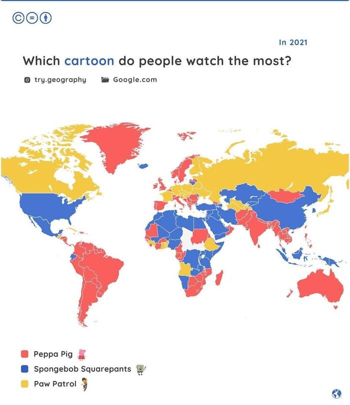
Image credits: datastuffplus
#40
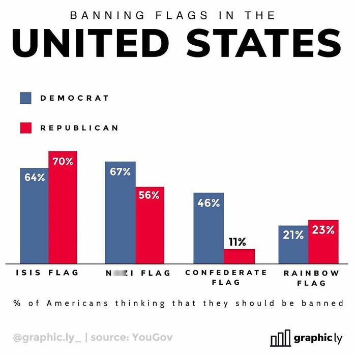
Image credits: datastuffplus
#41
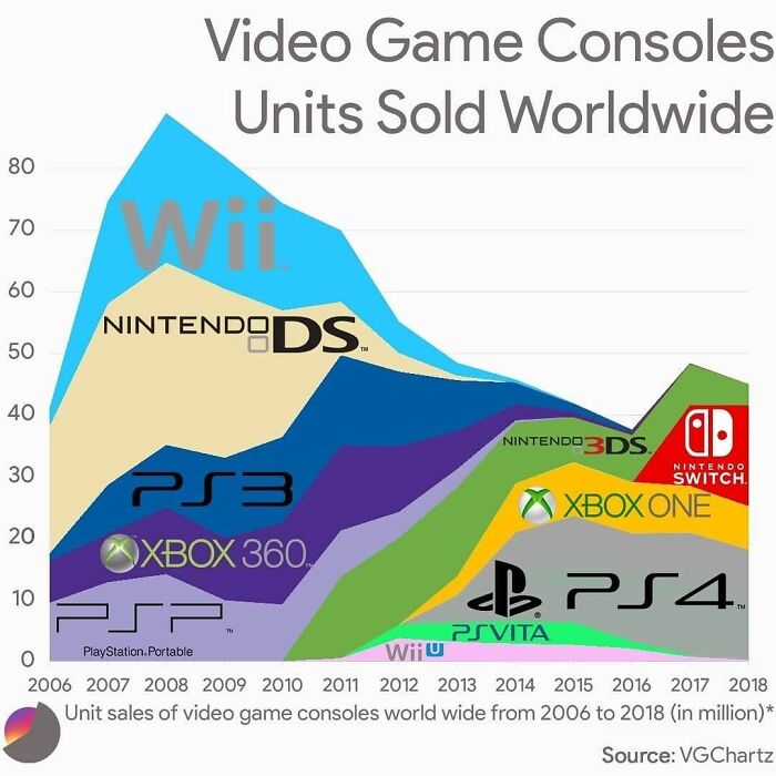
Image credits: datastuffplus
#42
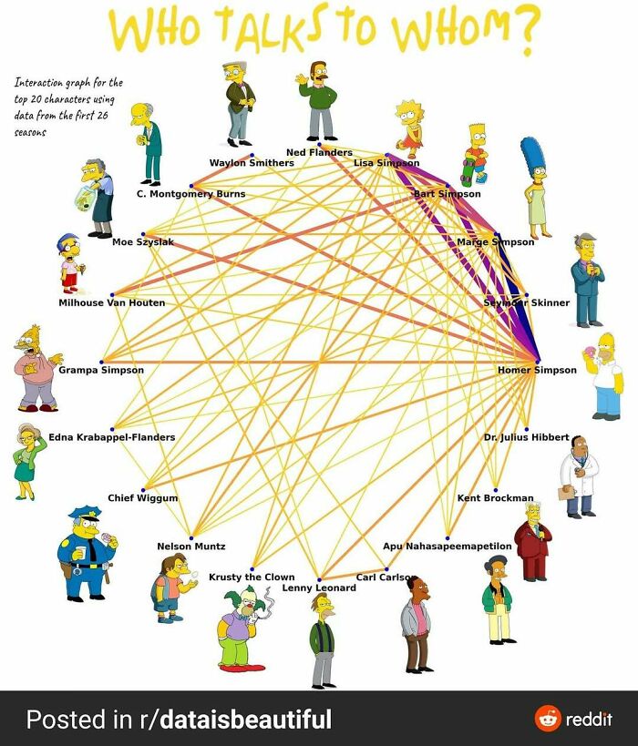
Image credits: datastuffplus
#43
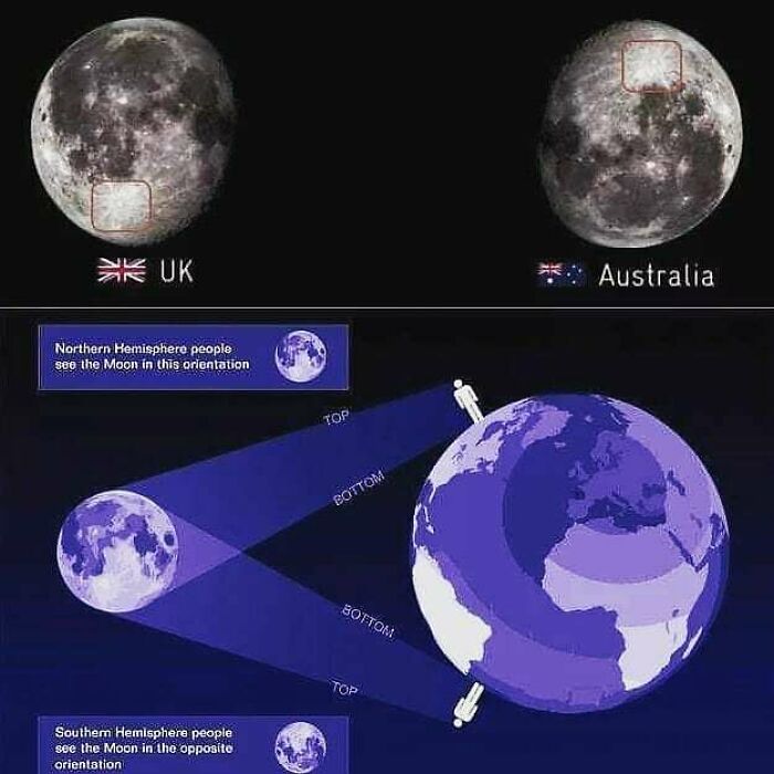
Image credits: datastuffplus
#44
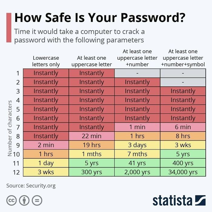
Image credits: datastuffplus
#45

Image credits: datastuffplus
#46

Image credits: datastuffplus
#47

Image credits: datastuffplus
#48
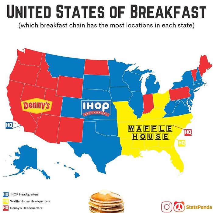
Image credits: datastuffplus
#49
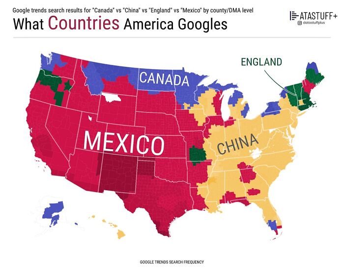
Image credits: datastuffplus
#50
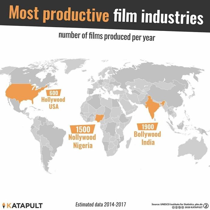
Image credits: datastuffplus
#51
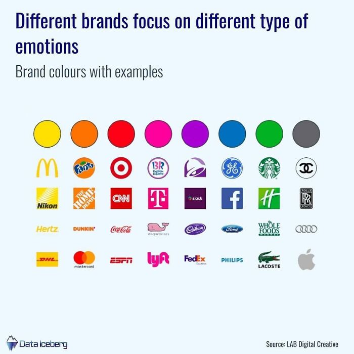
Image credits: datastuffplus
#52
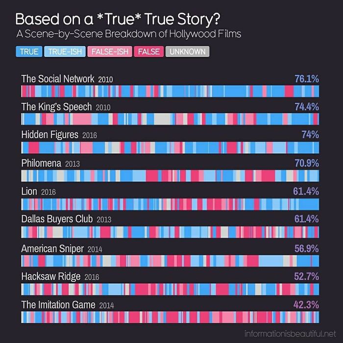
Image credits: datastuffplus
#53
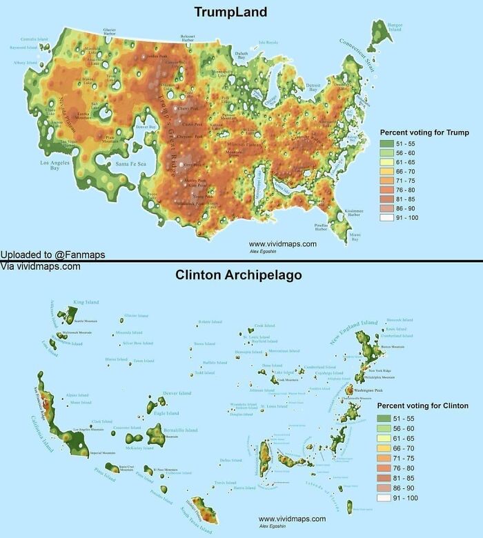
Image credits: datastuffplus
#54
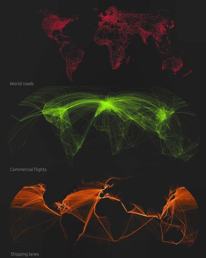
Image credits: datastuffplus
#55
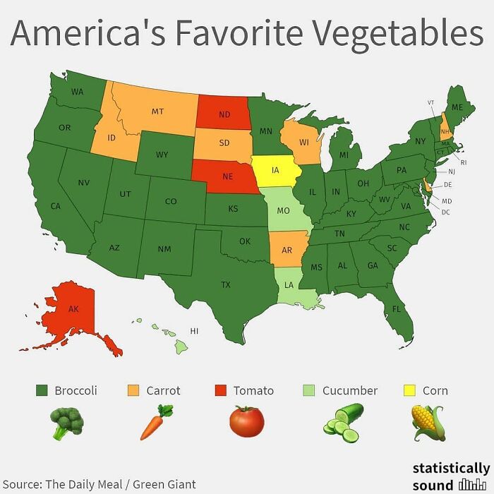
Image credits: datastuffplus
#56
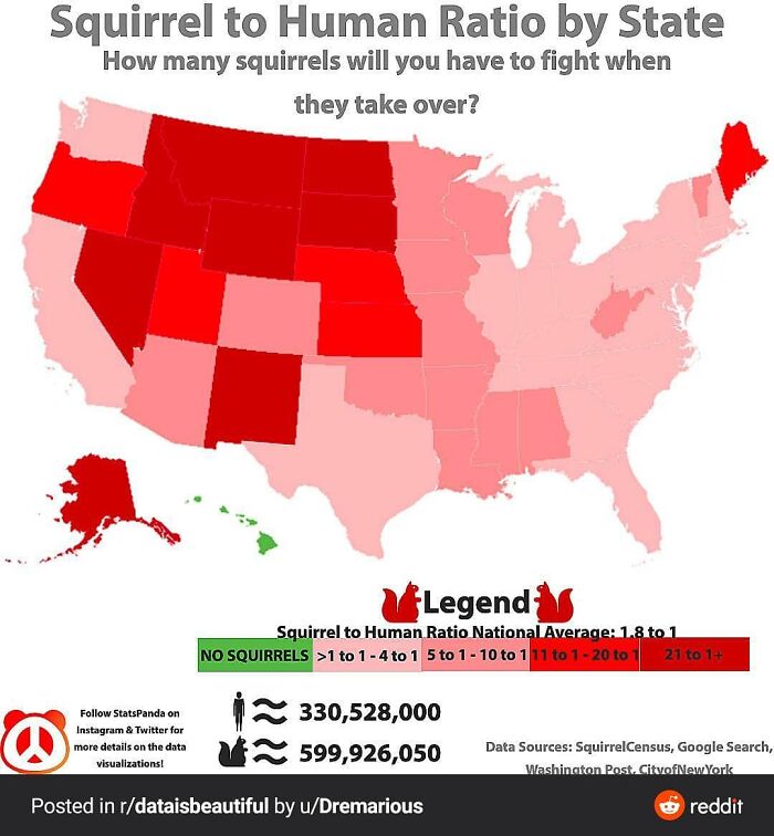
Image credits: datastuffplus
#57
Image credits: datastuffplus
#58
Image credits: datastuffplus
#59
Image credits: datastuffplus
#60
Image credits: datastuffplus
#61
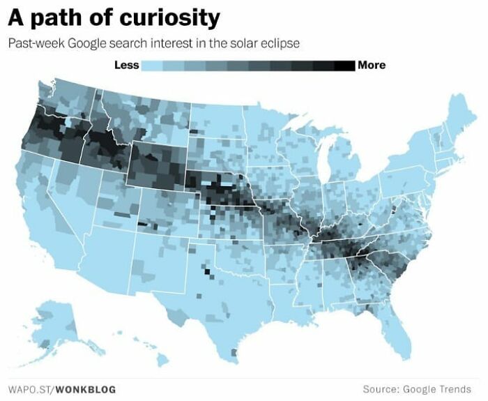
Image credits: datastuffplus
#62
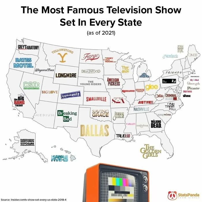
Image credits: datastuffplus
#63

Image credits: datastuffplus
#64
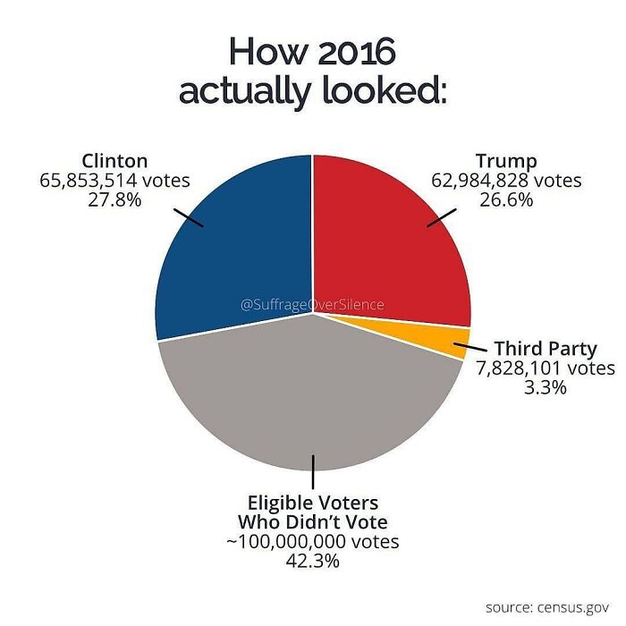
Image credits: datastuffplus
#65
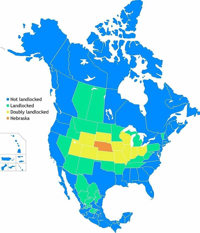
Image credits: datastuffplus
#66
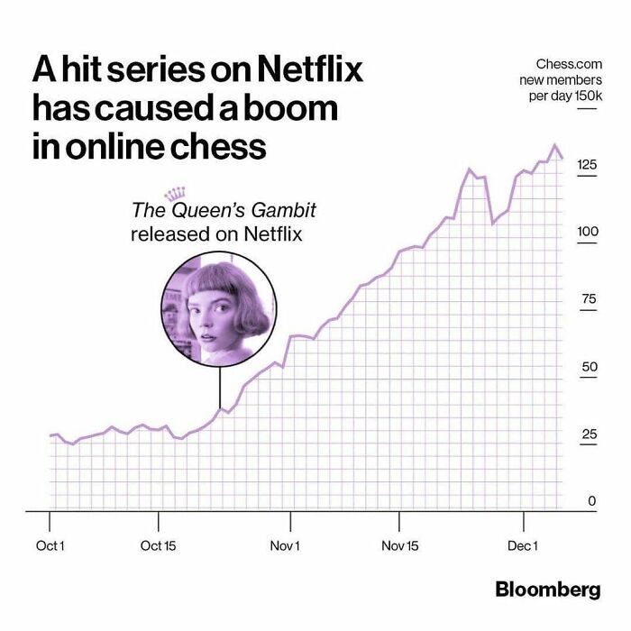
Image credits: datastuffplus
#67
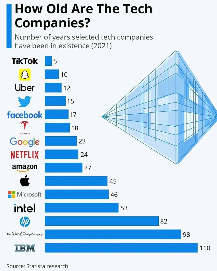
Image credits: datastuffplus
#68
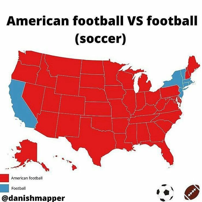
Image credits: datastuffplus
#69
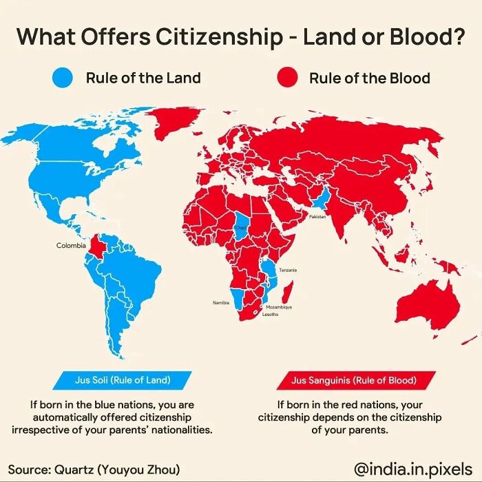
Image credits: datastuffplus
#70
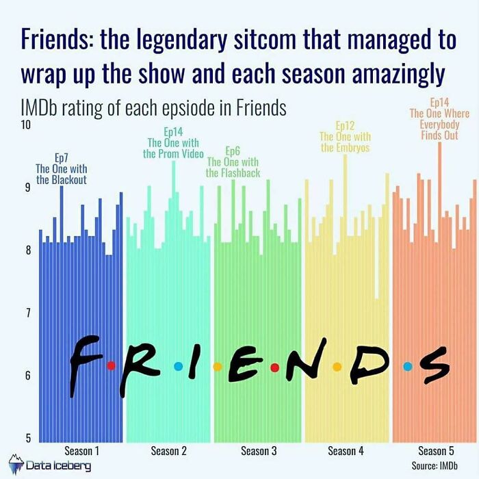
Image credits: datastuffplus
#71
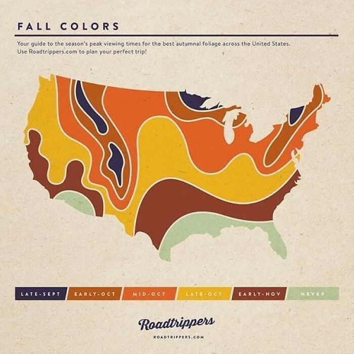
Image credits: datastuffplus
#72
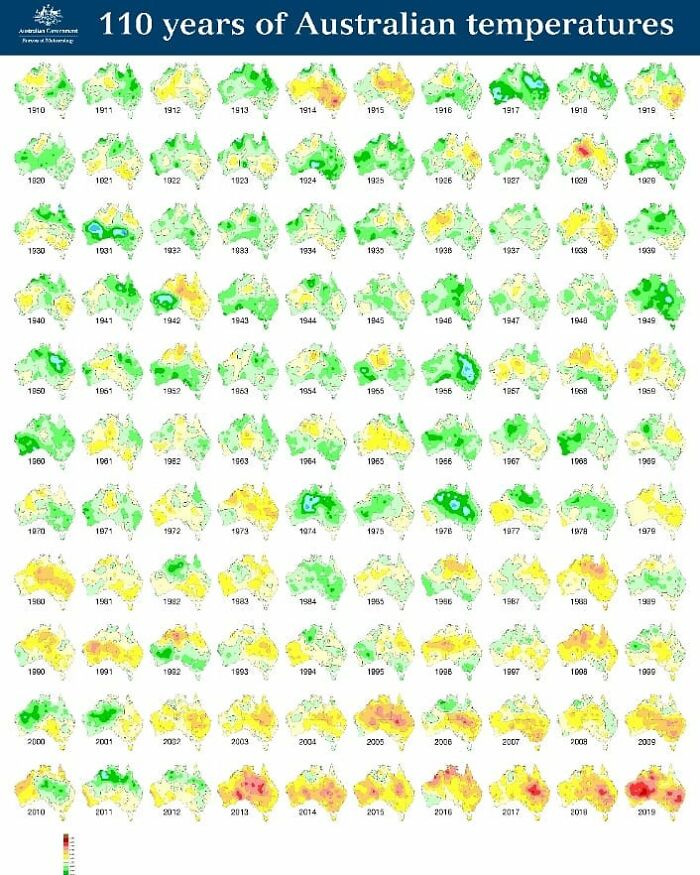
Image credits: datastuffplus
#73
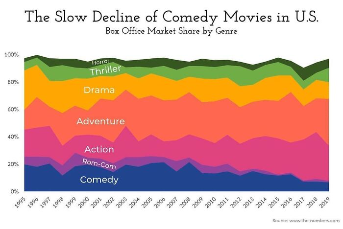
Image credits: datastuffplus
#74
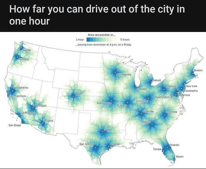
Image credits: datastuffplus
#75
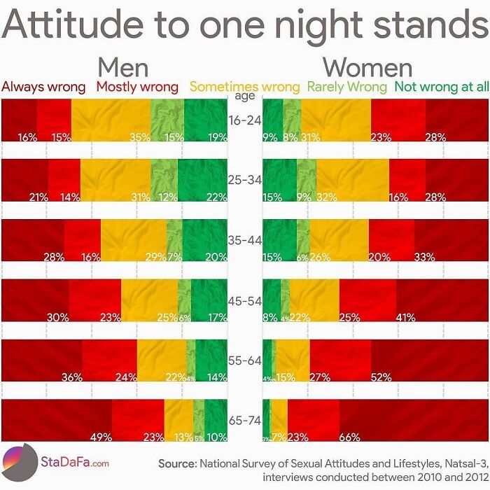
Image credits: datastuffplus
#76
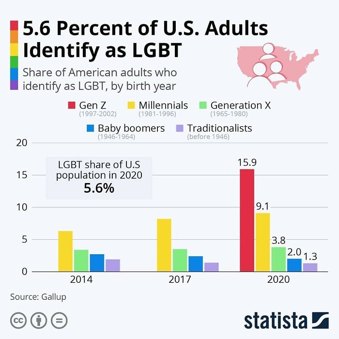
Image credits: datastuffplus
#77
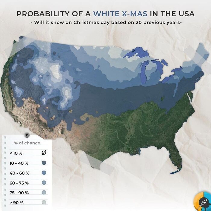
Image credits: datastuffplus
#78
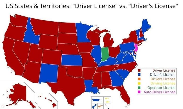
Image credits: datastuffplus
#79
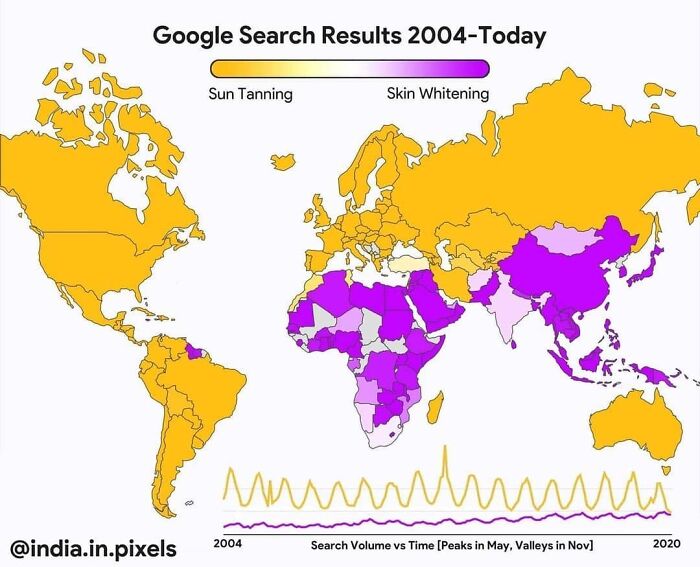
Image credits: datastuffplus
#80
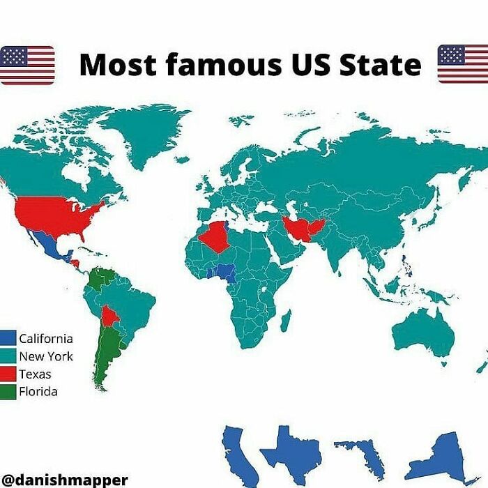
Image credits: datastuffplus
from Bored Panda https://ift.tt/W3Q8OTF
via IFTTT source site : boredpanda