Interiors have trends, much like our wardrobes. So if you wouldn’t leave your house wearing JNCO jeans, leg warmers or pedal pushers (I didn’t just make that word up!), you shouldn’t decorate your house with outdated designs either.
And if your inner interior design is in a deep winter sleep and you’re about to do a renovation, this thread from the Real Estate subreddit may be a real savior. “What current aesthetic trends do you think will age poorly?” the question popped up in the community and the responses started rolling in with bad, worse and the worst interior trends that should be canceled.
From any decor that says live, laugh, love to sliding barn doors, here are some of the most questionable interior details that, chances are, may not age that gracefully. Scroll down through the post below and share what design trend would totally ruin even the best interior for you!
#1
Anything that says Live. Laugh. Love.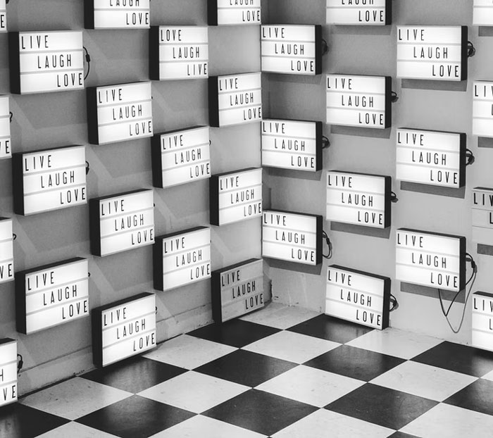
Image credits: theartofgettingup
#2
Word signs. Yes, we know you “eat” in the kitchen.
Image credits: pixiestardust8
#3
Flipper grey everything.
Image credits: Veeg-Tard
#4
Barn doors and farmhouse sinks, unless the house is actually on acreage/a farm.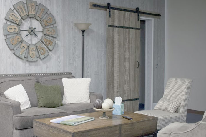
Image credits: snowgrrll
#5
Kitchens that are floor to ceiling subway tile (and all it’s derivative tiles) on all walls. It resembles a rest stop bathroom and will start to feel as dated as taupe walls in a McMansion do now.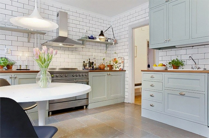
Image credits: effesstorm
#6
Brass faucets and other brass accents. It’s part of that disgusting 80s retro look that has become popular along with hunter Green and mustard yellow colors. Stop it. It was gross back then, it looks no batter now in the 2020s.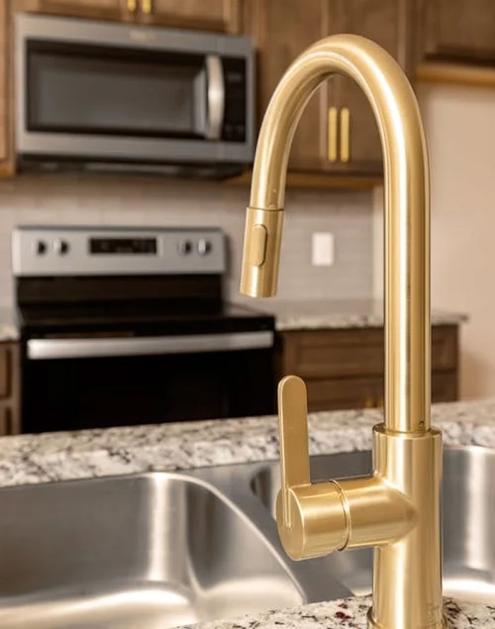
Image credits: s_0_s_z
#7
Linear mosaic. Oh god it’s f*****g ugly and there was a period where everyone was asking for it. I straight up tell our clients not to do it. It’s going to look like s**t in 10 years. It looks like s**t now but it will be so obviously dated.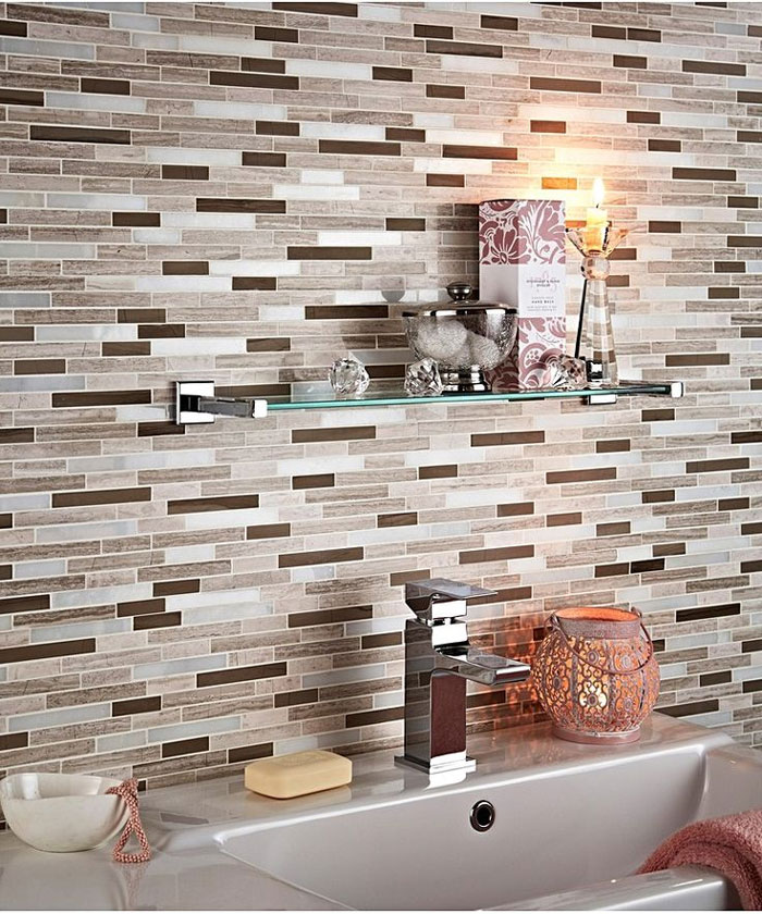
Image credits: SunglassesBright
#8
Paint everything that’s old white.
Image credits: giggles-mcgee
#9
The Moroccan tile everywhere. It fits in some houses, but it’s being put everywhere right now. I think it’s not going to age well except in houses where it’s aligned with the rest of the architecture.
#10
Painted brick, if you didn’t want to look at it, render or stucco it, or if you want to see the out line of the brick, bag it. Painting is a quick and not well thought process of restoring brickwork.
#11
Those accent walls with the abstract diagonal lines. Will age like popcorn ceilings and wood paneling on walls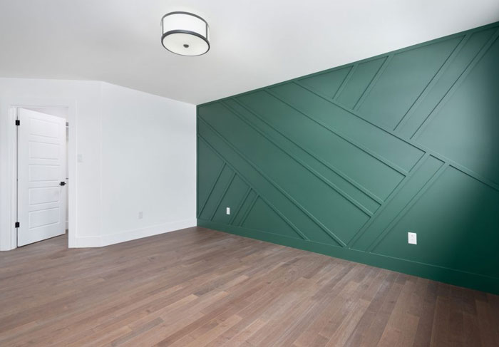
Image credits: blacksystembbq
#12
Vinyl signs and labels on everything. Everyone and their mother has a damn Cricut and those stupid vinyl cutouts are on everything at my school. Am teacher. It looks super trashy!
#13
Wallpaper with bold prints. It goes in and out of fashion and has for decades. I think it can be super cute but don’t kid yourself that your big floral with the toucans is going to be timeless in some way.
Encaustic tile is having a moment but it’s too much of a pattern to have real staying power and will be the Tuscan kitchen of the 2020s. I think huge giant tile will also go off trend, not because I dislike it but just because it’s a particular look and looks cycle out.
I really hate the houses that look like someone started with a Tuffshed and then took a bunch of Sketchup shapes and just mashed them together on the facade.
Adding brick facing on the front of the house but using vinyl siding on the sides. Like, if you’re going to use fake brick, at least make it convincing.
#14
Vessel sinks, they’re an impractical use of space and always make me feel like I’m at a restaurant that probably still serves molten lava cake.
#15
Black painted houses. Annoying as f**k to upkeep.
#16
Open layouts make the house appear bigger, but I can’t get over how much it makes a house echo. When you have more than a few people in the space it’s impossible to have much privacy.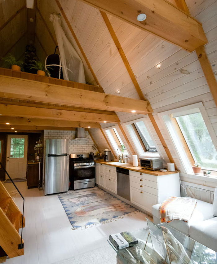
Image credits: PompousPun
#17
Pallet wood. You have no idea what the hell soaked into those things during their lifetime/transport.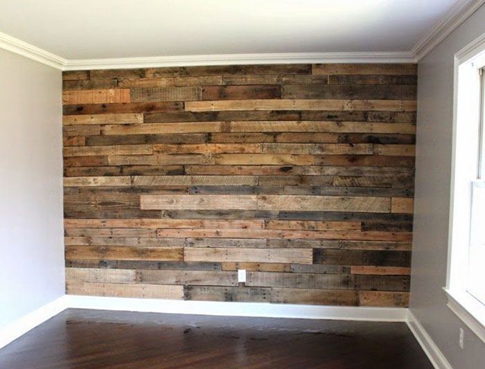
Image credits: butteryspoink
#18
Greige, live edge pieces, LED strip lighting everywhere.
#19
it’s not current but it definitely was an aesthetic trend that aged poorly—cow print, painting cow print on walls, doors, or any surface for that matter.
#20
Artificial olive trees.
#21
Painting walls like it’s a canvas instead of a solid color.
#22
Hunter green cabinetry & gold faucets and hardware.
#23
Painting everything bright white with an assortment of cheap black trinkets as decor. I hate modern farmhouse, and I hate painting over wood.
#24
Chonky microwave hood combos.
#25
20-foot ceiling living rooms on 2-story homes. What a waste of space for a great extra room on the 2nd floor. Ceilings can max out at 10 feet and still feel high.
#26
Fake hardwood flooring will be the avocado shag carpet of our time.
#27
Gold faucets, gold knobs on kitchen appliances, gold light fixtures, etc.
We tried this back 50 years ago and we agreed since that it sucked.
#28
Wet rooms. I don’t want my bathtub in my shower, thank you.
#29
All white kitchens. White cabinets, white quartz countertops, etc. Looks great in magazines but if you’re actually cooking meals most of the week, it has to be a nightmare to keep everything sparkling clean.
#30
Marble countertops, literally. Not marble-look, but actual marble. People need to be ok with the kind of wear that occurs on marble and I think most people are not. Marble in a kitchen is especially going to quickly accumulate stains and etching.
#31
Brown granite countertops with white appliances.
#32
the McMansion.
* way too many roof lines and roof planes. high-pitched roofs where the whole house looks like roof.
* none of the windows are the same size or style.
* 5 different siding types. brick, stucco, faux stone, and vinyl, on the same house!
* the oversized entryway that dwarfs the front door itself.
* no trees, a huge yard which somehow doesn’t provide any privacy because it’s just a turf covered hellscape with nothing to block the view of the next McMansion.
#33
Anything manufactured to look like it was worn out, damaged, and re-purposed creatively.
#34
—The New Construction Home… a bunch of random styles mashed together cheaply, usually some sort of gray with brown, a cheap looking garage plopped in front, and lots of open space inside, few walls
—The Flipper Special, dystopian gray s**t everywhere, arguably tied with the above for the title of World’s Tackiest
—The super bright white with some black and silver “could work as a background for THX-1138” interior
—Houses that look beautiful in the front but are just a gray vinyl blob in the back
—Abstract “modern” homes with tons of glass and right angles. Actually probably not, most people seem to love this sort of house and they’re usually really expensive, but I think they look like s**t
#35
Cottagecore
#36
Doors that pop with color.
#37
Gray vinyl flooring. Wood isn’t gray. Stop pretending it is.
#38
Shiplap. It’s literally just wood paneling but in white. I can’t stand it!
#39
These drawer/cabinet pulls. They’re literally everywhere and wildly overused. In ten years it’ll be impossible to give them away, especially in oil rubbed bronze color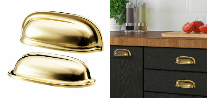
Image credits: notreallylucy
#40
I don’t know if this is everywhere but where I live the new trend in kitchens is to have the whole kitchen on one wall with a long island in front of it. No other walls in the kitchen because on one side is the dinning area and the other side is the living area. It’s too open and to make things worse you get maybe 2 upper cabinets and maybe 3 lower cabinets because the appliances and sink take up most of the space. I can see where people might think it looks nice but it’s completely not functional and gives such a small amount of storage.
#41
Open shelves in the kitchen.
#42
Who thought pairing granite countertops with busy tile backsplashes was a good idea? Cant they see how they often clash? And what is with the distressed-look cabinet doors? In 30 years it will look like our generation never cleaned and had dust and gunk on our cabinets!
#43
All these b******t minimalism facades that was made for Instagram. I hate it. It looks like a mindfulness guru took an architecture class.
The buildings lack character and I can’t distinguish neighborhoods from each other.
Every city also is now sort of looking the same because of this.
#44
I ban any decorations with words on it, no matter how cute it is.
#45
“Farmhouse” light fixtures where it’s an empty square or rectangle frame around a bulb.
#46
No eaves. In our rainy climate the siding stays permanently damp. You get mildew growing in the first year, moss by year five. I imagine by 8 or ten the mushrooms start popping out.
#47
The tired blue cabinet / gold hardware fever for kitchens and bathrooms.
#48
Rustic ladder shelves and bookcases.
#49
All those skinny, multi colored tiles in black, blue, gray, white, etc. I’m not describing it very well but they’re everywhere now and the business makes me wanna vomit.
#50
White farmhouse exterior with black windows – WAY overdone, which means people will get sick of it, and it will look dated in 5 years.
#51
Kitchen sink in the corner.
#52
As much as I understand the need for cheaper alternative housing, I believe “tiny homes” will be viewed for what they are: mobile homes. They’re nothing revolutionary. Also, so many of them are absolute fire death traps. Loft bedrooms with no means of egress.
#53
Ugly modern urban apartment exterior where everything is multiple colors/boxes/textures and the inside looks sad and basic.
I realize not everyone loves more period feeling houses, but god, at least Victorians and the like were INTERESTING. The current housing trend is like vanilla ice cream… no attitude, no flavor, and it looks like every other house out there.
And that’s insulting to vanilla ice cream, frankly.
#54
Corrugated metal siding. It’s everywhere here in Alaska and it’s ugly as s**t imo.
from Bored Panda https://ift.tt/F8eEhN4
via IFTTT source site : boredpanda