When most of us think about the word “data” our eyes glaze over as a million Excel cells appear in our minds, putting us to sleep. So clever folks out there rolled up their sleeves and got to work, making visual depictions of data that help us better understand the world.
This online group shares various cool and interesting maps that help put all sorts of facts and figures into context. So get comfortable, prepare to brush up on some geography, and get to scrolling. Be sure to upvote your favorite posts and share your thoughts and observations in the comments section below.
#1 Percentage Of Population (25-64yrs) In Europe That Cant Speak Any Foreign Language
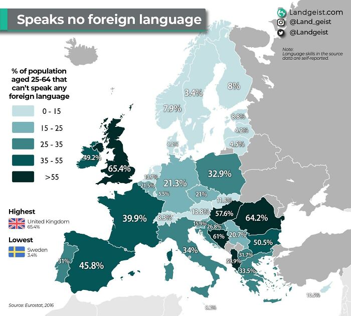
Image credits: MardukSyria
#2 Time Needed To Earn 1€ Million Earning On Average Wage
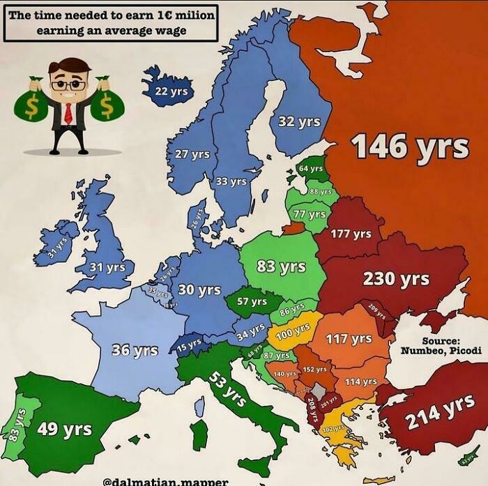
Image credits: karinasnooodles_
#3 Average Money Spent On Weddings In Us States
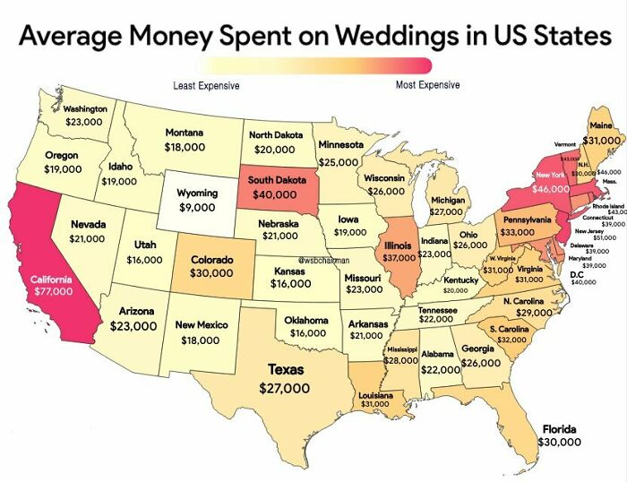
Image credits: Starry_Night0123
If you have ever taken a casual look at an average map of the world, you have no doubt been struck by the sheer size of Russia and, to a lesser extent, Canada. This does make sense, as these are the largest countries on the planet, however, did you know that a little feature of mapmaking called Mercator projection makes them look significantly larger than they really are?
This comes from the Flemish geographer and cartographer Gerardus Mercator, who created a “cylindrical” map to represent the world in 1569. After all, unless you are looking at a globe, most maps are drawn, painted, or printed on a rectangular surface. Imagine the tube-like maps pirates are always dragging around and you have a pretty good depiction of an early Mercator map.
#4 How Many % Of People Would Not Want To Live Next Door To Lgbt People?
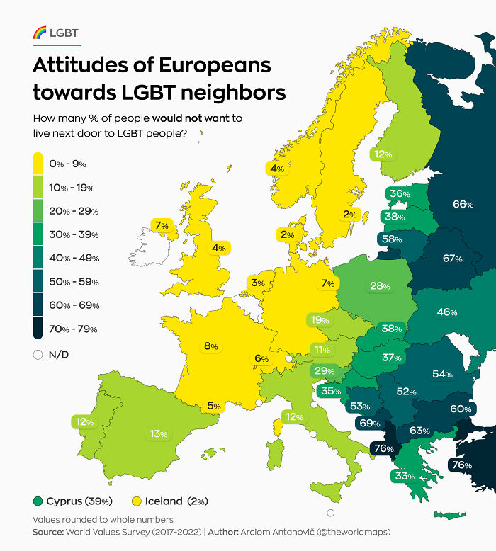
Image credits: theworldmaps
#5 U.S. States That Have Banned The Most Books (In Autumn 2022)
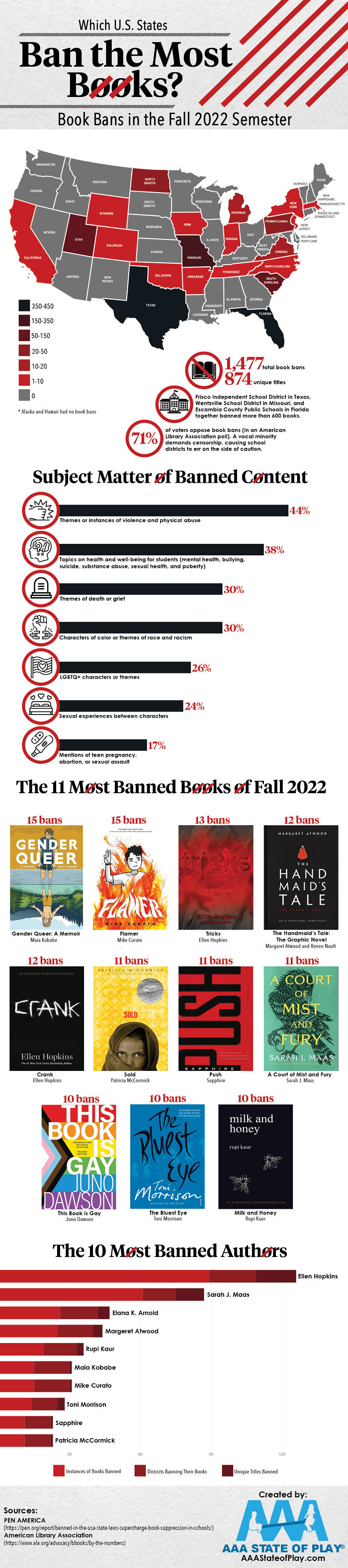
Image credits: GaffersB
#6 Europe’s National Animals
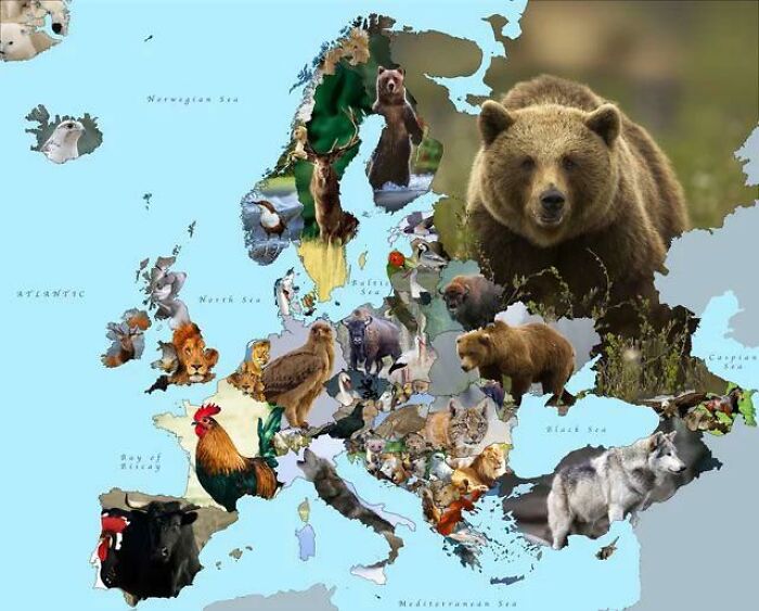
Image credits: cloudtdaz
After all, the real landmasses on the planet, which are spherical, don’t translate 1-to-1 on a rectangular map. Certain sections end up stretched and, as a result, appear to be a lot larger than they actually are. Mercator chose to “focus” the map on the northern hemisphere, where locations closer to the “top” of the map would end up seeming larger. Hence Russia and Canada being absolutely gigantic on so many maps.
#7 The Literal Meaning Of Every Country’s Name In Africa
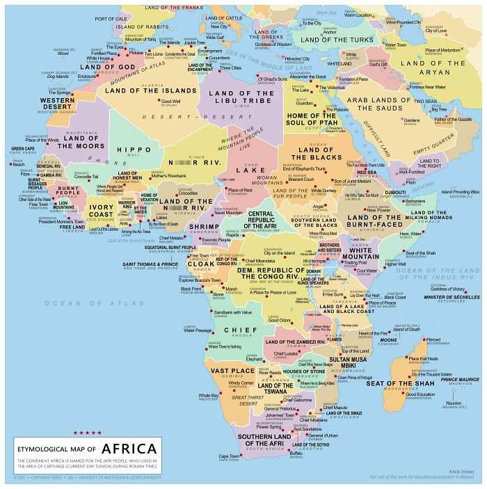
Image credits: Homesanto
#8 Endings Of Places In Poland
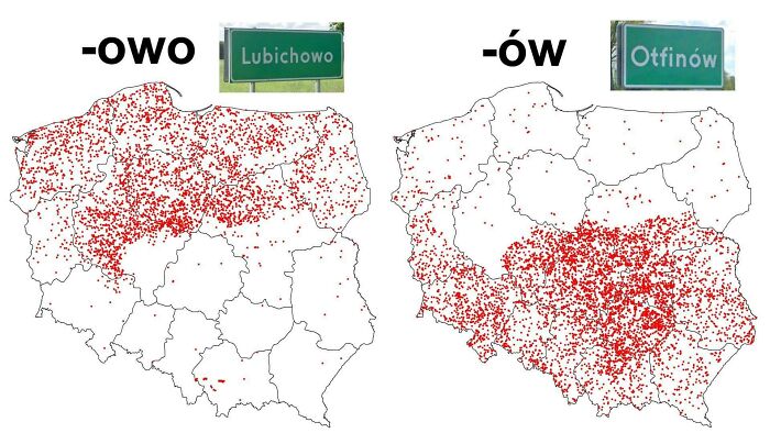
Image credits: DaveBensonPhilips
#9 Roman Coin Hoards, From The ‘Coinage In The Roman Empire’ Project — ‘Hoards Containing Coinage In Use In The Roman Empire Between 30 B.c. And A.d. 400.’
Image credits: idonotknowtodo
In fact, at the time, these maps were specifically created to aid in marine navigation. While it’s quite irrelevant to us, early seafarers could use a Mercator map to get a “straight” bearing when sailing to a new location. On a map that doesn’t use Mercator projection, the bearing would be a curve, representing the curve of the globe.
#10 Belief In Life After Death In Europe
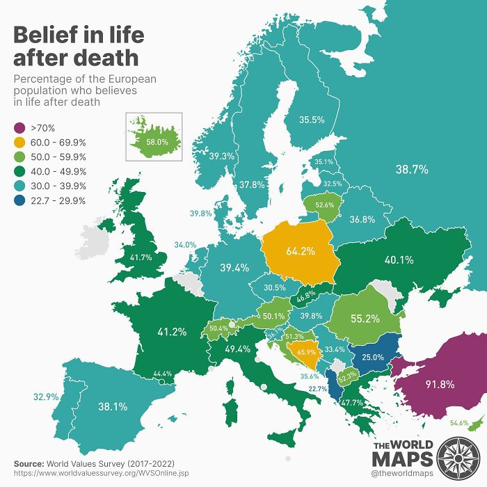
Image credits: cloudtdaz
#11 What’s The Most Popular Sport In Each Country?
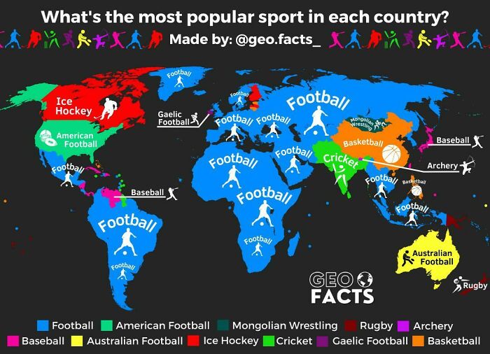
Image credits: geographyfacts
#12 Population Change In Europe And Arab World
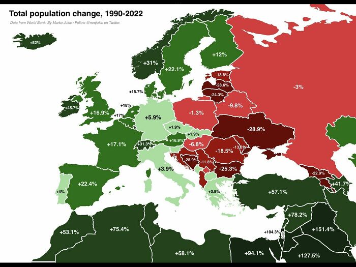
Image credits: Money_Astronaut9789
This sort of map has simply stuck around for hundreds of years, leading many people to draw somewhat incorrect conclusions about the real size of things. We are lucky that Russia and Canada really are the two largest countries, so the distortions don’t seem as bad. Other examples of distortion are the similarity between the UK and Madagascar, despite the latter being nearly twice as large.
#13 Us States By Violent Crime Rate
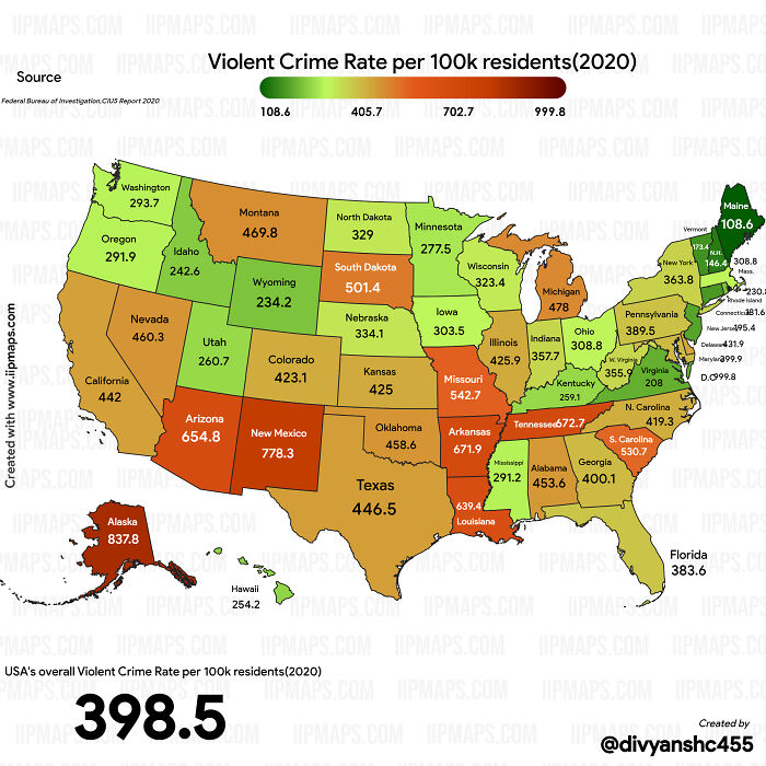
Image credits: Specific_Ad_685
#14 Most Wasteful Countries In The World
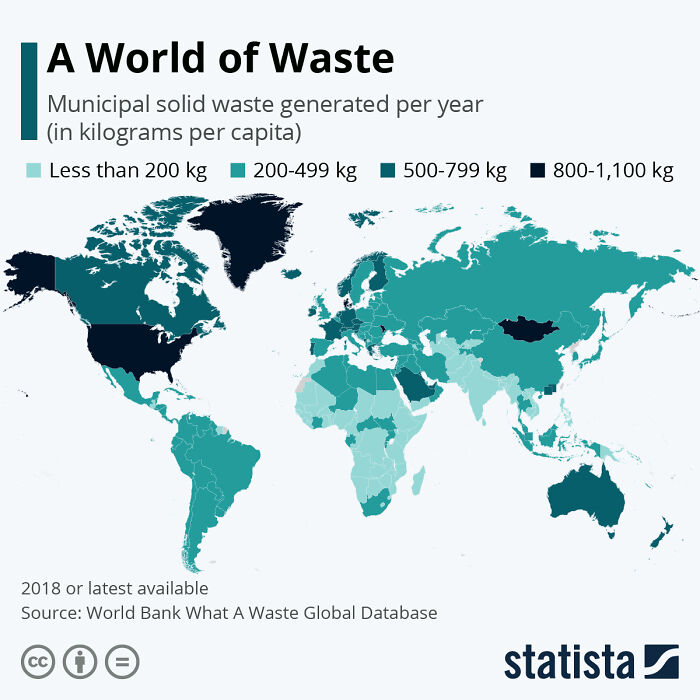
Image credits: flyingcatwithhorns
#15 Air Polution In Europe
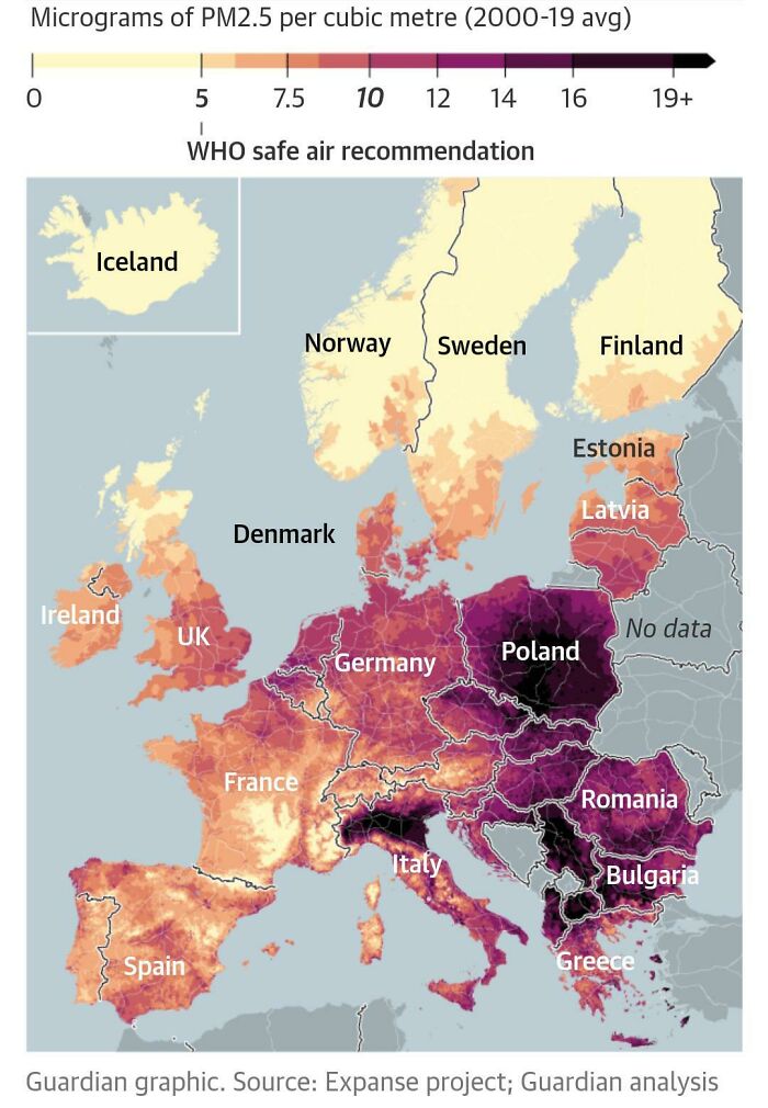
Image credits: therealcup_1
Even more comically, due to its northerly position, Alaska appears to be roughly the size of Australia, despite the fact that the land down under is almost five times larger. You can find an excellent gif depicting the presented and real size of various nations here.
#16 The Most And Least Happy Countries In The World
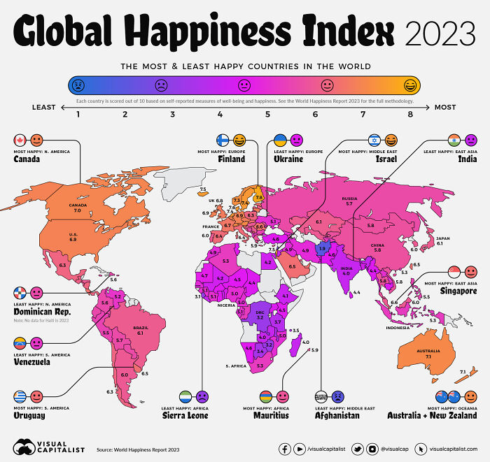
Image credits: Intelligent_Store0
#17 The Most Consumed Type Of Meat By Country Including Fish & Seafood

Image credits: giuliomagnifico
#18 The Countries With The Most Island
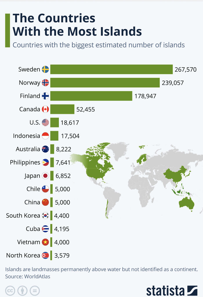
Image credits: robertjan88
#19 Most Spoken Languages In The Us Beside English/Spanish
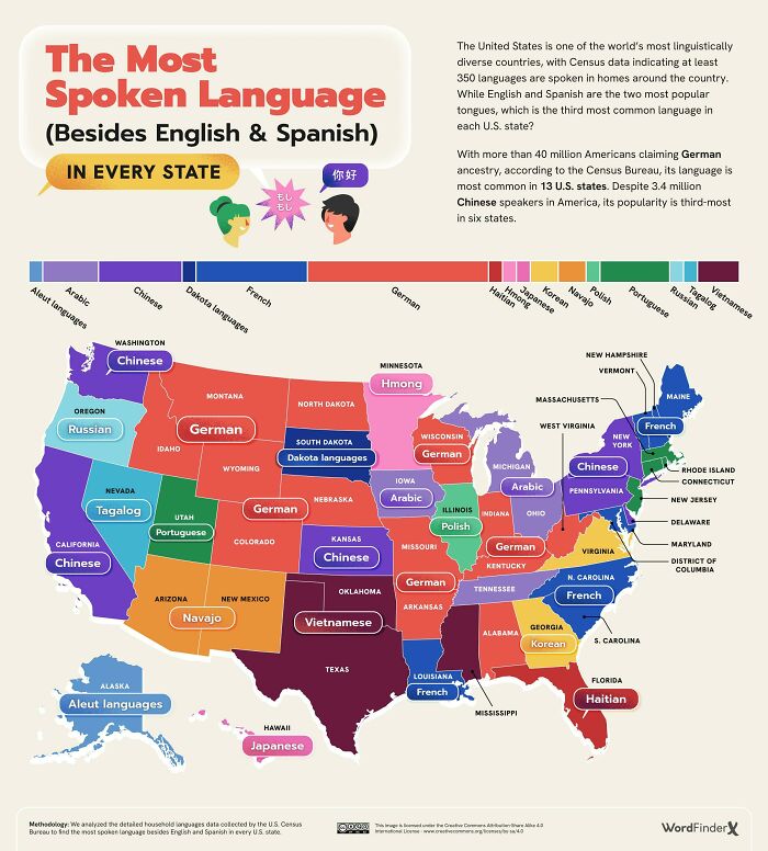
Image credits: kvnbtl
#20 Each European Country’s Highest Peak
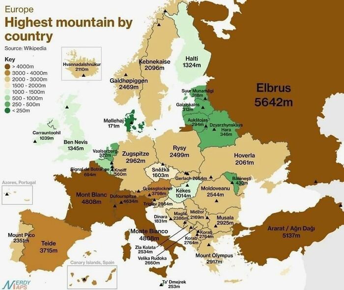
Image credits: alexsimi
#21 Percentage Of Light vs. Brown Hair In European Countries
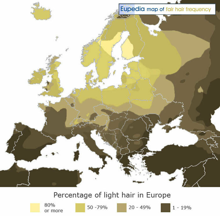
Image credits: Specific_Ad_097
#22 Biggest Sources Of Power In Every European Country
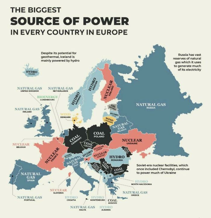
Image credits: Miserable-Move-7956
#23 Olive Oil vs. Butter Usage In Europe
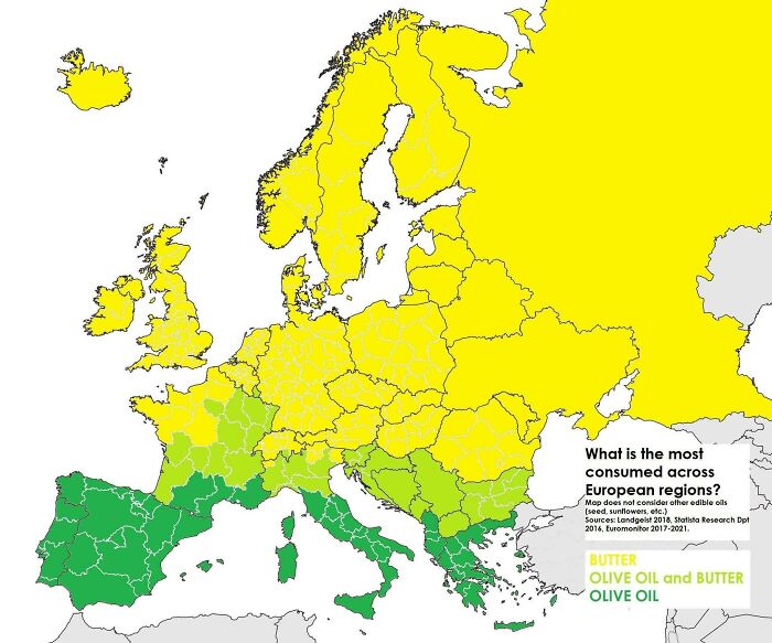
Image credits: island_wide7
#24 Highest Temperature Recorded In Europe Countries
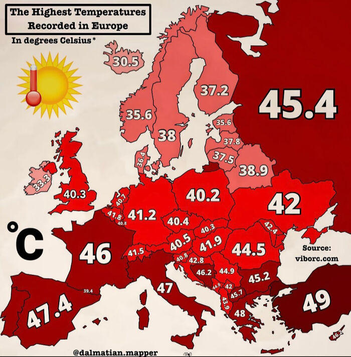
Image credits: Redstream28
#25 Dog Owning States vs. Cat Owning States
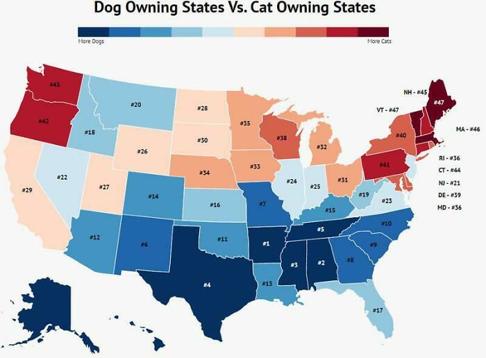
Image credits: Thequietasober
#26 When Is Weekend
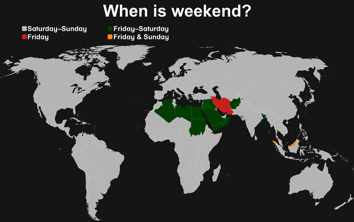
Image credits: two_plus_two_is_zero
#27 The Most Watched Anime In The Europe
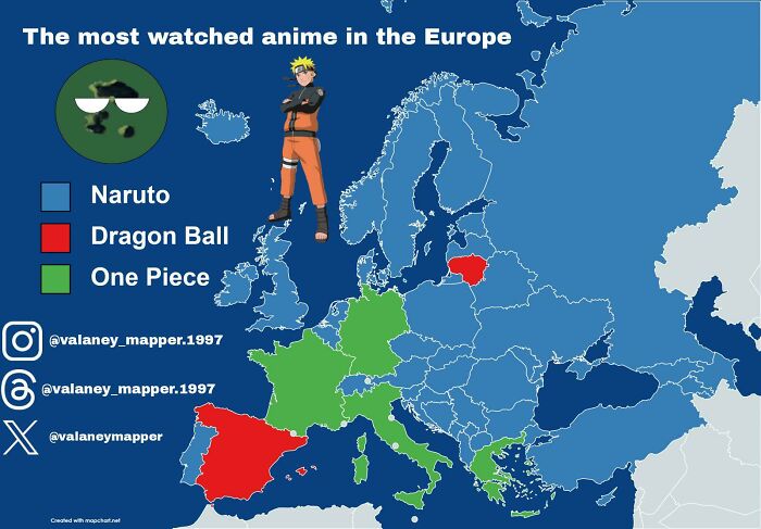
Image credits: valaney_mapper_1997
#28 If Europe’s Wealth Distributed Equally How Many Times Wealthier The Countries Would Be?
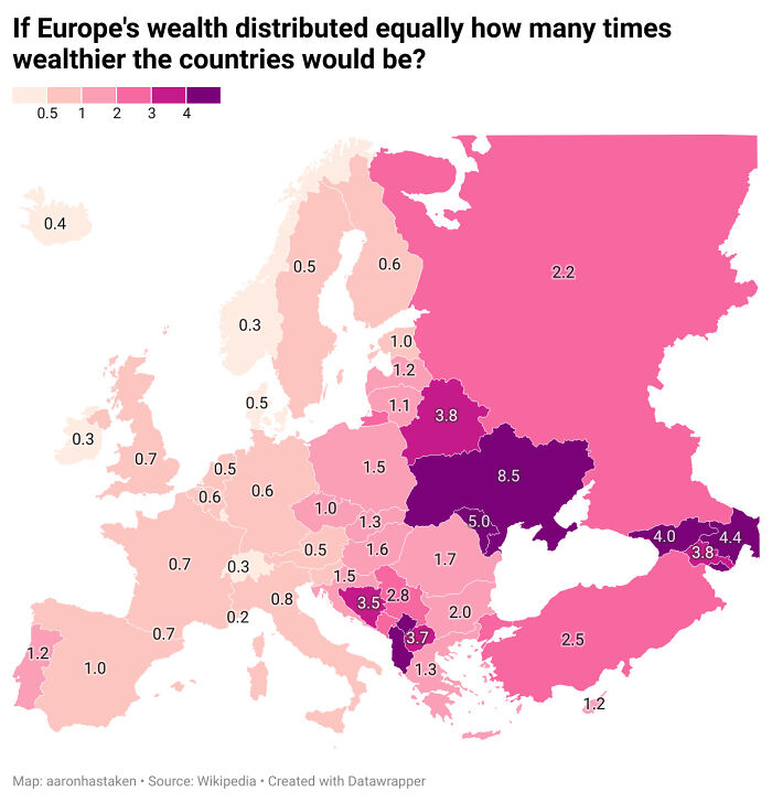
Image credits: aaronhastaken
#29 What To Say To Someone Who Leaves The Door Open After Coming In? (Includes Informal Expressions)
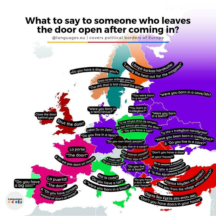
Image credits: languageseu
#30 Countries That Had People Displayed At Zoos
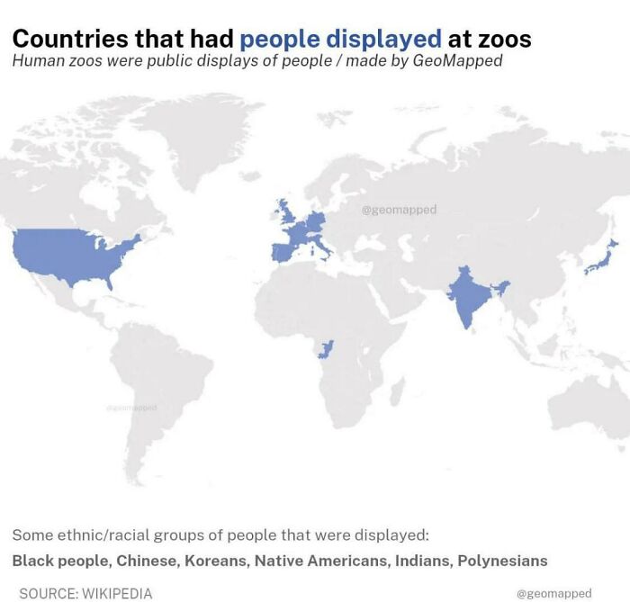
Image credits: cloudtdaz
#31 Symbols Of Armed Forces In Europe
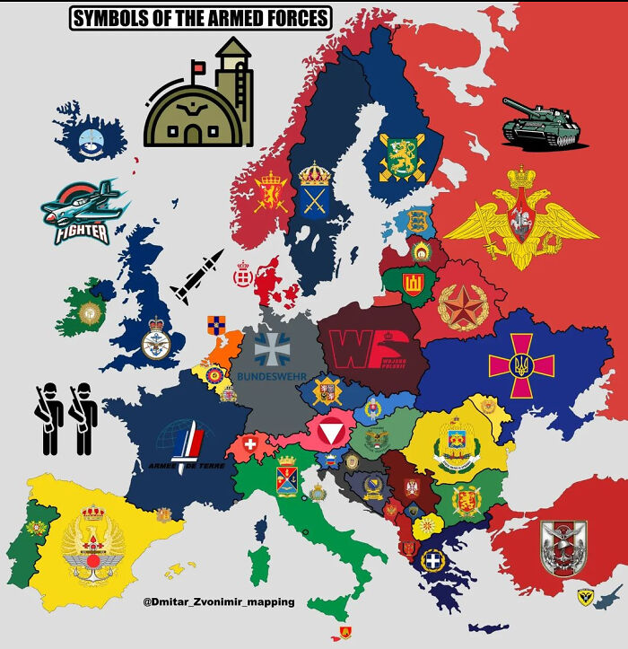
Image credits: Redstream28
#32 Percentage Of People That Were Unable To Keep Home Adequately Warm In Europe In 2022
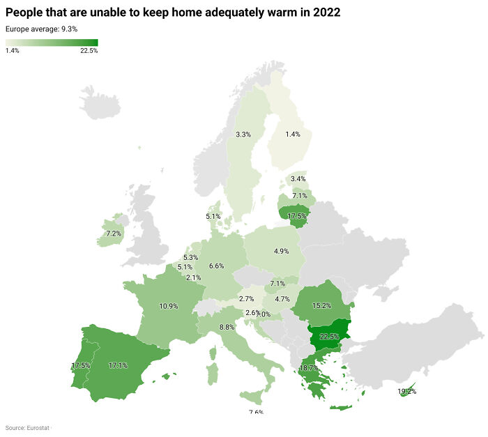
Image credits: giuliomagnifico
#33 Argentina As Depicted On The Back Of The Argentine Passport
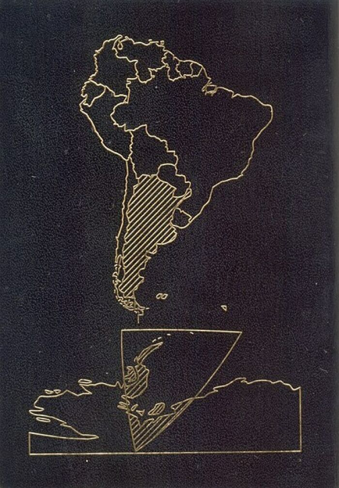
Image credits: Kooker321
#34 Cultural Regions Of Europe (Across Borders)
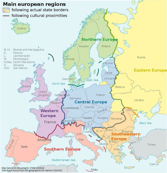
Image credits: PygmalionTheVI
#35 The Evolution Of The Seven Islands Of Mumbai
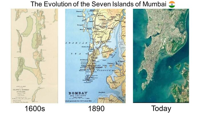
Image credits: Live_Wallaby9683
#36 European Nations Favourite Holiday Destination
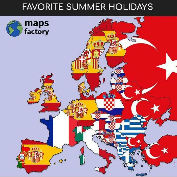
Image credits: SilasMarner77
#37 Good Political Maps Of Oceania Are Hard To Come By
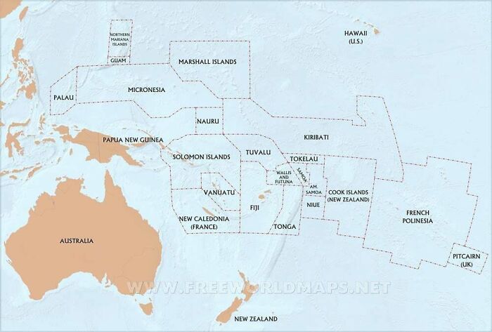
Image credits: RecordingFancy8515
#38 World Map According To China In 1799
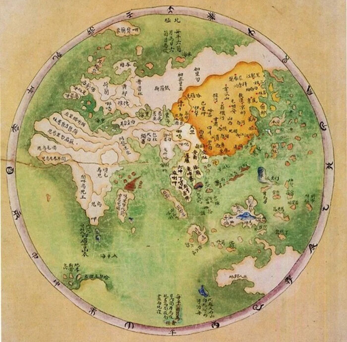
Image credits: Redstream28
#39 Male Body Hair Distribution Of Indigenous Human Populations Around The World
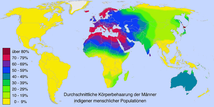
Image credits: Homesanto
#40 Population Change By Continent From 2000 To 2018
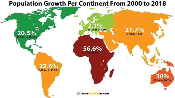
Image credits: special_tea23215
#41 Asia’s Counting System. How Do You Say The Number 57
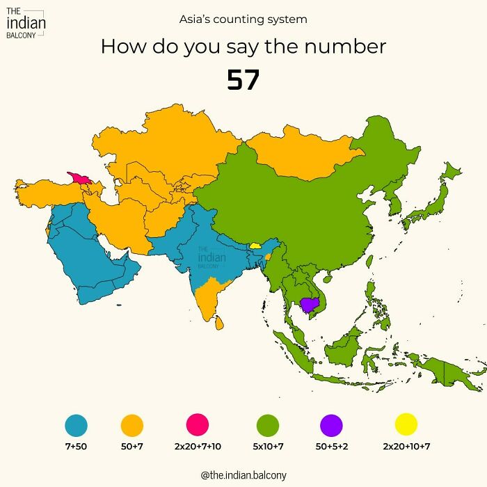
Image credits: Mokkasakka
#42 Asked Midjourney To Imagine The Most Stereotypical Face For Each Country
Image credits: anvaka
#43 A Map Of Superheroes In NYC & The Areas They Protect
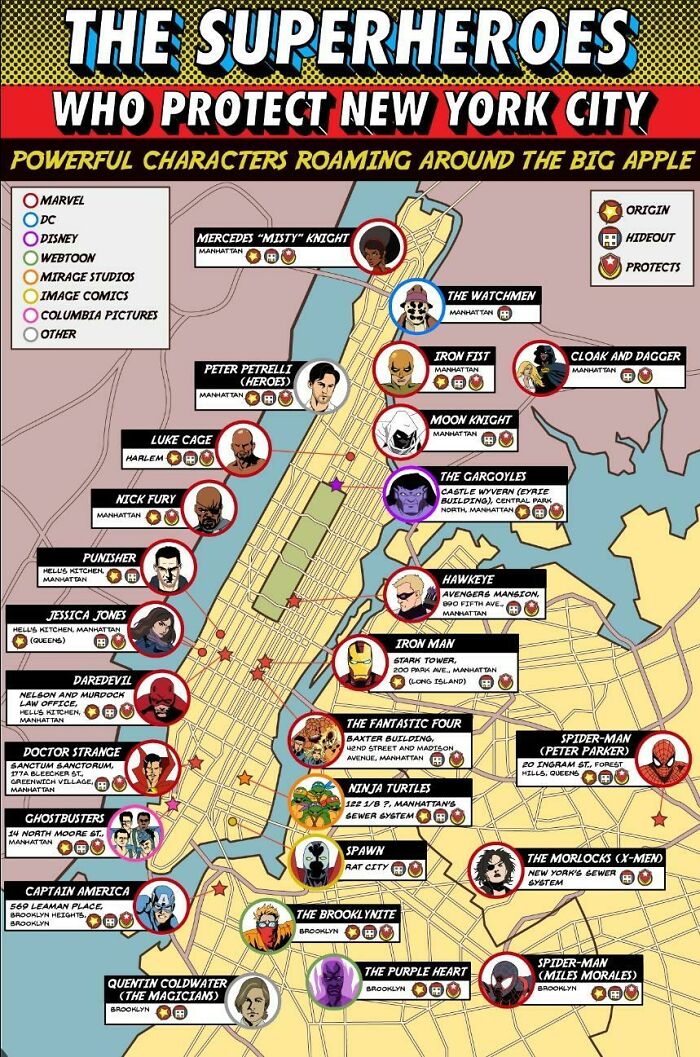
Image credits: Hockputer09
#44 Map Showing Brazilian State Names Translated Literally Into English
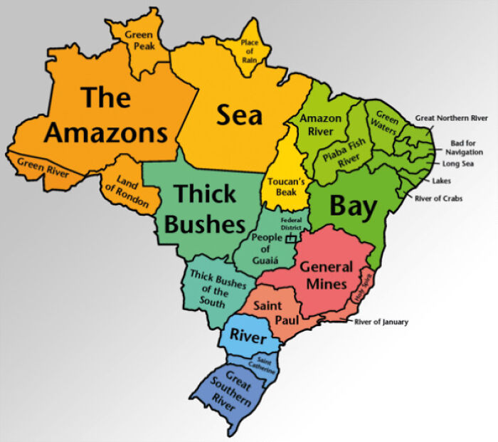
Image credits: Jazzlike-Power-7959
#45 95% Of Plastic Polluting The World’s Oceans Comes From These 10 Rivers
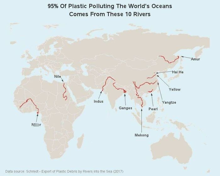
Image credits: wes7946
#46 Food Price Inflation For July Month
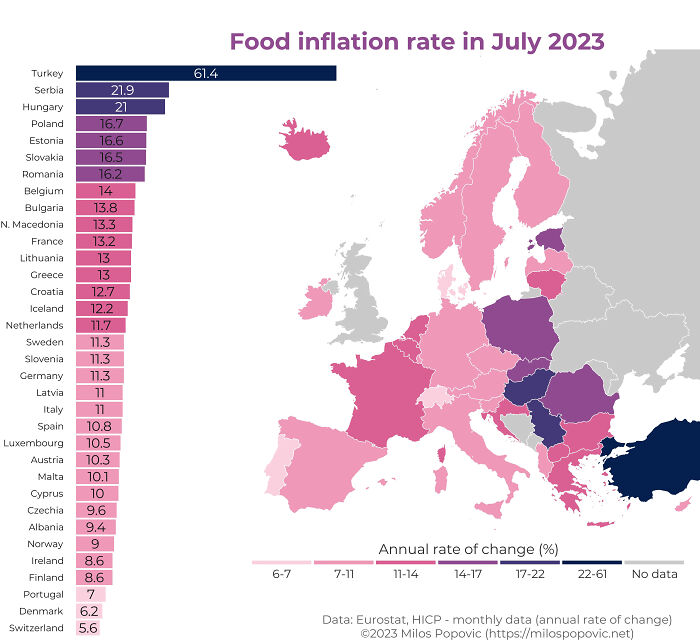
Image credits: Smart-Combination-59
#47 Most Common Baby Names In London
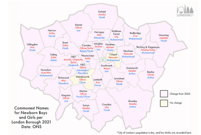
Image credits: jionki
#48 Sex Ratio
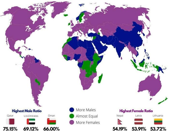
Image credits: Hockputer09
#49 Most Popular Us Female Baby Names 2022
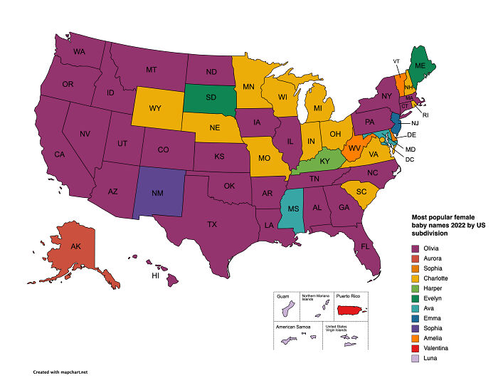
Image credits: Jakyland
#50 Unemployment Rates In Italian Provinces
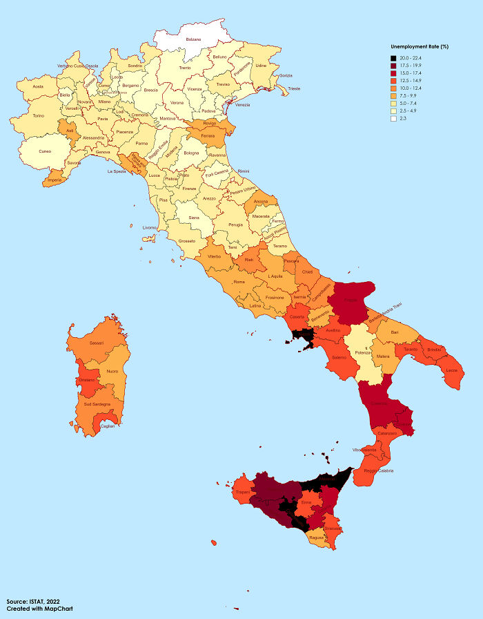
Image credits: JoeFalchetto
#51 The Most Common Surname In Each Department Of Mainland France
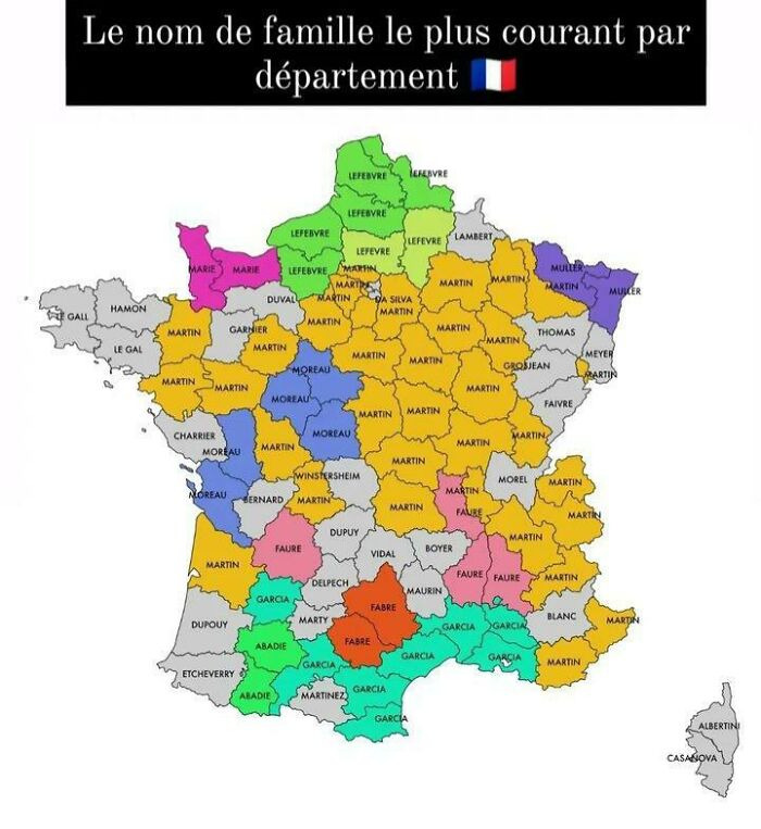
Image credits: SilasMarner77
#52 Cumulative Population Growth Of Each Us State From 1950-2016
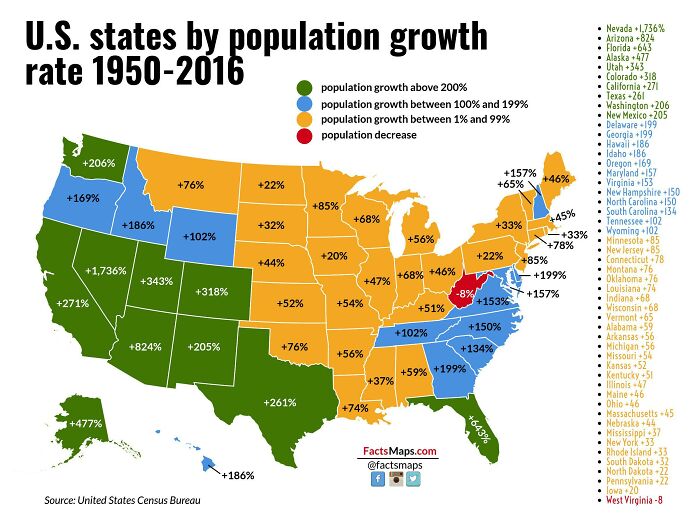
Image credits: PattonsDestroyer
#53 Projection Of Water Stress Level By Country In 2040
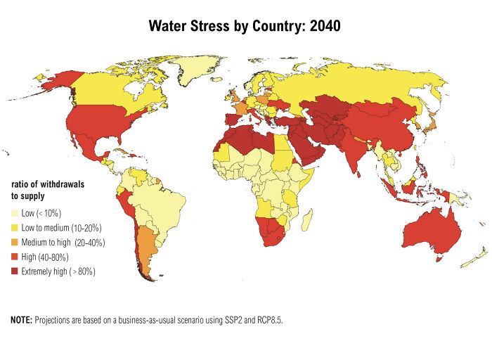
Image credits: giuliomagnifico
#54 What Percent Of Visitor Visa Applications Per Country Did The USA Reject In 2022
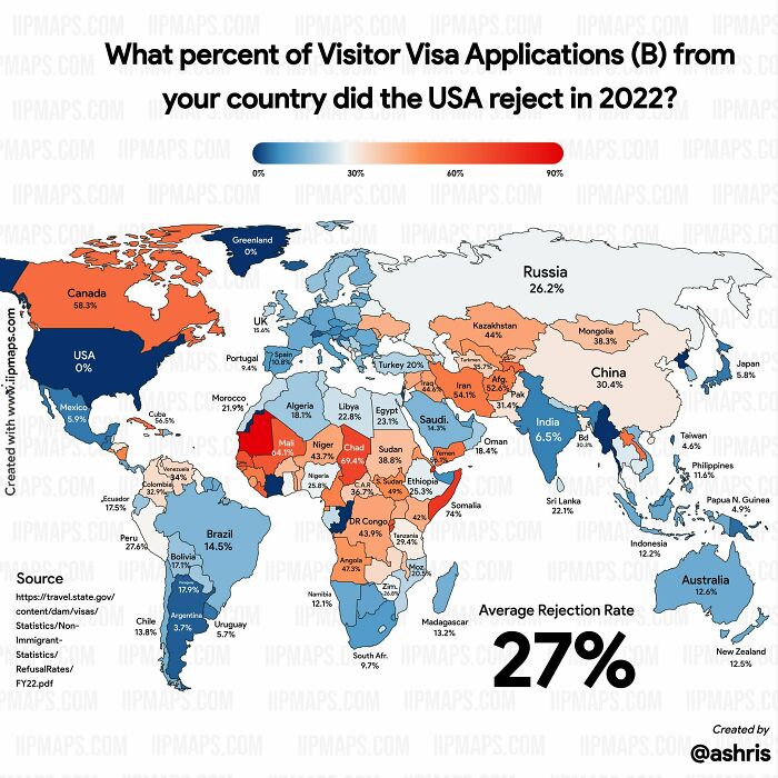
Image credits: john_doe_89
#55 Population Density In China
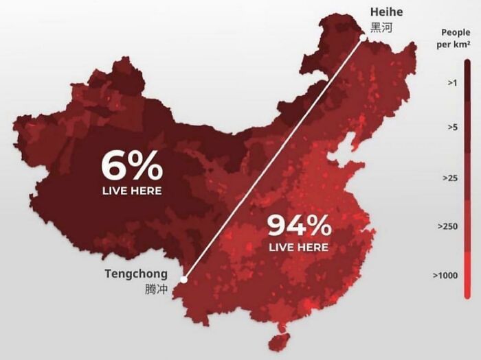
Image credits: Ambitious_Aioli6954
#56 The Most Common Blood Type Around The World
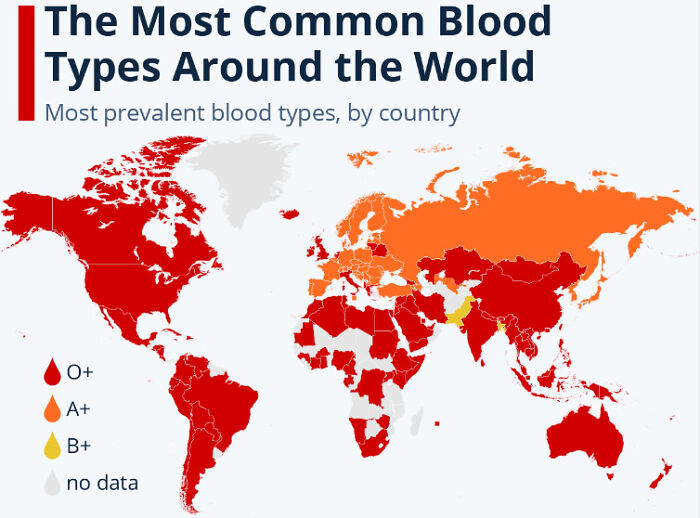
Image credits: Downingst
#57 Average Color Of Us State Based On Satellite Imaging
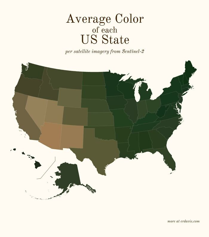
Image credits: SnooMacarons8038
#58 Bizarre Proposal From 1920 To Create New Single, Peaceful European Union With 24 Artificially Created States ( P.a. Maas, Vienna)
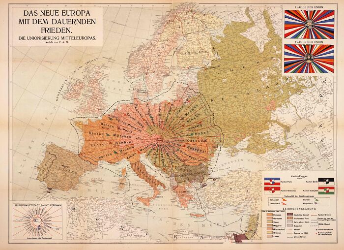
Image credits: StarklyCatenate342
from Bored Panda https://ift.tt/iVvD8yB
via IFTTT source site : boredpanda