“It’s through mistakes that you actually can grow. You have to get bad in order to get good.”
Paula Scher, one of the most influential graphic designers of our time, once uttered those words in reference to design. And while I’m sure she was being honest, I think some designers really took those words to heart and somewhere along the way abandoned the “getting good” part of their plans.
Below, we’ve gathered some of the most atrocious examples of design that have been shared on this subreddit that’s dedicated to roasting terrible design. From signs that induce headaches just from trying to read them to ovens that melt their own knobs, apparently, there are plenty of bad designers out there who need to grow a bit (or a lot) before they start producing excellent work.
Be sure to upvote all of the photos that make you want to fire a designer somewhere out there, and let us know in the comments what the worst examples of design you’ve ever seen were. Keep reading to also find an interview we were lucky enough to receive from graphic designer, writer and the man behind Identity Designed, David Airey. Then if you’re interested in checking out even more examples of horrific design, you can find some of our previous articles on the same topic here, here and here.
#1 Why Would You Do This?
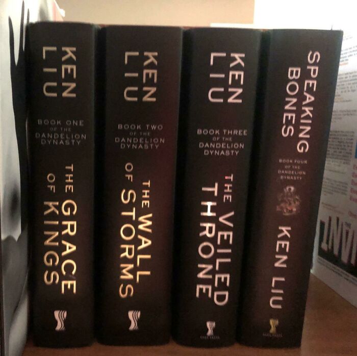
Image credits: AlephMartian
#2 This Playground Is Built In A Hole And Fills With Water When It Rains
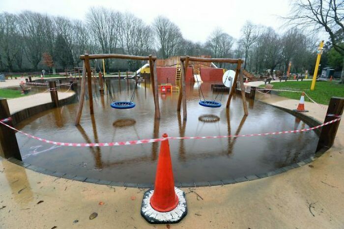
Image credits: iitc25
#3 You’ve Seen Crappy Elevator Button Designs Before. Get Ready For The Crappiest Elevator Button Design You’ve Ever Seen
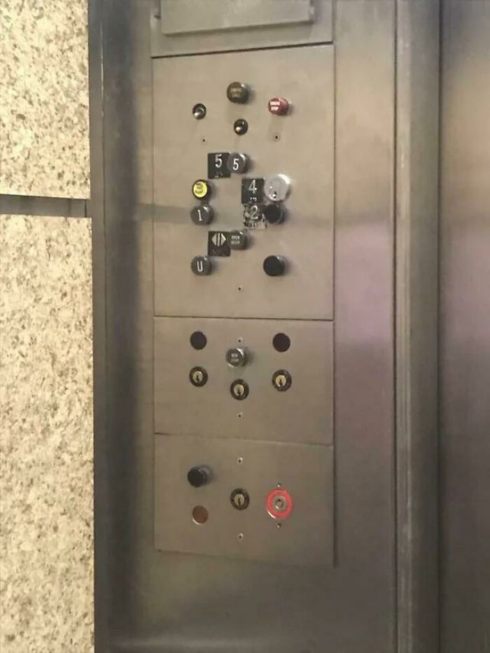
Image credits: AdhesiveHelplessness
#4 What Was Wrong With Blue Water?
Image credits: Dere_Dere
#5 Not Sure The Cover Artist Read The Book?
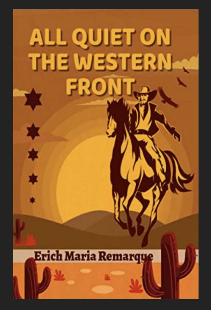
Image credits: LWYPLTDG
#6 The Shadows Of The Numbers Are In A Different Font Than The Numbers Themselves
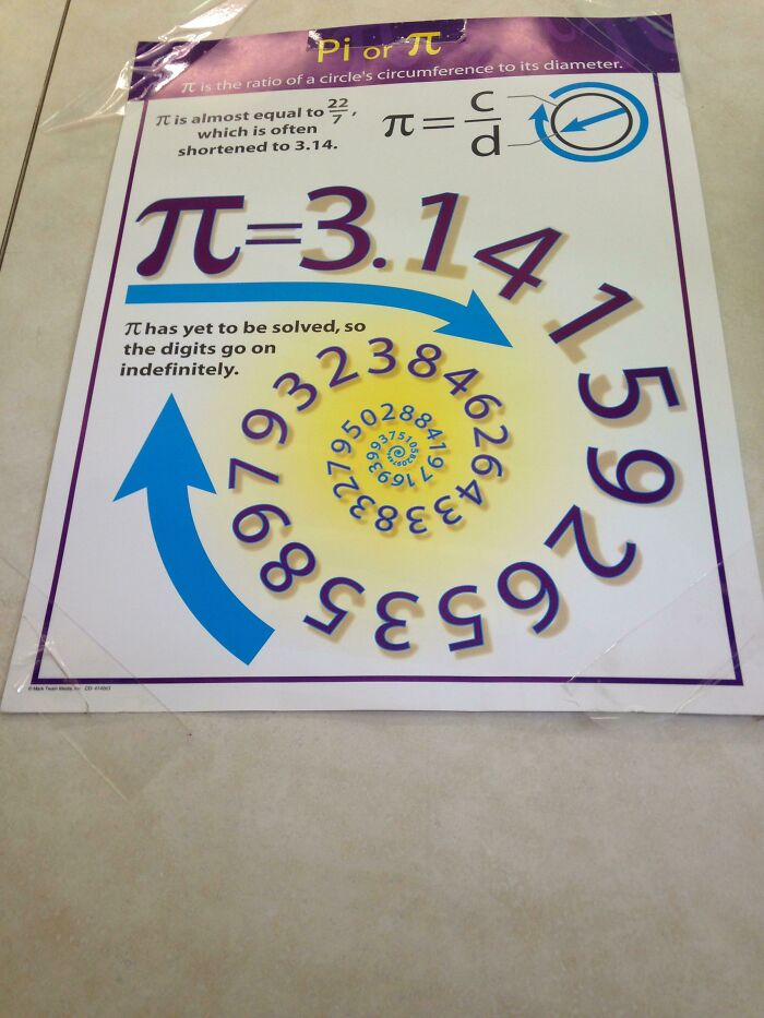
Image credits: GHarold101
#7 Couldn’t Figure Out Why I Kept Grabbing The Wrong Size Out Of The Multipack Box… Then Realized All 3 Sizes Come In All 3 Colors!
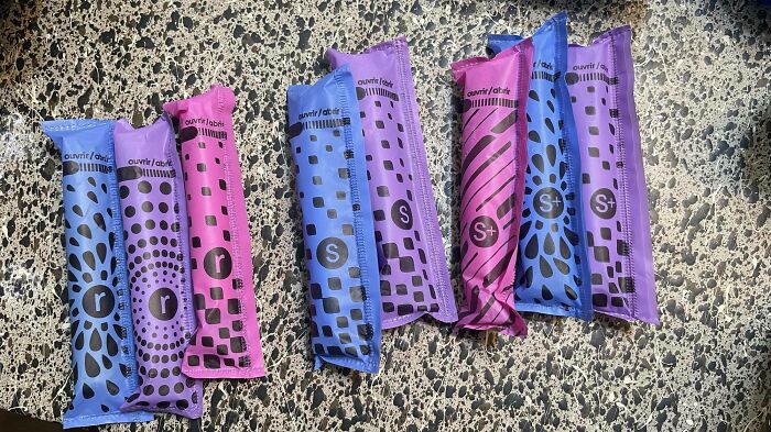
Image credits: facemymusic
#8 Are You 25 Feet Tall, Own A Multimillion Dollar Yacht And Want To Hand Wash Your Yacht Fully Clothed While Out To Sea? We Have An Inflatable Dock For You!
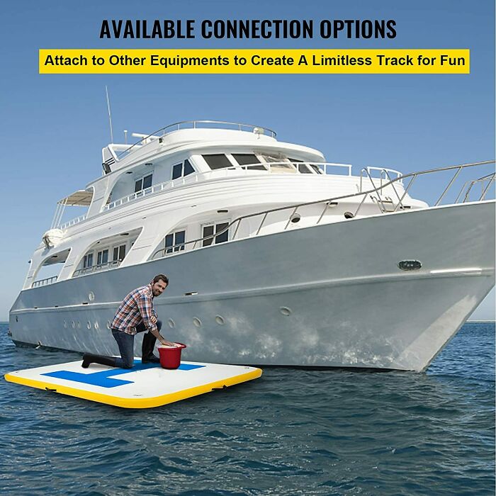
Image credits: Vincenzo77
#9 Oven Vents Directly Onto The Knobs, Making Them Discolored And Burning Hot To The Touch.
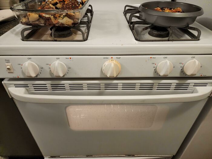
Image credits: Periphery755
#10 This Ad In My Print Copy Of The New Yorker
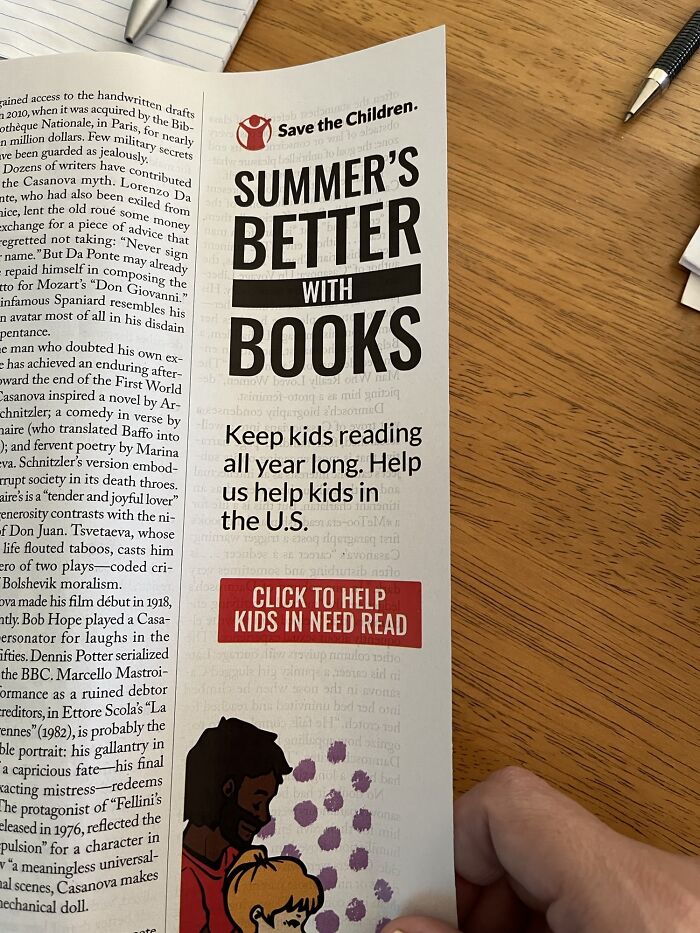
Image credits: crispytacofan
#11 1 Person Is Ok, 2 People Is Ok But In Red
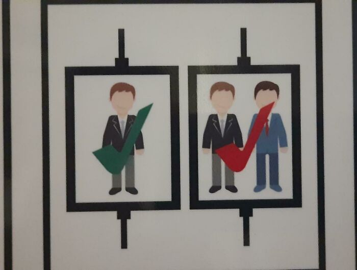
Image credits: Luis008_
#12 Not Sure Who’s Allowed To Park Here
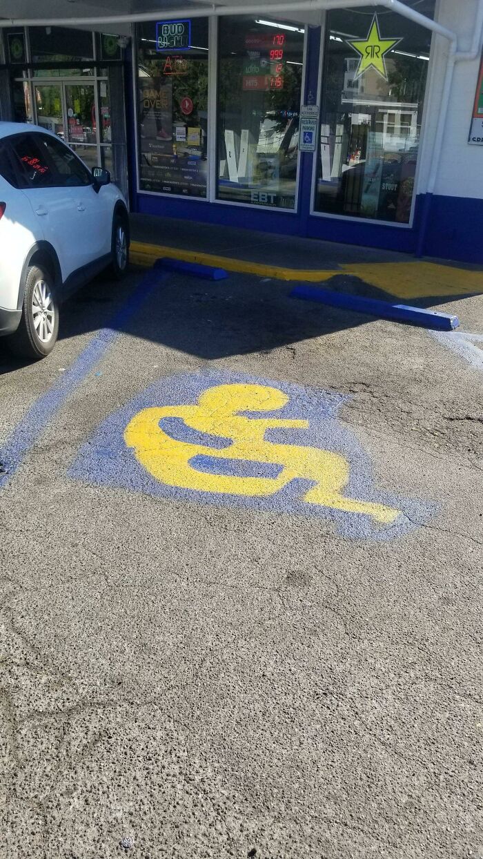
Image credits: Kowboooy
#13 The Ad Literally Says, “Modern Kitchen, Great Layout, Bright And Spacious!”
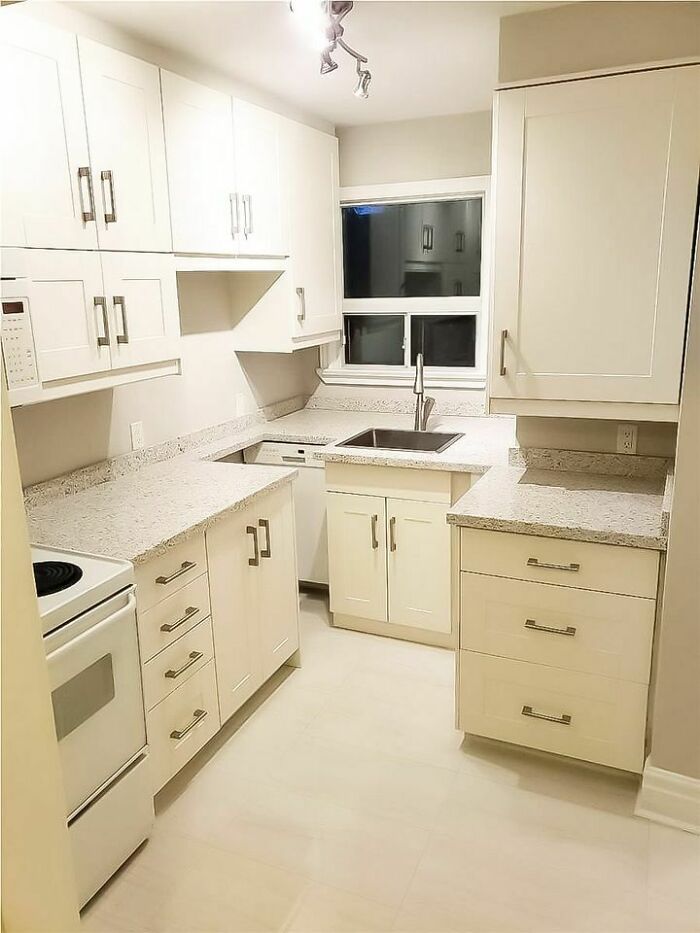
Image credits: mercuryrising137
#14 Insane Menu At An Insane Sandwich Shop
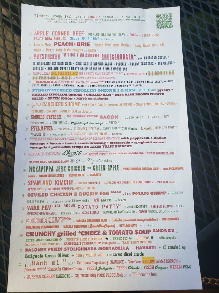
Image credits: Ultimichael
#15 Terrible Sign Color Choices
Image credits: bobwithlobsters
#16 7ft Pool Holds An Entire Family. (Legs Not Included)
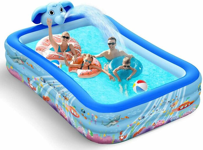
Image credits: CallPhysical
#17 If Only There Was A Letter In Flame That Could Resemble A Flame
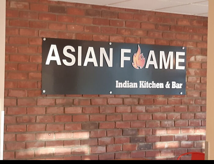
Image credits: dickb0tt
#18 Supposed To Be Finally 21 But Spacing Makes It Looks Like A 12
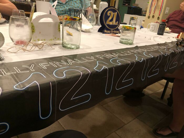
Image credits: Shadowpilot6
#19 A Catalog For A Clothing Company I Once Worked At. How Was This Cover Ever Approved?

Image credits: Taste_of_Natatouille
#20 A Beautiful Hardwood Bridge We Built At Work. Wheelchair Accessible. Comes With A Nice Steel Pole Almost Smack Bang In The Middle. This Is What Happens When Architects Refuse To Change Their Plan Even When Common Sense Says Let’s Move The Bridge
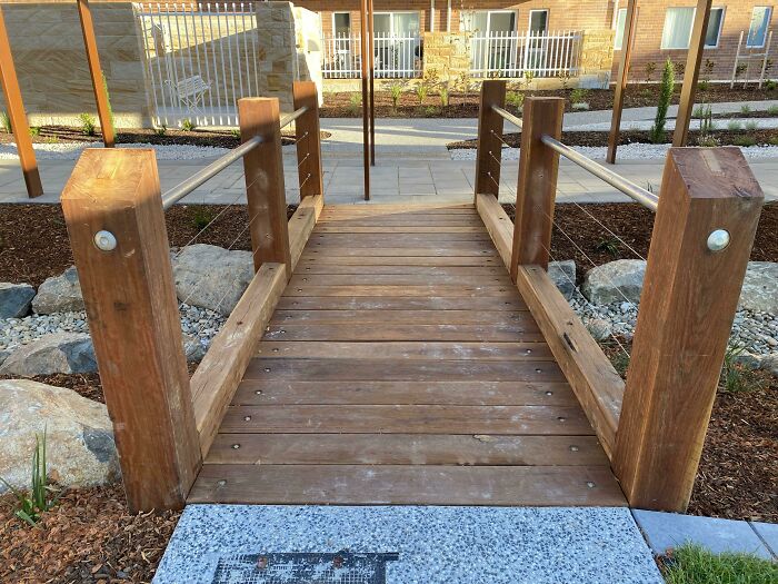
Image credits: BenignAndAHalf_
#21 Investing Ad Shows A Picture Of A Negative Return Rate

Image credits: SirBorf
#22 This Chicken Cookbook Has An Index Entry For Chicken
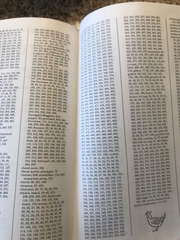
Image credits: FloppyTunaFish
#23 This Awful Photoshop For A Slide I Saw An Ad For. Why Are They Wearing Normal Clothes In The Water? What The Heck Is Going On In The Background? So Many Questions!
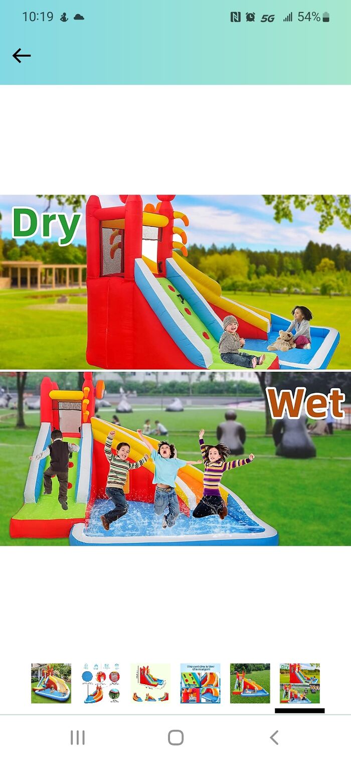
Image credits: Rimm9246
#24 Feel Like This Airline Overestimates The Danger Of Rogue Origami Birds
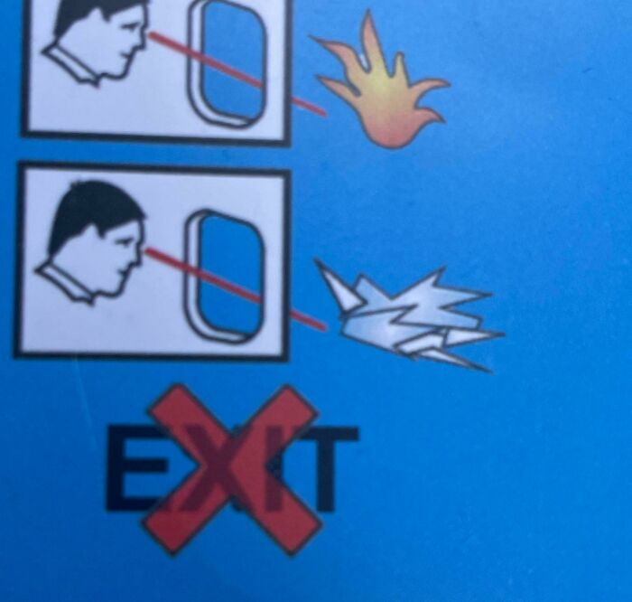
Image credits: Zealousideal_Emu_493
#25 Who Wants A Nice Cold Formaldehyde Beverage? Someone Didn’t Think That Chemical Formula Through…
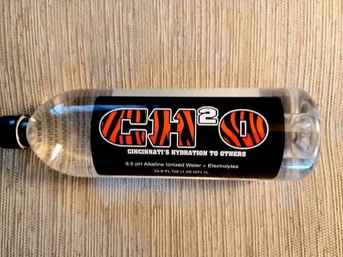
Image credits: kalitarios
#26 Slip And You’ll Break Your Neck Going To The Basement To Do Laundry At My Apartment Building
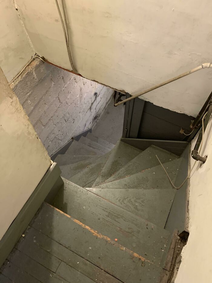
Image credits: Rargmas
#27 Missed Opportunity For Using The Jesus Statue As “T” Rather Than “I”, Which Would Be More Readable And Intuitive
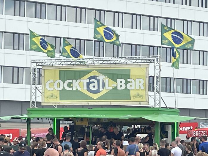
Image credits: furbz1
#28 From A Baseball Stadium That Took 1.2 Billion Nt Dollars To Build, This Sure Exceeds The Expectations
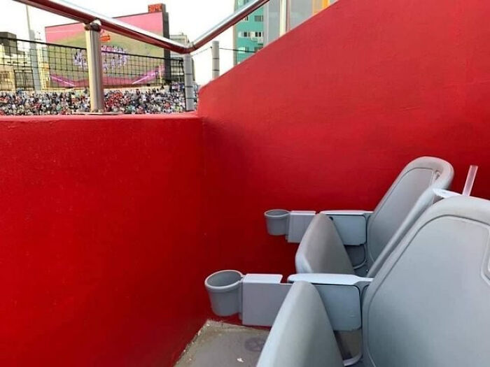
Image credits: hofong159
#29 Chilled Juice & Kids
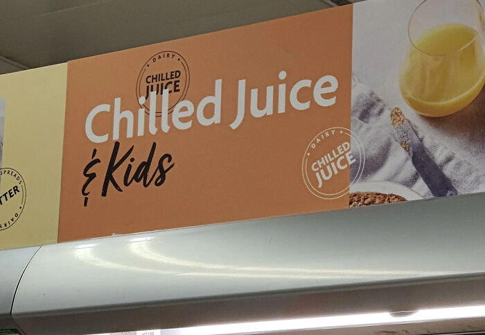
Image credits: shaquille_oatmeal911
#30 Parcours For Wheelchairs…
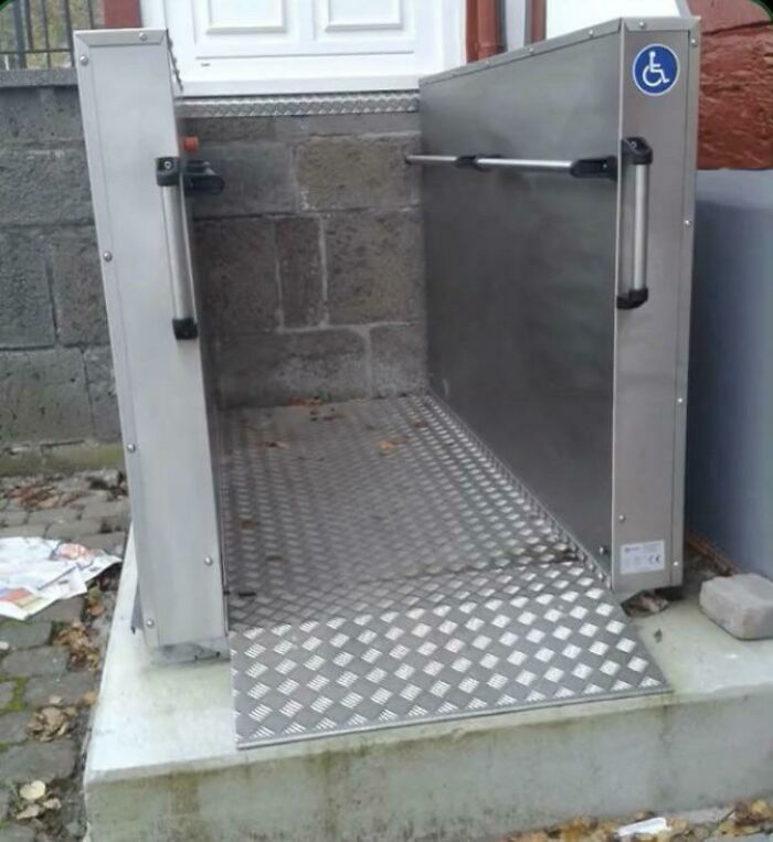
Image credits: FireIceWizard
#31 At First Glance I Thought The Can Was Badly Rusted. Turns Out It’s Part Of The Graphic
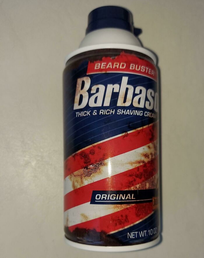
Image credits: RespectMyAuthoriteh
#32 Dont Mess With Chile 🇨🇱
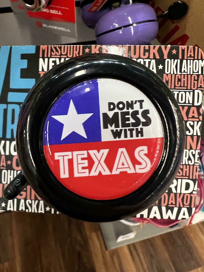
Image credits: wotwud
#33 R Is For ?
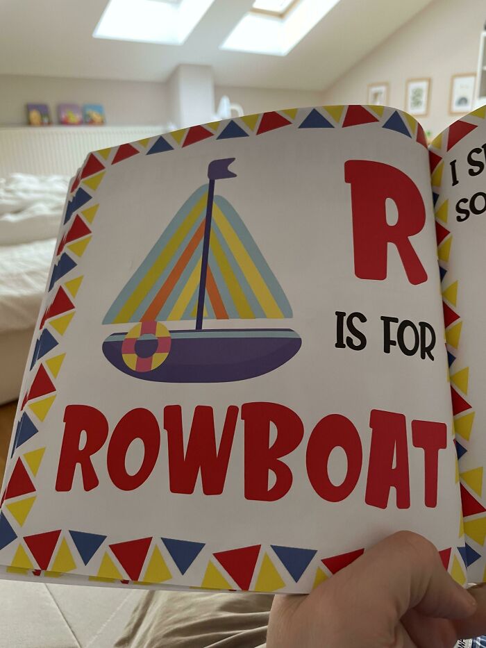
Image credits: scstraus
#34 Photoshop vs. Reality?
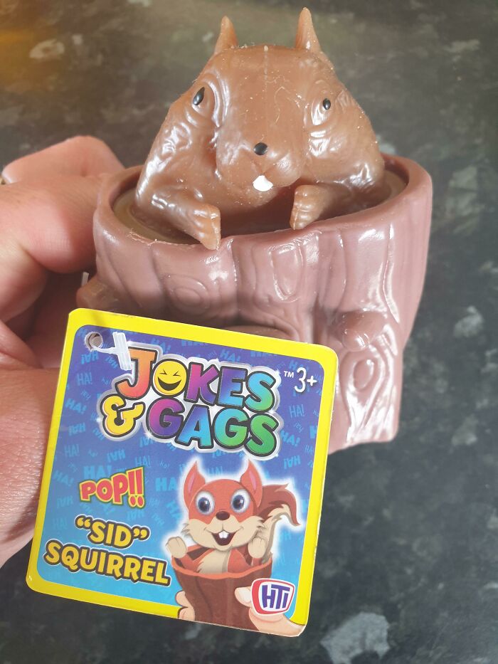
Image credits: misswooster22
#35 The Almost Never Ending Airport Directional Sign.
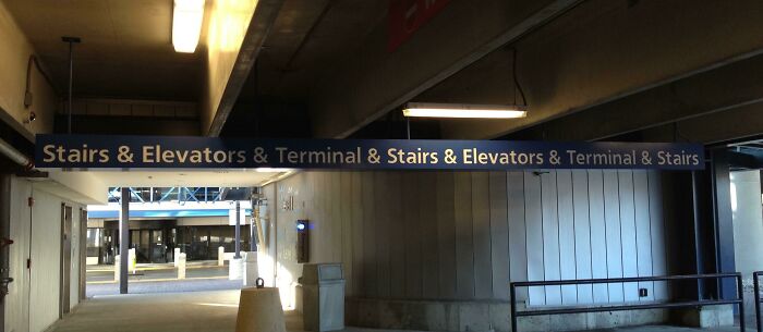
Image credits: TrevorAlan
#36 The Cup That Nibbles Your Lip With Its Little Teethies
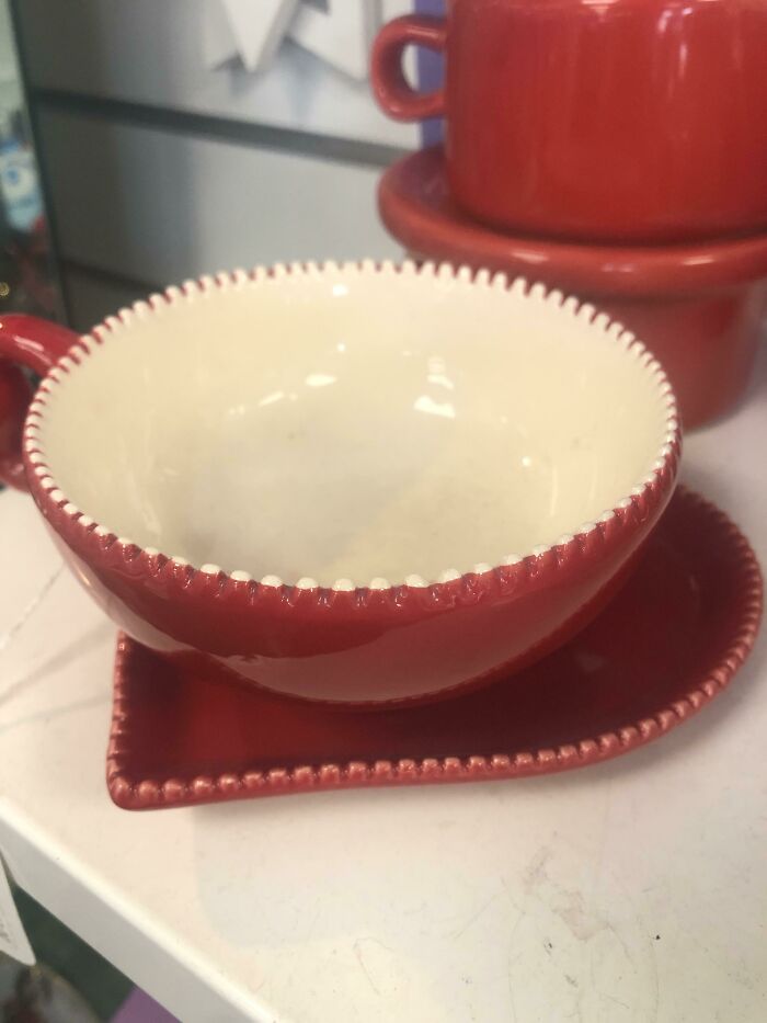
Image credits: SmolTownGurl
#37 God Is Goo.
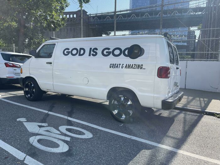
Image credits: tigho
#38 We Have To Decode What The Shirt Says
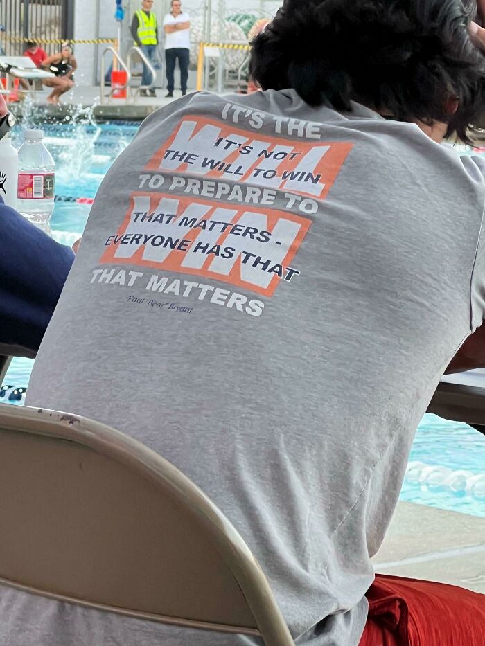
Image credits: Insomnicwriter
#39 Interior Design Of This Bus
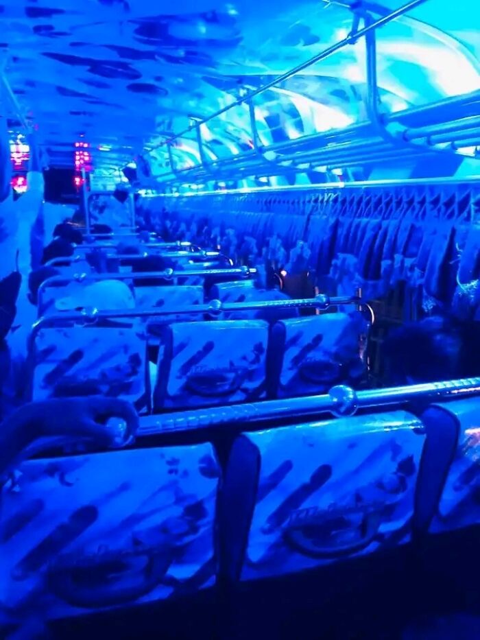
Image credits: Ehansaja
#40 It Just Looks Depressed
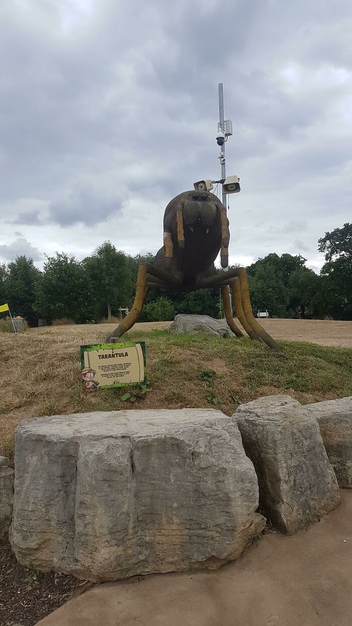
Image credits: GeneralJAW
#41 Don’t Smoke The Propane!
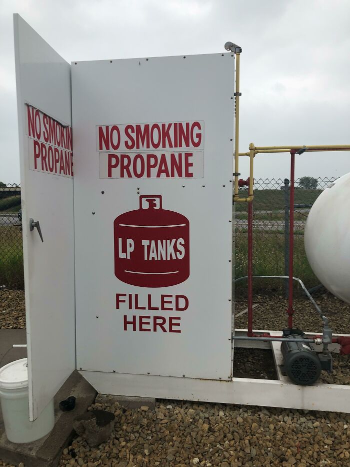
Image credits: Adorable-Display-676
#42 Happy Birthday Ha
- You Might Also Like: 35 Wholesome And Humorous One-Panel Comics By Harry Bliss
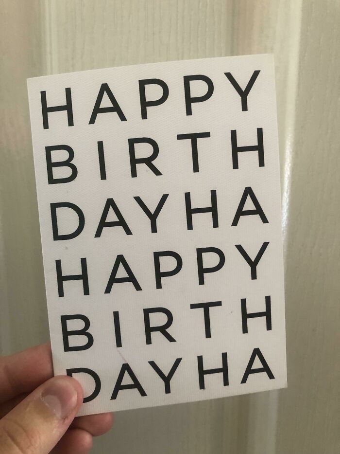
Image credits: fliberdy
from Bored Panda https://ift.tt/jeRIvQl
via IFTTT source site : boredpanda