We get used to seeing big-name brands like Pringles or Warner Bros everywhere. Like it or not, we form deep and even emotional ties with their qualities, logos, and characteristics. So when these companies decide to shake things up and change their “face” with a great brand refresh, the public takes notice. And since the stakes are this high, an obvious step in the wrong direction fires up our inner critic and almost begs us to poke fun at the results.
The margin for error is thin when it comes to redesigns, but it’s not only brands that get impacted by the obvious flaws designers didn’t pick up from the start. From products to artwork to our favorite animated shows, some updates simply go awry. In fact, they have even inspired one subreddit to go on a quest to shed light on some of the most unfortunate ones.
Aptly titled ‘Crappy Redesign’, this online community prides itself on sharing only the cream-of-the-crop examples of terrible changes in our favorite brands — and they mercilessly shame them online. Below, we have gathered some of the best cases from the community to share with you all. So continue scrolling, upvote the ones you loved hating most and let us know what you think of them in the comments!
Psst! If you’re in the mood for some more poor design madness, check out our earlier pieces here, here, and here.
#1 Ruh-Roh!
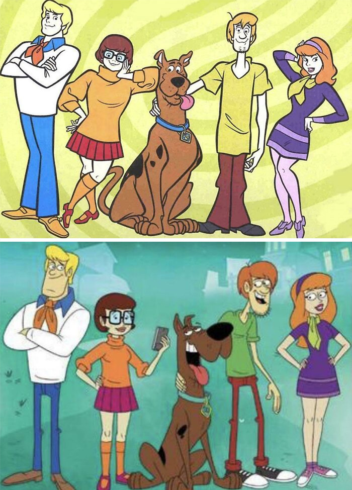
Image credits: Red_Leader_2020
#2 Just Why ? (Porky Pig)
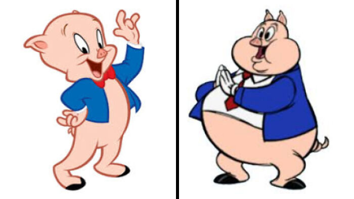
Image credits: _himo88
#3 Heroes In The Half-Shell To Whatever This Is
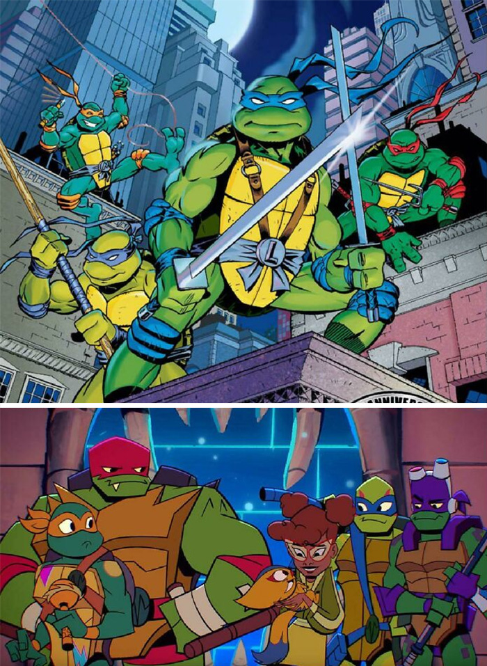
Image credits: neogeo5185
#4 Take A Design That You Can Use Correctly Even In The Dark And Replace It With An Abomination That You Can Get Wrong Even In Broad Daylight
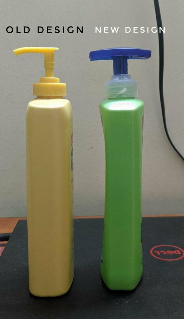
Image credits: reddit.com
#5 Well This Is Lame
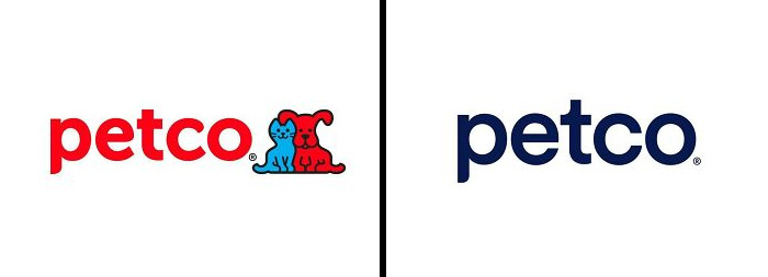
Image credits: EthanIceWaffle
#6 They Removed The Native American, But Kept The Land. Classic
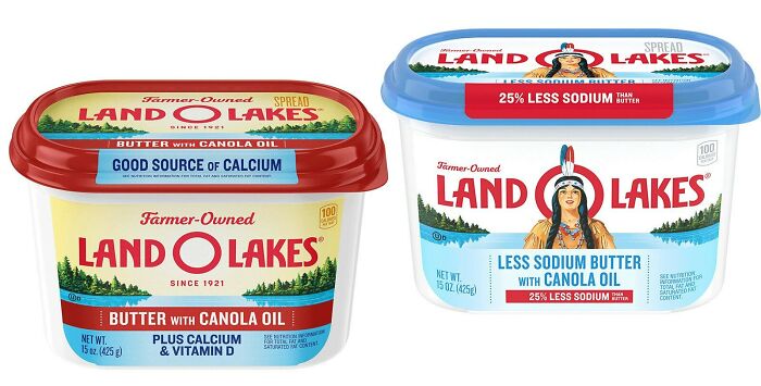
Image credits: diphthing
#7 Developer Downgrade
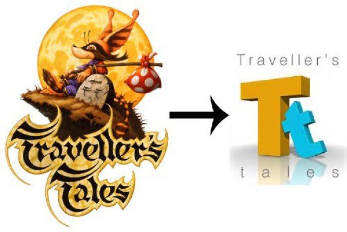
Image credits: ItsDaDoc
#8 What Will Be Next ? It’ll Finish The Circle ? Nothing Is Going Right With The New Logo
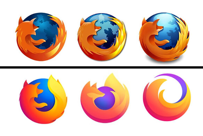
Image credits: Stephanoi_Gamer
#9 A Pointless Redesign
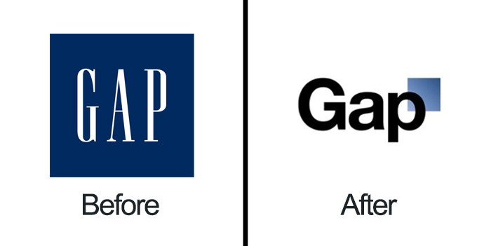
Image credits: apieber81
#10 Virgin Cgi Bob vs. Chad Clay-Mation Bob
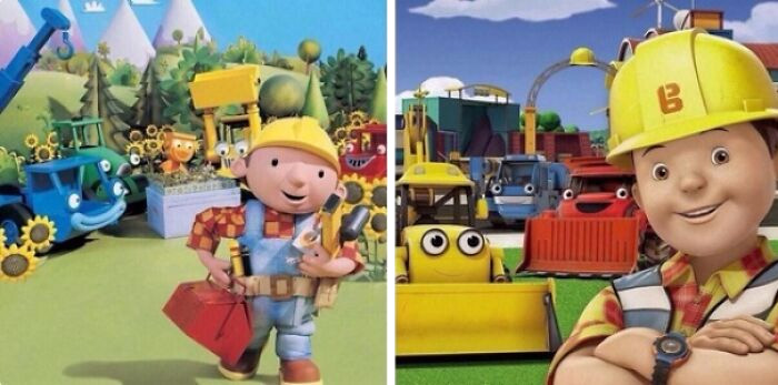
Image credits: aPingapongball
#11 Barbie Redesign
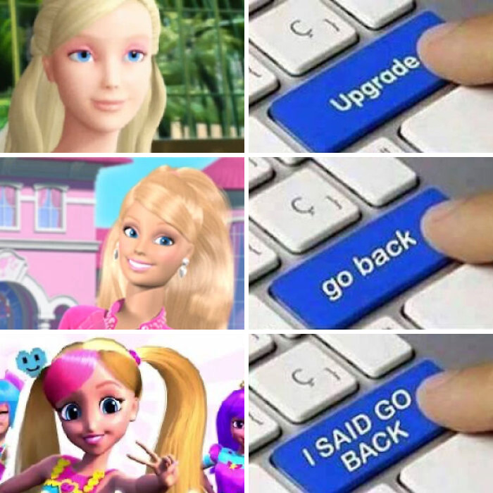
Image credits: reddit.com
#12 Look How They Massacred My Boy
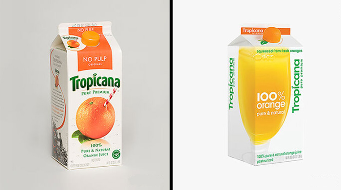
Image credits: AndyH16
#13 Modern ≠ Good
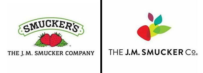
Image credits: Au_Ti_S_Ti_C
#14 From Restoration To Redesign Real Quick
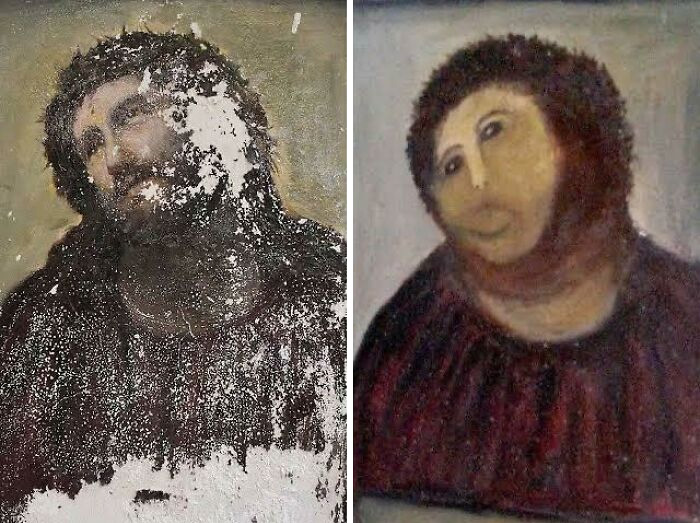
Image credits: sixfoldakira
#15 So Will The Films Get More Simplified?
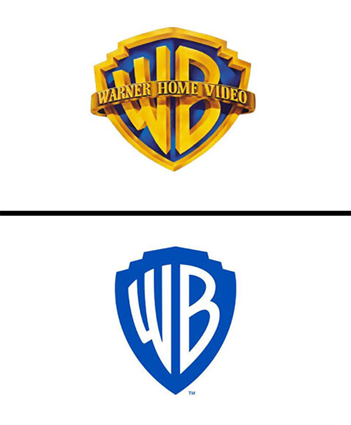
Image credits: Stephanoi_Gamer
#16 Look How They Massacred Pringles Logo
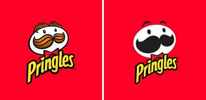
Image credits: stayedfished123
#17 It’s Soulless, Fits Cia Perfectly
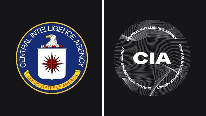
Image credits: reddit.com
#18 What Did They Do To Ms.frizzle?
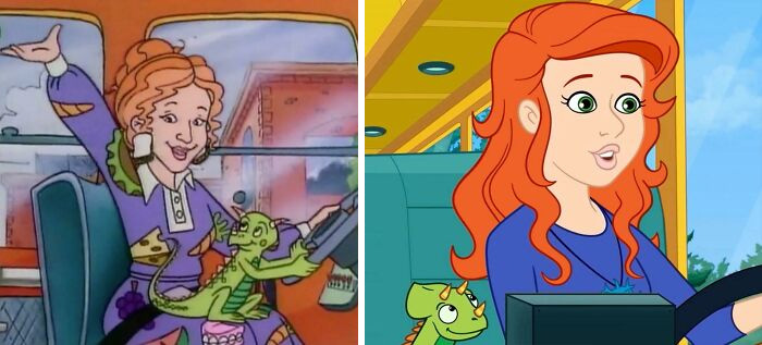
Image credits: TheExekutive
#19 This Is Just Awful
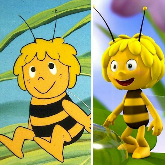
Image credits: MiJokri
#20 He Looks Cursed Now
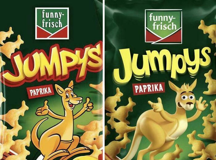
Image credits: JustinFFM
#21 Thousands Of Cgi Assets Wasted In One Fell Swoop
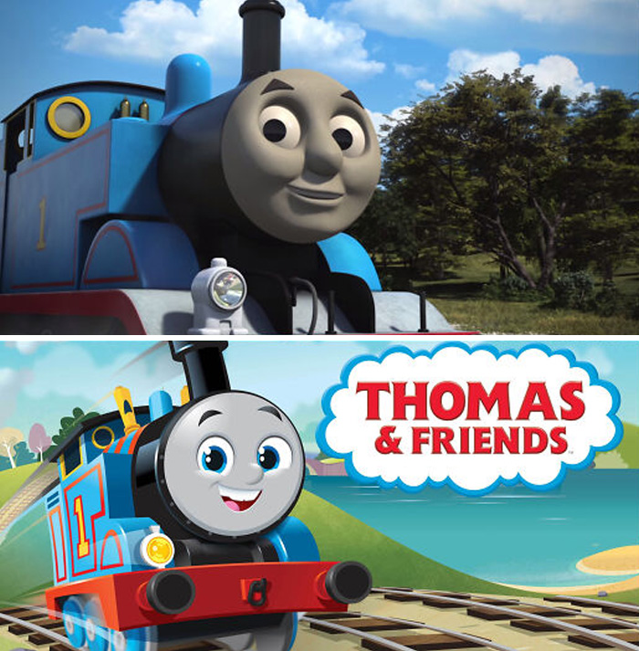
Image credits: The_BackOfMyMind
#22 The New Intel Logo Is So Boring

Image credits: TheGreenGobblr
#23 History Logo
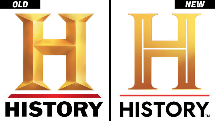
Image credits: ArrivingPlace
#24 Why Change It? The Old One Was Just Fine
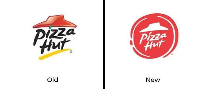
Image credits: WitleKidz
#25 Probably One Of The Worst Redesigns In Cartoon History
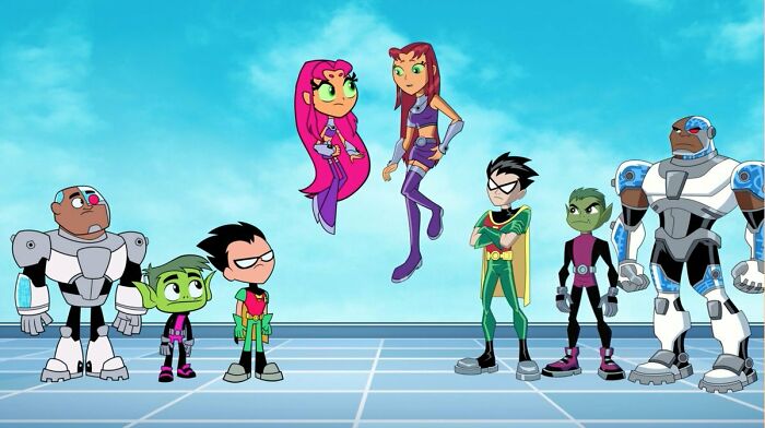
Image credits: demonic_pug
#26 Look How They Massacred The Google Photos Icon
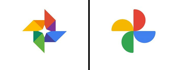
Image credits: random___pictures1
#27 How The Mighty Have Fallen
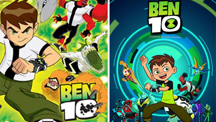
Image credits: SevenSevenSeve777
#28 Fireman Sam. Norman Price Looks Like He Works For A Lipstick Company
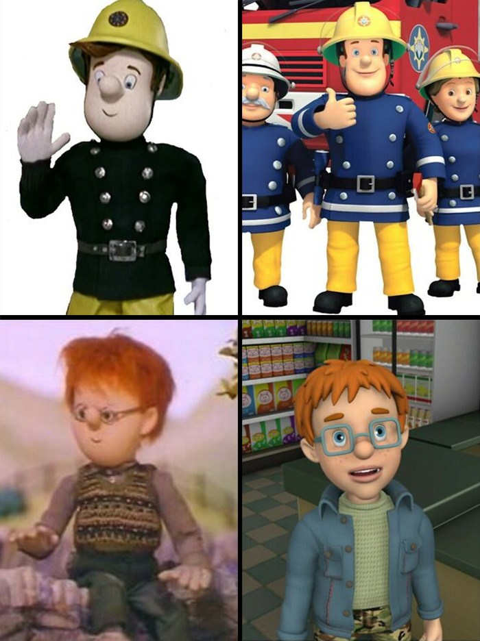
Image credits: Celestial_Light_
#29 This Is By Far The Worst Redesign I’ve Ever Seen
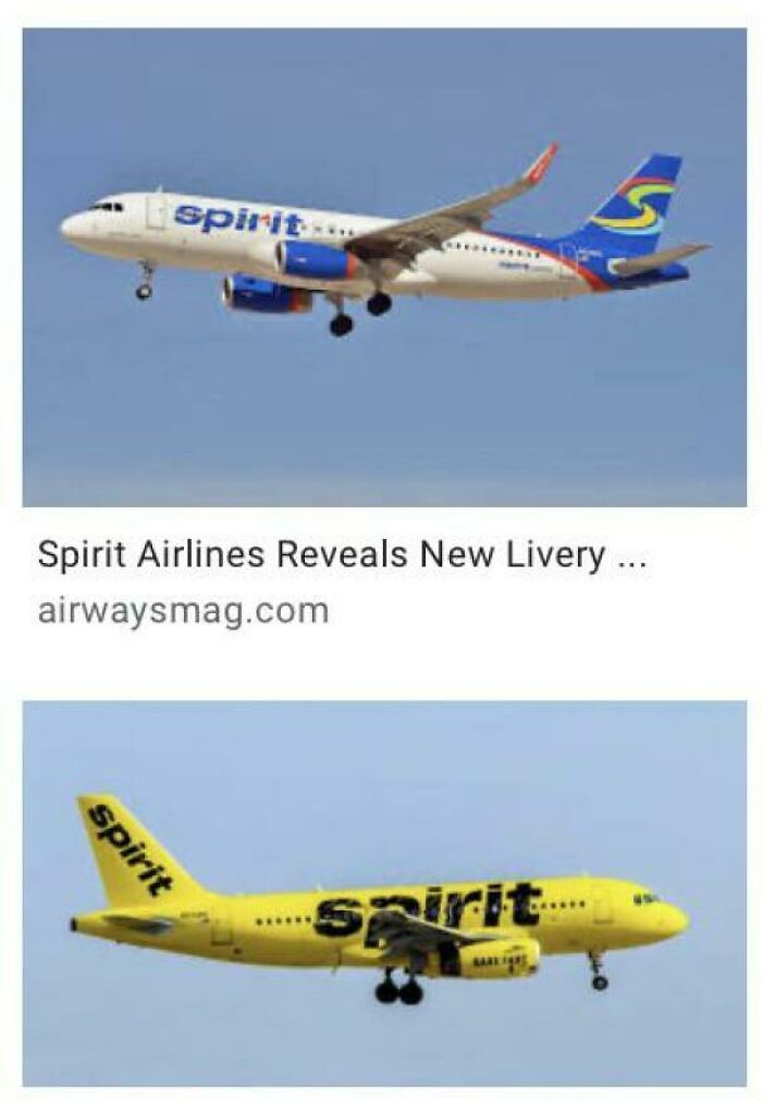
Image credits: JLirl
#30 Rip Dash
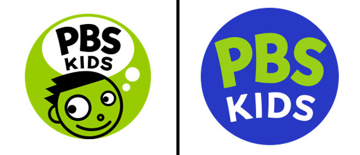
Image credits: DrNoob283
#31 I Can’t Believe They Just Did That
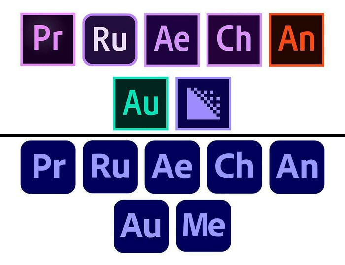
Image credits: RedditSlayer527
#32 Why
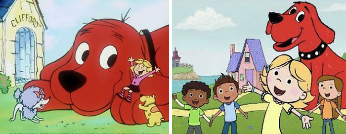
Image credits: kitkat8475
#33 I Don’t Like The New Fanta Redesign
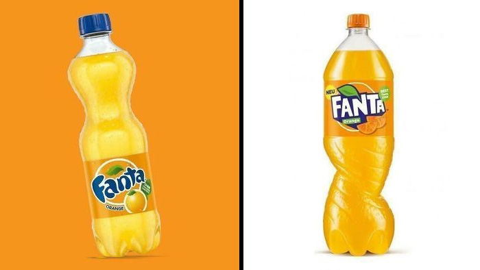
Image credits: random___pictures1
#34 Did They Really Have To Add A Bird?
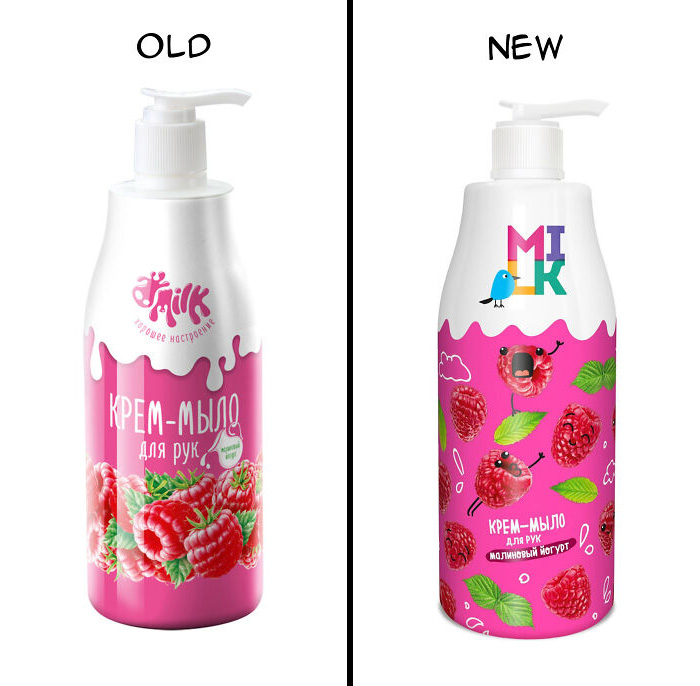
Image credits: pelmetalia
#35 Burger King Was Another Victim Of The 90s Redesigns
- You Might Also Like: These 32 Striking Images Captured Native American Men More Than 100 Years Ago
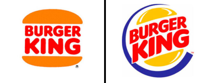
Image credits: imgur.com
from Bored Panda https://ift.tt/dMb6jG3
via IFTTT source site : boredpanda